- HOME
- Design & deliver
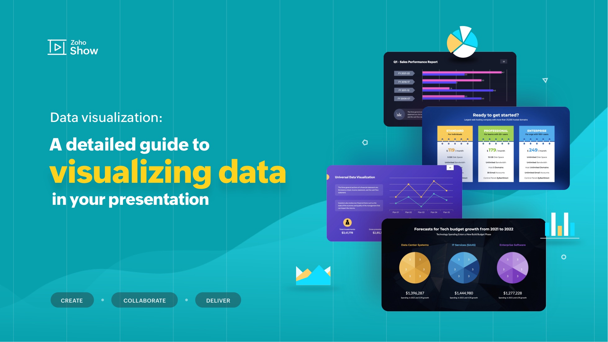
- Data visualization: A detailed guide to visualizing data in your presentation
Data visualization: A detailed guide to visualizing data in your presentation
- Last Updated : October 20, 2023
- 8.4K Views
- 15 Min Read
"The greatest value of a picture is when it forces us to notice what we never expected to see."
- John W. Tukey, mathematician and statistician
Visualization helps decipher or break down information that is challenging to understand in text or numeric form. It's mostly used for data storytelling, as it is a great way to simplify information and present it in a format that is understandable, insightful, and actionable.
Whether you're a data analyst, a graphic designer, a content strategist or a social media manager, expertise in data visualization can help you solve a wide range of business challenges and tell impactful stories. In this blog post, we will look at a step-by-step approach to using data visualizations in your presentation.
What is data visualization?
Data visualization is the process of presenting data in a visual format, such as a chart, graph, or map. It helps users identify patterns and trends in a data set, making it easier to understand complex information. Visualizations can be used to analyze data, make predictions, and even communicate ideas more effectively.
Some examples of data visualizations include dashboards to track analytics, infographics for storytelling, or even word clouds to highlight the crux of your article or script.
Why do we have to visualize data?
In today's information-rich world, audiences are often bombarded with vast amounts of data and complex information. This is where data visualization comes into play—it transforms raw data into visually appealing and comprehensible formats, allowing audiences to grasp key insights and trends at a glance.
Consider the picture below:
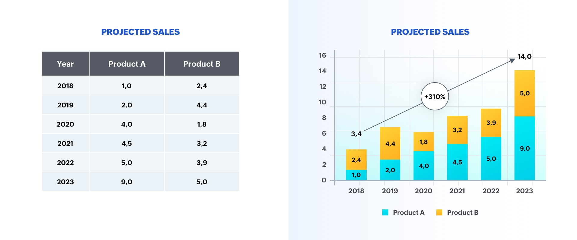
The option on the left is a table displaying two categories of data, whereas the option on the right is a graph representing sales growth. As you can see, the chart is more insightful, and makes it easier to identify trends in the numbers.
A good visualization typically represents some form of collected data as a picture, and can help with:
- Faster decision-making
- Identification of patterns and trends
- Presentation of an argument or story
Why is data visualization important in presentations?
Whether it's a business pitch, a campaign report, or a research presentation, data visualizations help you engage viewers on both rational and emotional levels.
They can be used to evoke empathy, urgency, or excitement, making the content more relatable and compelling. This is particularly crucial in decision-making contexts, where data-driven insights can sway opinions, drive actions, and guide strategic choices.
Ultimately, by incorporating data visualizations into presentations, you can benefit in the following ways:
- Elevate communication and convey impactful, data-centric narratives.
- Tell your story using visuals in a clear and meaningful way.
- Foster a deeper understanding of your data to make a stronger impact on the audience.
- Support idea generation and help derive business insights.
- Simplify data and business processes.
Step-by-step approach to data visualizations in presentations:
There are several factors to consider before adding a data visualization to your presentation. Here's a detailed guide:
Step 1: Define your purpose
The first step to visualizing data in your presentation is to determine your key message and decide on the type of story you are going to tell. Whether you plan to reveal trends, compare data, or explain a concept, a well-defined purpose will guide your data selection and visualization design, ensuring your visuals play a meaningful role in conveying your message.
Step 2: Understand your audience
Identify who your visualization is meant for and then make sure it fits their needs. Tailor your approach to suit your audience's familiarity with the topic and preferred level of detail. Knowing their expectations will help you fine-tune the complexity and depth of your visualizations, ensuring your presentation truly resonates with your audience.
Step 3: Choose your visualization type
Different data types and relationships call for different visualization formats. Selecting the appropriate chart, graph, or diagram is essential for accurately conveying your information. Here are some visualization types commonly used in presentations:
Tables: These consist of rows and columns and are used to compare variables in a structured way. Tables display data as categorical objects and make comparative data analysis easier. Example use: Pricing vs. feature comparison table.
Bar charts: Also known as column charts, these chart types use vertical or horizontal bars to compare categorical data. They are mainly used for analyzing value trends. Example use: Measure employee growth within a year.
Pie charts: These graphs are divided into sections that represent parts of a whole. They are used to compare the size of each component and are usually used to determine a percentage of the whole. Example use: Display website visitors by country.
Area charts: These are similar to bar and line graphs and show the progress of values over a period. These are mostly used to showcase data with a time-series relationship, and can be used to gauge the degree of a change in values. Example use: Show sales of different products in a financial year.
Histograms: Similar to bar charts (but with no space in between), histograms distribute numerical data. They are mainly used to plot the distribution of numbers and analyze the largest frequencies within a particular range. Example use: Measure app users by age.
Scatter charts: Also know as scatter plots, these graphs present the relationship between two variables. They are used to visualize large data sets, and show trends, clusters, patterns, and outliers. Example use: Track performance of different products in a suite.
Heat maps: These are a graphical way to visualize data in the form of hot and cold spots to identify user behavior. Example use: Present visitor behavior on your webpage.
Venn diagrams: These are best for showcasing similarities and differences between two or more categories. They are incredibly versatile and great for making comparisons, unions and intersections of different categories.
Timelines: These are best used for presenting chronological data. This is the most effective and efficient way to showcase events or time passage.
Flowcharts: These types of charts are ideal for showcasing a process or a workflow.
Infographics: These are a visual representation of content or data in a graphic format to make it more understandable at a glance.
Bonus: In addition to the above mentioned visualization types, you can use Gantt charts, word clouds, and tree maps. Gantt charts are used in project management presentations to demonstrate the work completed in a given period. Word clouds are a graphical representation of word frequency that gives greater prominence to the words that appear most within content. Tree maps display hierarchical data as a set of nested shapes, typically in the shape of rectangles.
Step 4: Use an appropriate chart
Once you're familiar with the different chart types available, the next step is to select the one that best conveys your key message. Knowing when and how to use each chart type empowers you to represent your data accurately and enhances the persuasiveness of your presentation. The best chart type for your needs depends more on the kind of analysis you are targeting than the type of data you've collected. Let's take a look at some of the most-used data visualization approaches in presentations.
Display changes over time: One of the most common applications of data visualizations is to show changes that have occurred over time. Bar or line charts are helpful in these instances.
Illustrate a part-to-whole composition: There might be times when you need to analyze the different components of a whole composition. Use pie, doughnut, and stacked bar charts for these part-to-whole compositions.
Visualize data distribution: Another important use of data visualization is to show how data has been distributed. Scatter plots, bar charts, and histograms help identify the outliers and demonstrate the range of information in the values.
Explore variable relationships: When you want to understand the relationship between two variables, use scatter plots or bubble charts. These can help you depict relationships between two variables, and observe trends and patterns between them.
Compare values between groups: Another common application of data visualization is in comparing values between two distinct groups. Using a grouped bar or line chart makes it easy to understand and compare trends.
There are several types of charts available in Zoho Show, each offering their own advantages. Learn how you can add and edit these charts in Show.
Step 5: Pick the right visualization tool
Utilize visualization software or tools that align with your proficiency and presentation needs. Factors such as ease of use, customization options, and compatibility with your data source should influence your choice of tool, enabling you to create impactful visualizations efficiently.
Zoho Show's charts are customizable, easy to use and come with wide range of options to make your data visualization easier. Some of the other prominent data visualization tools include Zoho Analytics, Tableau, Power Bi, and Infogram. These tools support a variety of visual styles and are capable of handling a large volume of data.
Step 6: Follow design best practices
Applying design principles will help you make sure your visualization is both aesthetically pleasing and easy to understand. You may apply these principles by choosing appropriate font colors and styles, or by effectively labeling and annotating your charts. By adhering to design best practices, you can create polished visuals and amplify the impact of your data-driven narrative.
Keep it simple: Data overload can quickly lead to confusion, so it’s important to include only the important information and simplify complex data. As a rule of thumb, don't crowd your slides with too much data, and avoid distracting elements.
Choose colors wisely: Use colors to differentiate and highlight information. The best practice is to use contrasting colors. You can also use patterns or texture to convey different types of information—but remember not to distort the data by applying 3D or gradient effects.
Add titles, labels, and annotations: Be sure to add a title, label, and description to your chart so your audience knows what they are looking at. Remember to keep it clear and concise.
Use proper fonts and text sizes: Use proper font styles and sizes to label and describe your charts. Your font choices may be playful, sophisticated, attention-grabbing, or elegant. Just be sure to choose a font that is easy to read and appropriate for your key message.
Closing thoughts
Human brains are naturally attuned to processing visual patterns and imageryUsing visuals not only helps you simplify complex information, but also makes your information more memorable. By leveraging charts and graphs, presenters can convey information to their audiences in a highly comprehensible manner. This helps them offer key insights and contribute to the decision-making process.
Ultimately, by incorporating data visualizations into presentations, presenters can elevate their communication from mere data sharing to impactful storytelling, fostering a deeper understanding of information among their audiences.


Comments(2)
I completely agree! Visualization transforms complex data into easily digestible insights, making it accessible for everyone. It not only simplifies difficult concepts but also enhances storytelling, allowing audiences to grasp key takeaways quickly. When done effectively, it can turn raw data into powerful, actionable information that drives decisions and fosters deeper understanding. It’s truly an essential tool in communication and data-driven strategies!
Great explanation! Data visualization indeed transforms complex data into a more digestible format. It’s fascinating how it aids in discovering insights and patterns that might otherwise be missed. The examples you mentioned, like dashboards and infographics, are perfect for different contexts—whether for decision-making or storytelling. Word clouds are especially fun and impactful in summarizing key concepts in a visual way!