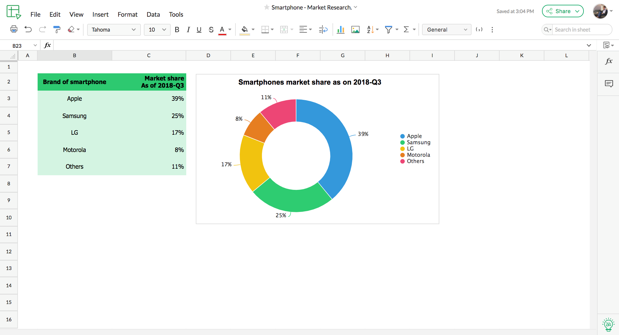
Vibrant charts to visualize data
With over thirty-five different chart types available, you can find the best way to visualize almost any datatype. Create and customize elegant charts with unique color schemes.
Pivot Table: The data summarizer
Pivot tables help you find the needle in the haystack. If you have a lot of data on your hands and want to make sense of it, pivot tables are the way to do it. They pull the desired reports and summaries out of your datasets to help you understand your data more easily.
Learn more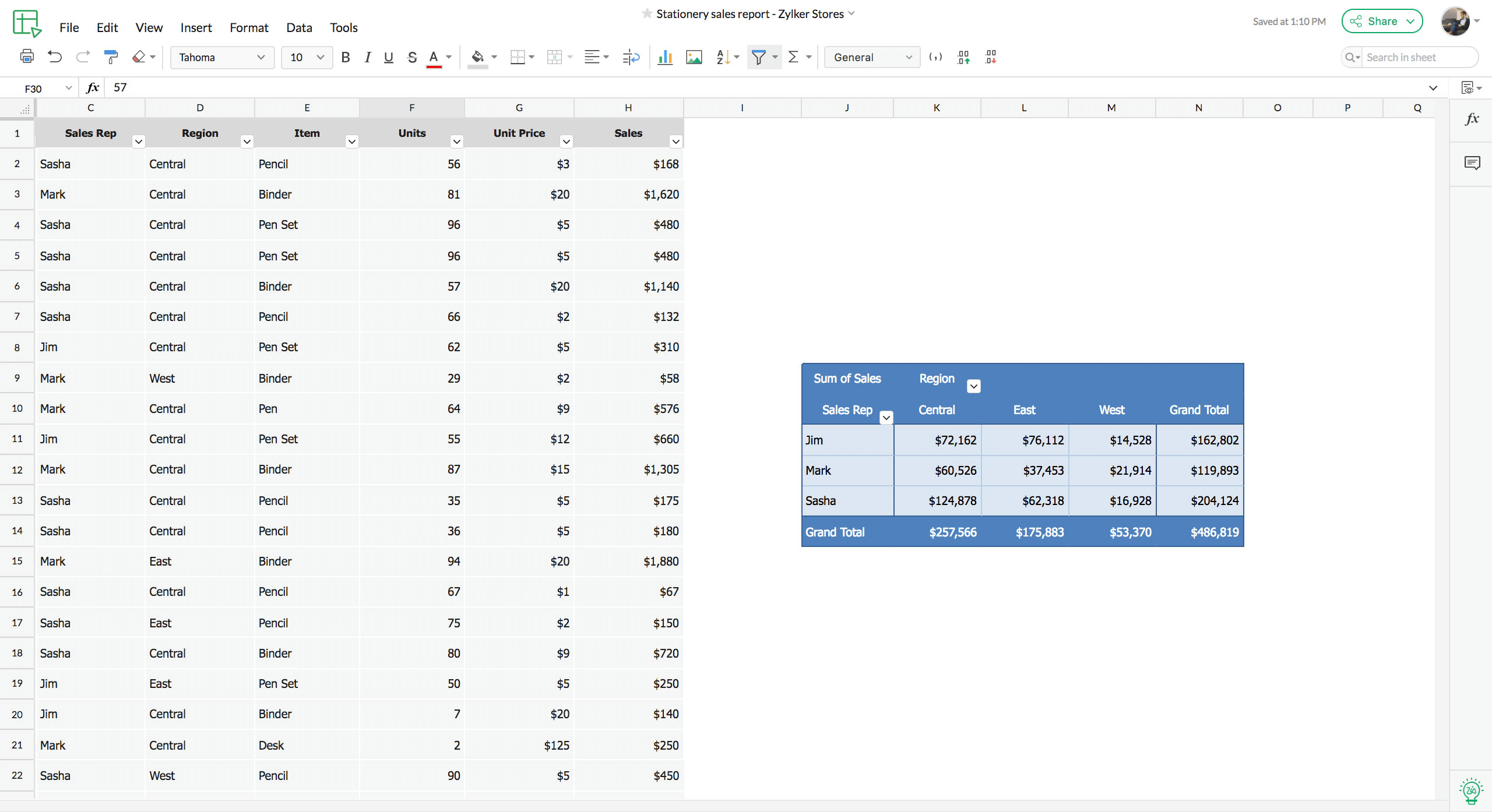
Zia: Let AI handle the data analysis
Say hello to Zia, your intelligent data assistant! From now on, Zia will help you analyze data by automatically creating charts, building pivot tables, and answering your data-related questions.
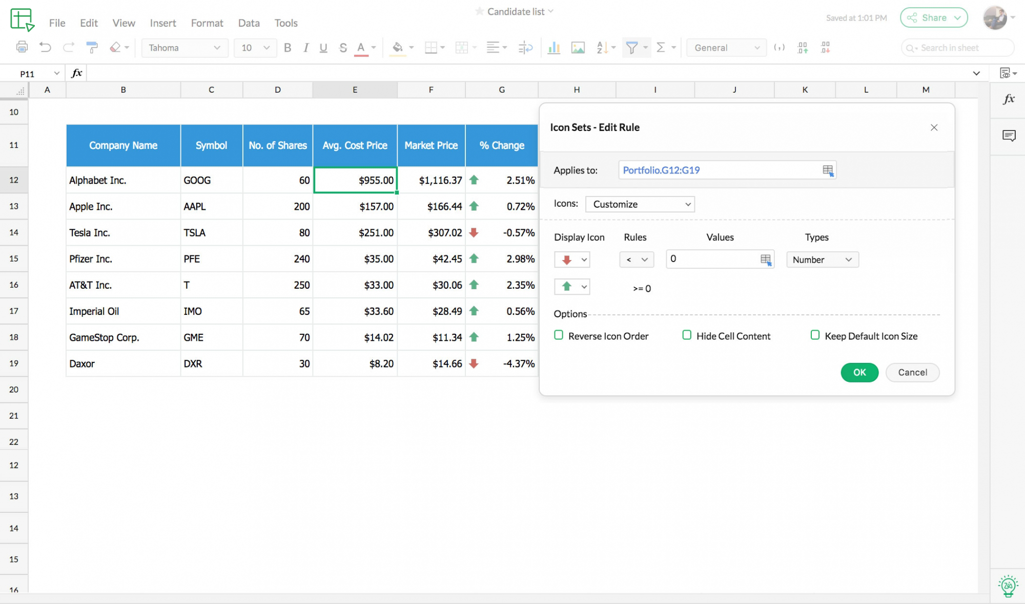
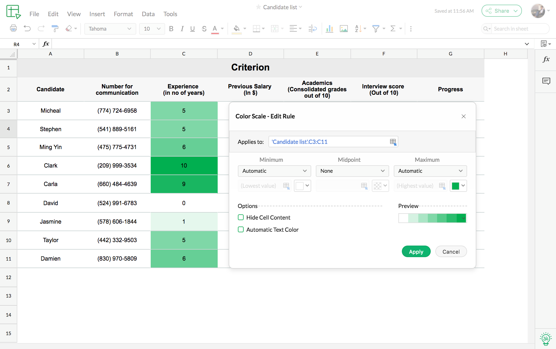
Learn moreConditional formats
Conditional formats make any data presentable. The formatting can be a color scale, an icon, or even a custom format, applied to a set of cells. Cells that match specified conditions will be formatted accordingly, making them stand out in a sheet full of cells.
Learn more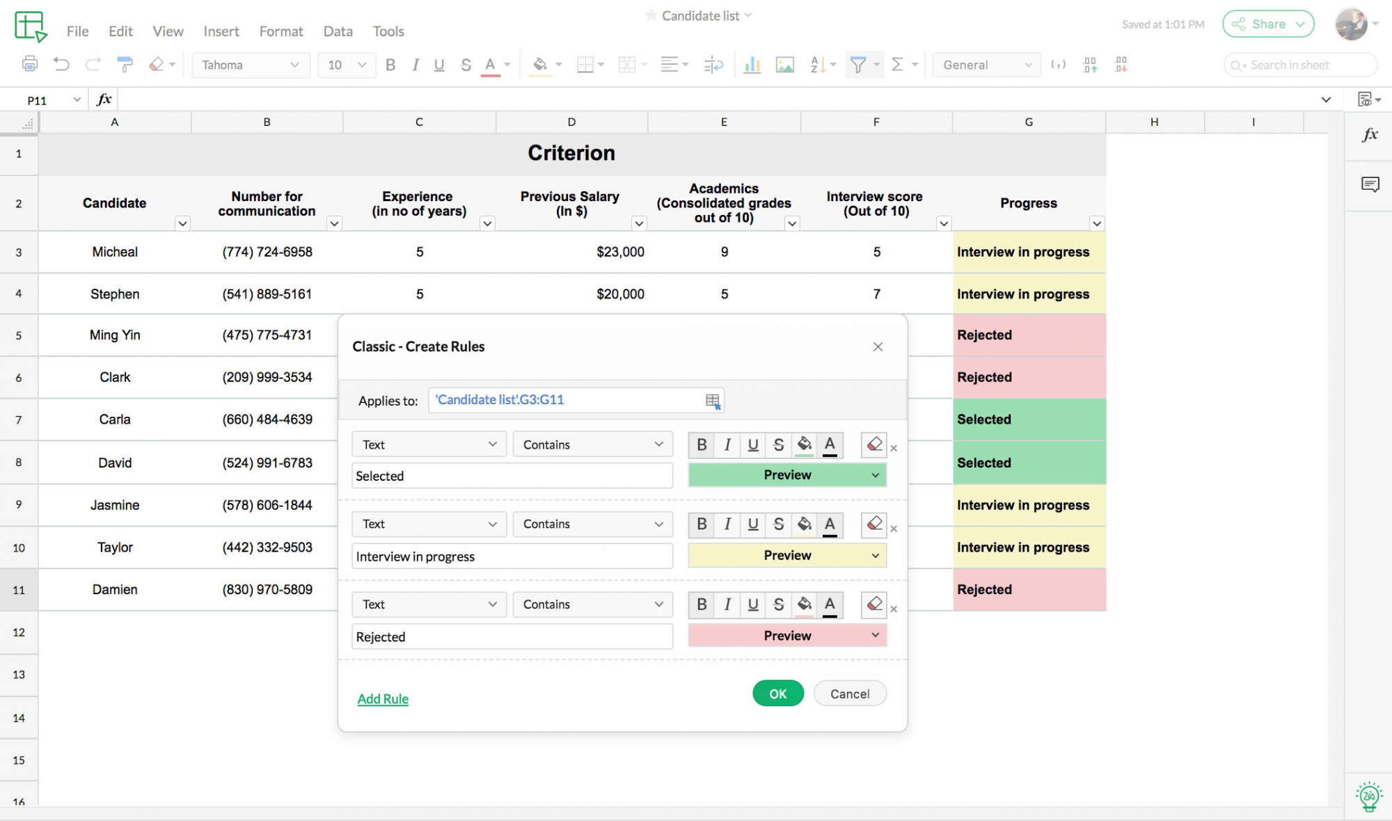
Sparklines
Sparklines are in-cell charts that'll help you visualize data rows. They are completely customizable, from the color, to the chart type, to the axes.

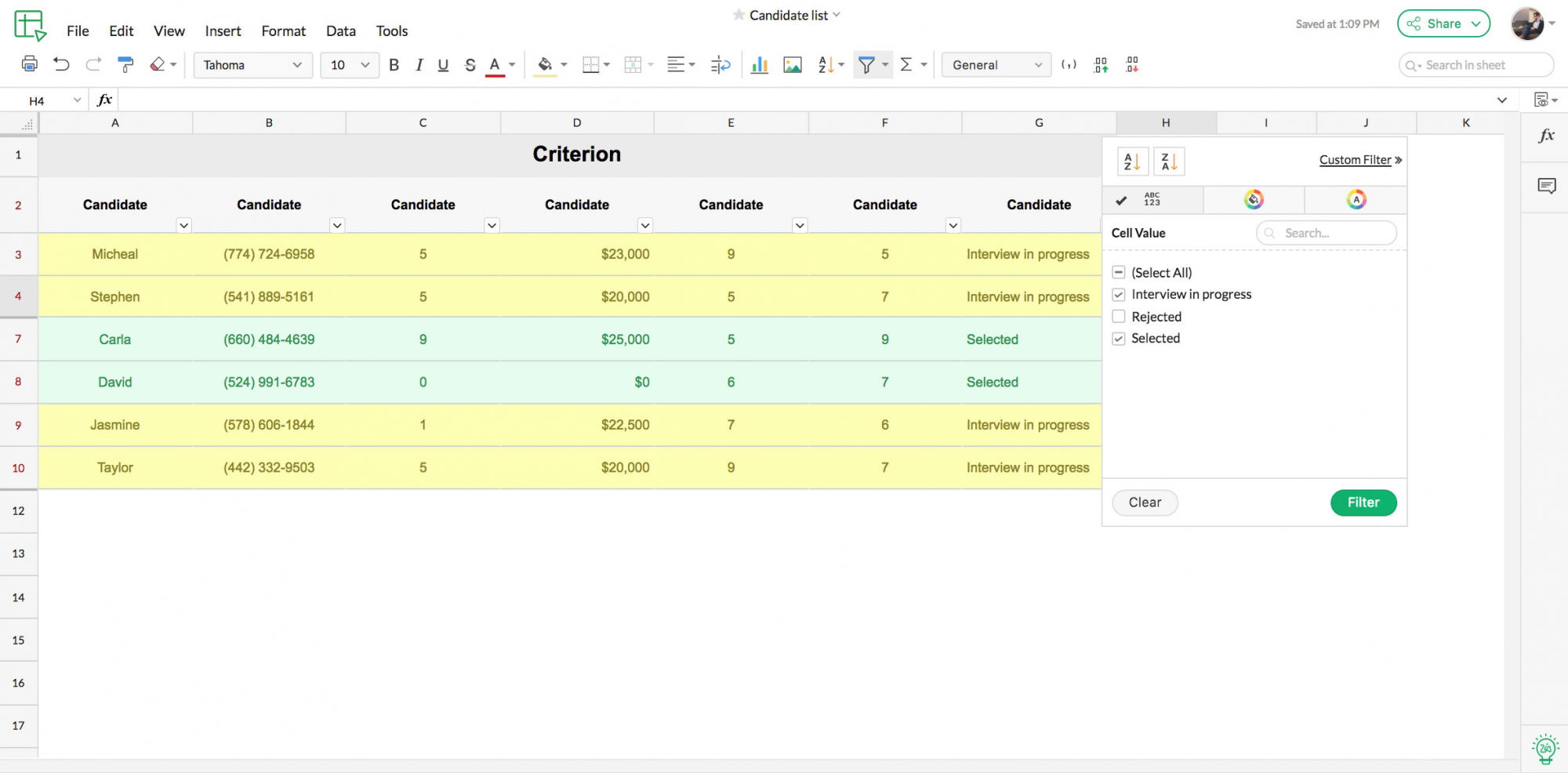
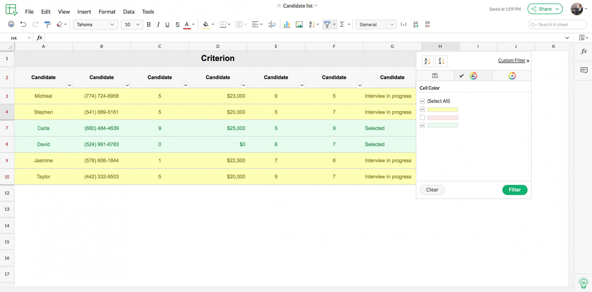
Sort and filter to save time
Sort the data and filter the results to get your hands on exactly what you need. Save the time you’d spend scrolling through rows and rows of unorganized numbers.