- HOME
- Website Analytics for small businesses — What to track and and what to ignore
Website Analytics for small businesses — What to track and and what to ignore
- Last Updated : June 17, 2026
- 76 Views
- 12 Min Read
You've got a dashboard full of numbers. Most of them are noise.
Open any analytics tool right now and count how many charts are on your screen. Eight, twelve, maybe more. There are dropdown menus with report categories you've never clicked. Metrics with names that sound important but don't obviously connect to anything your business actually does.
Here's the truth: most analytics dashboards were built for teams with a dedicated reporting person. Someone whose job it is to look at this stuff every day. That's not you, and that's fine. The problem is that the tool doesn't know that.
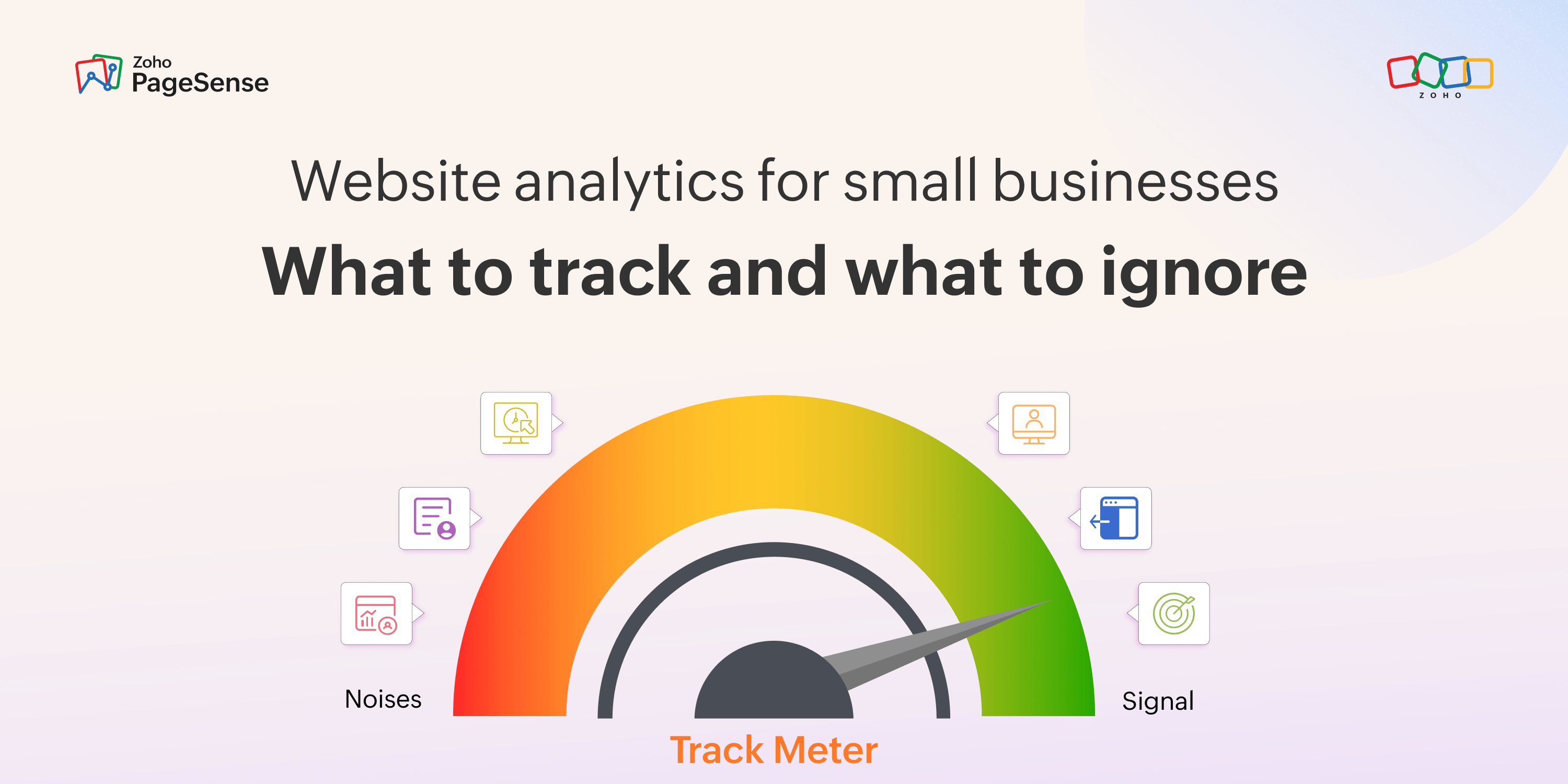
This guide is about five metrics. The ones that consistently tell small business owners whether their site is working. And then a clear list of what to stop looking at — because the signal you need gets buried when everything looks equally important.
One framing before we start, because it changes how you read all of this: every analytics metric answers one of two questions. Either "how much traffic do I have?" or "is that traffic doing anything useful?" The first question feels important. It almost never changes a decision. The second question is where all the actionable stuff lives. Almost everything in this guide is about the second question.
The Problem With Most Analytics Dashboards
Most small businesses set up analytics when they launch, look at the dashboard a few times, feel vaguely overwhelmed, and then check it sporadically — usually when something seems off.
That's not a discipline problem. It's a signal problem. The dashboard isn't surfacing clear signals because it's designed to show everything equally. And most of it doesn't apply to you.
Quick exercise: think about the last time you saw something in your analytics and changed something on your site because of it. If the answer is "I can't remember" or "I tweaked a button color, and I'm not sure if it helped" — that's the gap we're closing here.
Data only has value when it changes what you do. Everything else is just a number you glance at.
One thing that changed in 2026 that shifts which metrics matter
Before the five metrics, one structural shift is worth knowing about because it changes which numbers deserve your attention.
AI-generated answers — Google's AI Overviews, ChatGPT Search, Perplexity — are now answering a large share of search queries without anyone clicking through to a website. According to SparkToro and Datos 2026, click stream data, around 65% of Google searches end without a click to any external site. For searches that trigger an AI Overview specifically, that figure rises to 83%.
What this means practically: raw traffic volume has become an even less reliable signal than it used to be. Your session count might be declining even if your actual presence in search results is stable — because some of the clicks that used to reach you are now absorbed by AI summaries. The visitors who do land on your site from search are, on balance, more intentional. They wanted something specific enough to actually click through.
So the shift is this: you can't control how much traffic AI intercepts. You can control what happens when someone reaches your page. That's where your attention should go.
The practical implication: if your session count is declining but your conversion rate is holding steady or improving, your site is probably fine. The drop is a search landscape issue, not a website issue. Don't panic about the number. Check whether the traffic you do have is still doing something useful.
Metric 1: Conversion rate by traffic source
Which channel sends visitors who actually do the thing your site exists to make them do. Not which channel sends the most visitors.
This is the most consistently overlooked metric in small business analytics, and it's the one that most directly tells you where your budget is earning its return. Organic search, paid ads, social media, email, and direct visits — each source sends visitors with different intent, different levels of familiarity with you, and different reasons for clicking. Volume from any source tells you almost nothing about whether that source is worth anything.
The pattern that surprises most people the first time they look at this: the channel sending the most traffic is rarely the one converting best. Social media tends to send volume. Organic search, especially from specific queries, tends to send better-qualified visitors. Paid search can convert well per visit because people searching with purchase intent clicked an ad, but the channel only earns its keep if the conversion rate justifies the cost.
What you're looking for is cost per conversion by source, not conversion rate in isolation. Look at this weekly, and give it at least four consecutive weeks before drawing conclusions. One week is noise. A month of consistent data is a signal worth acting on.
One thing about direct traffic: it often converts well because it skews toward people who already know you. But treat this number carefully. A lot of what shows up as "direct" traffic isn't actually direct — see the note below.
The dirty truth about your direct traffic
A chunk of what your analytics calls "direct traffic" isn't people typing your URL into a browser. It's the traffic that lost its referral information in transit. Links shared in WhatsApp, Slack, private messages, and email — when someone clicks those, the referral data often gets stripped along the way. SparkToro research confirms that 100% of visits from WhatsApp, Slack, and Discord are recorded as direct traffic in standard analytics tools. Practitioners call this dark social or dark traffic, and as more content gets shared through private channels and AI tools, the problem is growing.
The implication: don't cut social or email spend purely because their reported conversion numbers look low. Some of that traffic is likely sitting in your "direct" bucket, unattributed. If your direct traffic is unusually high — say 20% or more of total sessions — a meaningful share of it is probably social or email traffic you can't currently trace. UTM tagging every link you share is the most reliable way to reduce that misattribution over time.
Metric 2: Top exit pages
Which page are people on when they finally leave your site?
This is a different question from "which pages get the most traffic" or "what's my overall bounce rate." And it's more useful than either.
Every site has pages where exits are expected. Your order confirmation page. Your blog posts (people read, then leave — that's fine). Your contact success page. Those high exit rates aren't problems.
What you're looking for are high exit rates on pages where you didn't expect people to leave. Your pricing page. Your checkout step two. Your services overview. Your demo request form. A high exit rate on a page that's supposed to move people to the next step tells you something's broken there. It might be the copy, the layout, a form that's too long, a button that doesn't work on mobile, or just that the page doesn't answer the question visitors had when they arrived.
Top exit pages give you a prioritized list of where to investigate. The page with the highest unexpected exit rate is your most valuable optimization target. Every percentage point you recover there compounds across all your traffic.
What to do with this: sort pages by exit rate, then remove the ones where exits are expected — blog posts, thank-you pages, confirmation screens. What's left is your work list. Start at the top, and before you change anything, look at a heatmap or watch a few session recordings. The cause is almost always visible once you look.
Metric 3: Goal completions
A goal completion is any action you've decided matters — a form submission, a button click, someone reaching a thank-you page, downloading a resource, or clicking a phone number. You define it. The tool tracks it. Most small businesses never bother, and then spend months looking at traffic data that doesn't connect to anything the business actually cares about.
Until you have at least one goal set up, your analytics data is interesting at best and misleading at worst. Two thousand people visited last month. That's a number. It doesn't tell you whether any of those visits were worth anything. Goal completions are what connect your website data to your actual business — they're what turn analytics from a reporting exercise into something you can make decisions from.
What to do: set up exactly one goal before anything else. Find the most important action on your site — the one thing that, if someone does it, means your site worked. Look at the goal completion rate weekly. Everything else is context for this number.
If you're a service business, your goal is probably a contact form or a booking. If you're an e-commerce business, it's a completed purchase. If you run a content site, it might be a newsletter signup or a download. The goal should connect directly to the commercial purpose of your site — not a proxy like "spent two minutes on the page."
Metric 4: Mobile vs desktop conversion gap
More than half of your visitors are probably on mobile. For many small business websites, it's 60–70%. Yet mobile conversion rates are typically lower than desktop — often significantly so for service and content sites, with the gap narrowing in ecommerce as one-tap payments improve the mobile checkout experience.
This is the metric most small businesses have never checked, despite it being freely available in every analytics tool. Both groups are visiting the same site with the same offer. The only variable is how they're experiencing it — which makes it the clearest signal that something specific needs attention.
The numbers make the case plainly: if 60% of your visitors are on mobile and converting at half the desktop rate, you could be missing 20–30% of potential conversions purely because of how your site behaves on a phone. That's not a marketing problem. It's a fixable website problem.
If you've never looked at your conversion rate broken down by device, do it now. If mobile is converting meaningfully worse than desktop, you have a layout or usability issue — not a traffic issue. And fixing it might be the single most impactful change you make this year.
What to do: check your conversion rate by device. If mobile is less than half your desktop rate — or sitting below 2% — open your own site on your phone and try to complete the conversion yourself. It usually only takes a minute to spot the problem. The most common causes: a CTA button too small to tap reliably, a checkout flow that hasn't been tested on a real device, images slowing the page on a mobile connection, or navigation that technically collapses but doesn't actually work.
One caveat: if you run a B2B business where your customers research during working hours at their desks, your desktop traffic share might legitimately be higher than 50%. The principle still applies — look at whether the conversion rate differs by device and understand why.
Metric 5: Unique visitors (direction, not the number)
Unique visitors made this list, but probably not for the reason you'd expect. The actual count — 500 visitors, 5,000 visitors, whatever yours happens to be — tells you very little on its own. A smaller site converting consistently is doing more useful work than a larger one where nothing converts. What matters is the direction the number is moving, and whether you can connect that movement to something you actually did.
Is the audience growing month over month? Shrinking? Holding flat for three months and then suddenly jumping? Each of those patterns means something different, and the meaning usually lives in the traffic source breakdown, not in the visitor count itself. When the number changes, the useful question isn't "why did visitors go up or down" — it's "which channel changed, and why?"
What to do: look at unique visitors month over month, not week to week. Compare against the same month last year to account for seasonality. When the trend shifts significantly, look at which traffic source drove the change. That's where the real signal is.
Note: if your unique visitor count is declining but goal completions are holding steady or growing, your site is probably performing better despite the drop in traffic. Some sites are experiencing exactly this pattern as AI search absorbs more casual informational queries, leaving the more intentional visitors who are actually interested in what you offer. A smaller, more converting audience beats a larger, non-converting one.
What to stop looking at — for now
These aren't useless metrics. But for a small business with limited time, they create noise rather than a signal. Park them until you've spent six months consistently tracking the five above.
Average session duration
A long session can mean deep engagement, or it can mean a confused visitor who can't find what they need. The metric doesn't tell you which. GA4 improved on this by introducing average engagement time, which only counts time when someone was actively focusing on a page, not sitting with a tab open in the background. Better, but still hard to act on in isolation. A two-minute average engagement time means something completely different on a product page versus a 3,000-word guide. Until you've sorted your conversion goals and your mobile gap, there are more useful things to look at.
Exception: if your business depends on content consumption — education, media, newsletters — tracking average engagement time by piece of content starts to become meaningful, particularly for finding what people start but don't finish.
Raw pageviews
Pageviews count every page load, refresh, bot traffic that slipped through filters, and the same person visiting twelve times in a month. It produces the biggest number on your dashboard, and the biggest number is not the same as a useful number. Unique visitors is a better proxy for audience size. Conversion rate is what tells you if those visitors matter.
Pages per session
More pages per session gets treated as engagement. It isn't — not on its own. Someone who found your contact page, read it, filled out the form, and left after one page is your best visitor. The person who browsed seven pages and disappeared converted nothing. Pages per session only start meaning something when you look at whether the people who complete your goal visit more pages first. That comparison is useful. The raw number isn't.
Social media traffic volume
The volume number is almost always flattering and rarely predictive. People arriving from social are usually in browsing mode, not buying mode — which is why social typically converts at a lower rate than organic or direct. That's not a reason to abandon social. It's a reason to stop optimizing for social traffic volume and start looking at conversion rate from social (Metric 1). Most small businesses, when they actually check, find the answer is "very low." That's useful. The raw volume isn't.
That said, if you're a local restaurant, an event venue, or a retail shop where people discover you through social and then walk in the door, the volume number has indirect value that's genuinely difficult to attribute. For those businesses, track downstream outcomes like bookings or footfall, not the traffic number itself.
Demographic reports
These feel insightful. They very rarely are. The age, gender, and interest data in analytics tools are modeled from browsing behavior patterns — it's estimated, not observed. The margin of error is meaningful. And even if the numbers were accurate, "55% of visitors are female, 35–44" doesn't tell you what to change on your website. What people actually do on your pages is almost always more useful than who they demographically are. Behavioral data over demographic data, every time.
The layer these five metrics still don't show you
The five metrics above will tell you there's a problem. They won't tell you what the problem is or how to fix it.
Knowing that your pricing page has a 78% exit rate is the beginning of an investigation, not the end of one. The exit rate tells you people are leaving. It doesn't tell you whether they're leaving because the pricing table is too far down the page, because a button doesn't fire on their phone, because a form field is putting them off, or because the copy isn't answering the right questions.
That's a different kind of data. You need to see what visitors actually experienced on the page — which is where website behavioral tools come in. Heatmaps show where people clicked and how far they scrolled. Session recordings let you watch real visits play back. Form analytics show which specific field people gave up on.
Get comfortable with the five metrics first. They surface the problems. Then use behavioral tools to find out what's causing them.
A practical weekly routine that takes under fifteen minutes
Monday morning. Check goal completions — up, down, or flat versus last week? Check conversion rate by source — anything shifted significantly? Check top exit pages — anything newly high? Check the mobile conversion gap — still similar to last week?
If something changed, investigate. If nothing changed, you're done.
That's the whole routine. The discipline of doing it consistently matters more than the sophistication of what you're tracking.