
Guessing can be expensive. One wrong guess about the placement of your CTA might cost you thousands of dollars. A/B testing allows you to eliminate the guesswork .
A/B testing is used to compare the performance of two variations of a webpage. These two variations, A and B, are shown at random to similar visitors at the same time. The variation with the most conversions is then chosen to replace the original.
Testing is especially important when deciding on a website layout and element placement. A/B testing provides you with a way to test the performance of each variation to be sure that every change you make to your website positively impacts your conversion rates.
What should you A/B test?
Conducting a test between two variations without having a strategic testing plan is like aiming for a bulls-eye while blindfolded. Figure out which of your website's pages have the largest impact on your conversion rate. A good way to find out the poorly performing page is to zone in on the one which gets high traffic, but still has a high bounce rate. Make this page the ground-zero of your A/B tests.
The primary objective of A/B testing is to improve user experience, and from it increasing the chance of converting visitors to leads. By asking focused questions about changes to your website, you can collect data about the impact of those changes.
Here's a list of 20 A/B testing ideas to get you started:
CALL-TO-ACTION
Color:
Always remember the rule of thumb while deciding the CTA color—make it stand out compared to the other elements on the page. While there is no way to proclaim that one particular CTA color will make your conversions go through the roof, one thing is certain: Buttons that convert the best are the ones that contrast most strongly with the other colors on the site. So, make sure to make the CTA pop!
Point to note: While making CTA color variants to A/B test, the goal is to have your CTA jump out at your visitors without clashing with your site’s overall design. This way, you might find the right aesthetically pleasing CTA color that rakes in conversions.Text:
Start free trial? Get started? Sign up now? Whatever text you add to your CTA, make sure it acts as clear and contextual guide to your visitors. This increases the chances of the visitor actively engaging with it. If you're reworking call-to-action content, run an A/B test to determine which one (original vs variants) gets the most clicks.
Size:
Small, medium, or large? Remember, elements that stand out get more attention. Once gain, do not try to break from the website design and layout. It might cause your conversions to take a hit.
Position:
In some cases, placing the CTA at the start of the page is a good way to catch visitor attention. However, in the other cases, placing it after a compelling piece of content can work wonders. Michael Aagaard, an international keynote speaker & conversion optimizer, found that placing the CTA below the average fold increased their conversions by 304%.
Shape:
This is a minor detail that we tend to overlook. But why speculate when you can be sure? Several designers favor rounded CTA button corners over square ones. It sounds odd, but it draws attention inside and is subconsciously more appealing. Don't believe it? Test it out.
Single or multiple CTAs:
It's often a good practice to strategically place the same CTA in different sections of your webpage so that it's always within the visitor's reach. The key here is not to overdo it: If you do, your website will look like it's trying too hard, or worse, that it has malware.
Instead of multiple primary CTAs, try sticking with one-two primary CTAs and make the rest secondary. It's better to be safe than sorry. A/B test how many CTAs it takes to reach your conversion peak.
Hyperlinks vs. buttons:
The jury is still out on Learn More as a button. It's best to choose based on context. If your webpage has a secondary call-to-action, give it a muted tone compared to the primary—in other words, make it a link.

CONTENT
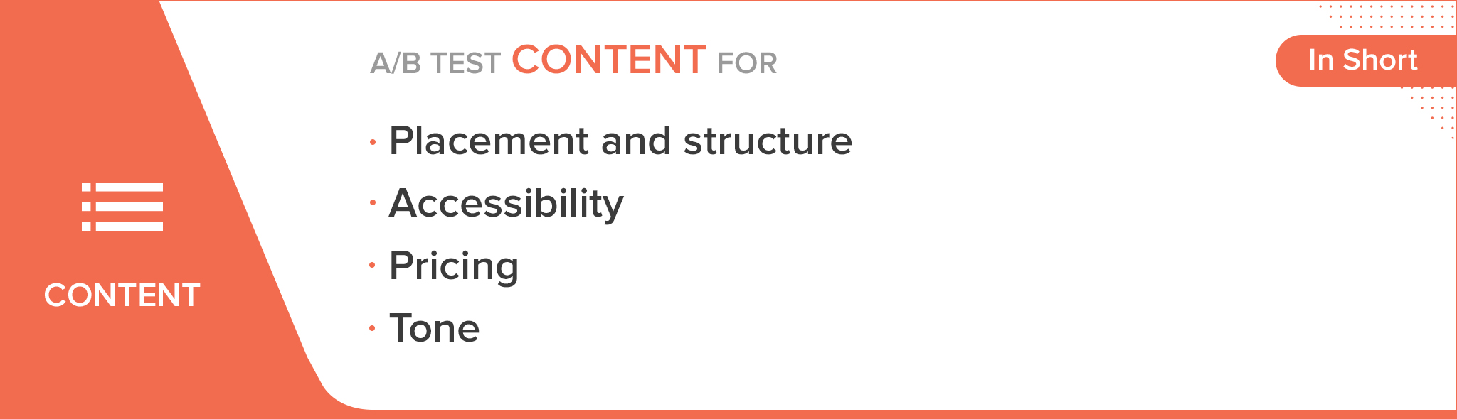
Placement and structure:
Often, subtle differences in the layout of a web page can contribute to a decent lift in the leads generate. For example, the strategic placement of a section of trust icons (enterprise customers, testimonies, ratings) can significantly increase the page's conversions.
Tom Demers, co-founder and managing partner at Measured SEM search engine marketing consulting ran a similar test on their website with two variants against the original and found the second variants won by 367%.
Accessibility:
Depending on what sort of content you're providing, it might be helpful to either keep it gated, or open—that is providing access to the content once the visitor fills out a form, or allowing them to download it directly. Test both—gated and non-gated content to find out which one generates the most high quality leads.
Pricing: Subtle pricing or direct pricing?
Visitors generally believe anything ending in $.99 is a discount. Robert Schindler, a marketing professor at Rutgers Business School conducted an experiment testing this very case. He found that items whose prices ended with .99 far outsold those ending with .00.
However, in the SaaS, software, and mobile industries, direct pricing(ending in "0" or "5") is used more often. One reason for this might be because these industries want their service to be perceived as high quality.Tone:
Based on your organization's branding and product placement, you might want to experiment with the way you talk to your visitors through your website. Casual or authoritative, technical or non-technical, humor and satire, or straightforward delivery? Each style has its pros and-cons, finding the right fit for your audience is key. A/B test different content tones to see which lands best.
TYPOGRAPHY
Font size:
For header content, test different weights, or font size increases and decreases of 2px.
Styling:
Experiment with complementary fonts, text formatting like strikethroughs, symbol usage, and whether handwriting fonts or monospace fonts best attract visitor attention.
Sans-serif vs serif:
Studies show that readability is better with serif fonts. However, sans serif are more popular for web usage and serif for print.

MEDIA
Size: Big vs small
A study conducted by CXL on image sizes in experience-driven products and specs-driven revealed opposing results. One variant received more visual engagement for smaller images, and the other for larger images. The size of an image on your website depends on a variety of factors like placement, relevance, and type (given below). A rule of thumb is to ensure the image is responsive.
Remember to keep these points in mind before running tests on image sizes.Type: Image of object vs image of people vs videos
> Illustrations and images of objects need to be in line with the service you offer. A distinct powerful image of an object should make the user stop and examine the website each time they visit. But this doesn’t mean that the image needs to say everything. Rather, the image just needs to reinforce the message in a relevant way visually.
> While selecting images of people, make sure you focus on a single subject image than a crowd shot. Also, choose the image in which the person matches your target audience. Several corporations end up using uncanny stock photos of people. Of course, it does the opposite of the intended effect and comes across as insincere.
Running a test between these two types will give you clear idea about your audience's preference.
> Consider your business offers complicated products/services. You might have to spend significant more time in educating your visitors, to persuade them to convert. In this case, a 30 second video accompanied by persuasive messaging can boost your conversions. You'll end up covering the same ground of content as a long form piece with images. Besides boosting conversions, videos can be a vital in building trust in your brand.
Make sure you A/B test each media type and match it to the context of the page, to make an informed decision about the one you finally pick.Alignment: Left vs center vs right
The alignment of media(images, illustrations, and videos) depends on the placement of the text as well. They should be complementary. Some copies use alternate between left and right alignment with the images placed alongside each section of text. This can be an effective way to retain the visitor's attention by keeping them constantly engaged.

WEBSITE LAYOUT
Length:
Long-forms vs short-form. In theory, a short form piece should land more conversions that a longer, more detailed version. However, in practice, there are cases in which the opposite works. Conversion Rate Experts found a 363% increase in CrazyEgg's conversions by making the variant 20 times as long as the control.
Navigation vs no navigation:
A commonly known "best practice" while building a landing page is removing the navigation menu. For some, this works: removes any form of distraction for the visitor, and guides them to remain within the funnel. However, there are quite a few cases in which removing the navigation of a page has increased its bounce rate since the visitors end up feeling trapped.
By allowing visitors to navigate away from the funnel, you give them the chance to educate themselves about the service you're offering. Experiment both the cases to find the one which leads to maximum conversions. The results might surprise you.
Manual search vs drop-down search:
Visitors want to perform quick and easy searches. If you're looking for a minimalistic design, a single search bar with manual text entry might be the right fit. However, using a drop down menu with clear choices steers the visitor towards swift decisions.

While monitoring each detail can help max out your conversion rates, conducting A/B tests between variations that create barely noticeable differences is a waste of resources. Try to figure out which of these elements are the most important, or could use the most drastic change. Only you will be able to answer that question.
Do you have any unique testing ideas that have had surprising results? Share your A/B test stories with us below!
Comments