- HOME
- Highlight what matters with conditional formats
Highlight what matters with conditional formats
- Last Updated : July 18, 2025
- 701 Views
- 3 Min Read

Conditional formats in spreadsheets allow you to highlight cells or rows that meet the specified criteria for easy data analysis. Conditional formats are dynamic cell formats that automatically adjust whenever there is a change in the dataset.
Types of conditional formats:
- Classic
- Color scale
- Icon sets
- Data bars
Which conditional format to choose and when
1. Classic
Classic conditional formats are highly suitable to highlight values—duplicates, unique values, top/bottom values, and more—that meet the specific criteria.
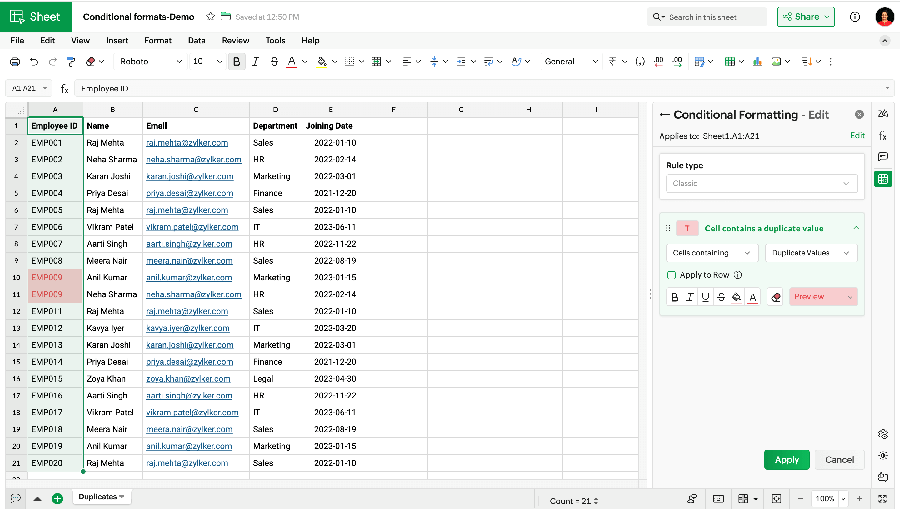
Highlight unique or duplicate values
Whether you're managing employee records, sales data, order logs, or customer database, it's essential to ensure the data is clean.
For example, suppose an employee ID is repeated; condition formatting would flag this error before it leads to discrepancies in the payroll or employee attendance tracking systems.
Highlight the highest or lowest values
Conditional format allows you to highlight the top and least values based on the rule you set.
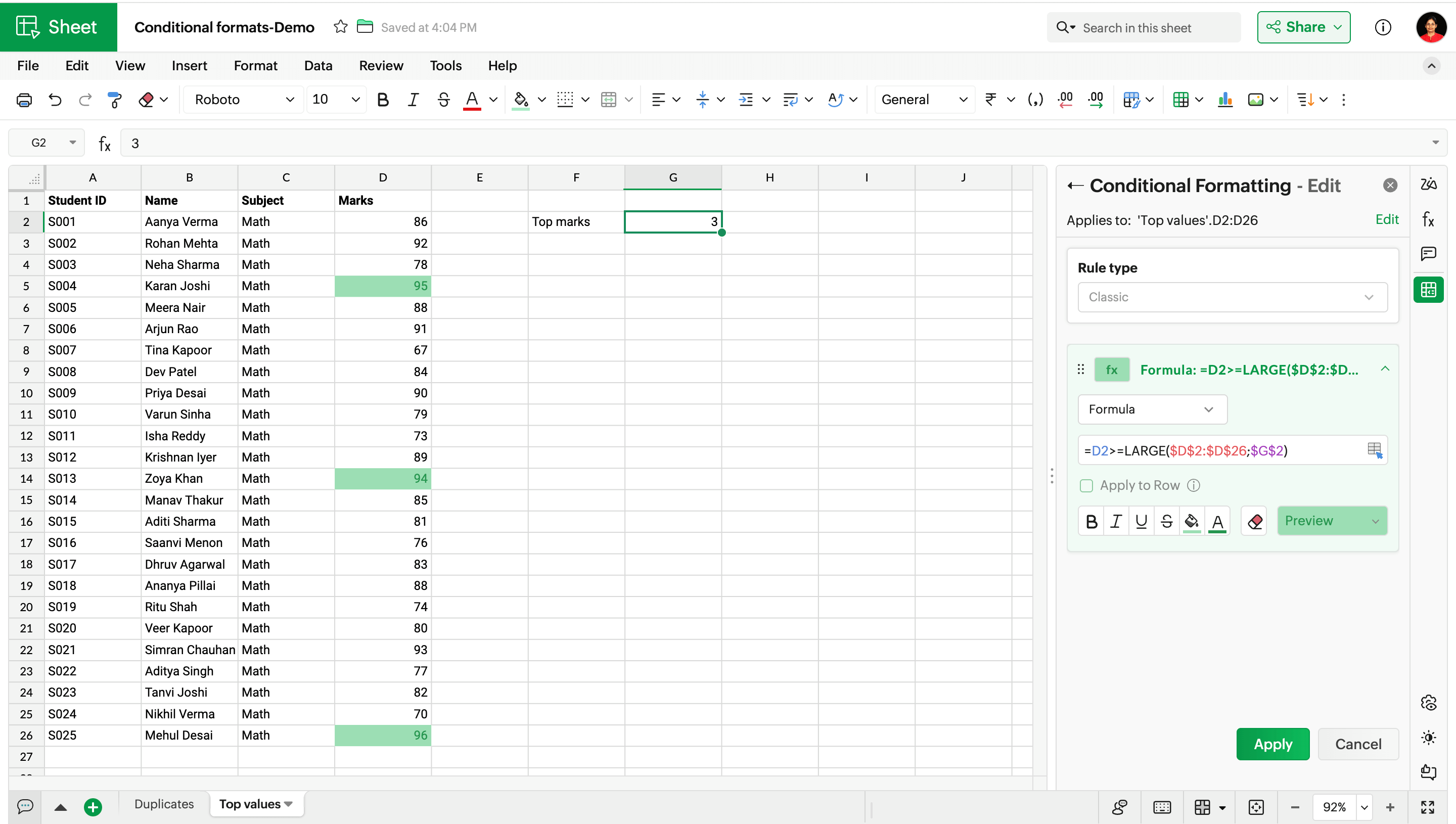
Here, we have a list of student marks, and I want to highlight the top three marks. I use this formula to highlight the marks:
=D2>=LARGE($D$2:$D$26;$G$2)
$G$2: 3 (Since we need to find the top three values)
LARGE($D$2:$D$26;$G$2): The LARGE() function returns the 3rd largest number in the selected range ($D$2:$D$26), which is 94.
=D2>=LARGE($D$2:$D$26;$G$2): This formula checks if each of the values in the range D2:D26 is greater than or equal to 94. When it's true, the cell is highlighted.
D2 is a relative reference, meaning it adjusts to each row when the rule is applied in the selected range. For example, when the rule checks row 3, D2 becomes D3.
$D$2:$D$26 is an absolute reference, meaning it remains unchanged, wherever the formula is copied or moved to.
Highlight values based on the input
Conditional formats are more dynamic—allowing you to highlight cells based on a varying value in another cell.
Say, you have sales data and want to highlight values that meet a specific sales target. The highlighted values automatically adjust when you change the value of the sales target.

Highlight the entire row based on a specific condition
So far, we have used conditional format rules to highlight the cells that meet the given criteria. Now, let's set a rule that highlights the entire row based on the given criteria.
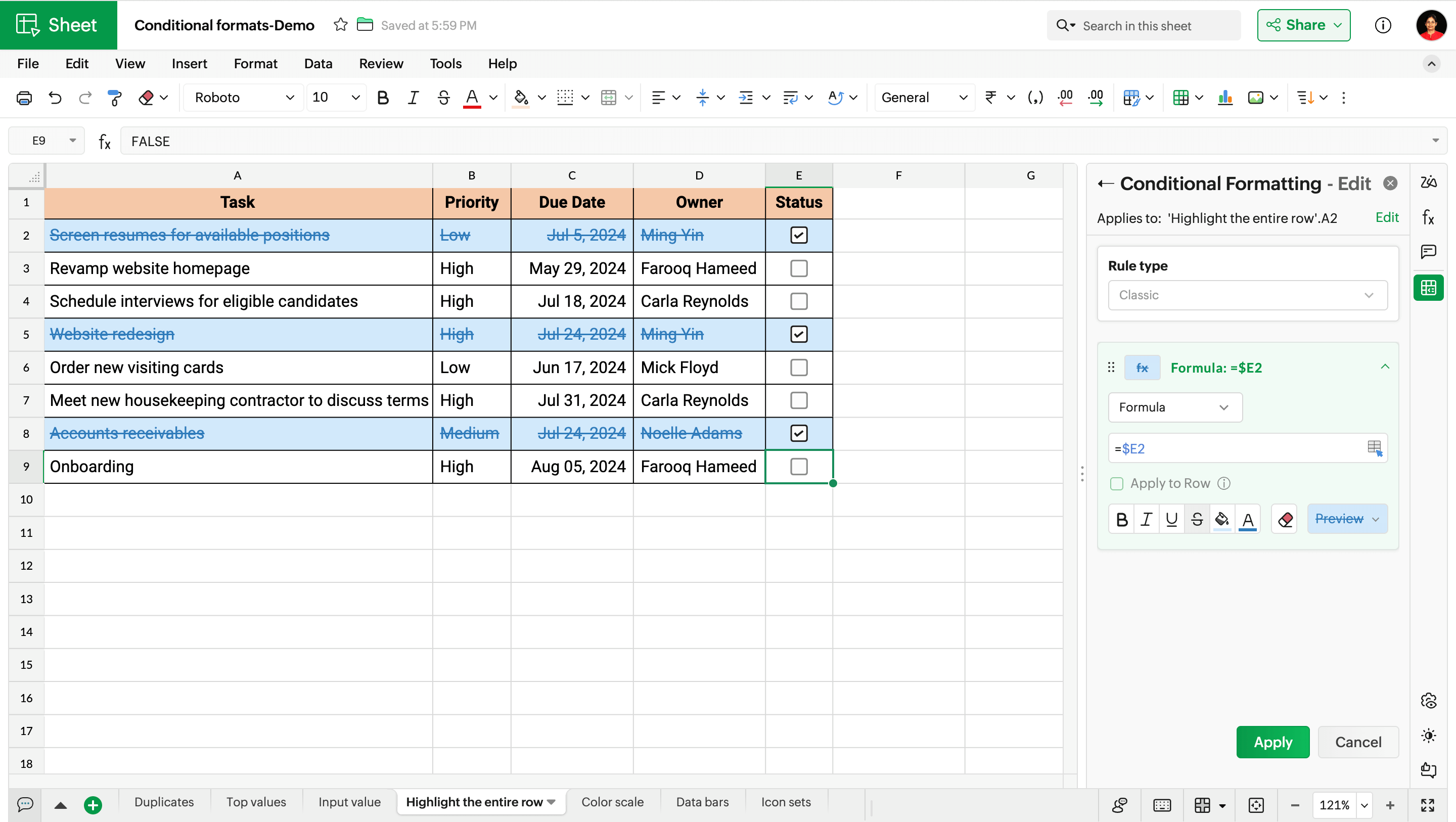
In this example dataset, whenever the checkbox is checked, the entire row gets highlighted.
Here, the formula $E2 represents that column $E is an absolute reference, meaning the rule checks only column E, while the row numbers change from 2 to 3, 4, 5, and so on.
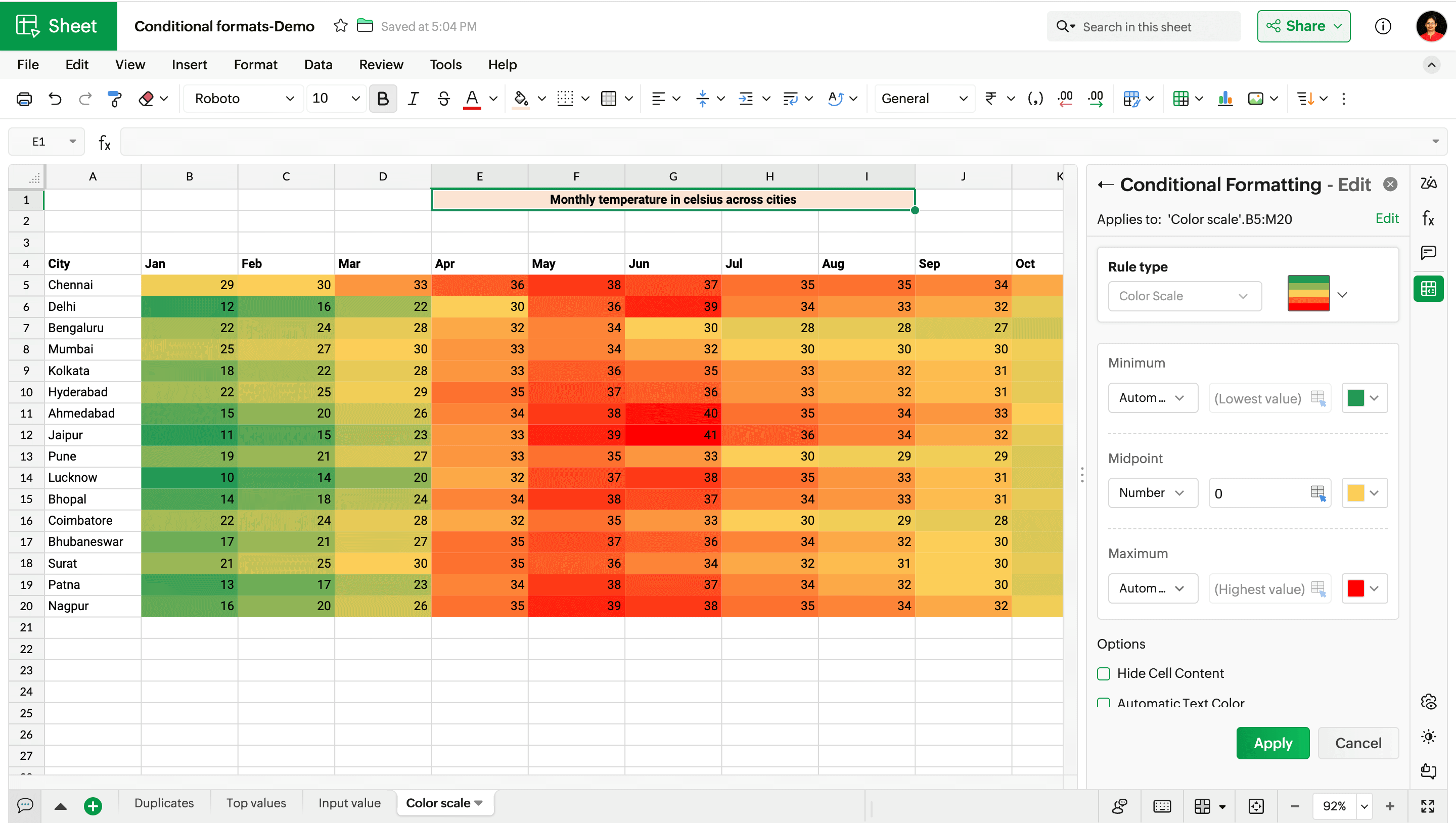
2. Color scale
If you're looking to build a heat-map style spreadsheet, then color scale formats are highly recommended. With color scale formats, you can observe the patterns and trends all at a glance.
In this example, I have chosen the green-yellow-red color scale, where green represents the minimum value, yellow represents the midpoint value, and red represents the maximum value.
You can either allow the spreadsheet to automatically pick the colors based on your data, or customize it by selecting the color, data type, and entering the values.
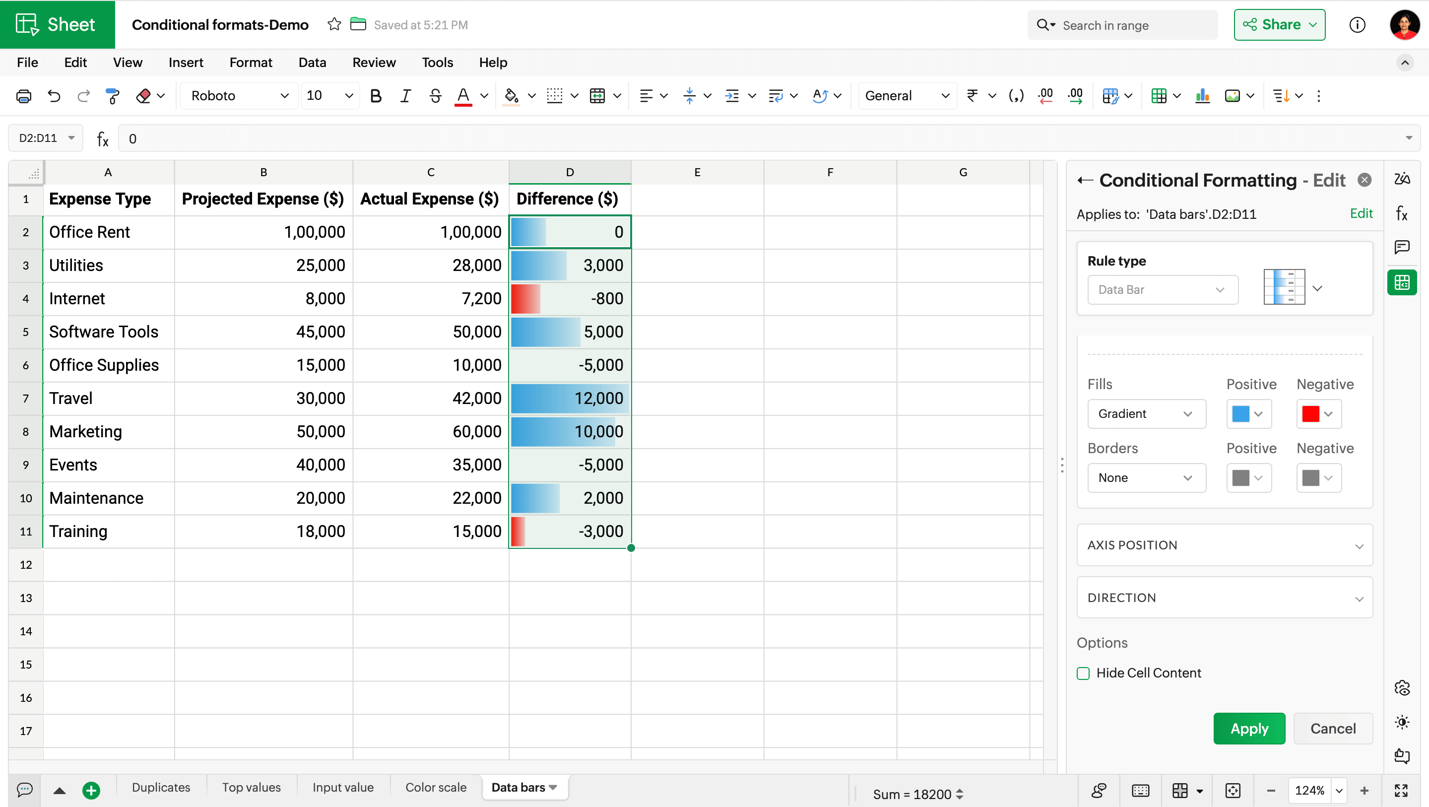
3. Data bars
Data bars are in-cell graphs that are highly useful for side-by-side comparison of values across rows. Data bars are perfect conditional formats if you're looking to view the progress of the data at a glance.
Here, I'm using data bars to represent the difference in expenses by allowing the spreadsheet to automatically pick the minimum and maximum values. You can also pick the colors for data bars with positive and negative values.
4. Icon sets
Icon sets comprise a preset of symbols that give visual cues of how values are related to one another. Whether you're monitoring sales performance, tracking task progress, or comparing budget reports, use icon sets to highlight differences in values.
Here, I have used the 3-arrow direction icon set to analyze the growth (%) in sales figures. Green arrows represent values that are above the threshold, yellow arrows show the midpoint, and red represents values below the threshold.
![]()
I hope you'll try out the conditional formats and let us know your feedback in the comments below!
 Subashree Ramamurthy
Subashree is as a product marketer that drives product launches, updates, and focuses keenly on sales enablement. She also actively contributes in demand generation and user education.Outside work, she's somewhere stuck between curating kids-friendly recipes and testing sipper bottle cleaning hacks.