Working with Chart
- On Mouse Over Effects
- Legend Filter
- Using User Filters
- Sorting a Chart
- Changing Chart Types
- Merge Axis
- View Underlying Data
- Chart Drill down
- Exporting a Chart
- Sharing a Chart
- Publishing a Chart
Zoho Analytics offers a wide range of interactive options on a chart when accessed by an end-user. The options include interactive chart highlighting, changing chart type, dynamic filtering of data displayed, sorting, viewing underlying data, exporting, sharing and publishing. In this section, we will discuss each of these options in detail.
On Mouse Over Effects
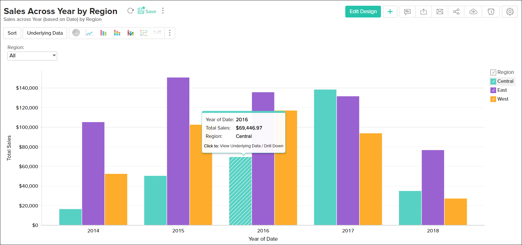
Zoho Analytics provides interactive on-mouse-over effects in a chart. You can mouse-over a particular data point in the chart to highlight the corresponding point or view the corresponding data as a tooltip. You can also mouse-over a data series provided in the legend to highlight the corresponding data series in the Chart. Refer to the following screenshots which exhibit the on-mouse-over interactive option.
Legend Filter
When designing a chart, if you have enabled Show Legend Filter option in Settings -> Legend tab (Refer here), a checkbox next to each legend item will be added as shown below.

If Legend Filters are exposed then users of the chart can dynamically filter the data series in a chart by selecting/deselecting the corresponding legend item connected to the data series. For instance, in a chart that displays date wise sales in each region, if you want to display only East and West region data, hover the mouse on the legend and deselect the Central legend item. This removes the Central region data and will dynamically regenerate the chart with the remaining data as shown below.
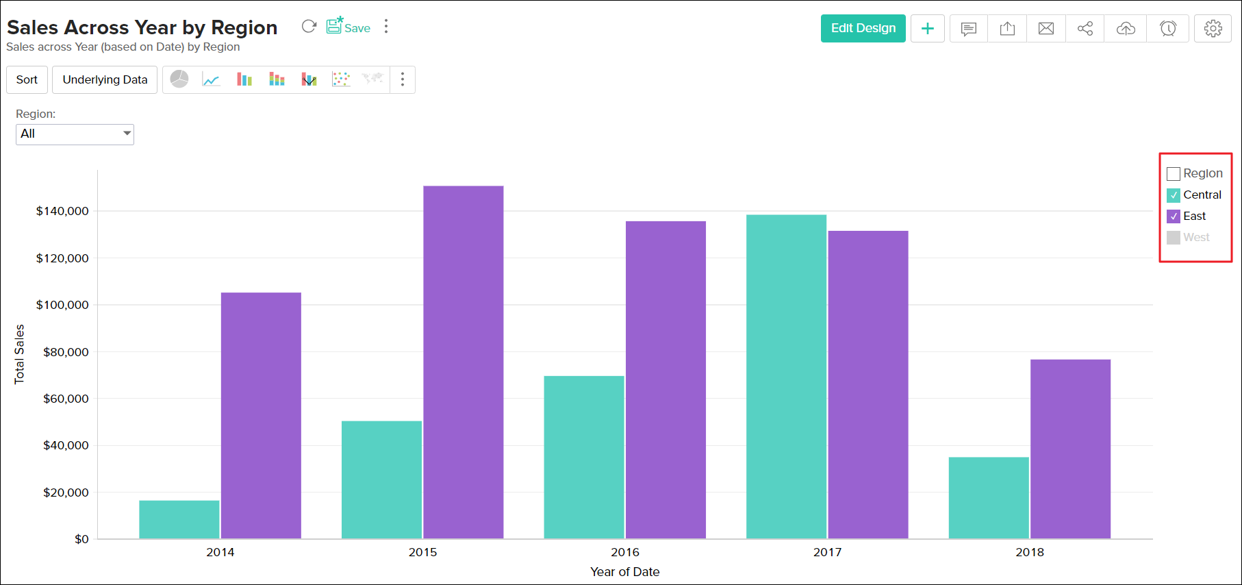
In case, if you want to select/deselect all legends items at a time, select the check box provided adjacent to the legend title.
Using User Filters
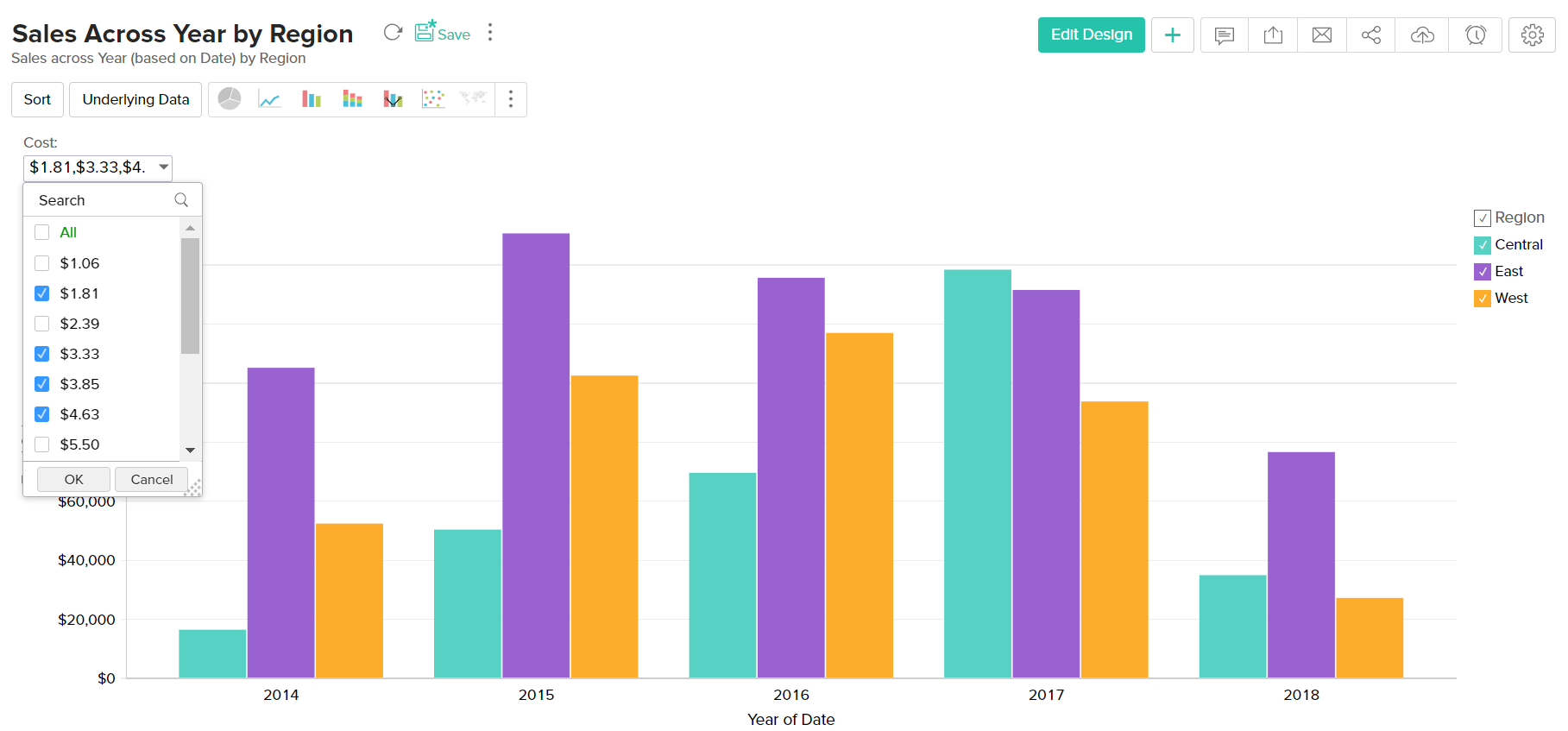
In Zoho Analytics, chart owners can add User Filters to their charts, to provide dynamic filtering capability to the users. User Filters in a chart enables users to dynamically filter the data displayed in the chart by selecting or deselecting the appropriate values in the filter columns provided.
Following is a brief description of how to use the provided user filters for various column types:
Date type columns:
In case of a user filter on a Date type column, options to select date ranges or a multiple select combo box to select the required dates will be provided to allow users to select values depending on the component type chosen by the chart owner.
To filter displayed chart data using User Filter provided on a Date type column, do the following:
- Select a date range either by typing in the date or by choosing the date with the calendar picker.
- If a filter drop-down list has been provided, multiple dates can be selected by checking the boxes next to the required date.
- Click OK to apply the filter.

Numeric type columns:
In case of a user filter on a Numeric type column, a slider or a multiple select combo box will be provided to allow users to select values depending on the component type chosen by the chart owner.
To filter displayed chart data using User Filter provided on a Numeric type column, do the following:
- Choose a specific numeric range by adjusting the slider bars accordingly.
- If a filter drop-down list has been provided, multiple values can be selected by selecting the boxes next to the filter items.
- Click OK to apply the filter.
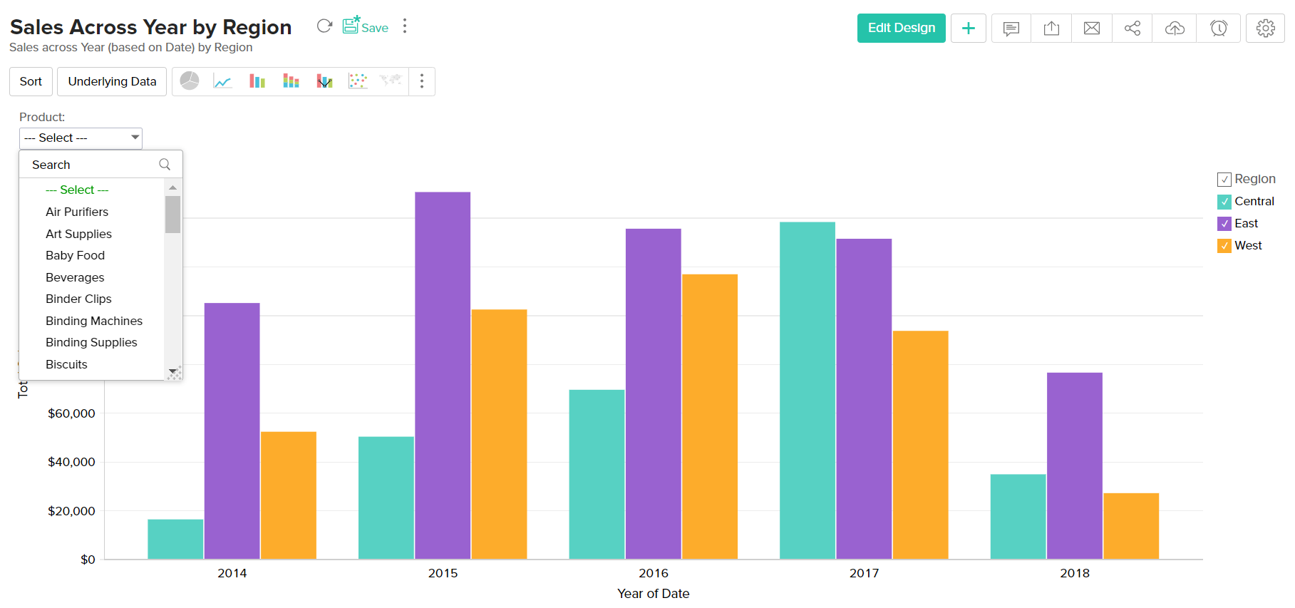
Category(String) type columns:
In case of a user filter on a Category(String) type column, a single or multiple select drop down box will be provided to select values depending on the component type chosen by the chart owner.
To filter displayed chart data using User Filter provided on a Category/String type column, do the following:
- Invoke the filter drop-down list containing the filter values.
- Select the required filter values in the filter drop-down list.
- If the filter drop-down list provides check boxes next to the filter items, multiple values can be selected simultaneously as shown below.
- Click OK to apply the filter.

Select Others filter item, if you want to display data corresponding to all other remaining items that are not listed in the user filter drop down.
Sorting a Chart
Zoho Analytics allows you to sort the chart metrics by Axis, and by Legend. You can sort the chart in ascending or descending order. You can also choose to apply a custom sort to meet your requirements.
You can sort the chart by invoking the Sort option in the toolbar and choosing the appropriate option in the list given.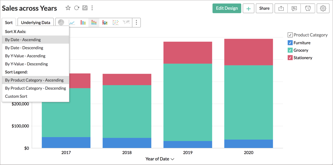
Described below are various sorting options available in Zoho Analytics.
Sorting by Axis
You can sort the axis either based on the dimensional column or based on the metric column.
The following are the options to sort the axis.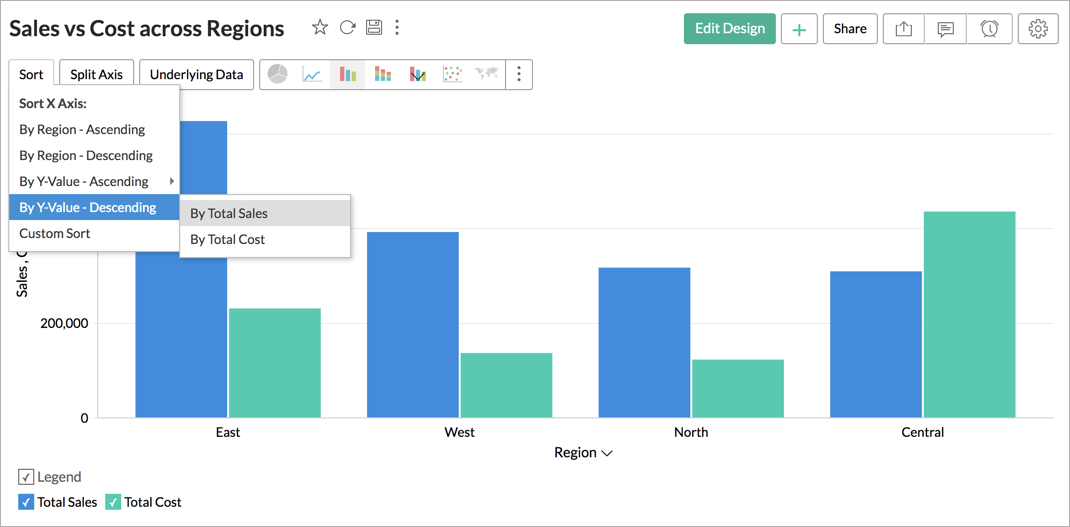
- By Dimensional column name - Ascending: Sorts the dimensional column in ascending order. i.e., the Text column will be ordered from A to Z, and the Date column will be ordered from earlier to later.
- By Dimensional column name - Descending: Sorts the dimensional column in descending order. i.e., the Text column will be ordered from Z to A, and the Date column will be ordered from later to earlier.
- By Y-value - Ascending: Orders the values in X-axis based on Y-values sorted from smallest to largest.
- By Y-value - Descending: Orders the values in X-axis based on Y-values sorted from largest to smallest.
- Custom Sorting - For Text-based columns, you can choose to apply a custom sort to meet your requirements.
In case the dimension column is added in Y-Axis and the metric column is added in X-Axis, then the menu will be renamed as follows.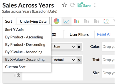
- By X-value - Ascending: Orders values in Y-axis based on X-values sorted from smallest to largest.
- By X-value - Descending: Orders values in Y-axis based on X-values sorted from largest to smallest.
Sorting by Legend
Zoho Analytics also provides an option to sort the Chart Legend. You can sort the legend values by ascending and descending order. You can also apply a custom sort order for your chart legend.
Note on Sorting:
- The sort option will be enabled only when a Category or Date column is plotted along either X or Y axis but not both.
Custom Sorting
When your chart is grouped by text-based dimensions, you will be able to sort the chart by your own custom-defined order. Custom Sorting is applicable for both Axis Sorting and Legend Sorting.
To sort the chart by your custom-defined order:
- Open the Chart you want to sort.
- Click the Sort button in the toolbar.
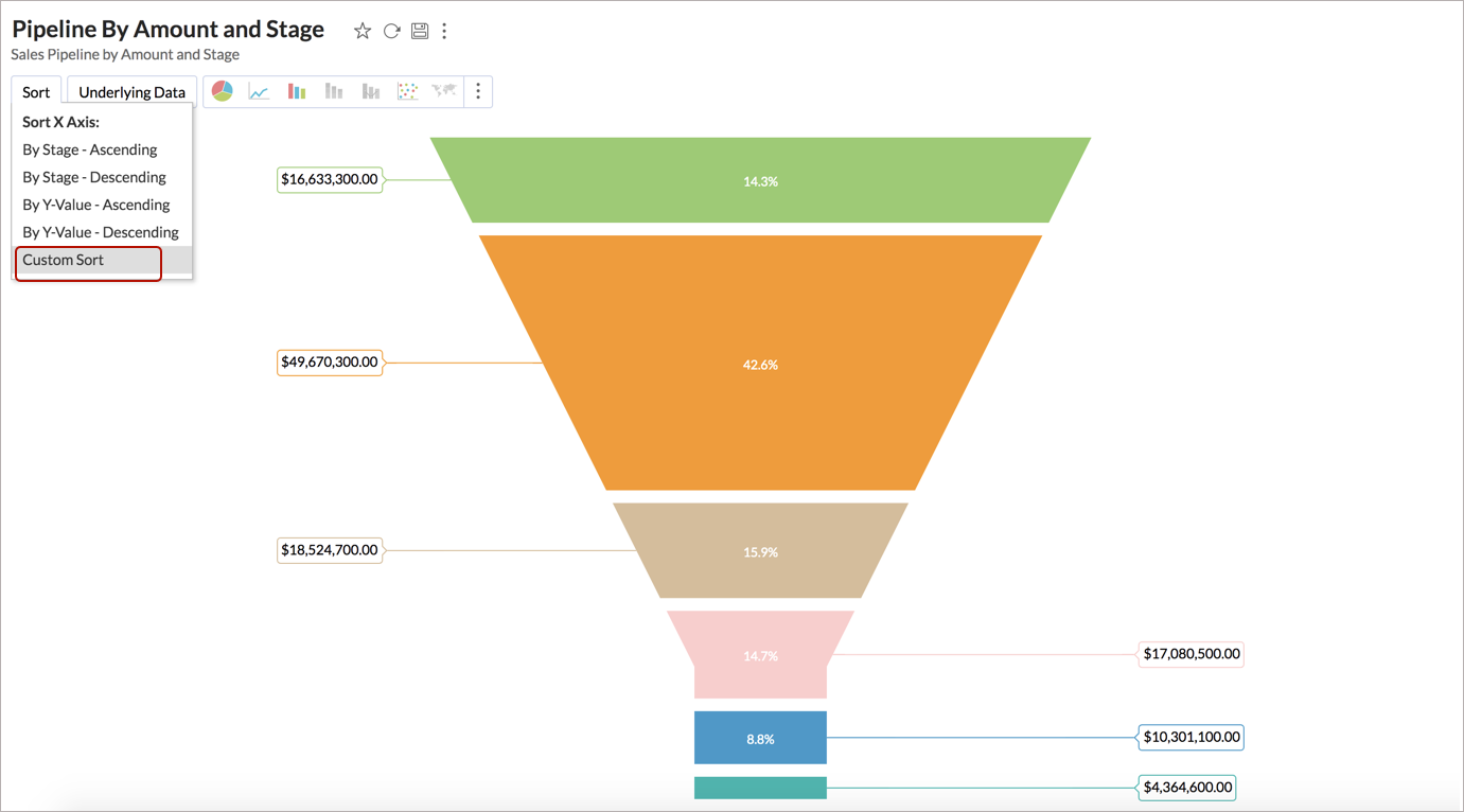
- Click Custom Sort. The Custom Sort Order dialog box will open, listing all the values in the column.
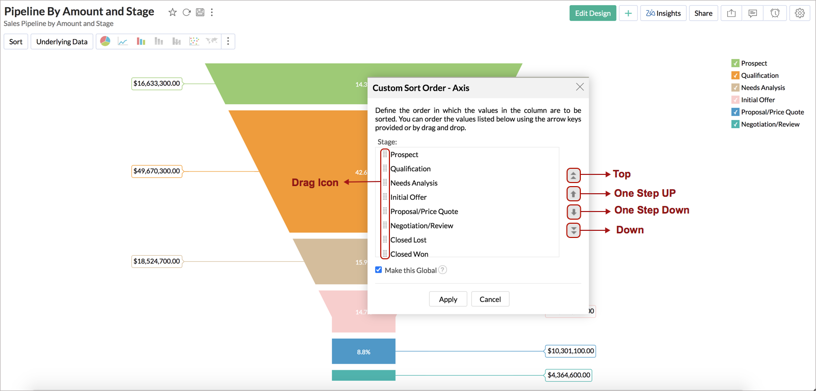
- Arrange the values in your custom order. You can either drag the items or use the arrow keys to move the values to the desired position.
- If any value is no longer available in the underlying data, you will find an option to delete it.
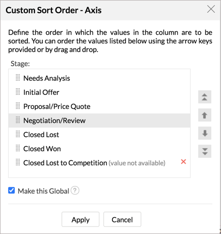
- Select the Make this Global checkbox to set this order as the default custom sort order for all reports with this column. In case you already have a global custom order for the column, selecting this will override the old sort order.
- Click Apply.


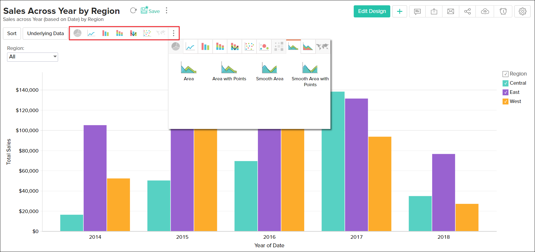
Changing Chart types
A chart can be easily changed to another chart type any time at a click of a button. The Toolbar provides you with the options to choose between Pie, Bar, Stacked Bar, Line, Scatter and Table chart types at the top level. If you do not find the chart type that you are looking for, then click on Other Charts button in the toolbar and select the chart type that you want to apply, from the Chart Options dialog box that appears. After selecting the required chart type in the dialog box, click OK.
Merge Axis
In Zoho Analytics, when you create a chart by dropping multiple columns in the Y-Axis shelf, by default, each Y-column will be plotted as a separate axis. You can choose to merge them into multiple groups as needed.
Zoho Analytics provides a Merge/Split Axis toggle button in the toolbar to switch between Split and Merge axis modes quickly. This button allows you to merge and split all the axes in the chart in a single click.
You can also merge selective axes into groups as needed by dragging and dropping them together in chart edit mode.
The following video explains how to merge and split axes in the chart.
- Stacked Bar, Stacked Area, Butterfly and Combo charts with Stacked Bar and Stacked Area does not support Merge axes.
- Chart with multiple Y-axes will be shared to users with Split or Merge axis based on the mode in which it was designed and saved.
View Underlying Data and Data Drill Down
Often you need to view the data that makes up your chart. Zoho Analytics provides two options to view (drill into) the chart data. These options are:
You can view these options by clicking the corresponding chart series.

View Underlying Data
The View Underlying Data allows you to view the underlying data of the data point. You can click on any data point in the chart to view the underlying data of that corresponding point in a pop up table. You can also view the entire data making up the chart by clicking on the Underlying Data option in the toolbar.
The following screenshot shows the underlying sales data for "Grocery" for the year "2013"

In case you have created a report by joining two or more tables then you can view the underlying data by selecting the tables from the View Data From dropdown. By default the option displaying the base table along with the related tables will be selected. You can also choose to view the individual tables seperately.
The below example shows the View Underlying Data table of a report that was created by joining the Sales table and the Stores table. By default the option Sales and Related Tables will be selected. This option will display the data from both Sales and Stores in a single table. However if you wish to view the data only from the Stores table you can do so by selecting Stores from the View Data From dropdown.

The View Underlying Data table that opens provides options to Show/Hide columns, search, filter and sort the data displayed. You can also export the underlying data into a variety of file formats like CSV, XLS, PDF and HTML.
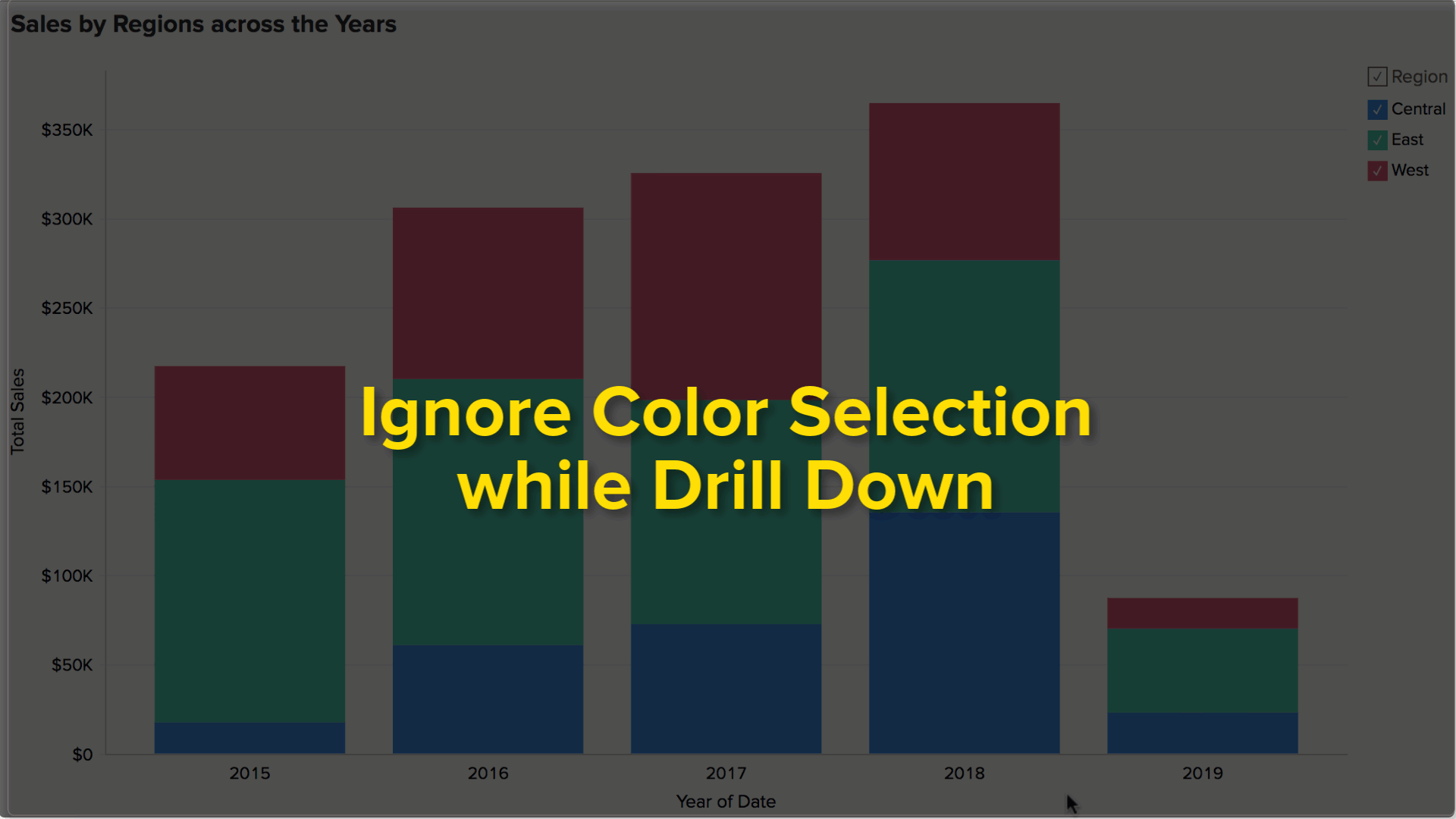
Chart Drill Down
The Chart Drill Down option enables you to do deeper exploratory analytics on a chart. Click on any point in the chart and visualize the underlying data points as a new chart.
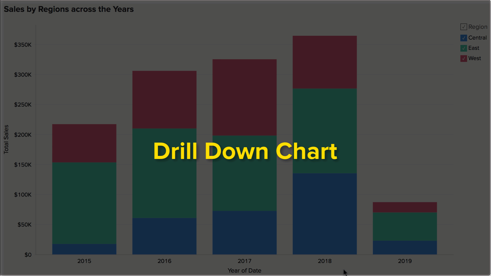
You can choose to ignore the specific color which you have clicked and drill down the entire data point using the Ignore Color Selection toggle button.
Zoho Analytics by default provides a Drill Down path for the Charts. You can also configure the drill path as you need. To know how to set the drill-down path refer to Set Drill Down Path section.
Switch Axis
You can switch the X-Axis column dynamically as required and view the chart by different dimensions. Switch Axis inherits the settings from Chart Drill Down options. You will be able to switch the axis among the columns set as Chart Drill Down X Axis path or by the dynamic drill down columns that Zoho Analytics suggests.
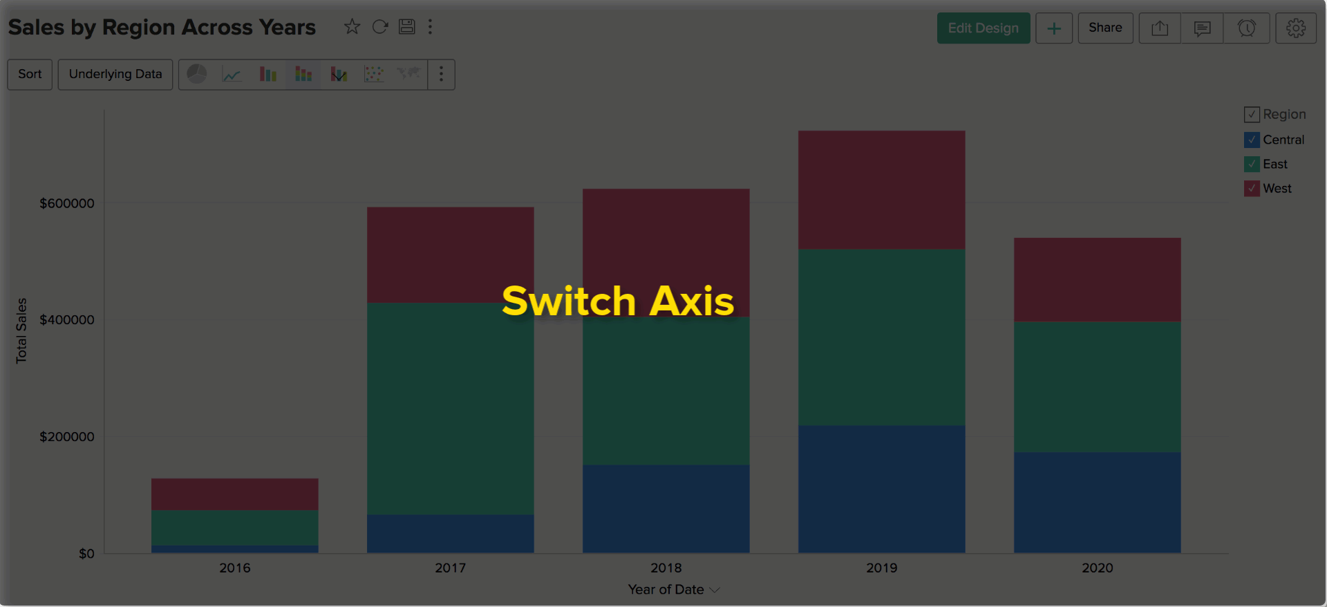
You can also drill down the chart after you switch axis. The new axis will also be retained when you come back to this stage in the drill down path.
The switched axis will be retained only for this current session. The default axis will be restored when you access the chart again later.
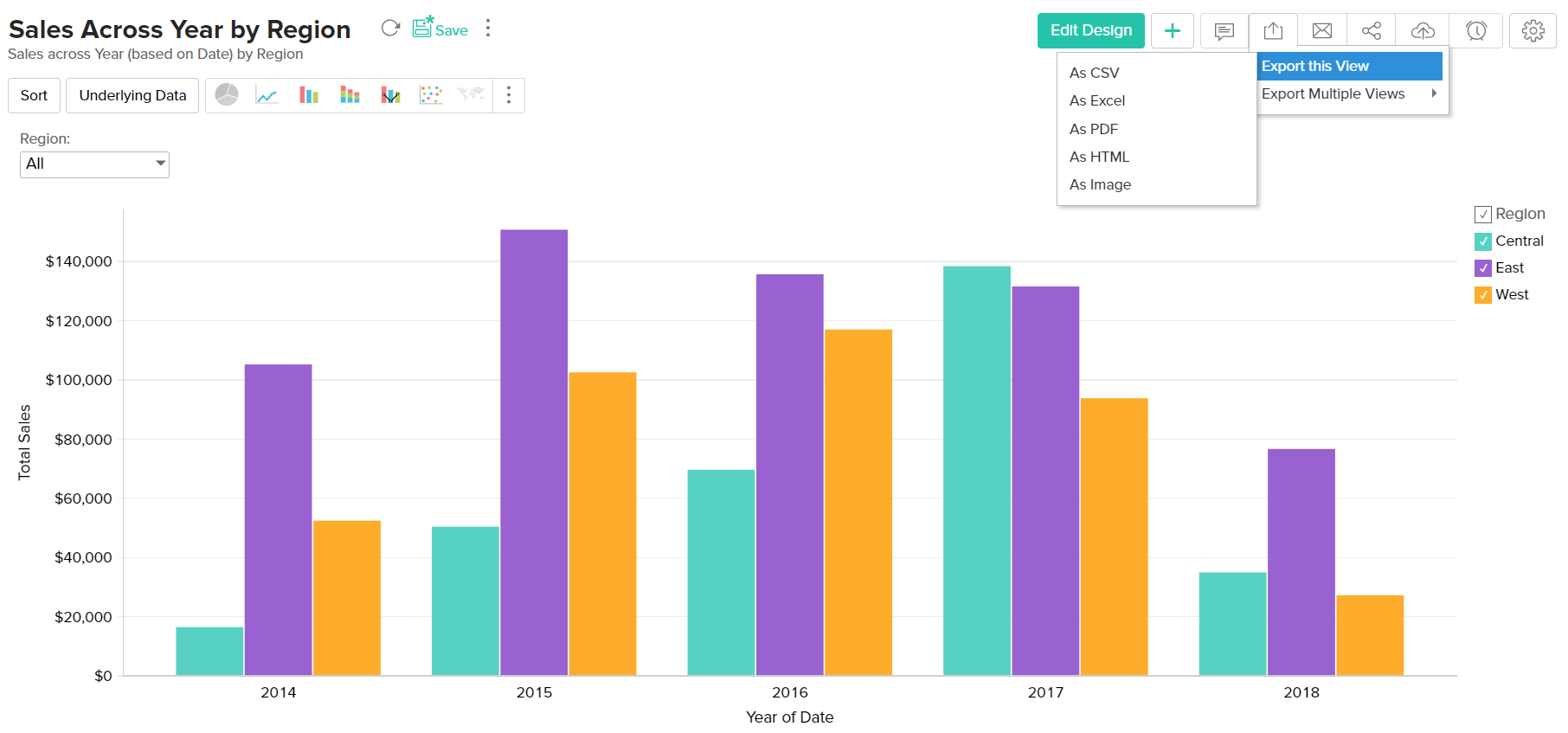
Exporting a Chart
Zoho Analytics allows you to export charts that you have created into various file formats like CSV, PDF, XLS, HTML or Image files. To export a chart:
- Open the chart that you would like to export
- Select Export button in the toolbar
- Select one of the five export format options:
- CSV - Exports the underlying data of the chart as a Comma Separated Value (CSV) file.
- PDF- Exports the chart in Portable Document Format (PDF) file format.
- HTML - Exports the chart in HTML file format.
- Excel (XLS)- Exports the underlying data of the chart as a Excel file.
- Image - Exports the chart as a GIF or PNG image.
- In the export settings window that opens, set the required options and then click Export button at the bottom to export. To know more refer to the Export and Email help documentation.
Sharing a Chart
In Zoho Analytics you can easily share charts that you have created, for other user's access. You can also set specific permissions on the shared charts, so that the users would be allowed to do only permitted actions when they access the chart. The various share options are provided under the Share menu in the toolbar.
Refer to the topic Sharing and Collaboration to know how to share your Charts.
- Share option will be enabled only to users who have been provided that permission during sharing by the Administrator.
Publishing a Chart
Zoho Analytics allows you to publish/embed charts that you have created, into your websites/web pages or as easy to access URLs. Zoho Analytics also allows you to control the access privileges and permissions provided to the users who access the chart.
Refer to the topic Publishing Options to know how to Publish your Charts.
- This option will be enabled only to Administrator and Workspace Administrators of the Workspace.