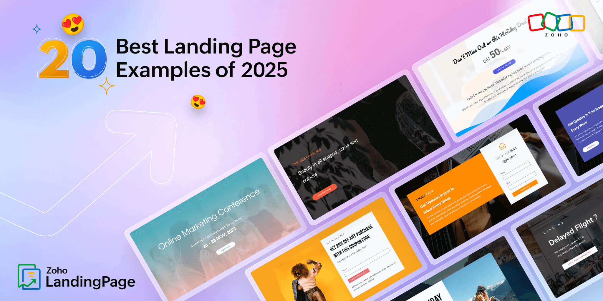
20 Good Landing Page Examples from 2025 to Spark Your Creativity in 2026
- Last Updated : February 4, 2026
- 18.4K Views
- 21 Min Read
High-converting landing pages require continuous effort, but the definition of a high-converting page can vary across different industries and niches. Landing page examples are also available in abundance but understanding your specific audience, their preferences, and the unique dynamics of your business is essential for creating a landing page that can maximize conversions.
What makes a landing page effective?
Crafting an effective landing page is about blending appealing design and clear content seamlessly. The top-notch ones grab attention with enticing visuals, persuasive text, and a layout that is a breeze to navigate.
Striking images and videos are essential to hook users quickly. Equally crucial is straightforward writing that conveys the page's message and addresses user needs. Balancing captivating visuals with compelling words is the magic formula for a standout landing page.
Yet, it is incomplete without a user-friendly layout. That means a clean, easy-to-follow design with a well-placed call-to-action (CTA). A strategically positioned CTA serves as a roadmap, guiding visitors toward the page's goal effortlessly.
In essence, a successful landing page brings together visuals, writing, and layout to not only capture attention but also deliver a crystal-clear message, guiding visitors smoothly toward the intended action.
Throughout this blog, we'll lead you through a series of landing pages that have adopted effective marketing strategies to improve their conversions. Whether you're an experienced marketer seeking a source of inspiration for your next landing page, or a newcomer to the world of landing page marketing, our analysis of these real-world landing pages will deliver valuable insights, practical suggestions, and a renewed spark of imagination.
| Disclaimer: The majority of the images in this article are positioned above the fold. To gain a better understanding of the topics mentioned, please click on the provided links. It's important to note that seasonal and event-related landing pages might become inaccessible after their respective timeframes |
The best landing page examples for 2026
- Ghirardelli (Seasonal - Food & Beverages)
- Fable (Mobile App - Technology)
- Quite Nice (Clickthrough - Food & Beverages)
- Target (Discount - Retail)
- Wing Sweet Fleet (Sign up - Mobile Application)
- Design Center at CalArts (Service - Education)
- FIFA World Cup 2026 (Event landing page - Sports)
- Dedcool (Ecommerce - Fashion)
- Braindrop (Early access - Software)
- ONSKN (Video - Lifestyle)
- Brand Appart (Agency - Marketing)
- Later (Sign up - Software )
- TrySchema( Click-through - Mobile Application)
- DeepLearning.AI ( Countdown - Event)
- Land of Ride (Service - Travel)
- Flighty (Interactive - Travel)
- Fable & Mane (Black Friday - Retail)
- The Brandt (Real Estate - Consulting)
- Today in Design (Newsletter - Design)
- The Letter Club (Subscription - Mobile Application)
Ghirardelli: Seasonal landing page
Seasonal landing pages are usually designed to highlight timely offers and promote themed collections. They offer festive visuals and a smooth navigation that helps shoppers quickly browse categories tied to the season or holiday. Through its premium product photography and featured collection of products, the Ghirardelli landing page creates a luxurious yet relevant shopping experience.
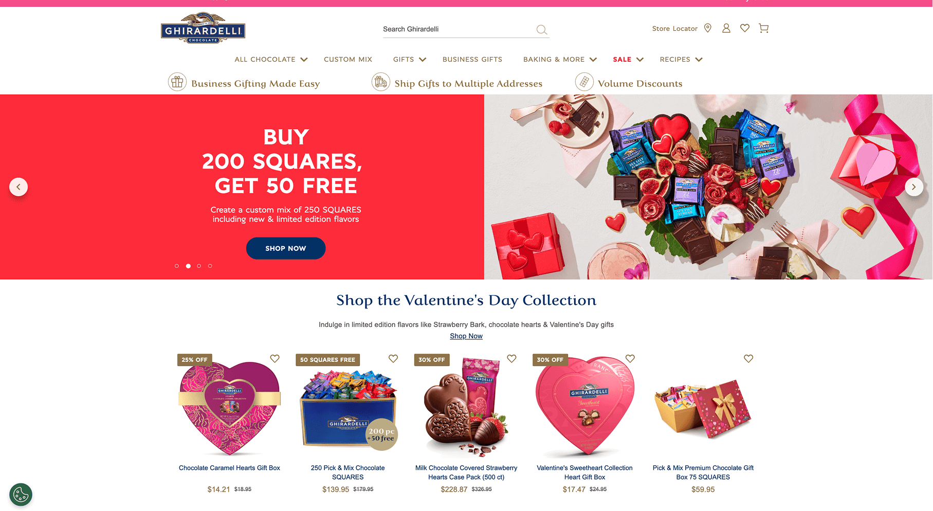
What makes this page effective?
The page immediately communicates the seasonal focus with a bold banner and clear discount messaging. The imagery is bright and inviting with chocolates in jars. The “Shop Best Sellers” and “Shop Valentine’s Day Clearance” sections appear high on the page, helping shoppers quickly jump into both evergreen and seasonal offers without scrolling too far.
Each product collection is visually distinct making it simple for shoppers to find what they want. The page also uses lifestyle photography (baking scenes, gifts, holiday tables) to keep the festive mood while also showing real-world use cases.
- Toward the bottom, the landing page does a great job reinforcing trust for new users and helping them take action. Sections like "Find a Ghirardelli Store," business gifting options, and subscription perks help communicate the practical value of the brand.
Inspired to create? Start building your own landing page. Get your 15-day free trial for Zoho LandingPage - the no-code builder for your online success : https://zurl.co/VeJD
Fable: Mobile app landing page
Mobile app landing pages must communicate the app’s purpose, highlight key features, and guide users toward downloading or joining the app. Most application landing pages rely heavily on product screenshots and feature lists to help users understand the product better. The Fable landing page uses warm storytelling, playful illustrations, and community-first copy to make the landing page an inviting space for book and TV lovers.
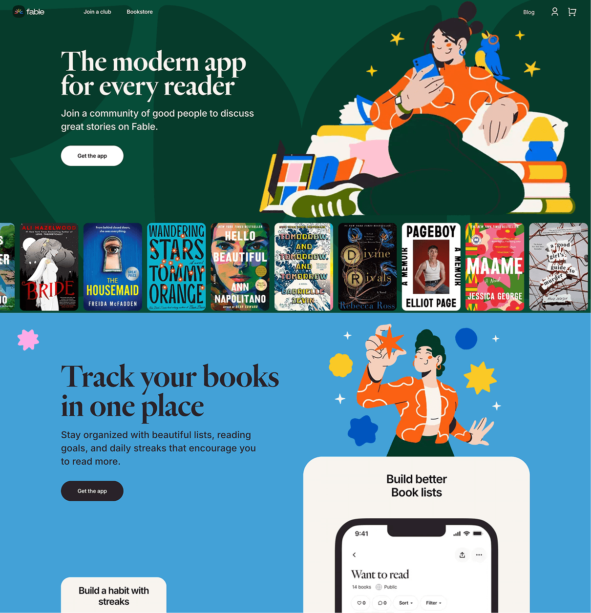
What makes it effective?
The headline welcomes “bookworms and binge-watchers,” immediately calling out the audience in a fun and relatable manner. This, paired with an array of book and show covers, sets the tone of the landing page and makes the experience feel personal. The CTA “Create a club” encourages users to join a community rather than just download an app. This positions Fable as a community experience instead of just another tool to track reading.
Product screenshots are placed strategically to help visitors visualize how they’ll interact with the platform. The features are grouped to make the landing page experience more seamless for new users.
Testimonials and social proof create trust by showing how users describe the app in their own words. With its vibrant, community-driven approach, the landing page invites users into a shared cultural space along with clearly showing what their application does.
Inspired to create? Start building your own landing page. Get your 15-day free trial for Zoho LandingPage - the no-code builder for your online success : https://zurl.co/VeJD
Quite Nice: Food & beverage landing page
Food and beverage landing pages must instantly communicate quality, and make it effortless for users to explore, order, or engage with the brand. A thoughtfully designed food and beverage landing page pairs mouth watering imagery with concise storytelling, celebrates ingredients and craftsmanship, and gently guides users toward actions such as ordering, subscribing, or visiting. The Quite Nice landing page comes across as a strong food and beverage landing page because it pairs a clear, benefit-led promise with appetizing visuals and a prominent CTA to guide shoppers towards taking action.
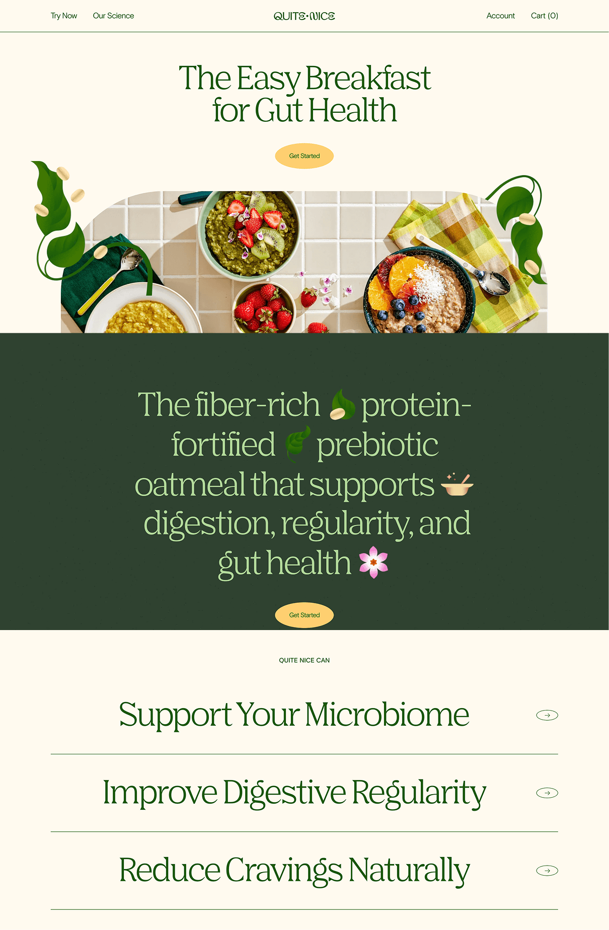
What makes it effective?
The hero section instantly communicates the core benefit—an easy breakfast that supports gut health paired with warm colors and inviting food photography that make the product feel comforting and achievable.
The design uses simple language, soft visuals, and clean layouts to break down wellness into something approachable, helping visitors understand the value without feeling overwhelmed. As users scroll, the page builds trust by highlighting key benefits, flavor options, ingredients, and real customer moments in a straightforward way.
Each section supports the idea of a daily, feel-good ritual, making the product feel both practical and enjoyable. By ending with a gentle, encouraging CTA, the landing page maintains its calm, reassuring tone while guiding visitors toward a purchase with confidence.
Inspired to create? Start building your own landing page. Get your 15-day free trial for Zoho LandingPage - the no-code builder for your online success : https://zurl.co/VeJD
Target: Discount landing page
Discount landing pages are usually loud, busy, and focused on big banners, bold colors, and lots of deals fighting for the user attention. They’re built to push shoppers toward quick decisions, often sacrificing clarity for impact. What makes Target’s discount landing page different is how organized, friendly, and easy to browse it feels. Instead of overwhelming visitors, it uses clear sections, warm lifestyle imagery, and simple product grids to guide people naturally through deals, new arrivals, and seasonal picks.
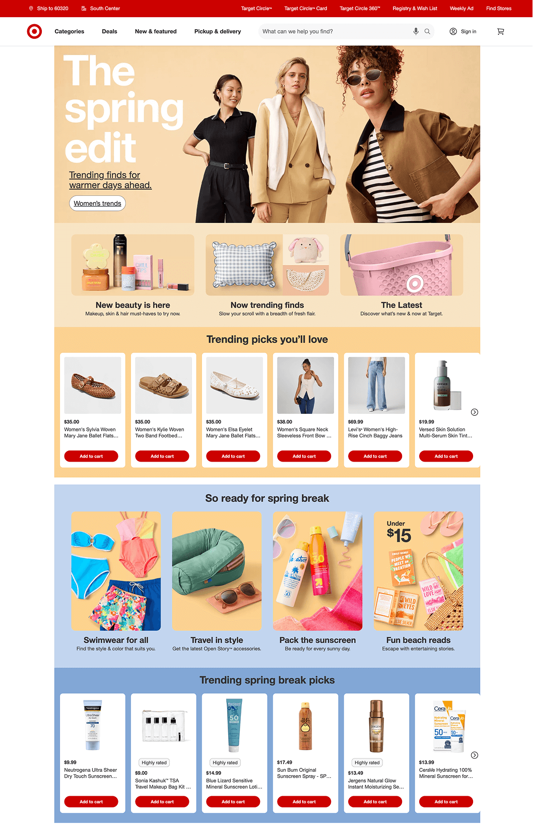
What makes it effective?
This Target landing page works well because it’s easy to browse and packed with useful sections. The big spring-themed banner at the top sets the tone right away, and each block that follows highlights something different such as new arrivals, trending products, deals, seasonal picks, and more. The layout stays consistent to ensure that the page never feels overwhelming despite the numerous landing page elements.
- Below the fold, Target also uses lifestyle photos with products so shoppers can get some fashion inspiration. Using clear labels, simple CTAs, and bright colors in discount landing pages help people find what they need fast. Extra touches like delivery reminders, promo offers, and community features make the page feel helpful and trustworthy.
Insipired to create? Start building your own landing page. Get your 15-day free trial for Zoho LandingPage - the no-code builder for your online success : https://zurl.co/VeJD
Wing Sweet Fleet : Sign-up landing page
Sign-up landing pages are usually designed to be straightforward: a clear offer at the top, a short explanation of the value, and a direct call to action that pushes users to submit their email or download an app. Most rely on clean layouts, minimal text, and simple visuals to keep attention on the form or CTA.
The Sweet Fleet landing page fits this structure in terms of clarity and CTA placement, but it stands out because of its playful, imaginative world; it uses bright colors and visual elements to turn a typical sign-up moment into something fun and memorable. Instead of feeling transactional, the page feels like an experience.
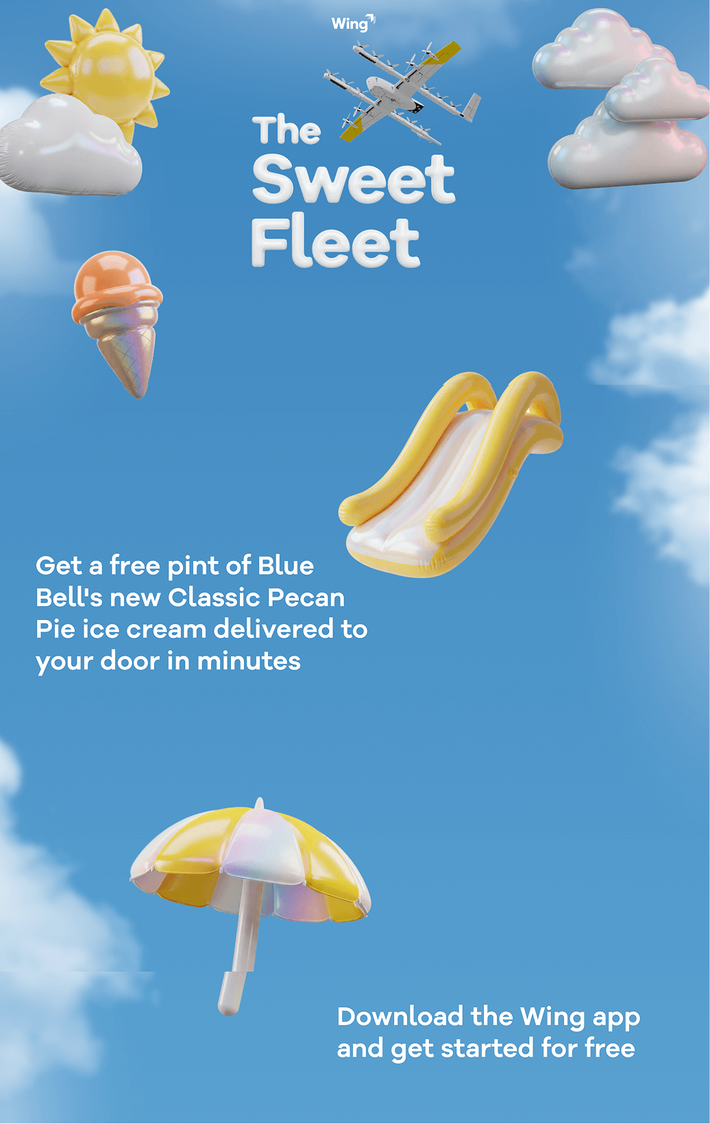
What makes it effective?
The Sweet Fleet landing page works well because it communicates its offer instantly and visually. The headline is short and friendly, and the hero section uses eye-catching visual elements to build excitement about the giveaway.
The USP of the page, "Get a free pint delivered in minutes," is communicated clearly so visitors immediately understand what they’re getting and what to do next.
Despite the length of the landing page, the experience is kept light and simple. The “How it works” section breaks the process into four quick steps, using minimal text and clean cards to guide the user without overwhelming them. Every element on the page reinforces the same idea: this is quick, easy, and enjoyable.
The bottom of the page effectively ties the offer together with strong app-store buttons, a reminder of the limited-time nature of the promotion. By keeping the design fun but the structure clear, the page manages to be both memorable and highly actionable.
Inspired to create? Start building your own landing page. Get your 15-day free trial for Zoho LandingPage - the no-code builder for your online success :https://zurl.co/VeJD
Design Center at CalArts: Service landing page
Service landing pages are usually designed to be clear, structured, and easy to navigate, with straightforward sections that explain what the service is and how to get started. They often use simple layouts, icons, and FAQ blocks to reduce confusion and build trust quickly. The Design Center page, with its bright and playful visuals, makes the landing page student-centered and approachable instead of feeling formal or corporate.
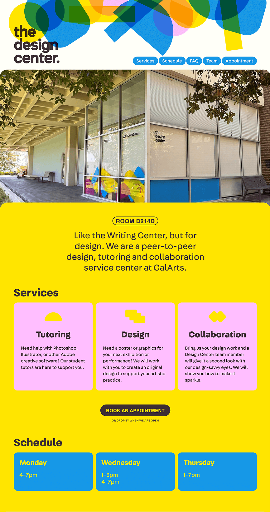
What makes it effective?
The opening description clearly explains what the Design Center is and what it offers, making it easy for new students to understand its purpose within seconds. The layout is clean, with well-defined sections for services, schedules, FAQs, and team members, so visitors never have to search for key information.
The schedule area is straightforward, and the FAQ section is organized in collapsible blocks that remove clutter while still giving students all the details they need. This helps reduce confusion and makes the service feel accessible.
The “Meet the Team” section adds a human touch, showing real faces and allowing students to book sessions directly with tutors. The final call to action to book an appoinment is placed in the right position: after visitors have seen the value and met the people behind the service.
Insipired to create? Start building your own landing page. Get your 15-day free trial for Zoho LandingPage - the no-code builder for your online success : https://zurl.co/VeJD
FIFA World Cup 2026: Event landing page
Event landing pages are usually built around visuals, dates, schedules, and a bold registration CTA that help visitors understand what’s happening and when. The FIFA World Cup landing page stands out with its dynamic visuals that help transform it from just another event landing page to a high-energy celebration designed for football fans all over the globe.
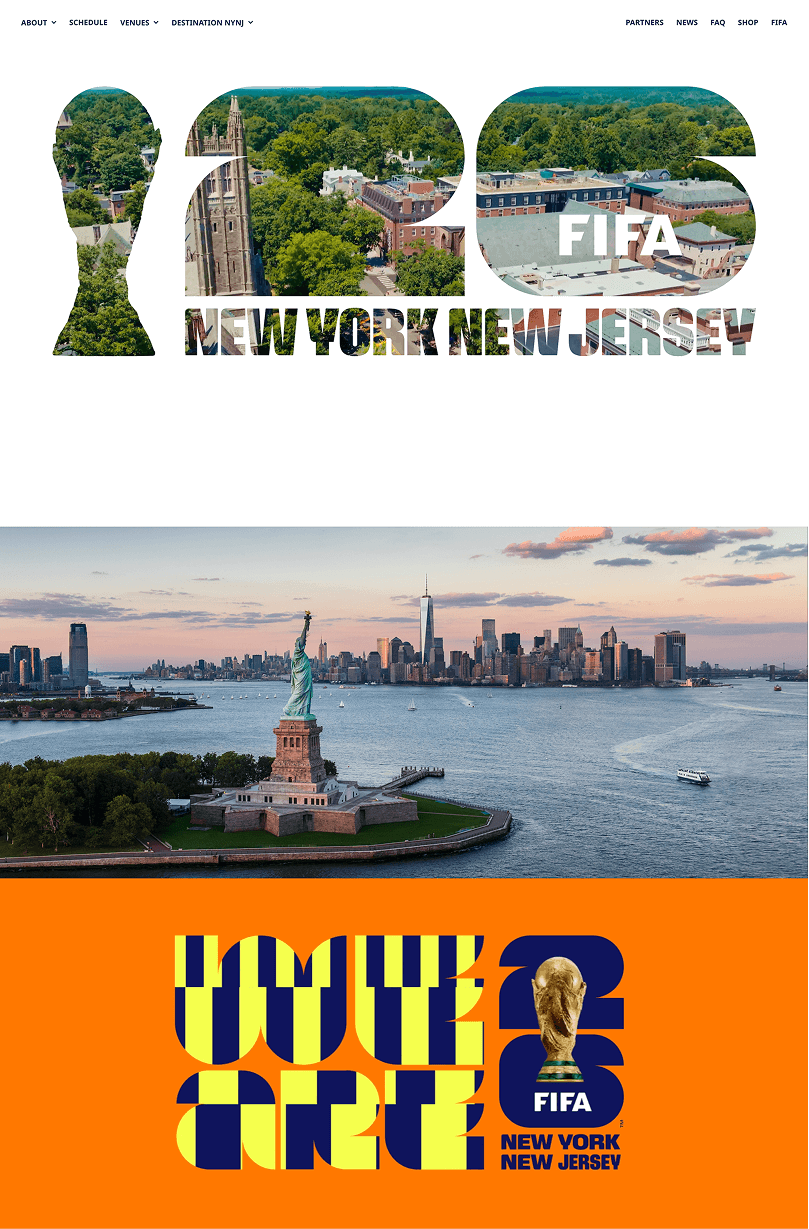
What makes it effective?
The page captures attention immediately with large, striking text, bold color palettes, and high-contrast imagery. The stadium shots, fan photos, and iconic local scenery clearly communicate the magnitude of the event and the location.
Even as users scroll down, the landing page maintains user engagement through well-organized information. The countdown timer creates urgency, the match schedule is clearly spelled out, and users are gently guided from one section to the next without any friction.
The registration and newsletter sections are placed strategically near the bottom, after visitors have absorbed the excitement and context of the landing page. The use of fan and player images in the CTA makes users feel more emotionally connected to the landing page.
Inspired to create? Start building your own landing page. Get your 15-day free trial for Zoho LandingPage - the no-code builder for your online success : https://zurl.co/VeJD
DedCool: Ecommerce landing page
Ecommerce landing pages are a great way to showcase products, highlight best sellers, and guide shoppers toward quick discovery and purchase. They rely on strong visuals, simple layouts, and trust signals like reviews or social proof. The DedCool landing page is a great ecommerce landing page that perfectly encapsulates the brand's modern and trendy sensibility without being purely transactional.
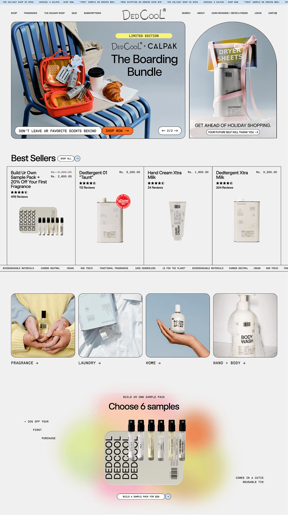
What makes it effective?
The page is effective because it blends a clean ecommerce structure with premium visuals. Best-seller tiles follow immediately, helping shoppers jump into shopping without scrolling far. The “Choose 6 samples” section is placed strategically to encourage new users to try their brand.
The fragrance quiz adds another layer of personalization, giving hesitant shoppers more clarity about the products. Customer reviews, user-generated photos, and “From Our Favorite Humans” galleries add authenticity and social proof without feeling too forced.
The bottom of the page reinforces trust with incentives for signing up. The entire page is laid out with generous spacing to make the experience more visually rich and easy to browse for users.
Insipired to create? Start building your own landing page. Get your 15-day free trial for Zoho LandingPage - the no-code builder for your online success : https://zurl.co/VeJD
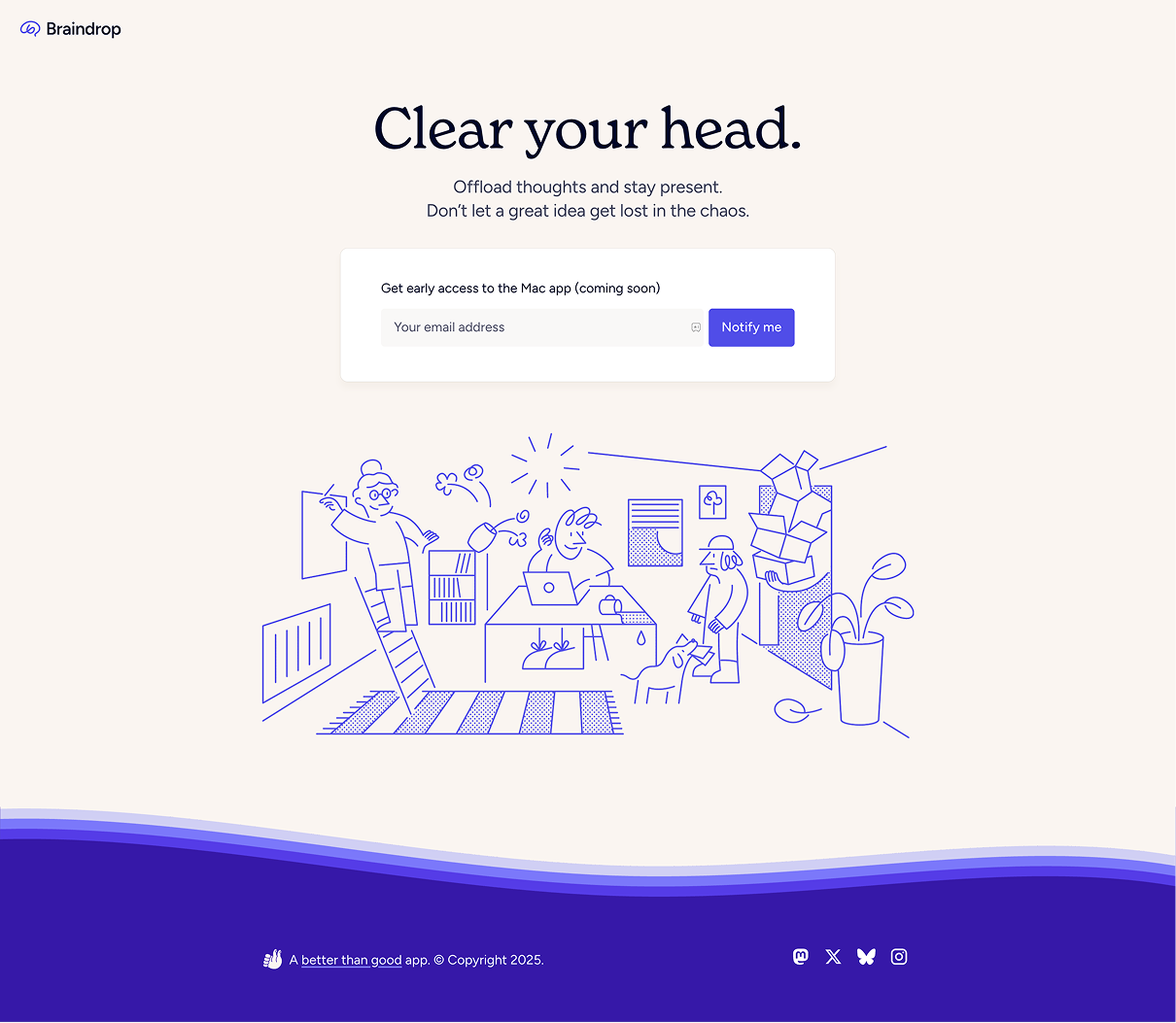
Braindrop: Early access landing page
Early-access landing pages have to be minimal and clear. They often feature a short explanation of the upcoming product and a single form field that makes signing up feel effortless. Braindrop comes up with a playful "coming soon" landing page that barely looks like your typical tech waitlist page, which is also in line with what the product aims to achieve.
What makes it effective?
The page is effective because it communicates its purpose in seconds. The headline “Clear your head,” is short, memorable, and communicates the value of the product. The supporting line explains the benefit without listing features, which is ideal for yet-to-be-launched products. The clean layout and white space help keep attention on the CTA.
The illustration below adds personality and storytelling without making the page feel too cluttered. The footer stays in the background with gentle branding and social links. The entire experience feels calm and intentional, which aligns perfectly with the product’s promise of mental clarity.
Insipired to create? Start building your own landing page. Get your 15-day free trial for Zoho LandingPage - the no-code builder for your online success : https://zurl.co/VeJD
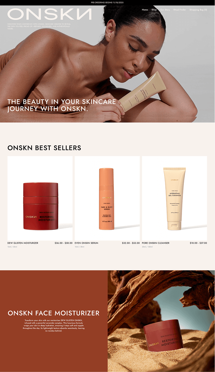
ONSKN: Video landing page
Beauty and skincare landing pages are usually built around beautiful visuals and benefit-first messaging that help shoppers quickly understand their brand. They rely on clean, clutter-free layouts with trust-building elements like reviews and before-and-after imagery to win over new customers. The ONSKN landing page is an immersive landing page that looks more like a skincare/beauty magazine.
What makes it effective?
The page opens with a striking hero image that communicates the brand's values without needing heavy copy. Right below, best sellers are presented in a grid that helps shoppers quickly see the core products and compare them at a glance. All the visuals are soft and warm, matching the brand’s soothing aesthetic.
Product spotlights are prominent, with each product having its own section while maintaining the cohesive design of the landing page. The customer review section helps add credibility through real voices, keeping the tone conversational and trustworthy.
Toward the end of the landing page, the “Follow Us” gallery and lifestyle images help humanize the brand and show how the products fit into real routines. The collage-style layout creates a sense of community that beauty shoppers respond to. Overall, the page works because it guides users smoothly from discovery to purchase while creating an atmosphere that feels luxurious and personal.
Inspired to create? Start building your own landing page. Get your 15-day free trial for Zoho LandingPage - the no-code builder for your online success : https://zurl.co/VeJD
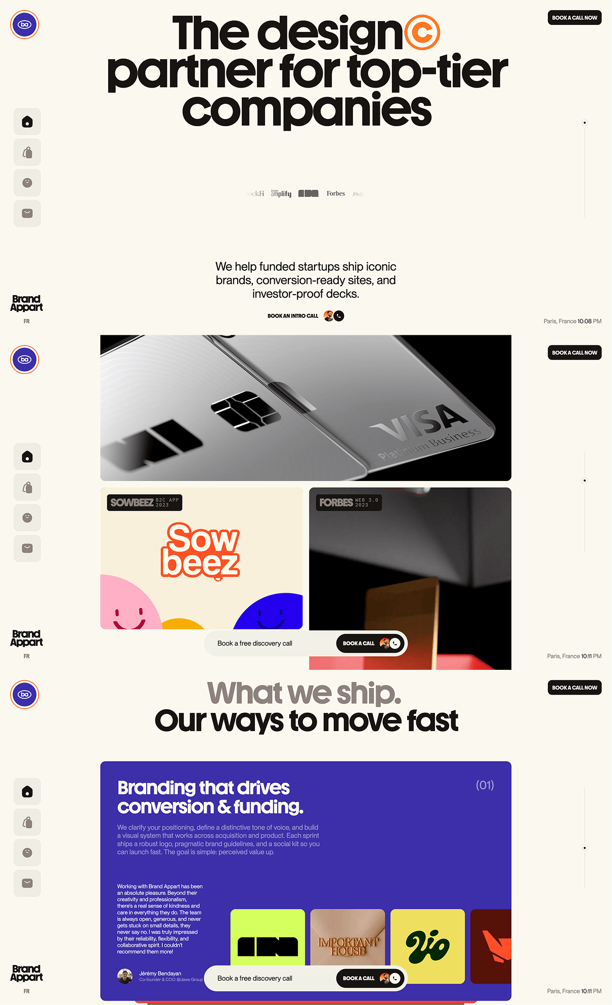
Brand Appart: Agency landing page
Agency landing pages are all about showcasing the services, building trust, and ultimately converting visitors into leads. The Brand Appart landing page does this precisely with an impactful hero section, client logos, minimal lead form, and engaging case studies.
What makes it effective?
The biggest positive of this landing page is the strong headline: “The design partner for top-tier companies." The narrative is direct and targeted to their intended audience. This helps position Brand Appart as a niche, premium design studio that caters to a select circle of companies.
Another effective element is the trust and social proof section. The page includes genuine testimonials from clients and a list of growth-stage clients the agency works with. These trust signals increase credibility in the visitor’s mind and build trust without needing heavy visuals or long portfolios. The layout also uses white space to its advantage by keeping user attention on the landing page goal.
Lastly, the CTA and the next steps are placed strategically. The “Get your quote in 24 hours” prompt is visible without being aggressive, offering a clear next step and a timeframe which helps set expectations. The page structure flows organically from what the agency offers, how they have delivered in the past, and finally how users can contact the agency.
Inspired to create? Start building your own landing page. Get your 15-day free trial for Zoho LandingPage - the no-code builder for your online success : https://zurl.co/VeJD
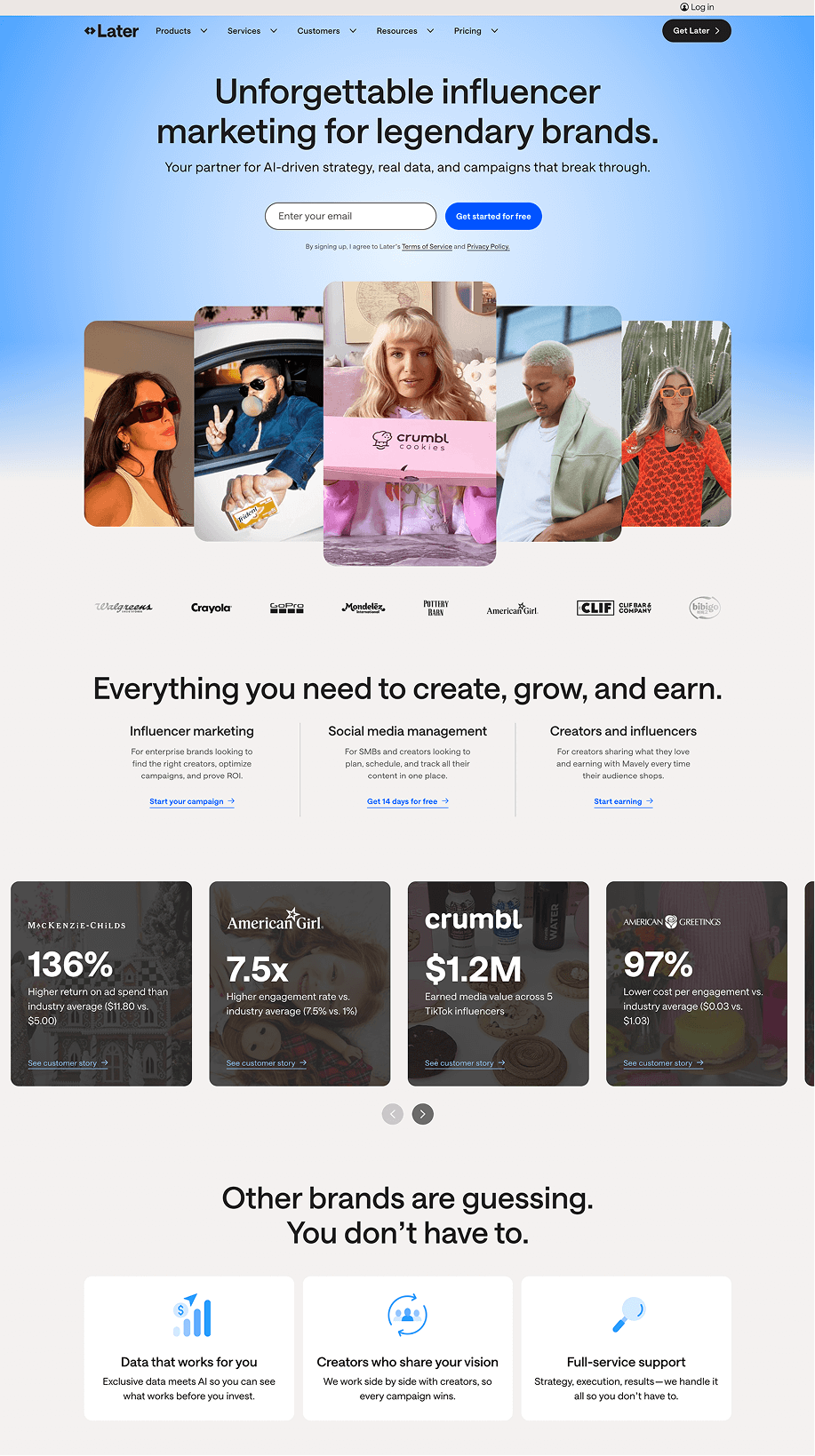
Later: Sign-up landing page
Sign-up landing pages are usually designed to showcase the value of the product/service and guide users toward creating an account or starting a trial. The Later landing page makes complex influencer-marketing tools feel easy and approachable with its rich visuals, structured flow, and creator-centric approach. This also helps make the sign-up moment natural without being too pushy.
What makes it effective?
The headline clearly communicates what the product is all about: “Unforgettable influencer marketing for legendary brands.” This is followed immediately by clear CTAs to sign up or get a demo. The hero imagery of creators and campaigns reinforces the brand’s focus and adds personality. Trust signals such as client logos and key metrics establish immediate credibility, helping visitors feel assured that the platform is trusted.
Further down the landing page, the product’s value is explained clearly in a sequence. Each section in the sequence uses minimal design, screenshots, and short descriptions to make the platform feel digestible despite its many capabilities. The statistics and example campaigns offer concrete proof rather than generic claims, which helps potential users imagine using the product themselves.
The page further pushes users towards a conversion with trust signals such as testimonials and awards. By the time visitors reach the final sign-up section, they’ve seen enough proof, structure, and reassurance to feel confident converting.
Inspired to create? Start building your own landing page. Get your 15-day free trial for Zoho LandingPage - the no-code builder for your online success : https://zurl.co/VeJD
TrySchema: Click-through landing page
Click-through landing pages are built to warm up visitors before sending them to a product page or download page. They don’t ask for sign-ups directly; instead, they explain the value, show features, remove objections, and guide users toward a final action. TrySchema uses a simple clean landing page layout, visuals, and feature explanations to prepare the user for the next step: downloading the app.
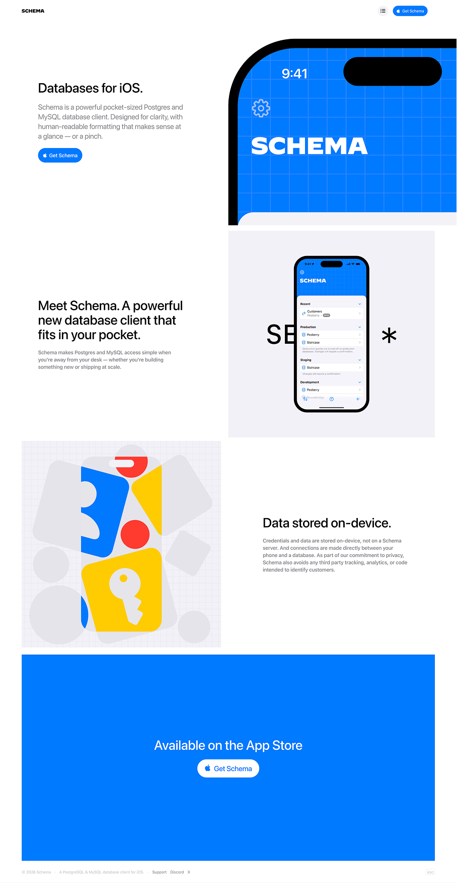
What makes it effective?
The hero section communicates exactly what the product is without fluff or jargon. The minimal layout and product screenshots give users an immediate sense of trust and product familiarity.
Users can see the actual product experience from the very first scroll. Each feature is introduced in consistent bite-sized sections. Even though the product is technically complex, the usage of simple, well-explained sections helps guide users smoothly through the product walkthrough without overwhelming them.
Having a distraction-free landing page with a singular goal also encourages users to click through and download the app. By the time users reach the bottom, they’ve seen every major feature, understood how it works, and are naturally ready to tap the CTA button. This seamless, friction-free journey is what makes the page highly effective as a click-through experience.
Inspired to create? Start building your own landing page. Get your 15-day free trial for Zoho LandingPage - the no-code builder for your online success : https://zurl.co/VeJD
AI Developer Conference : Countdown landing page
Event landing pages coupled with countdown timers are designed to instill urgency and excitement from the moment visitors arrive. The countdown acts as a reminder that seats are limited and action needs to be taken now. In the AI developer conference landing page, the countdown is placed prominently amid a structured landing page with social proof and clear calls to action.
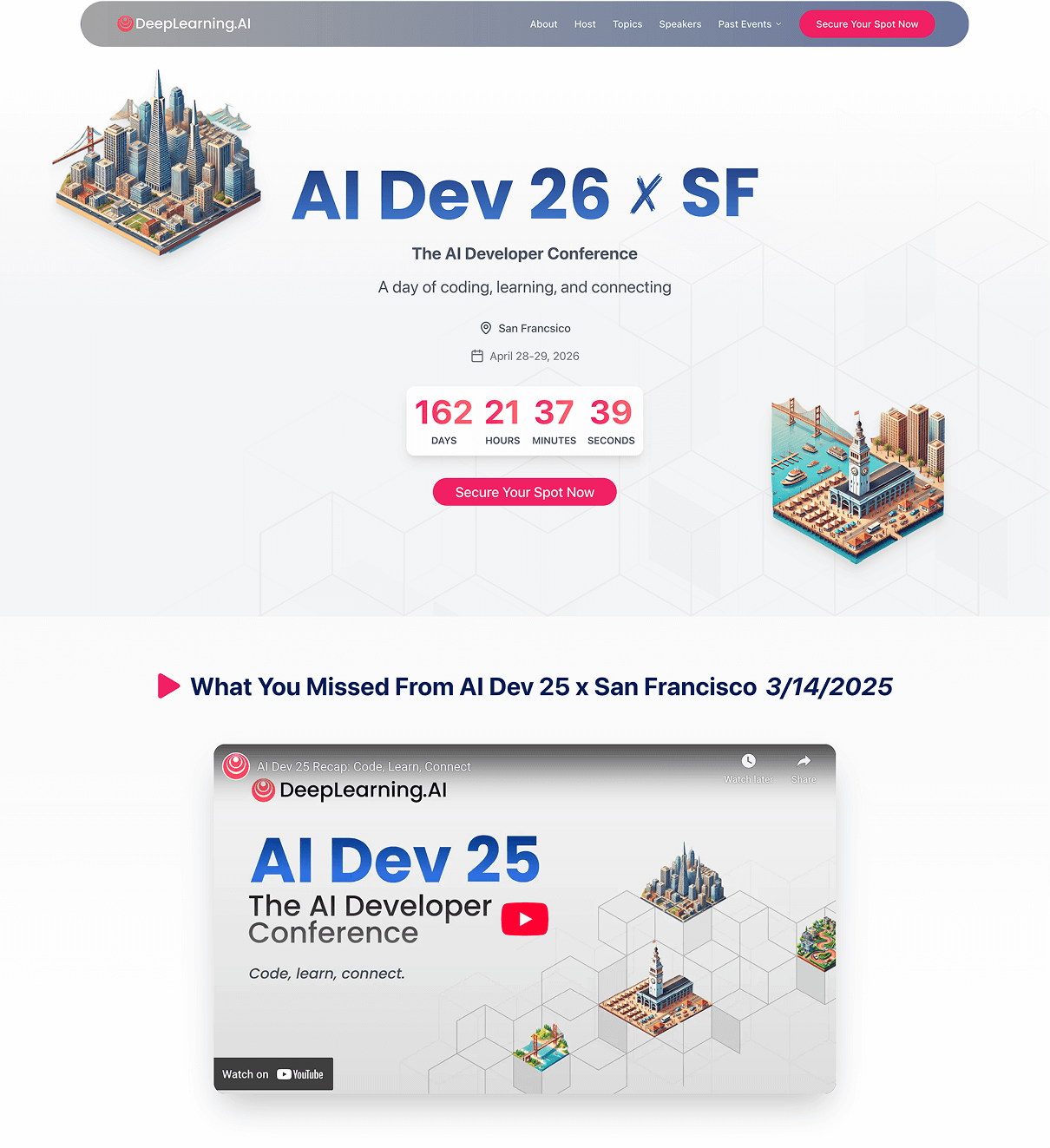
What makes it effective?
The hero section includes a bold event title, clear date, and a countdown timer that immediately communicate relevance and time sensitivity. This helps users understand what the page is about within the first two seconds, which is critical for event registrations.
The strong “Secure Your Spot” CTA gives visitors a direct next step and delivers the page’s primary goal. Each section is visually distinct but sticks to a consistent design making the long page easy to skim through.
Toward the end, the page emphasizes their community and expertise by showcasing their speaker lineup and recognizable faces in the AI field. The final CTA at the end of the landing page reinforces the hero section and makes it convenient for users who scroll down to sign up once they have understood the value.
Inspired to create? Start building your own landing page. Get your 15-day free trial for Zoho LandingPage - the no-code builder for your online success : https://zurl.co/VeJD
Land of Ride: Travel landing page
Travel landing pages often use immersive visuals and storytelling to grab visitor attention. On the Land of Ride landing page, the destination photography makes the landing page experience delightful with a magazine feature-like style. Instead of burdening users with too many details, it guides them through the seamless journey of inspiration and discovery.
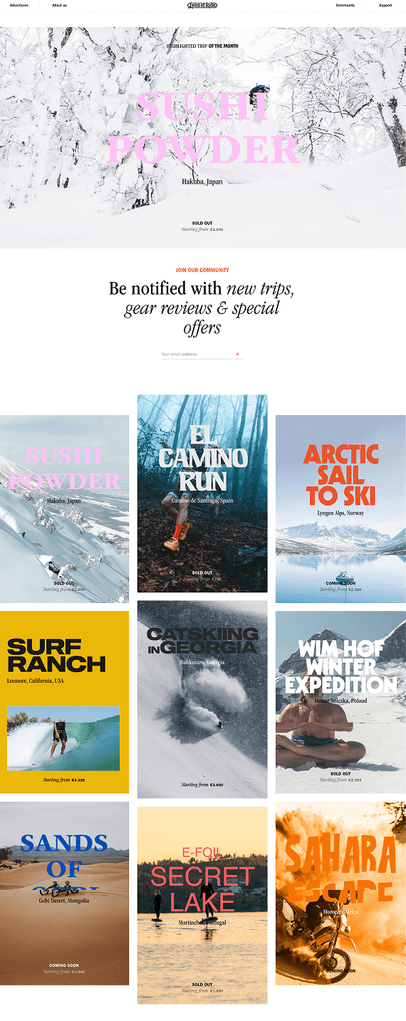
What makes it effective?
The entire landing page unfolds like a premium travel magazine but maintains a clean, intuitive layout to keep users scrolling. This helps build an emotional connection with new users and makes them explore the landing page further.
Each destination is depicted in a different section to break the monotony of the landing page design. Below the fold you can find sections like gear recommendations and highlights that offer practical value without breaking the flow of the landing page.
The newsletter sign-up is placed strategically so it appears like the natural course of action rather than being forced upon the user before they have warmed up to the brand. The visual design of the landing page works smartly to convince users of their brand without being too preachy.
Inspired to create? Start building your own landing page. Get your 15-day free trial for Zoho LandingPage - the no-code builder for your online success : https://zurl.co/VeJD
Flighty: Interactive landing page
Interactive landing pages are all about grabbing user attention with scroll-triggered interactions, smooth transitions, and micro-animations that make the experience feel alive. Instead of passively presenting information, they guide users through a story. The Flighty landing page uses motion, app previews, and dynamic visuals with every user interaction. By doing so, the page not only explains what Flighty does but also delivers a preview of what the app experience would be like.
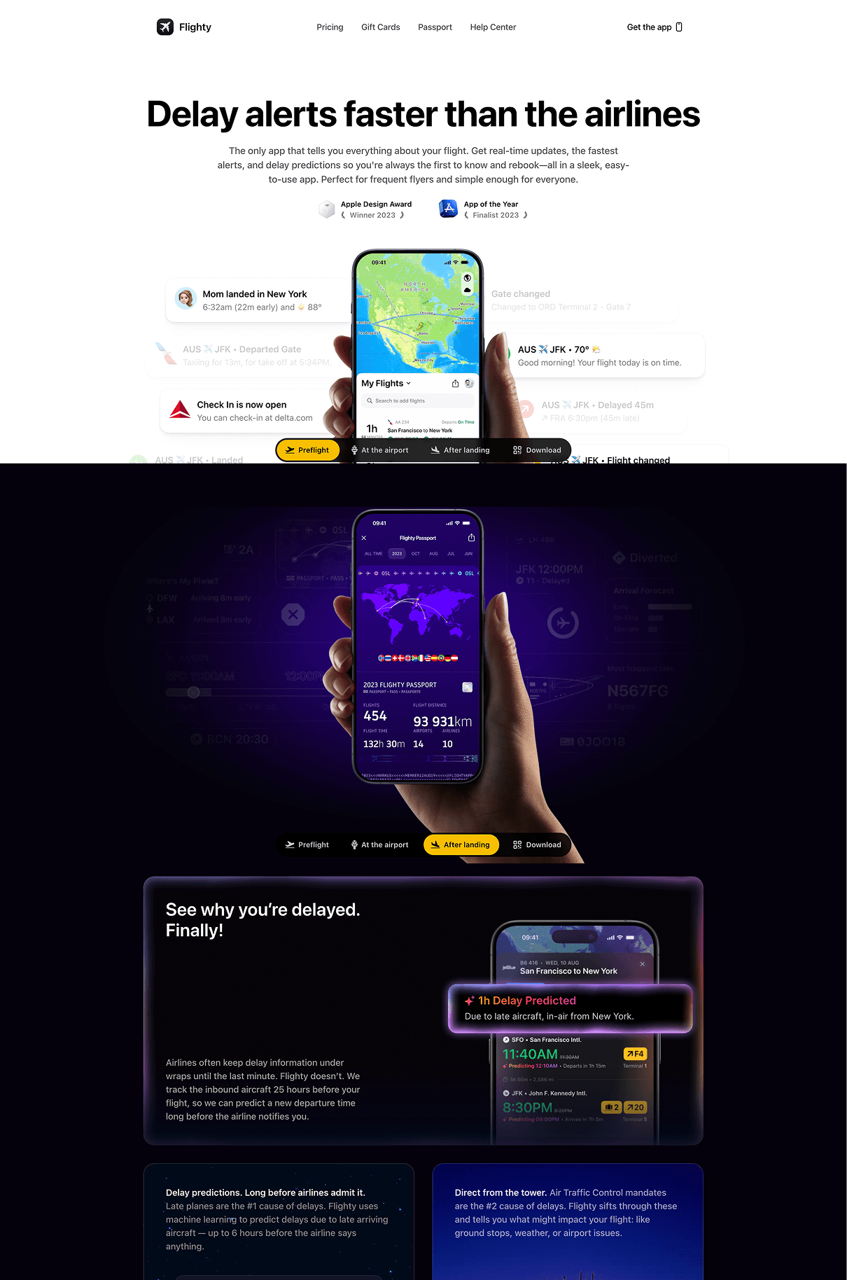
What makes it effective?
The moment users land on the page they are greeted with a bold hero section that spells out the USP of the product. This mix of bold visuals and direct benefit-oriented copy grabs attention and sets the tone of the landing page right away.
With every scroll, the landing page transforms into an interactive storytelling experience revealing features step by step. This interactivity keeps the user engaged and mirrors the real-time experience of the app. Each feature section is narrated with user-centric copy that makes the product easy to understand even for users unfamiliar with travel apps.
Finally, the page builds trust with testimonials, screenshots, App Store reviews, and mentions from frequent flyers and pilots. These elements are placed at natural decision points to encourage conversions without feeling forceful. The design, pacing, and interactivity make this landing page both informative and memorable for users.
Inspired to create? Start building your own landing page. Get your 15-day free trial for Zoho LandingPage - the no-code builder for your online success : https://zurl.co/VeJD
Fable & Mane: Black Friday landing page
Black Friday landing pages are designed to create urgency and spotlight limited-time offers. They typically feature bold color palettes and high-contrast CTA buttons that help shoppers make quick decisions. Fable & Mane's landing page elevates the traditional Black Friday landing page with festive visuals and a seamless landing page layout.
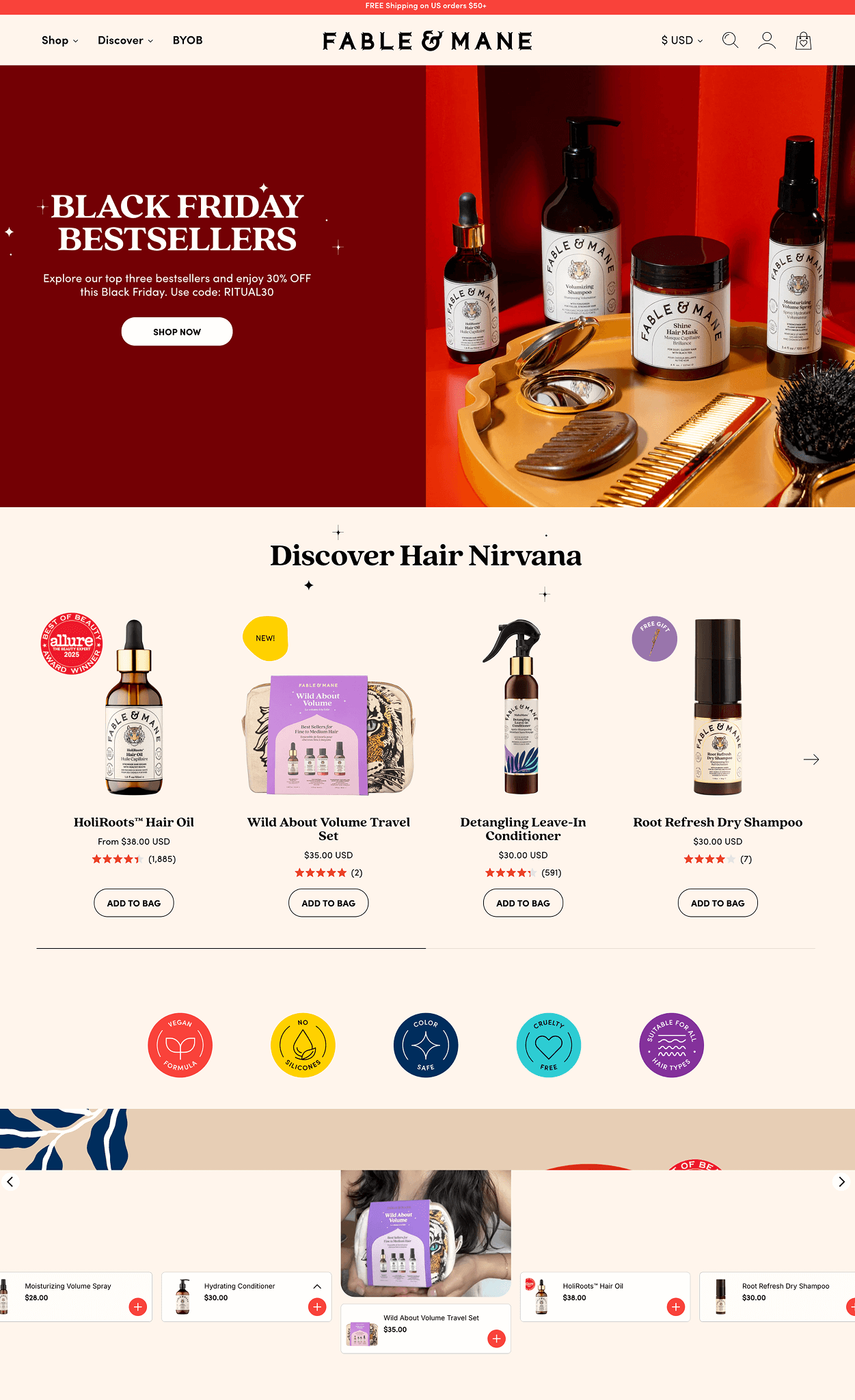
What makes it effective?
Fable & Mane’s Black Friday landing page works because it blends seasonal festivity with brand storytelling instead of relying only on heavy discounts. The hero section immediately communicates the Black Friday offer, but the premium photography helps create a premium landing page experience.
The page organizes its vast product range in an efficient manner for users to discover and explore easily. Bestsellers, curated bundles, and holiday-themed sets are placed early in the layout, reducing browsing time and helping shoppers quickly find high-value items. Each product card includes ratings, badges, and price comparisons, which boost trust and encourage faster purchase decisions.
Testimonials, features in the press, and behind-the-scenes visuals make the brand more human and emotionally connected to users. The page ends on a narrative about family and heritage to make the brand even more personal without being too "salesy."
Inspired to create? Start building your own landing page. Get your 15-day free trial for Zoho LandingPage - the no-code builder for your online success : https://zurl.co/VeJD
The Brandt: Real estate landing page
Real estate landing pages focus on showcasing spaces and properties with essential details to attract relevant users and seal the deal with clear calls to action. The Brandt landing page, instead of just listing properties, creates a design experience that guides users through their various properties and its advantages before inviting them to get in touch.
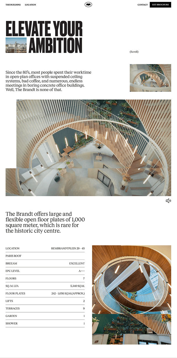
What makes it effective?
This landing page works because it strikes a clear balance between visual storytelling and practical information. The hero headline paired with architecture photography immediately conveys the premium nature of the brand. Instead of relying on heavy copy, the page focuses on spacious layouts and property photographs.
Below the fold, the landing page breaks down each property into smaller blocks and explains the amenities and location in detail so users can quickly skim without reading too much text.
Finally, the page closes with a prominent CTA button that encourages immediate action. Placing the form at the end of the landing page also ensures users are informed and warmed up before moving to the next steps.
Inspired to create? Start building your own landing page. Get your 15-day free trial for Zoho LandingPage - the no-code builder for your online success : https://zurl.co/VeJD
Today in Design: Newsletter landing page
Newsletter landing pages are built in a way to deliver just one key message: Why someone should subscribe. A strong headline coupled with a minimal form helps achieve this instantly. The Today in Design landing page also takes a similar approach but focuses on clarity and credibility to make the newsletter feel curated and exclusive.
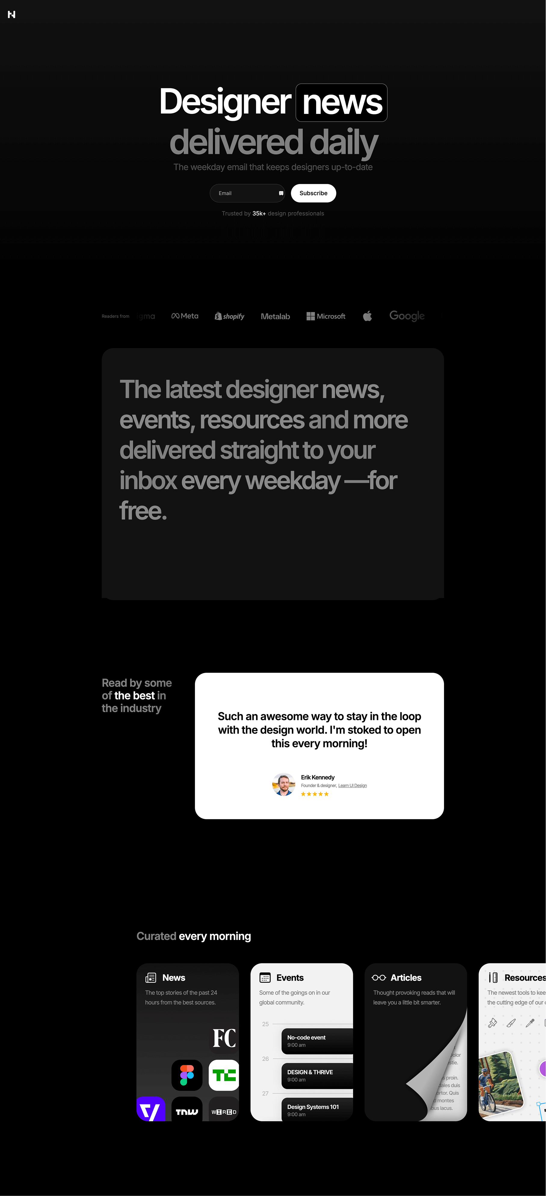
What makes it effective?
The page is effective because it delivers the value proposition clearly. The headline “Designer news delivered daily” immediately tells visitors exactly what they’ll get. The simple email field further encourages conversions because of the ease of sign-up.
Testimonials from well-known designers, paired with star ratings and personal endorsements, make the newsletter feel credible and worth subscribing to. These elements assure readers that they’re joining a community, not just another mailing list.
The dark theme, the aesthetic layout, and the micro interactions help position the newsletter as a thoughtfully curated, exclusive community, and make the landing page highly persuasive.
Inspired to create? Start building your own landing page. Get your 15-day free trial for Zoho LandingPage - the no-code builder for your online success : https://zurl.co/VeJD
The Letter Club: Newsletter subscription landing page
Subscription landing pages are designed to slow the user down and focus attention on one simple action which is signing up. They rely on a calm layout, clear messaging, and a minimal form to explain what the user will receive and why it is worth their time. The Letter Club landing page fits this model well, but it also stands out by using a storytelling format that connects to users personally.
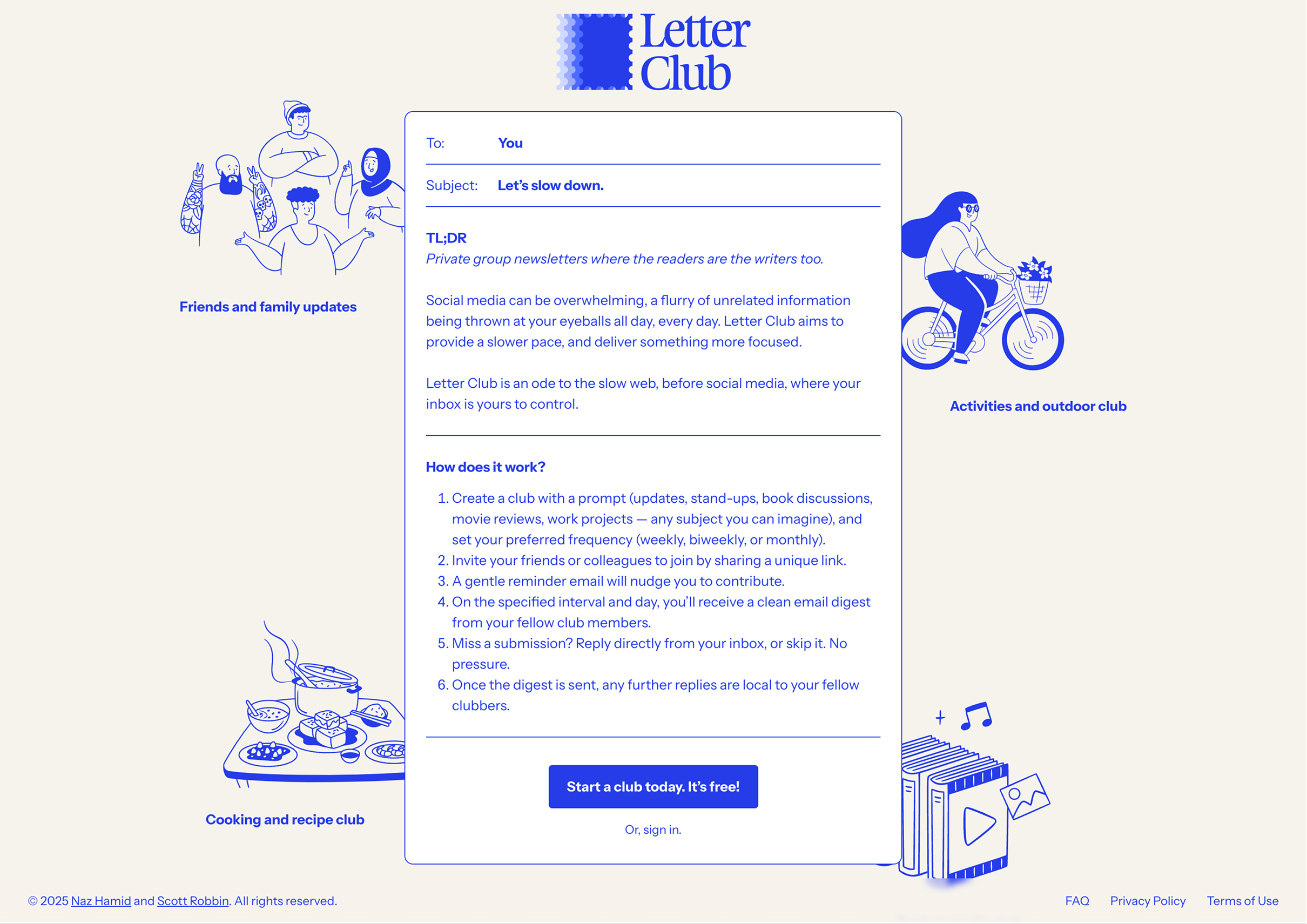
What makes it effective?
The page is effective because it pitches the product with an emotional perspective rather than just a set of features. The hero message, “Let’s slow down,” immediately sets the tone and differentiates The Letter Club from fast, noisy social platforms.
The email style layout strengthens the narrative. Presenting the content in a To, Subject, and TL;DR format makes the experience feel human and not "salesy." The step-by-step explanation of how the product works removes doubt and shows that using the platform requires very little effort.
Finally, the illustrations and color palette reinforce the idea of calm, everyday connection. By showing use cases like friends, cooking, and outdoor activities, the page helps users imagine how The Letter Club would fit into their real life. The single, friendly CTA “Start a club today. It’s free,” keeps the focus on action without pressure, making the overall experience feel warm and welcoming.
Inspired to create? Start building your own landing page. Get your 15-day free trial for Zoho LandingPage - the no-code builder for your online success : https://zurl.co/VeJD
How Zoho LandingPage helps you create great landing pages
When it comes to crafting effective landing pages, these examples provide just a glimpse of what's possible in the realm of landing page marketing. Zoho LandingPage helps you build landing pages that follow proven best practices and are designed to convert.
Use them as a source of inspiration and begin creating your own outstanding landing pages with Zoho LandingPage, a robust landing page builder.
Start your 15 day free trial today : https://zurl.co/VeJD
Start with ready-to-use templates
Choose from professionally designed templates inspired by high-performing landing page examples. These layouts give you a strong structure to communicate your message clearly and focus visitors on a single goal.
Refine and improve with data
Use built-in analytics and testing to understand how visitors interact with your pages. Optimize headlines, content, and calls to action based on real behavior to improve results continuously.
 Krithika
Content Marketer @ Zoho LandingPage