Creating a Dashboard
Dashboard allows you to combine multiple reports in a single page for a quick overview. Zoho Analytics provides a flexible m x n layout that allows you to organize the dashboard in any way as required. With this, you can easily create a visually rich and interactive dashboard by adding reports, widgets, user filters, and rich-formatted text.
Creating a Dashboard
With Zoho Analytics, you can easily create multiple tab dashboards with easy-to-use, flexible m x n layouts. You can quickly drag and drop reports and more components to your dashboard to organize them the way you require.
To create a Dashboard, click the Create button at the top left which invokes the Dashboard Editor. Select the New Dashboard option. The Edit Design window will open. Design your dashboard as required.
The following video explains how to create a dashboard.
Note:
You can also create a new dashboard from the Dashboards button in the menu bar.
A shortcut link Create New Dashboards will be available inside the Dashboards button in the menu bar. You will be navigated to the Dashboards Editor by clicking the Create New Dashboards link.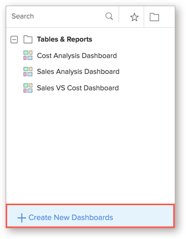
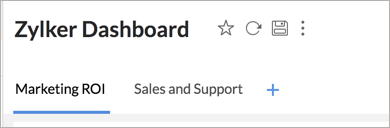
Adding Tabs
Zoho Analytics allows you to add multiple tabs to organize your reports. You can add up to 10 tabs in a dashboard. You can add tabs while creating a dashboard, or to an existing dashboard. Follow the below steps to add tabs to a dashboard.
- Open the Workspace.
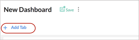
- Click Create at the top left and then select the New Dashboard option.
- The Dashboard designer will open. Click Add Tab button.
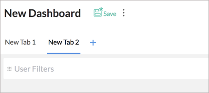
- The existing view will be assigned as New Tab 1 and a new tab will be created. You can further add tabs using the (+) icon. You can add up to 10 tabs in a dashboard.
- Click the Action icon that appears on the mouse over on the tab. Select Rename.
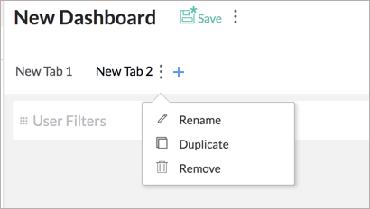
- The tab title will convert to edit mode. Specify the names for your tabs.
- Clicking the Duplicate option will copy the tab along with the embedded components into a new tab.
- Click the Remove option to delete a tab.


Adding Reports
Zoho Analytics allows you to add reports to your dashboard easily with a drag and drop interface.
Follow the steps below to add reports to your dashboard.
- Open the Workspace.
- Click Create at the top left and then select New Dashboard option.
- You will notice that all the reports available in this Workspace listed in the left panel, which you can drop into the Design Area and resize them to fit your need.
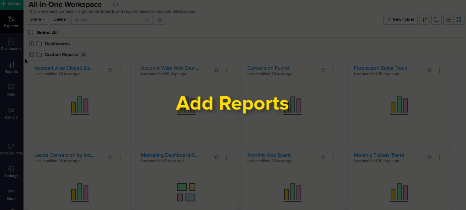

You can add any number of reports to the dashboard and organize them as needed.
Layouting components in Dashboards
Zoho Analytics provides a flexible m x n layout Dashboard. You can organize the dashboard in any way. You can simply drag and drop the components in edit mode of the dashboard.
Customize the Dashboard Designer Area Width
You can adjust the size of your dashboard to organize its contents better and use it with ease. To change the size, open the dashboard in Edit Mode, click the Screen icon at the top right, next to the Ask Zia icon.

Fixing the dashboard size is helpful when designing a dashboard to embed in your websites/ blogs at a specific size. Setting the width lets you design a dashboard with exact dimensions.
You can choose the dashboard size from these options:
- Web (Fit to Width): The dashboard will automatically resize to fit the size of your screen. This may make the dashboard look different on different screens.
- A3 (1123px), A4 (797px), Letter (816px), Tabloid (1056px): These sizes are all fixed and will not change based on your screen size.
- Custom Width: You can set a custom width for your dashboard, ranging from a minimum of 797px to a maximum of 4000px.
Note:
- The Web (Fit to Width) option may affect the layout, as views, and elements like widgets, images, and text might stretch or shrink to adapt to different screen sizes.
- For a fixed-size dashboard that looks consistent on all screens, choose one of the other options. The specified width will be preserved for both embedding and exporting.
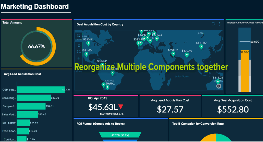
Reorganizing Components
You can rearrange the components in a dashboard into any location needed by drag and drop. As you drag, other components will be automatically arranged. A purple line will appear marking the borders of surrounding views. This will be useful to arrange the views in the desired way. 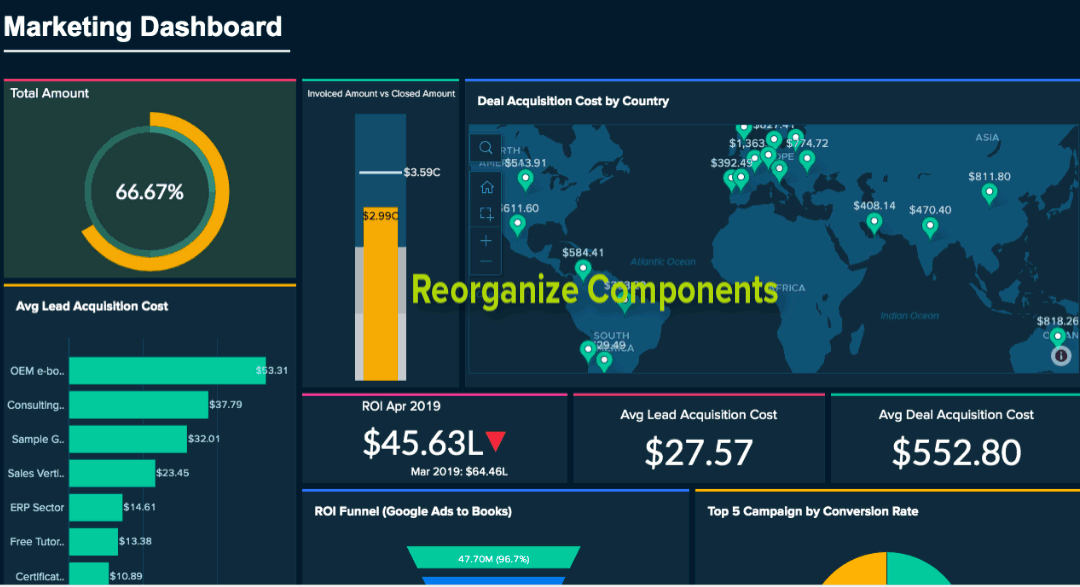
You can now move views between the tabs in a dashboard. This allows you to rearrange views in a multi-tab dashboard easily. 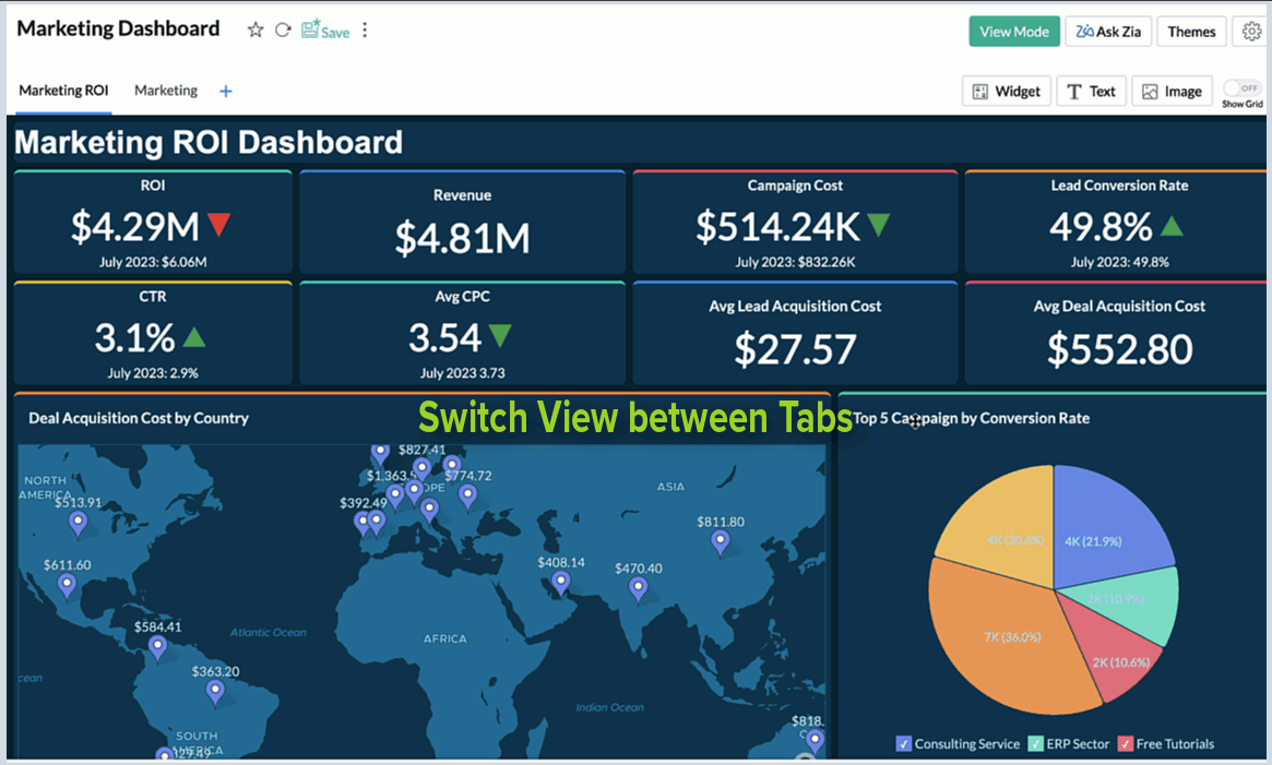
You can also reorganize multiple components together. Select components in the same row and/or column and drag them to the required location. The following animation explains how to re-organize multiple components.
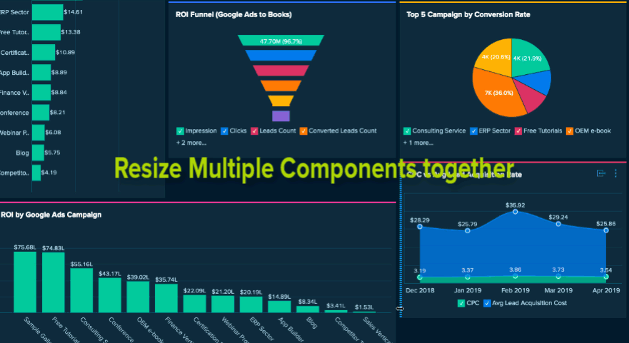
Resizing components
You can resize the components in the dashboard anytime using one of the following options.
Drag to Resize
You can easily resize the component by dragging the border. As you drag, a purple line will appear marking the borders of surrounding views. This will be useful to arrange the views in the desired way.
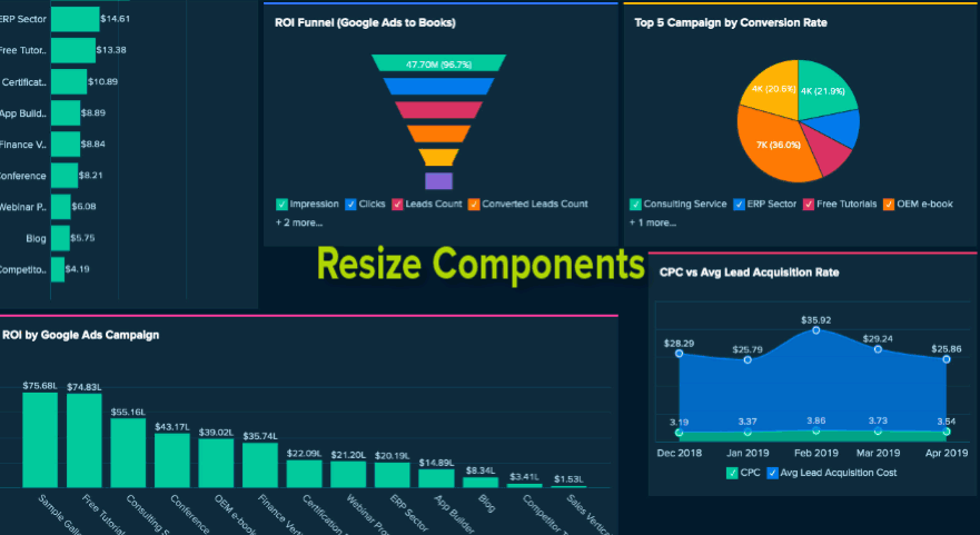
You can also resize multiple components together. Select components the same row and/or column and drag them to resize.
The following animation explains how to resize multiple components together.
Copy and Paste Dimensions
Zoho Analytics allows you to apply a uniform dimension to multiple components using the Copy-Paste Dimension option.
You can select the component with the desired dimensions and click Copy Dimensions option in the contextual toolbar that appears at the bottom. Now select the components on which you want them to be applied and click Paste.
The following animation explains how to copy-paste dimensions from one component to others.
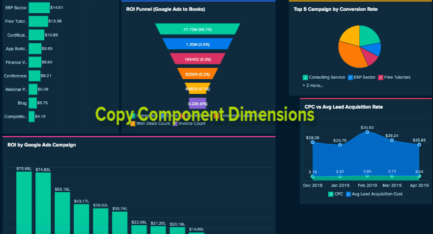
You can choose to copy the width, or height or both.
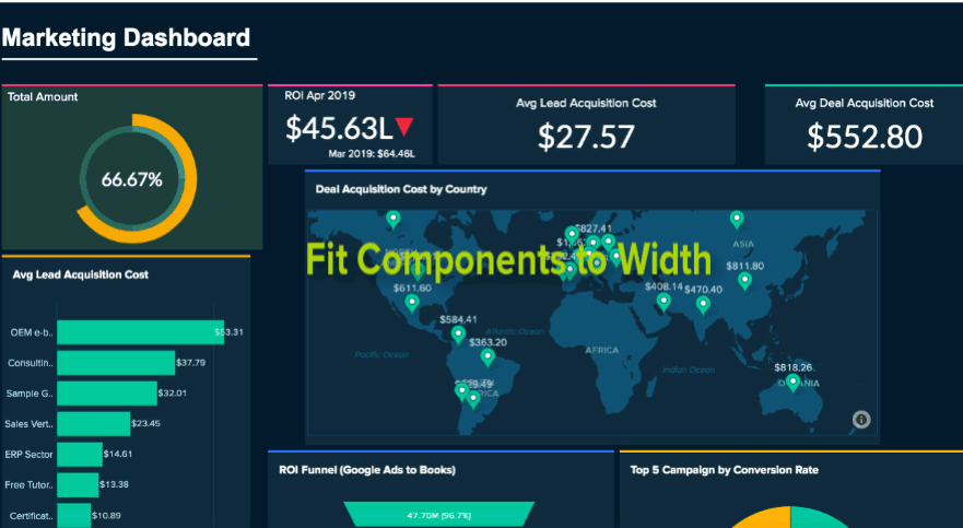
Fit Components to Width
Fit components to width allows you to resize the components to fill available space with proportionate width.
Select components which are in the same row and same height and click Fit to Width option in the contextual toolbar that appears. The components will be resized with proportionate width to fit in the available space. The following animation explains how to resize to fit components to width.
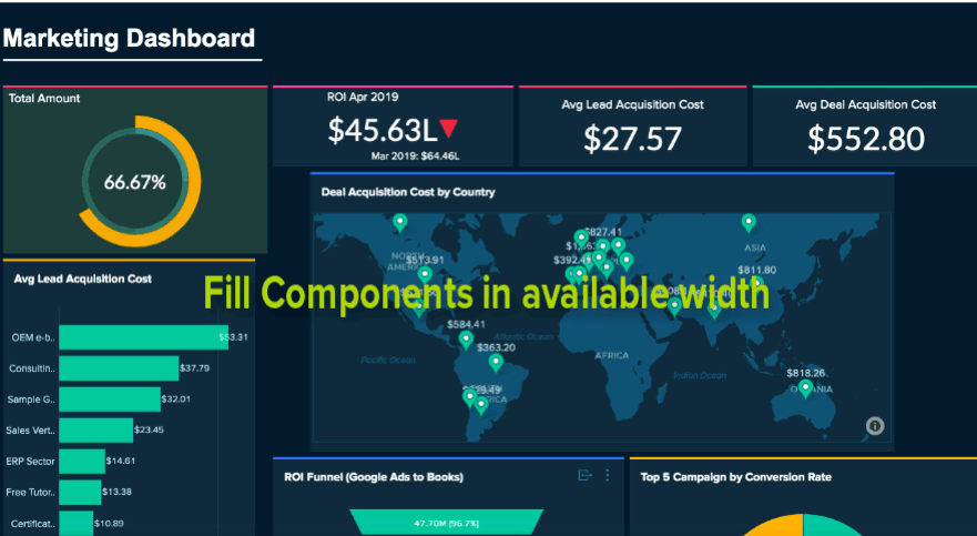
Fill Space
You can resize the components to fill the space in the dashboard layout in few clicks. The following animation explains how to resize to fill the space.
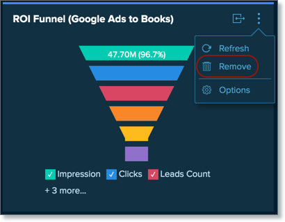
Remove Components
You can easily remove the components from dashboards anytime.
To remove a component, click the action menu of the component and click Remove.
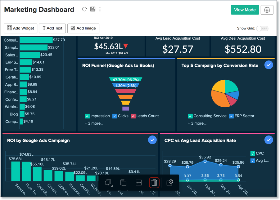
To remove multiple components together, select the components you want to remove and click the trash icon in the Dashboard contextual toolbar.
Handle Deleted Views
In case a view present as part of a dashboard is deleted, you can choose to restore or remove it from the dashboard.
Restore
To restore the view from dashboard, hover the mouse over the deleted view and click the Restore icon on the top right.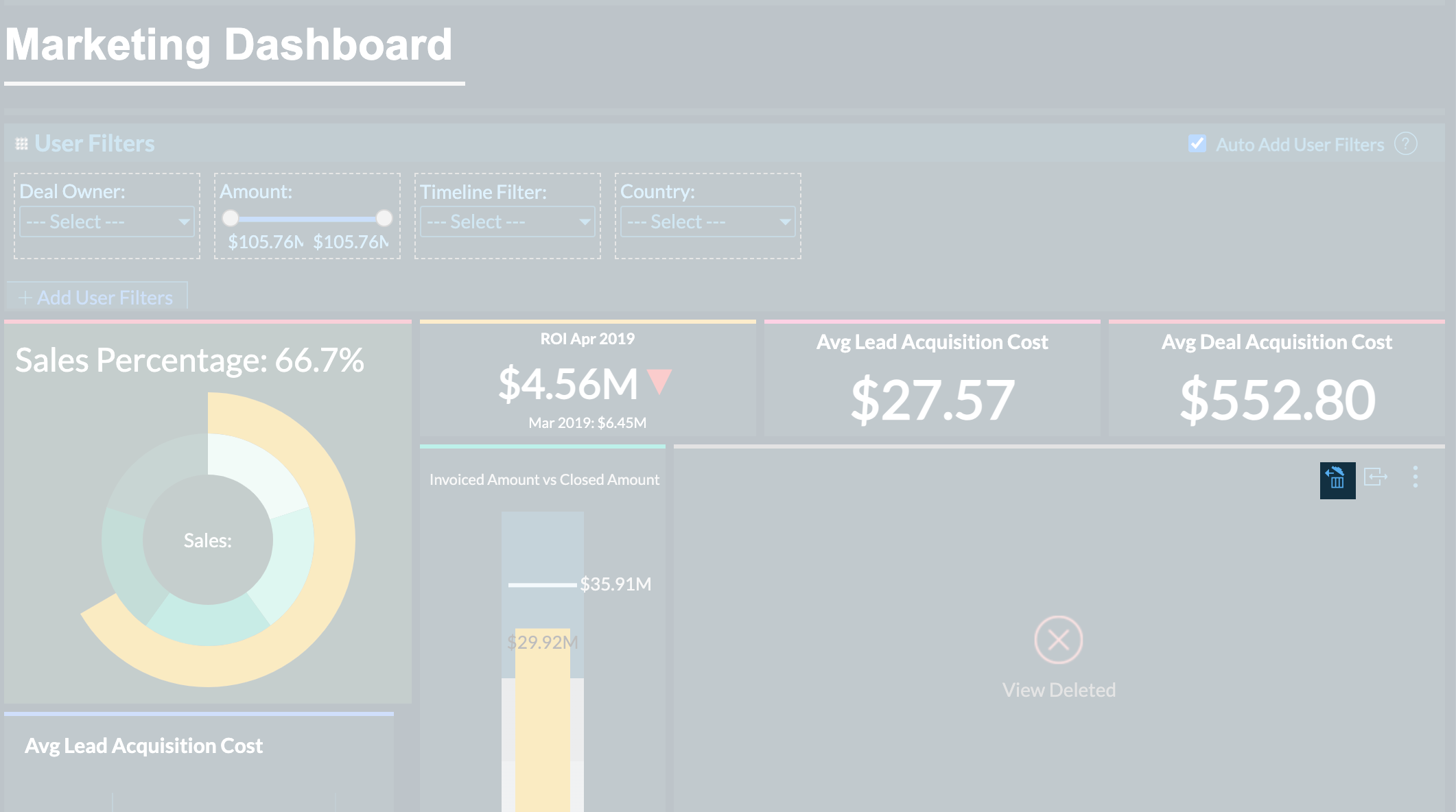
Remove
To remove the view from dashboard, click the Close icon of the deleted view.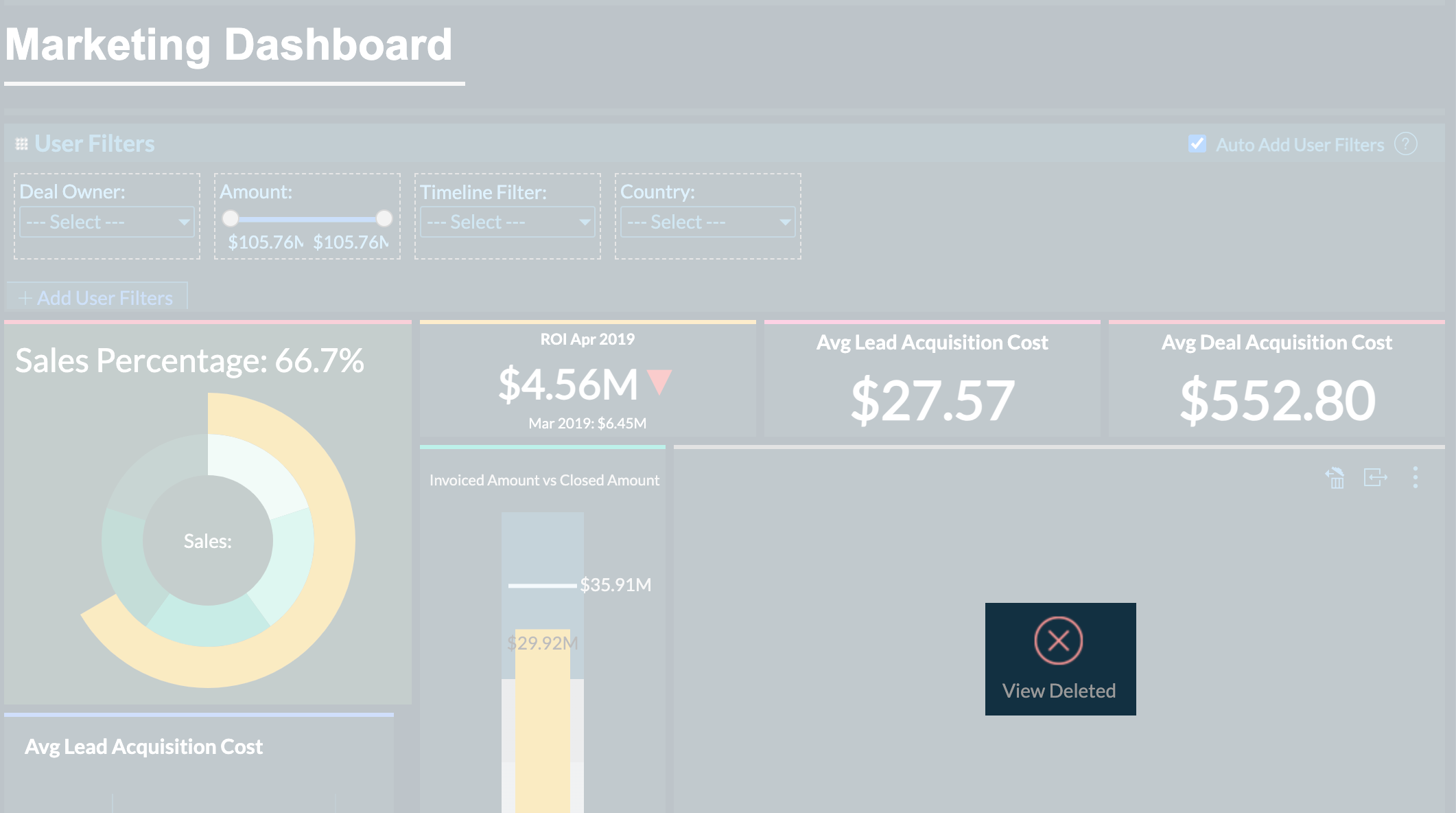
Copy and paste reports from one tab to another tab
Zoho Analytics allows you to reuse reports and KPI widgets by copying and pasting reports to other tabs in the dashboards. This cuts down the redundant work and saves time recreating similar reports. The alignment will not be changed while doing this. You can use the keyboard shortcuts "Ctrl + C" and "Ctrl + V" on Windows and "CMD + C" and "CMD + V" on Mac to copy and paste visualizations respectively.

Customizing Dashboard
Zoho Analytics provides context-specific customizing options for all view that you dropped in a dashboard. You can also apply themes to improve the look and feel of your dashboard. To know more details on this, refer to the Customising Dashboard section.
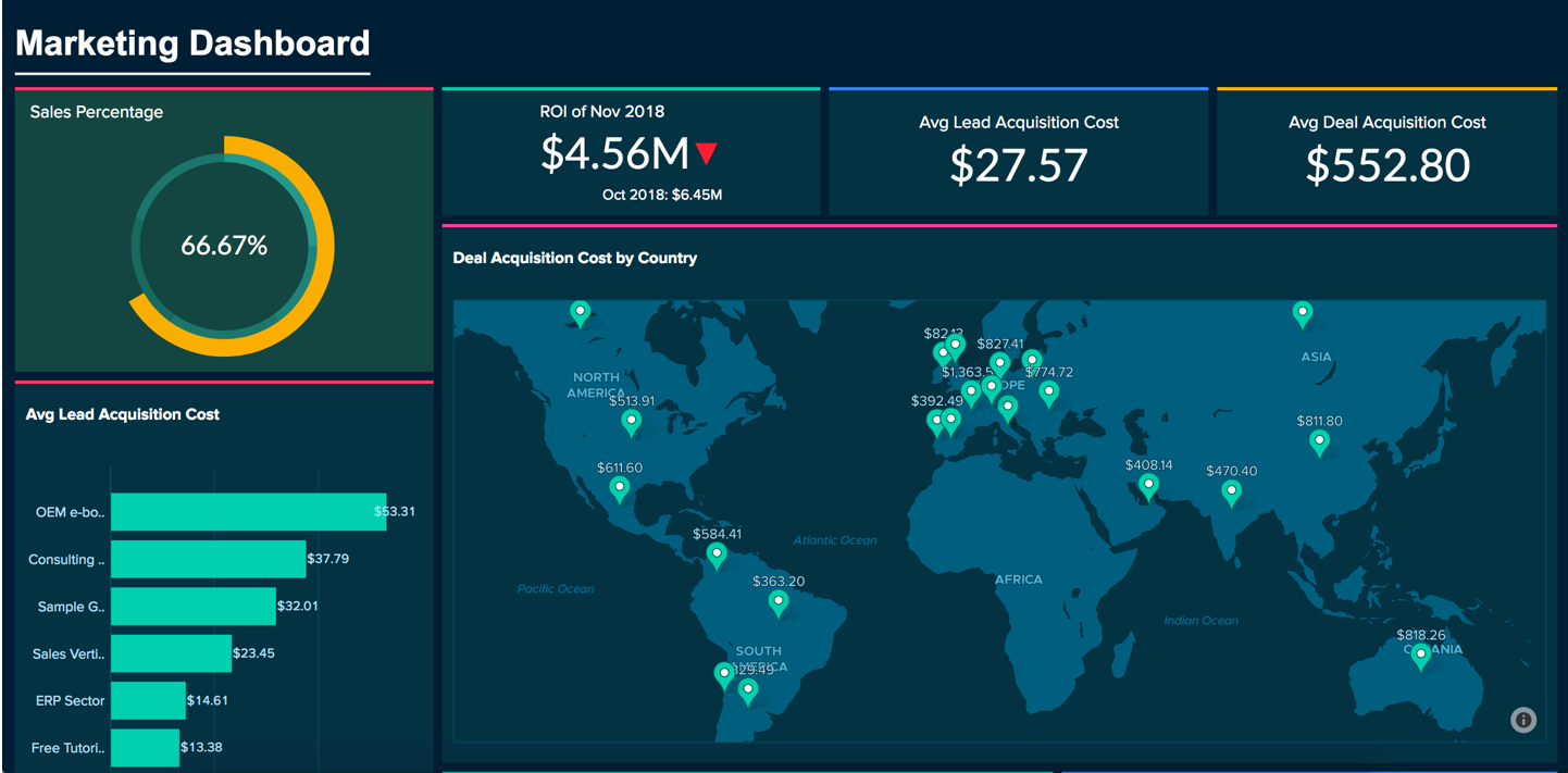
Below is a final Dashboard with customized theme.
Adding Elements
Zoho Analytics allows you to add widgets and elements like text and images, which can enrich and enhance your dashboards with relevant contextual information and styling. You can also embed elements like Google Maps, YouTube videos, and online forms by using HTML iframe code snippets.
To add elements to your dashboard,
- Open the Dashboards Designer page.
- Click the Elements icon on the left side pane.
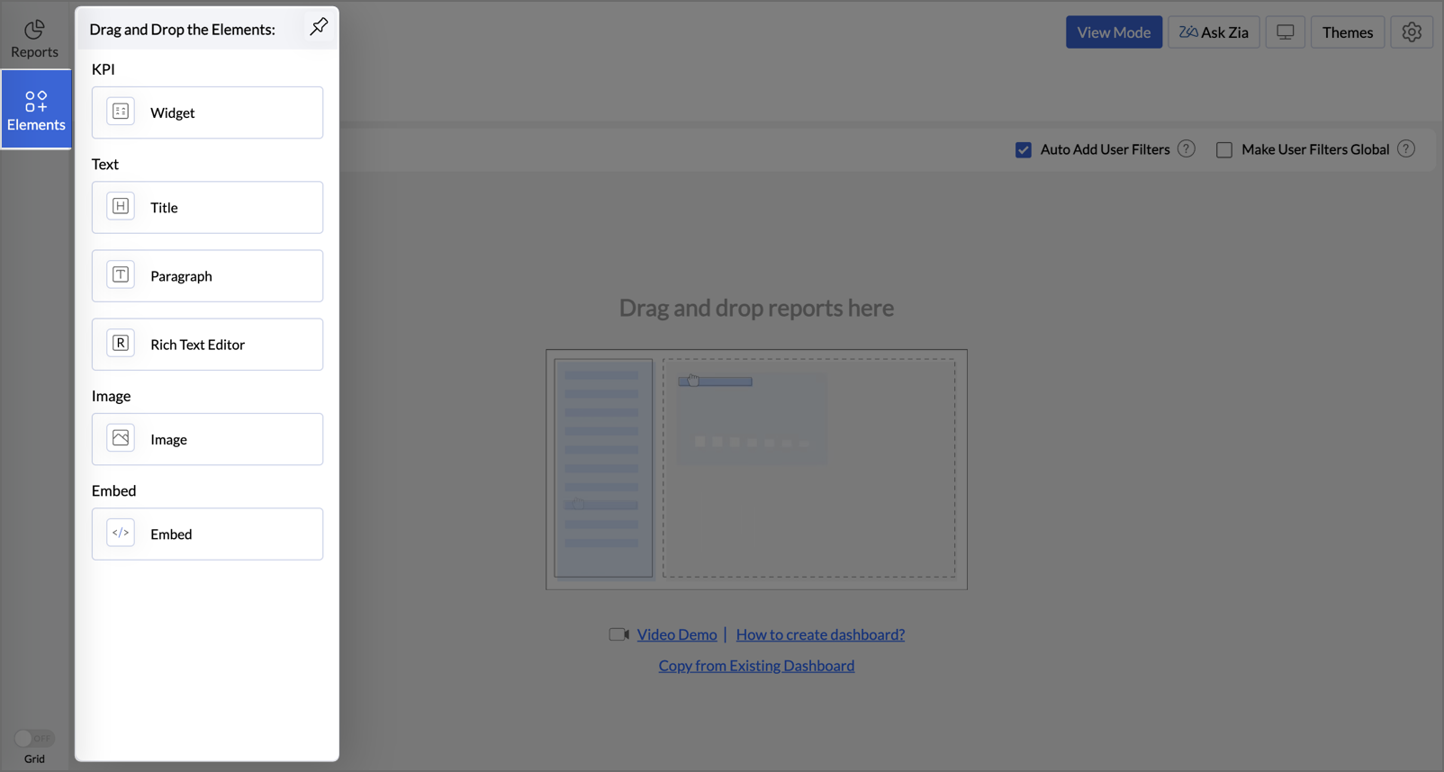
- The Drag and Drop the Elements menu will open with the following options
- You can drag and drop elements of your choice from this menu. Click the Pin icon at the top of the menu to pin the menu option.

Adding Key Performance Indicators (KPI)
Zoho Analytics allows you to monitor your key metrics and display them prominently on a dashboard using a widget-based model. You can add single number and chart type widgets within the dashboards to track the key metrics. These widgets can feature comparison indicators to illustrate trends or be compared against a target to show progress.
To add widgets to your dashboard,
- Open the Dashboards Designer page and click the Elements icon on the left side pane.
- Drag and drop the Widgets element into the dashboard layout.
- The KPI Widget Editor dialog will open. Zoho Analytics offers two types of widgets,

Adding a Single number KPI Widget
Adding a Chart Type KPI Widget
Click here to read a detailed help document about adding a KPI Widget.
Adding Text
You can now include text like titles, descriptions, and other formatted texts into your dashboard by adding text elements. You can easily drag and drop the Text elements to your dashboard. Zoho Analytics offers three types of text elements.
- Titles - Enable you to add headings to your dashboard. This element offers basic font styling tools to customize text style, color, and alignment. You can also change the card color.
- Paragraph - Allows you to add text sections like descriptions to your dashboard with options for customizing font style, color, and alignment. Additionally, this element supports toggle points, indentation, line height adjustments, etc., to enhance readability and organization.
- Rich Text Editor - This element allows you to add rich formatted text, quotes, tables, images, html codes, etc., to your dashboards along with all features available in the Paragraph element.

Adding Images
Zoho Analytics allows you to add images and GIFs to your dashboard to enhance visual appeal and improve contextual understanding of your dashboard.
To add an image/GIF to your dashboard,
- Drag and drop the Image element into your dashboard.
- The Import Image dialog box will open. You can import an image from any of the three sources - Upload Image from Disk, URL, and My Library.
- Select the image and click Insert.
- The selected image will be added to the dashboard along with the following editing tools.
- Color: Change the color of the added image to any hue from the palette, including options to modify the Foreground or Background color.
- Brightness, Contrast, Transparency: Adjust image effects like brightness, contrast, and transparency for enhanced visual impact.
- Crop to Shape: Crop the image into various shapes, such as round, rectangle, pentagon, teardrop, and more.
- Stroke: Add a stroke to your image, with adjustable stroke color and thickness.
- Drop Shadow: Apply shadows to the image with three intensity levels: Low, Medium, and High.
- Rotate and Flip: Rotate the image in 90-degree increments, allowing full 360-degree rotation, or use the Flip option to create a mirror image.
- Image Scaling Options: You can use different scaling options available to control how an image fits within its designated container on the dashboard.
- Original: Displays the image at its actual pixel size.
- Fit Width: Scales the image so that its width matches the container's width.
- Contains: This default option resizes the image to be fully visible within the container while maintaining its aspect ratio.
- Stretch: Expands the image to completely fill the container's dimensions.


Adding Embed Components
Zoho Analytics allows you to add embed elements like Google Maps, YouTube videos, and online forms by using HTML iframe code snippets.
To add embed components to your dashboard,
- Drag and drop your Embed element into your dashboard.
- The Embed Editor dialog box will open.
- Enter the Title and Embed URL, then click Apply to insert the iframe code.

Adding User Filters
Zoho Analytics allows you to include dynamic filtering capability in the dashboard view mode using the User Filters option. This enables viewers of the dashboard to apply filters dynamically and view the required information. You can add User Filters to the entire dashboard or for the individual reports embedded as required.
Refer to the Dynamic Filters for Dashboard section to know more about it.