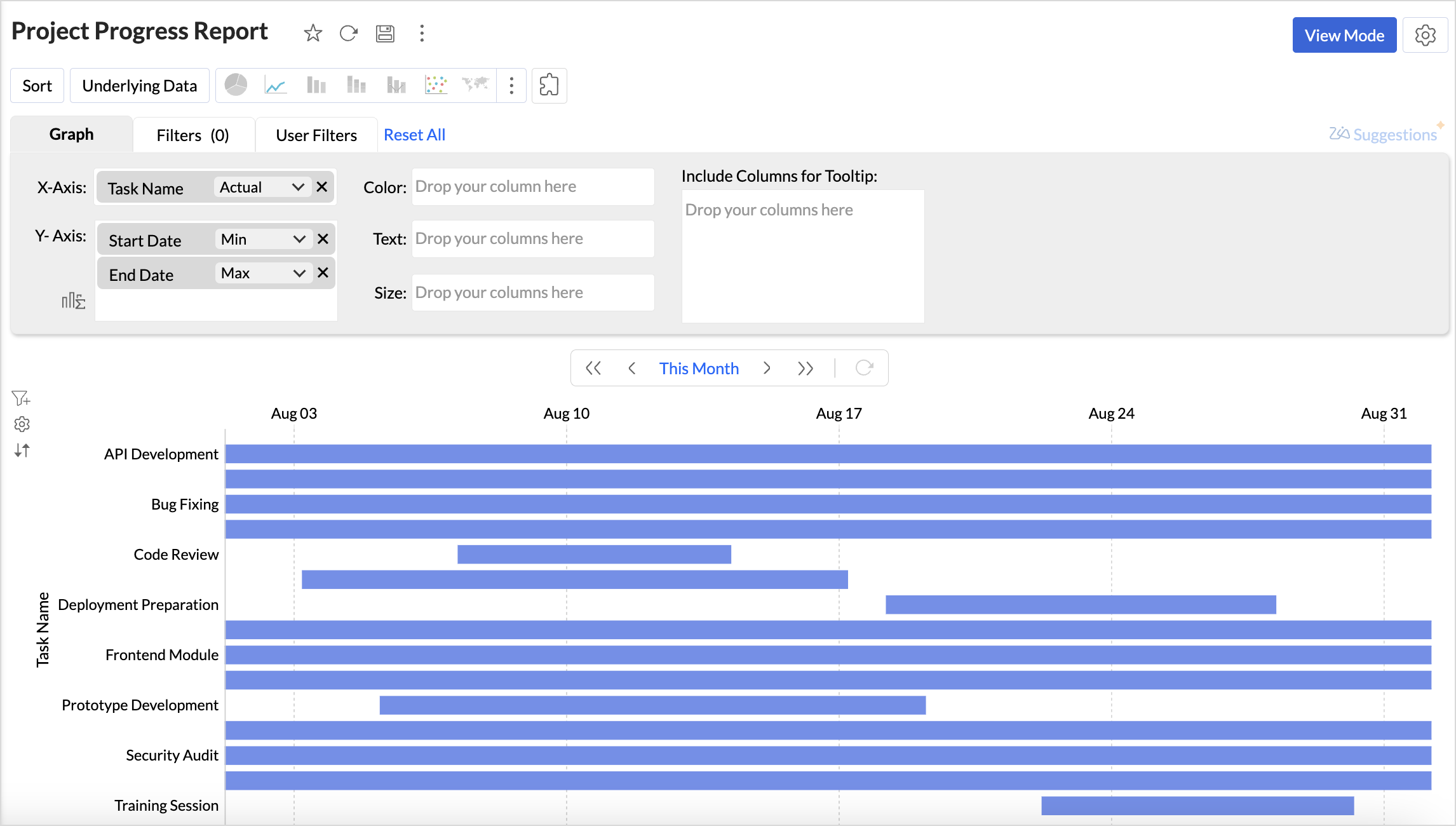
Gantt Chart
Gantt charts in Zoho Analytics help visualize the progress of projects over time, helping teams analyze project timelines and performance. In a Gantt chart, each task is shown as a horizontal bar, with the length representing the duration of the task and the position indicating the start and end dates.

Connect your project management data with Zoho Analytics and track your project's progress in real time with a Gantt chart. Zoho Analytics provides a wide range of customization options for customizing the Gantt chart.
Gantt Chart helps project managers throughout the lifecycle of a project.
- Project Planning: Breaks down projects into manageable tasks, clearly mapping them on a timeline. This helps teams track which tasks are in progress and which are completed. schedule, delayed, or completed, and ensure deadlines are met.
- Performance Analysis: By comparing planned timelines with actual progress, Gantt charts make it easier to identify bottlenecks, delays, or overlapping tasks that may affect overall project execution.
- Smarter Resource Allocation: Gantt charts provide visibility into how resources are distributed across tasks. This ensures resources are used efficiently.
Data Requirements
A minimum of three columns - a dimension column, which has the details about the tasks, a start date column, and an end date column.
Creating a Gantt Chart
- Access the project data for which you intend to create a Gantt chart.
- Click the Create icon on the side navigation panel and choose New Chart view from the list.
- Drag and drop the columns into the chart designer area as follows:
- X-axis: A dimensional column like the task name for which you wish to track the progress
- Y-axis: Project start date column with minimum date function and project end date column with maximum date function. This will generate a basic Gantt chart.
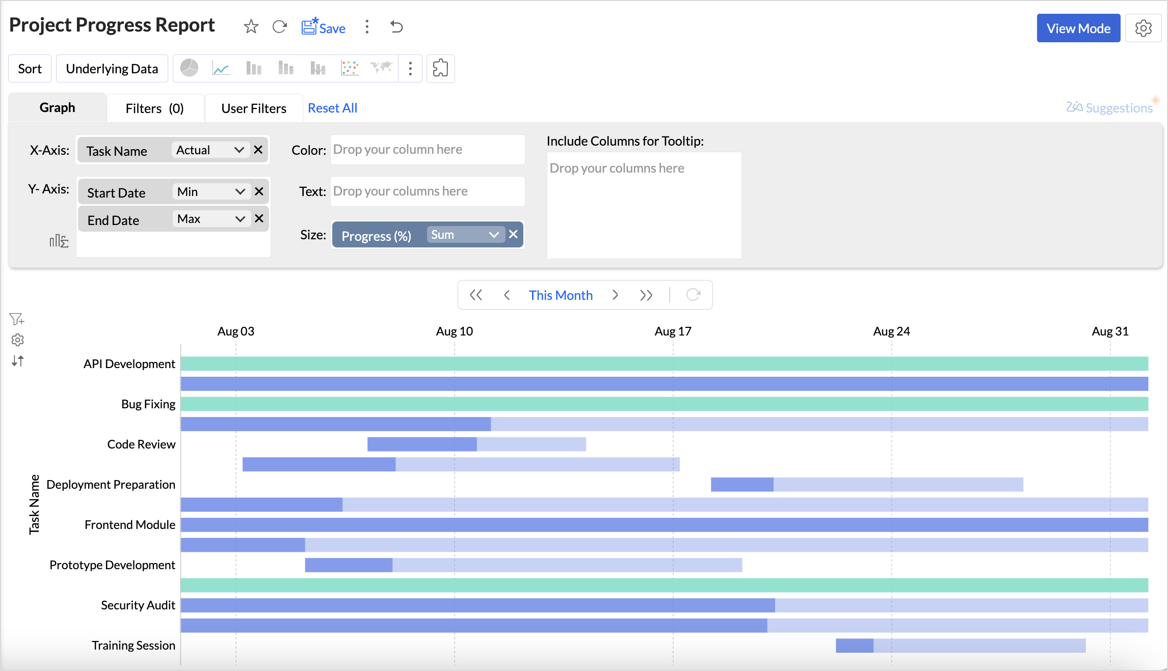
- Text/Size/Tooltip: Adding a measure column like progress (%) to text, size, or tooltip helps visually distinguish tasks that are In-progress from those that are Completed. When added to the Text shelf, the completion percentage is displayed at the end of the bar.
- Click Generate Graph. A scatter plot chart will be generated.
- Choose Gantt chart from the visualization types.
- Customize the Default Date Value to be displayed.


Customizing a Gantt Chart
Zoho Analytics offers extensive options to customize any chart. This section explains the customization options specific to the Gantt chart. Refer to Customizing Charts article to learn more.
Click the Settings icon in the top right corner of the chart designer. Choose Gantt to customize the chart settings.
Select Gantt Style
- Bar: Displays tasks as horizontal bars along a timeline, making it ideal for detailed project planning with task duration, dependencies, and overlaps.
- Bullet: Represents tasks or milestones as bullet markers on the timeline, best suited for high-level tracking of key checkpoints and critical dates.
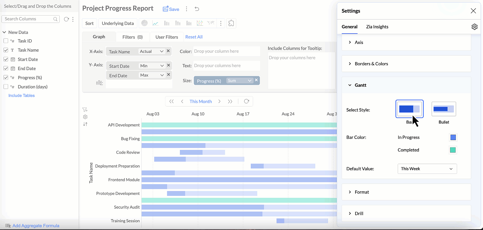

Bar Color
Customize the color scheme of tasks to visually distinguish between tasks based on their status. This way, tracking the overall progress of the projects is made easy. This customization can be applied by adding a measure column to the Text, Size, or Tooltip shelf.
Default Date Value
Set the initial time range shown when the Gantt chart opens. You can choose to view tasks for the current week, month, quarter, or year or define specific or custom date ranges aligned with your project timelines.
Possible Combinations
| X- Axis | Y-Axis | Color | Text | Size | Tooltip |
Case 1 | Dimension | Dimension 1 (Date) Dimension 2 (Date) | - | Measure (optional) | Measure (optional) | Measure (optional) |