Customizing a Chart
When designing a chart, the Zoho Advanced Analytics app offers a wide range of options to customize the chart and improve the overall appearance in different ways. In this section, we will discuss the various options provided by the Zoho Advanced Analytics app to customize the chart that you create.
- Title and Description
- Axis Settings
- Borders and Colors
- Format
- Legend Settings
- Adding Threshold
- Chart Drill Down Path
- Customizing Chart Color
Title and Description
Zoho Advanced Analytics app provides options to customize the chart title, description and data display in the General tab.
To customize these settings :
- Open the corresponding chart.
- Click the Settings option in the toolbar. The Settings - General tab will open.
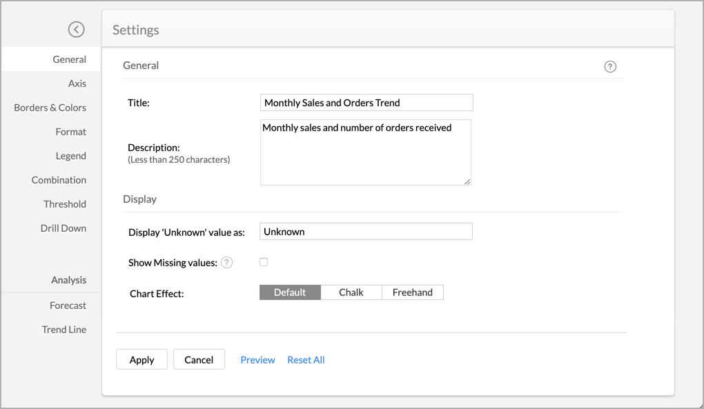
The following table describes various options in the General tab.
Option Description General Title Specify a unique title for the chart. This is mandatory. Description Specify a description for the chart. This is optional.
Display Display 'Unknown' value as Specify the value you want to display in the chart if the data contains null or empty values. Show Missing Values Select Show Missing Values to plot the chart including the data points (date/categories) which does not have any corresponding value in the underlying data. Deselecting this will skip these points in the axis. Show Data Label This option will be available in the case of Pie and Funnel Chart. With this, you can set whether to display the percentage or value as a data label over the corresponding section. You could also choose to show the chart without the data label. Chart Effect This option allows you to modify the chart's display look. The available options are:
- Default (normal)
- Chart
- Freehand
Show Conversion Rate Select this to display the conversion rate of the funnel in percentage, by comparing the value of the last slice with the first slice in the funnel.
Funnel Design Select the funnel design. The available options are. - Weighted height
- Uniform height
- Weighted width
- Set the required options and click Apply.

Axis Settings
Zoho Advanced Analytics app will automatically set values for chart axes properties such as X-axis and Y-axis labels, axis range, the interval between labels, etc. while creating a chart. You can also customize these properties to suit your needs using the Axis tab in the Settings screen.
To customize axis settings:
- Open the required chart and click the Settings option in the toolbar.
- The Settings screen will open. Click the Axis tab. Alternatively, you can also open the Axis tab by clicking the Settings icon next to X/Y Axis in Edit Mode.
The following table describes various options available in the Axis tab.
Option Description X-Axis Label This option consists of two fields. They are:
Name: Text field to specify the name of the X-axis. By default, the name of the corresponding column will be set as an axis label.
Font: Multi-column drop-down displaying options to customize the font style, size, and color of the X-axis label.
Tick Marks Font: This option is used to set the font style of the tick marks in X-axis. It contains a multi-column drop-down, displaying the options to customize the font style, size, and color of the tick mark.
Direction: This option can be used to set the orientation of X-axis tick labels. Available options are:
- Auto: Align the tick labels in the most appropriate direction based on the number of characters in the tick label.
- Horizontal: Align the tick labels in a horizontal direction.
- Vertical: Align the tick labels in the vertical direction (90-degree angle to the axis).
- Slanting: Align the tick labels in the slanting direction (45-degree angle to the axis).
Format This option will be available only for a numeric column added in the axis. Click the Format link to format the numeric data for the tick marks. Read more.
Range Zoho Advanced Analytics app will automatically calculate the X-axis range based on the maximum and minimum values in the data series.
If required, you can set a custom range by selecting the Range check box and enter the maximum and minimum values in the corresponding fields.
This option will be available only when numeric data columns are added to the X-axis and the chart type is set to Line, Area, or Scatter chart.
Interval Zoho Advanced Analytics app will automatically determine the interval between axis labels based on the axis label length and the size of the chart.
If required, you can set a custom interval by selecting the Interval check box and enter the interval value in the corresponding field.
This option will be available only when numeric data columns are added to the X-axis and the chart type is set to Line, Area, or Scatter chart.
Y-Axis Label This option consists of two fields. They are:
Name: Text field to specify the name of the X-axis. By default, the name of the corresponding column will be set as the axis label.
Font: Multi-column drop-down displaying options to customize the font style, size, and color of the X-axis label.
Tick Marks Font: This option is used to set the font style of the tick marks in X-axis. It contains a multi-column drop-down, displaying options to customize the font style, size, and color of the tick mark.
Direction: This option can be used to set the orientation of X-axis tick labels. Available options are:
- Auto: Align the tick labels in the most appropriate direction based on the number of characters in the tick label.
- Horizontal: Align the tick labels in a horizontal direction.
- Vertical: Align the tick labels in the vertical direction (90-degree angle to the axis).
- Slanting: Align the tick labels in the slanting direction (45-degree angle to the axis).
Data Label This option can be used to display Y-axis values as data labels in the chart. On selecting this option a text string that displays the Y value corresponding to each data point will be added.
Note: In case, if you have dropped a column into the Text shelf when creating a chart, then it will override the data label setting provided.
Format This option will be available only for a numeric column added in the axis. Click the Format link to format the numeric data for the tick marks. Read more.
Range Zoho Advanced Analytics app will automatically calculate the X-axis range based on the maximum and minimum values in the data series.
If required, you can set a custom range by selecting the Range check box and enter the maximum and minimum values in the corresponding fields.
This option will be available only when numeric data columns are added to the X-axis and the chart type is set to Line, Area, or Scatter chart.
Interval Zoho Advanced Analytics app will automatically determine the interval between axis labels based on the axis label length and the size of the chart.
If required, you can set a custom interval by selecting the Interval check box and then enter the interval value in the corresponding field.
This option will be available only when numeric data columns are added to the X-axis and the chart type is set to Line, Area, or Scatter chart.
- Set the required options and click Apply.

Borders and Colors
When a chart is created, the Zoho Advanced Analytics app will set the default background and border for the new chart. However, you can customize these settings to enhance the look and feel of the chart. The Borders & Colors tab in the Settings page provides various options to customize the chart appearance.
To customize the chart appearance:
- From the corresponding chart, click the Settings option in the toolbar.
- The Settings screen will open. Click the Borders & Colors tab. The following screenshot illustrates the Borders & Colors tab.
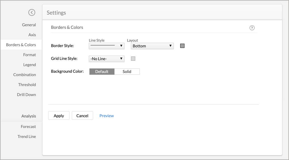
The following table describes various options available in the Borders & Colors tab.
Option Description Border Style This option is used to customize the chart border. It consists of three options:
- A drop-down to set the border Line Style.
- A drop-down to set the Layout.
- A color picker to set the border Line Color.
Grid Line Style This option is used to customize the chart grid line. It consists of two options:
- A drop-down to set the Grid Line Style.
- A color picker to set the Grid Line Color.
Marker Fill ColorThis option is used to customize the default color of the chart fill for single data series. Background Color This option is used to set the chart background. Available options are:
- Default - Set the default setting as chart background.
- Solid - Set the selected single solid color as the chart background.
- Customize the chart and click Apply.

Format
Zoho Advanced Analytics app allows you to format all the columns used in the report creation individually. You can also format the data labels and tooltips individually.
Let us see how to format the below chart. Here, the data labels with extended decimal values make it difficult to interpret the chart. This is where formatting comes in handy.

Let us now see how to resolve this issue.
- From the required chart, click the Settings option in the toolbar.
- The Settings page will open. Click the Format tab.
- Click the Format link inline to the respective column name.
- In the Format Column dialog that appears, choose '2' from the drop-down that is available next to Decimal Places. This will limit the units after the decimal point to two.
Apart from decimal places, there are various other options that you can use to customize your data. Also, please note that the formatting options in this dialog will change based on the data type of the column. Click here to learn more.
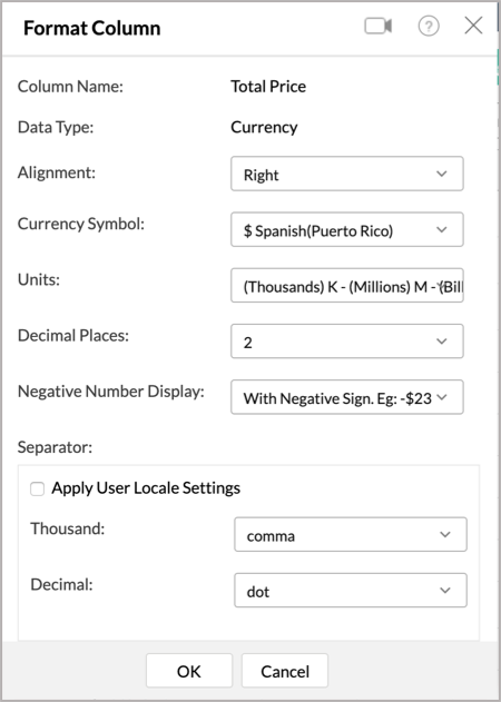
- Click OK.

The chart after formatting will look as shown in the screenshot given below.

Note: In case, if you have created a Pie chart, the Zoho Advanced Analytics app allows you to format the Percentage and Value datatype from your Format dialog.
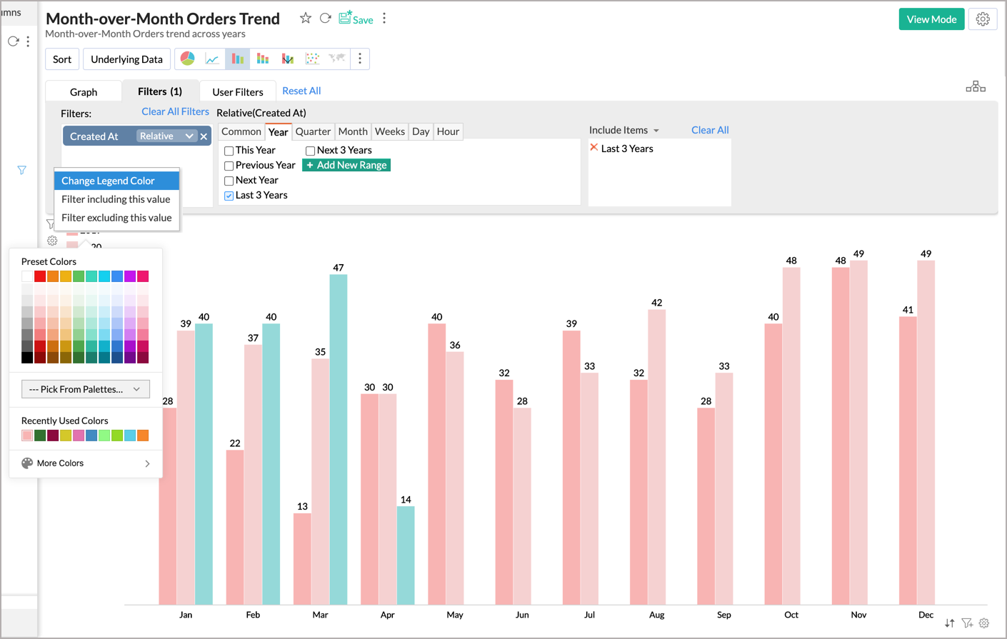
Legend Settings
The legend in a chart provides a quick overview of the different data series involved in the chart along with the color associated with each series. Legend consists of Legend Title and Legend Items. Each legend item consists of a colored box that indicates the data series and the name of the data series.
In the Zoho Advanced Analytics app, by default, the legend will be placed on the right side of the chart, and legend items will be added to it depending on the data series involved in the chart. You can customize the legend position, legend title, legend filters, and the colors of each data series easily.
To customize the legend:
- Open the corresponding chart and click the Settings option in the toolbar.
- The Settings screen will open. Click the Legend tab.
- The Legend tab provides various options to customize the legend properties. Set the options as required and click Apply.
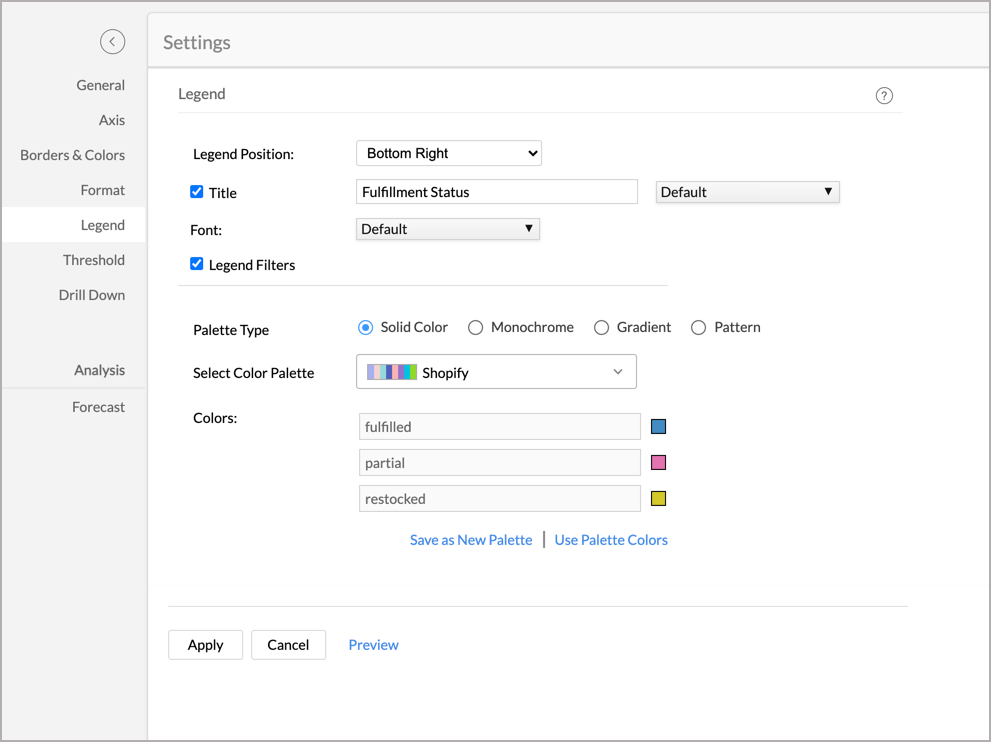

The following table describes the options available in the Legend tab:
| Option | Description |
| Legend Position | This option allows you to set the position of the Legend in a chart. Supported positions are:
|
| Title | The checkbox allows you to show or hide the legend title. In the text field, you can change the default title of the legend. You can also customize the font style of the legend title. |
| Font | Using this option you to customize the font style of the legend items. |
| Legend Filters | Select this option to enable legend items to act as filters in chart view mode. This allows users to dynamically filter the data series using the legend items. Refer here to know how to use the Legend filters to filter a data series. |
| Palette Type | Select the Palette type. Zoho Advanced Analytics app offers three types of palettes. They are:
|
| Color Palette | Select the color palette to apply color for your data series. You can also select a color palette based on the palette type that is selected. Zoho Advanced Analytics app has a predefined set of color palettes that you can choose from. Apart from this, you can also add new color palettes. |
| Labels & Colors | You can also rename your label names by providing the required legend names in the displayed labels text field. Using this option, you can override the colors of the individual series of the chart. Once you override the palette, you will find the following options.
|
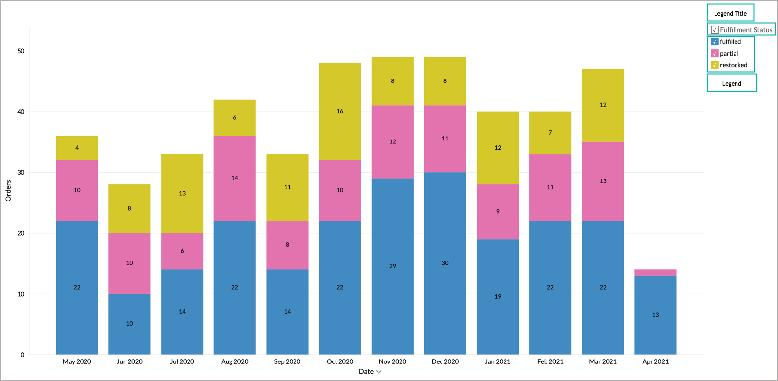
The following screenshot illustrates the resulting legend when Legend Title and Legend Filters options are selected and Legend Position is set to Right.

You can also change the color of each data series using the corresponding legend item in the chart Edit Mode. Refer to the Customizing Chart Colors section to know how to customize chart color using a legend.
Adding Threshold
Zoho Advanced Analytics app provides you an option to draw threshold lines in a chart to highlight specific values. Threshold lines can be added horizontally or vertically at a fixed value on the X or Y-axis of a chart. A threshold will be useful to highlight specific values for better visualization and for comparing the data series.
For example, you can set a threshold line to represent the maximum sales target, and another to represent the lowest acceptable sales target to spot regions that are out of sales target easily. Zoho Advanced Analytics app allows you to add two types of threshold lines - Static and Dynamic Threshold lines.
Static Threshold: The static threshold function allows you to set a constant value as a threshold line.
To add a threshold in your chart:
- From the required chart and click the Settings option in the toolbar.
- Click the Threshold tab in the Settings page.
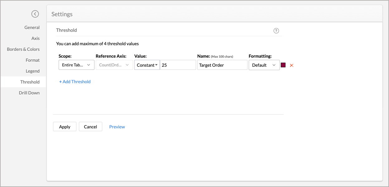
- Select the Scope of the Threshold, the available options are:
- Entire Table: Applies the same threshold for the entire table.
- Per Cell: Applies a threshold for a single cell. This option is recommended while creating dynamic thresholds. It is not applicable for charts with multi Y-axis chart.
- Select the reference axis from the Reference Axis drop-down.
- Select Constant from the Value drop-down and enter a value.
- Enter the desired name of the threshold line in the Name text box.
- Select the line type and color from the Formatting drop-down.
- You can add more thresholds using the +Add Threshold link.
- Click Apply once you have added the required threshold lines.

Dynamic Threshold: The dynamic threshold feature allows you to apply dynamic functions such as Sum, Average, Minimum, and Maximum over the columns in your reference axis or over a different column.
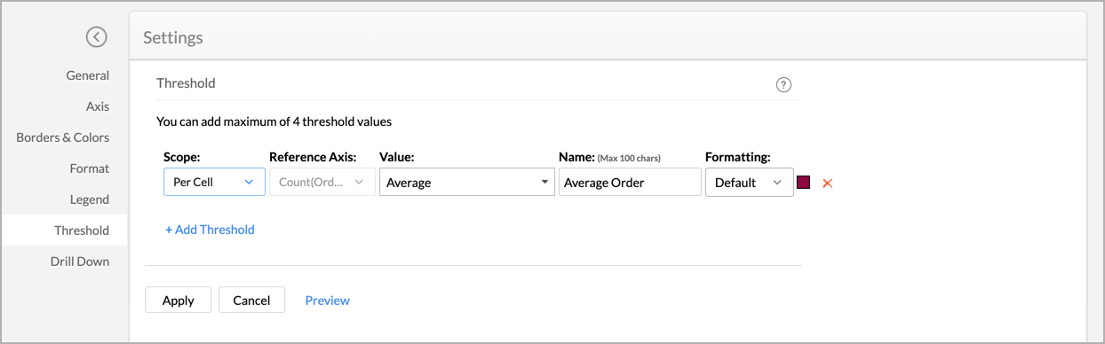
To add a threshold in your chart:
- From the required chart and click the Settings option in the toolbar.
- Click the Threshold tab in the Settings screen.
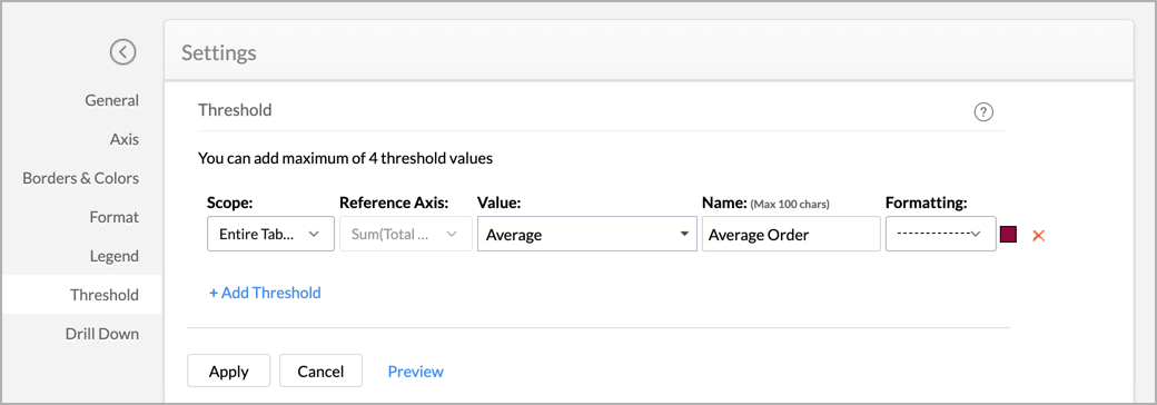
- Select the Scope of the Threshold, the available options are
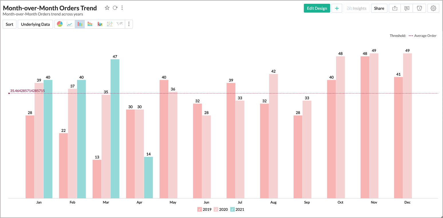
- Per Cell: Applies a threshold for a single cell. Not applicable for columns with multiple Y-axis. Shown below is a sample screenshot displaying the threshold line based on the per cell. It displays the average sales per cell.

- Entire Table: Applies the same threshold for the entire table. Shown below is a sample screenshot displaying the threshold line for the entire table. It displays the average sales for the entire table.
- Per Cell: Applies a threshold for a single cell. Not applicable for columns with multiple Y-axis. Shown below is a sample screenshot displaying the threshold line based on the per cell. It displays the average sales per cell.
- Select the reference axis in the Reference Axis drop-down. If you only have one Y-axis value, it will be selected by default.
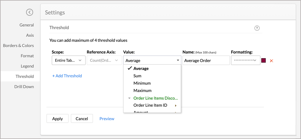
- Select the function that you wish to apply from the Value drop-down. You can add dynamic functions such as Sum, Avg, Min, and Max on the reference axis column or on a different column.
- Enter the desired name of the threshold line in the Name text box.
- Select the line type and color from the Formatting drop-down.
- You can add more thresholds using the +Add Threshold link.
- Click Apply once you have added the required threshold lines.


The following screenshot illustrates a chart with two threshold lines.

You can remove an existing threshold any time using the Remove link next to the corresponding threshold in the Settings screen.
Chart Drill Down Path
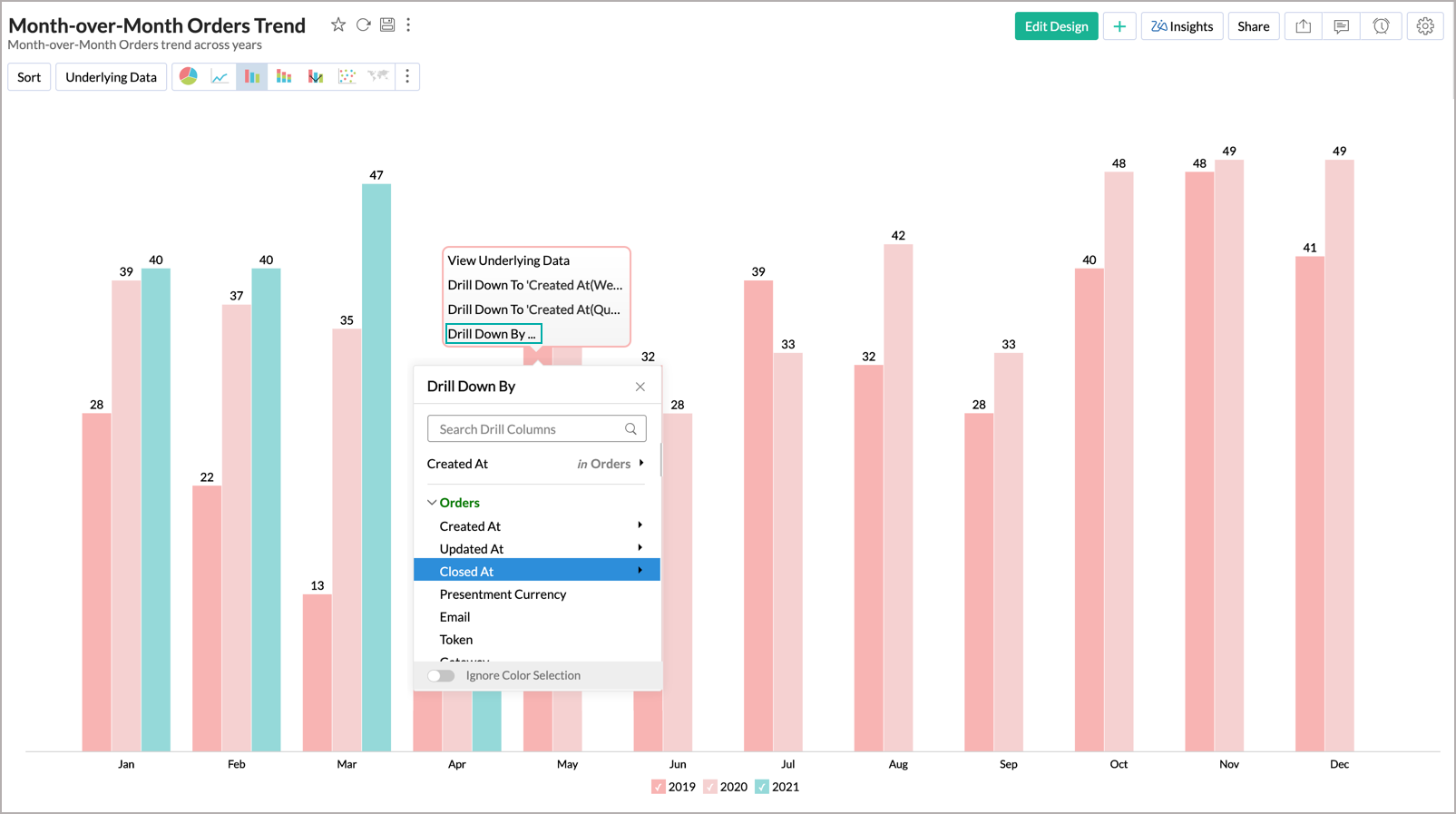
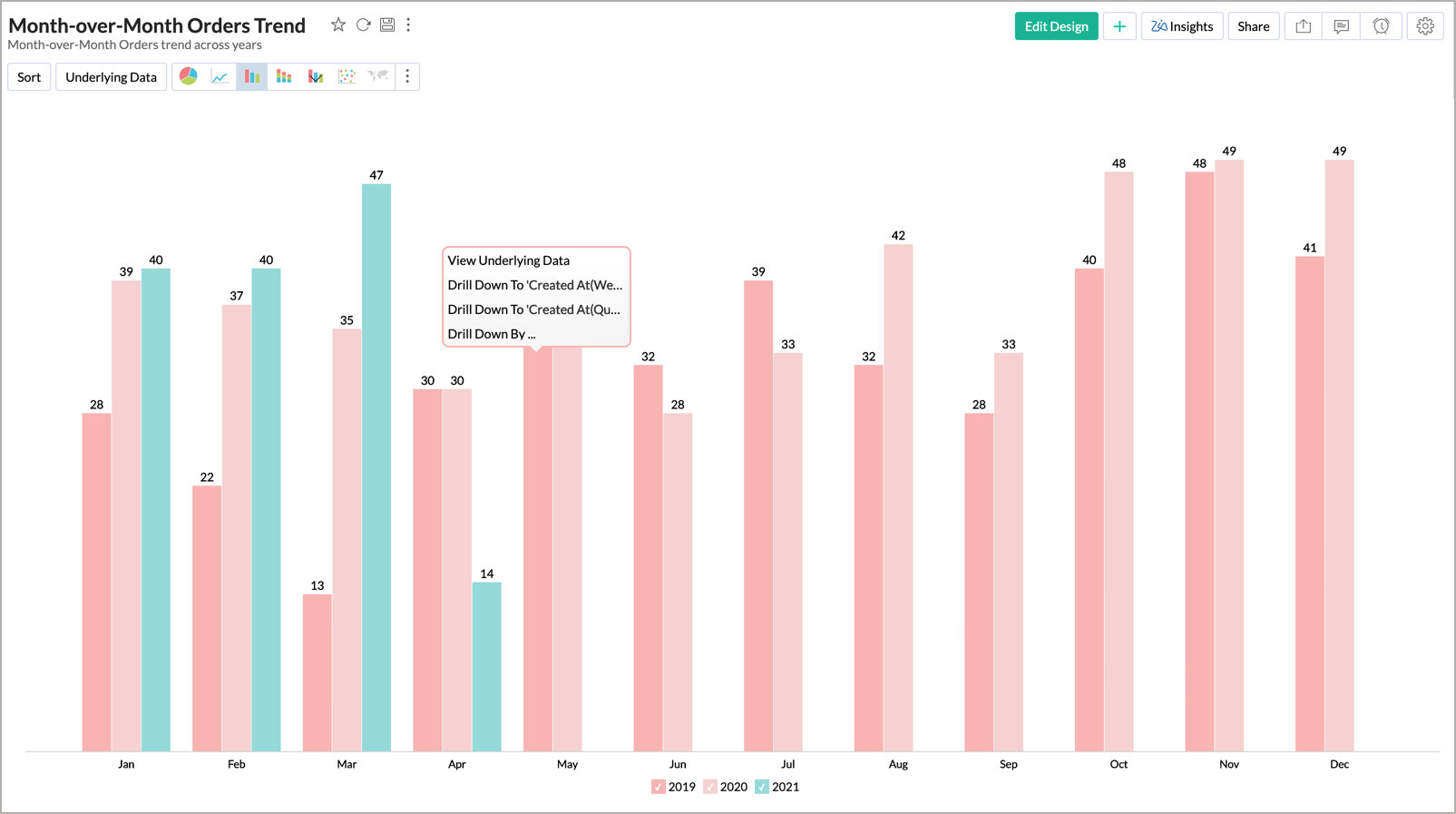
Zoho Advanced Analytics app allows you to drill down on your chart, enabling you to do powerful exploratory analytics. With this, You can click on any point in the chart and visualize the underlying data points as a new chart. Zoho Advanced Analytics app by default provides a Drill Down path for the Charts.
Enabling Chart Drill Down
You can also specify a custom drill-down path for your charts using the Drill Down tab of the Settings page. The following are the steps to define a drill-down path:
- Open the corresponding chart and click the Settings option in the toolbar.
- The Settings screen will open. Click the Drill Down tab.
- The Drill Down tab will open.
- In case if there are any drill paths already defined at the table level it will be displayed by default. You can modify the drill-down paths or define a new path for the chart axis.
- You can define a drill-down path for X-Axis Path and Color Path.
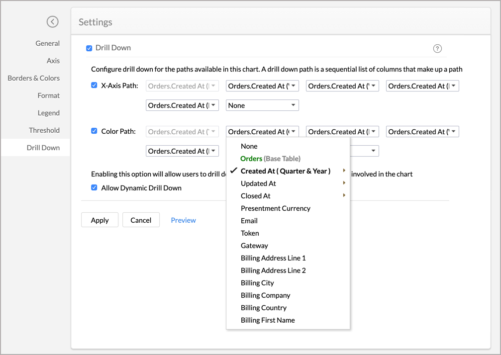
- Click Apply. The drill-down path will be defined for this chart. This will be listed in your chart as Drill Down To 'Column Name to drill down'.


This path is specific to the chart where you are defining it. If you want to define the path globally (i.e., for all charts), then you need to define that for the corresponding columns at the table level.
Disabling Chart Drill Down
You can disable the drill down option from your chart by unselecting the corresponding checkboxes.
- Drill Down - Deselect this to completely remove the drill down option from your chart.
- X-Axis Path - Deselect this to remove the drill down option based on the X-Axis column Path from your chart.
- Color Path - Deselect this to remove the drill down option based on the Color column Path from your chart.
- Allow Dynamic Drill Down - Deselect this to remove the dynamic Drill Down By option from the chart.
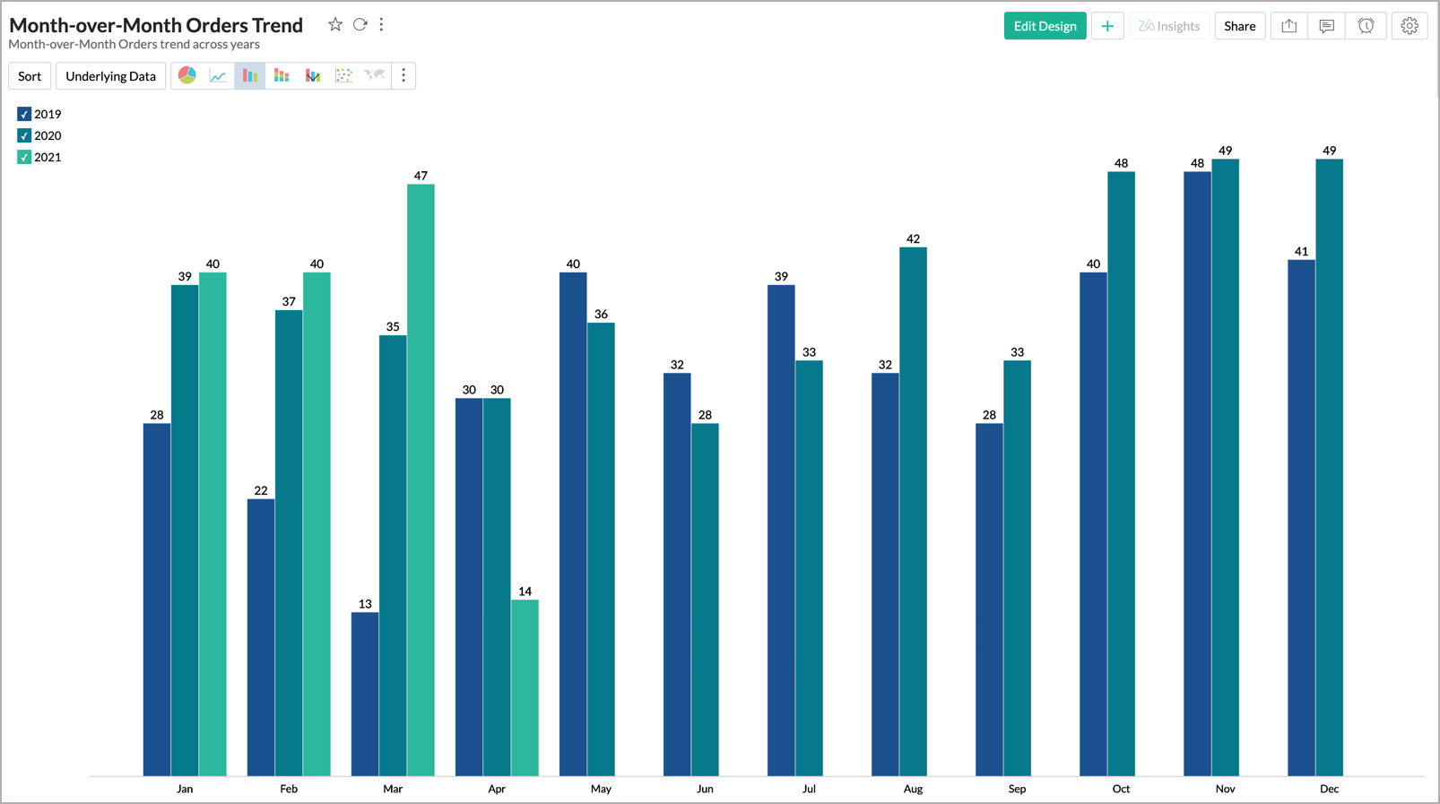
Customizing Chart Color
In the Zoho Advanced Analytics app, when you create a chart, colors to represent the various data series involved will be automatically assigned to your chart. This will be picked from the color palette assigned to your chart. However, you can change the default colors of the data series.
To customize the data series colors in your chart:
- Open your chart in Edit Design Mode.
- Click on the color box of the legend item of the data series for which you want to change the color.
- Select Change the Legend Color option in the menu that shows up.
- A color picker dialog opens. Choose the required color from the full range of colors available. You can also specify the color by specifying the RGB value or the Hexadecimal value in the corresponding fields provided or choose a color from the listed color palette.
- Click OK after choosing the required color.
The newly chosen color will show up in your chart for the corresponding data series as shown below.
You can also customize the legend colors using the Legend tab in the Settings option. Refer to the legends section to learn more.
We have now seen how to customize the chart colors for a single chart. It is also possible to change the chart colors for all the charts in your Zoho Advanced Analytics app. Refer to the color palette document to learn more.
Note: You can customize the color of the single data series using the Marker Fill Color option in the Borders & Colors tab in the Settings screen.