
There is a version of the pop up survey that everyone has experienced and nobody likes. You land on a page. The content hasn't even loaded yet, and a full-screen modal is already asking you to rate your experience. You have had no experience yet. You close it immediately, mildly annoyed, and the company gets nothing.
Then there is the version that works. You are halfway through reading a product comparison page when a small slide-in appears in the corner, asking one question. And before you have really thought about it, you have answered. The company now knows something specific and useful about a visitor who was actively engaged.
The difference between those two experiences is not the survey itself. It is the timing, the placement, the number of questions, and the judgment about when to ask versus when to stay out of the way.
What makes a pop up survey different from other feedback methods
A pop up survey on a website is a feedback form that appears during a visitor’s session, triggered by a specific behavior rather than sent after the fact. That timing is what makes it valuable and risky.
Unlike an email survey that arrives a few days after someone has bought something, or a survey link buried in the footer, a website pop-up reaches people while they are actually using the site. They’re looking at a particular page and trying to do something. So, the question can be about what they are seeing or doing right then. That usually gives you more useful feedback than asking someone to remember the experience later. They don’t have to think back to what they felt at the time because they’re still in the middle of it.

That is also where things can go wrong. If the pop-up shows up at a bad time, gets in the way of what someone is trying to do, or asks them to spend too much time answering questions, it can make the experience worse. Forrester’s 2024 US Customer Experience Index found that CX quality among US brands reached an all-time low, with 39% of brands seeing a decline in CX quality over the previous year. Digital experience friction was one of the contributors. A survey pop-up that gets in the way is one more source of friction that the business has added itself.
The five trigger types that determine whether a pop up survey works
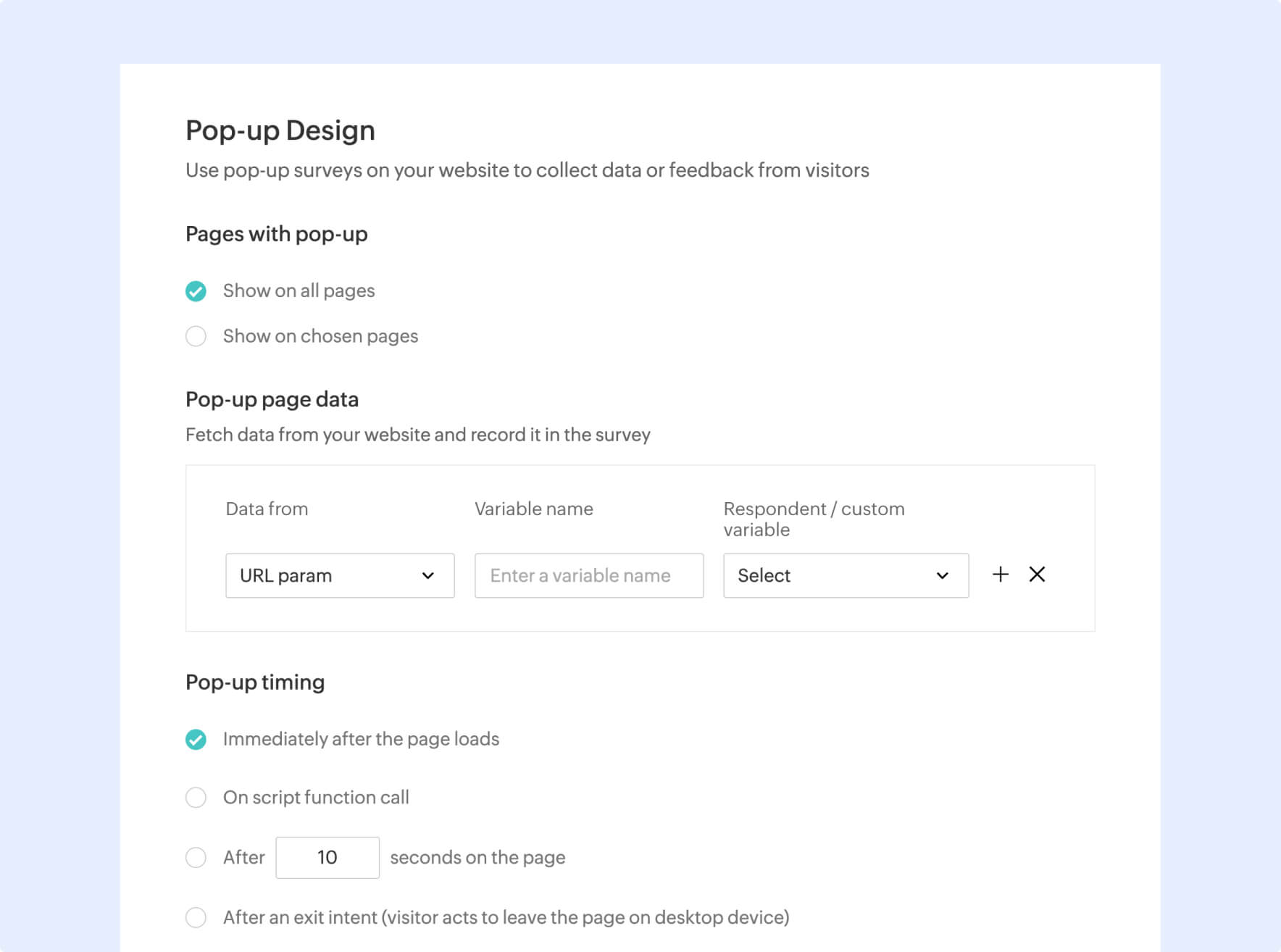
The single biggest decision in pop up survey design is not what you ask. It is when you ask it. Every pop up survey on a website should be triggered by something. Choosing the right trigger is what separates a survey that generates useful data from one that generates exits. Here, let us look at the five parameters based on which a pop up survey should be triggered.
- Time on page: The survey appears after the visitor has been on the page for a set amount of time. This is the most common trigger and works well for content pages where engagement time is a proxy for genuine interest. A visitor who has spent 45 seconds on a blog post is worth asking a question. One who has been on the page for four seconds is not.
- Scroll depth: Here, the survey appears when the visitor has scrolled past a certain percentage of the page. Scroll depth is one of the most reliable engagement signals available. A visitor who has scrolled 70% through a pricing page is actively reading and is a good candidate for a one-question pop up.
- Exit intent: This involves showing the survey when someone is about to leave the site, usually when they move their cursor toward the close or back button. This is useful for people who looked around but didn’t end up buying or converting. A question such as “What stopped you from completing your purchase today?” gives you a chance to find out what happened rather than guessing from page analytics.
- Page-specific triggers: In this case, the survey appears only on specific pages according to rules you define. A post-checkout thank-you page, a specific product page, or a support article are examples where a highly targeted one or two question pop up is directly relevant to what the visitor just did.
- Session behavior: The survey appears based on what the visitor has done during the session, such as visiting three or more pages, returning for the second time, or spending more than five minutes on the site. Session-based triggers produce some of the highest-quality responses because they target engaged visitors with sufficient context to provide a meaningful answer.
Pop up survey examples that work and why
Checkout abandonment survey
- Trigger: Exit intent on the checkout page
- Question: What stopped you from completing your order today?
- Response type: Multiple choice with an open-ended “other” option
This is one of the most useful pop-up surveys because you’re asking the question right when someone decides not to finish the purchase. The multiple-choice options make it quick to answer, while the “other” field gives people a way to tell you about something you didn’t include.
Post-article feedback survey
- Trigger: Scroll to 80% of a page
- Question: Was this article useful for what you were looking for?
- Response type: Yes / No with optional follow-up if No
By this point, the visitor has actually read most of the page, so the response is more useful than feedback from someone who only landed on the page and left. The yes/no question takes almost no effort, and only people who answer “No” are asked for more detail.
Feature discovery survey
- Trigger: First visit to a specific product feature page
- Question: How did you hear about this feature?
- Response type: Multiple choice
Use this when you want to know how people are finding a particular feature. Your attribution data may tell you which channel brought them to the site, but it may not tell you how they first heard about that feature.
Support page friction survey
- Trigger: Time on page exceeding 60 seconds on a help article
- Question: Did this article answer your question?
- Response type: Yes / No
Someone who has been sitting on a help article for more than a minute may still be looking for an answer. Asking a simple yes/no question gives them an easy way to say whether the article helped. It also gives you feedback you can use when the support content needs work.
How many questions a pop up survey should have
One. Ideally one, occasionally two, never three.
This is not a preference. It is a function of how pop up surveys work. A visitor encounters a pop up survey during an active session. They are in the middle of doing something else. The more questions you add, the higher the cognitive cost, and the more likely the visitor is to close the survey without answering.
Baymard Institute’s UX research found that 88% of online consumers report they are less likely to return to a site after a bad experience. A pop up survey that interrupts a flow with five questions is a bad experience. One well-timed question with a clear answer format is, at worst, a minor pause.
If you genuinely need two questions, make the second one conditional and only show it to respondents who gave a specific answer to the first. This way, only respondents whose answers warrant a follow-up see the second question.
Design choices that protect UX
The format and placement of a website pop up survey matters as much as the timing and the questions. Here are the factors you should consider while designing a pop up survey that doesn’t impact user experience.
Size and placement: A slide-in from the bottom corner is significantly less disruptive than a center-screen modal. It does not block the content the visitor is reading, and it can be dismissed without losing their place on the page.
Close button visibility: The close button should be obvious and easy to hit, especially on mobile. A pop up survey that is hard to dismiss creates frustration regardless of how good the question is.
Mobile-specific design: A pop up survey that looks clean on desktop can be unusable on a phone if it has not been tested at smaller screen sizes. On mobile, simplicity is even more important. The survey should ideally have one question, large tap targets, and an immediately visible close option.
Frequency capping: A returning visitor should not see the same pop up survey every session. Set a frequency cap so that once a visitor has seen the survey, whether they responded or not, they do not see it again for a set period.
Response time expectation: The survey should look completable in under 30 seconds. If it does not, visitors will not engage with it regardless of how interested they are in giving feedback.
Using Zoho Survey to build website pop up surveys
Zoho Survey’s web embed and pop up survey features allow teams to build, trigger, and deploy website survey pop ups without needing a developer for every configuration change. Trigger logic can be set by time on page, scroll depth, or exit intent. Display rules let teams target specific pages or visitor segments without affecting the rest of the site.
Branching logic means the second question, if needed, appears only based on the respondent’s answer to the first, keeping the experience focused and friction low. And response data feeds directly into Zoho Survey’s reporting dashboard, where results can be segmented by page, session behavior, or any demographic variable collected in the survey.
For teams running multiple pop up surveys across different pages or products, the ability to manage all of them from a single dashboard, compare response rates, and adjust trigger logic without deploying new code is what makes the program sustainable rather than something that requires a sprint to update.