
If someone visits your pricing page, looks around for eleven seconds, and leaves, your analytics can tell you that they were there, how long they stayed, how far they scrolled, and possibly where they moved their mouse. What it can’t tell you is what they were thinking when they decided to close the page. Maybe the price put them off. Maybe none of the plans seemed right for their team. Maybe they were looking for something and couldn’t find it.
That’s where an exit-intent survey can help. Instead of trying to work out what happened from the visitor’s behavior later, you can ask them while they’re still there. The reason for leaving is much easier for them to explain when it has just happened.
What exit intent actually means
Exit intent is just a way to figure out when someone is likely to leave a website. On desktop, the site can look at cursor movement. If someone moves the cursor toward the top of the browser, they may be getting ready to go back or close the tab. You can’t do that on a phone because there’s no cursor. So you need to look at things like scrolling, time on the page, or whether someone switches apps.
Once that signal is picked up, the website can show something to the visitor. Usually, that’s a discount, an offer, or some other attempt to get them to stay. An exit intent survey uses the same trigger, but for a different reason. Instead of offering something in return, it asks a short question about why the visitor is leaving. You’re essentially using the same moment to learn something rather than make another sales pitch.
Why analytics alone can't explain website conversion problems
Most teams already have a good idea of where people are dropping off. The pricing page may get a lot of visitors but few stick around. People may start filling out the signup form and leave halfway through. Or a product page gets plenty of traffic, but hardly anyone adds anything to the cart. The analytics will show you where people dropped off, but not necessarily why. That’s where teams can end up making changes based on what they think is happening rather than what visitors are actually telling them.
The scale of the problem is well documented, at least on the ecommerce side. The Baymard Institute, an independent research firm that has spent close to two decades studying checkout usability across large-scale ecommerce sites, has tracked cart abandonment at an average of 70.22% across 50 separate studies.
Separately, Baymard's own checkout usability testing has found that fixing documented usability issues can lift conversion rates by an average of 35.26% on large ecommerce sites. That's a massive gap between what a typical checkout actually achieves and what it could achieve, and closing it starts with knowing which of the dozens of possible friction points are actually driving people away on a given site.

An exit intent survey narrows that guesswork considerably. Instead of testing five hypotheses about why a page underperforms, a team can ask the people leaving it.
Exit intent survey questions that actually surface something useful
The question you ask matters more than most of the other setup decisions. Something vague like “Why are you leaving?” is easy to ignore and usually doesn’t give you much to work with. A question that is more specific and takes almost no effort to answer is much more likely to give you something useful.
There are a few ways to approach it. On a busy page, a short list of reasons is usually easier to follow. Price, not enough information, a technical issue, or simply browsing are some obvious options, with a space for “other” if none of them fit. For checkout or signup pages, where there may be fewer visitors but they have a stronger reason to be there, an open-ended question can be better. Asking what nearly stopped them from completing the action can give you more detail than a list of boxes. On pricing and comparison pages, it can also be useful to ask whether they found what they needed somewhere else. That’s one way to hear directly from the people considering competitors.
Whatever the format, the question needs to be answerable in under fifteen seconds. A visitor who's already decided to leave has no patience left for a long form, and a survey that takes too long to complete will get closed just as fast as the tab it was trying to save.
Exit intent survey examples worth learning from
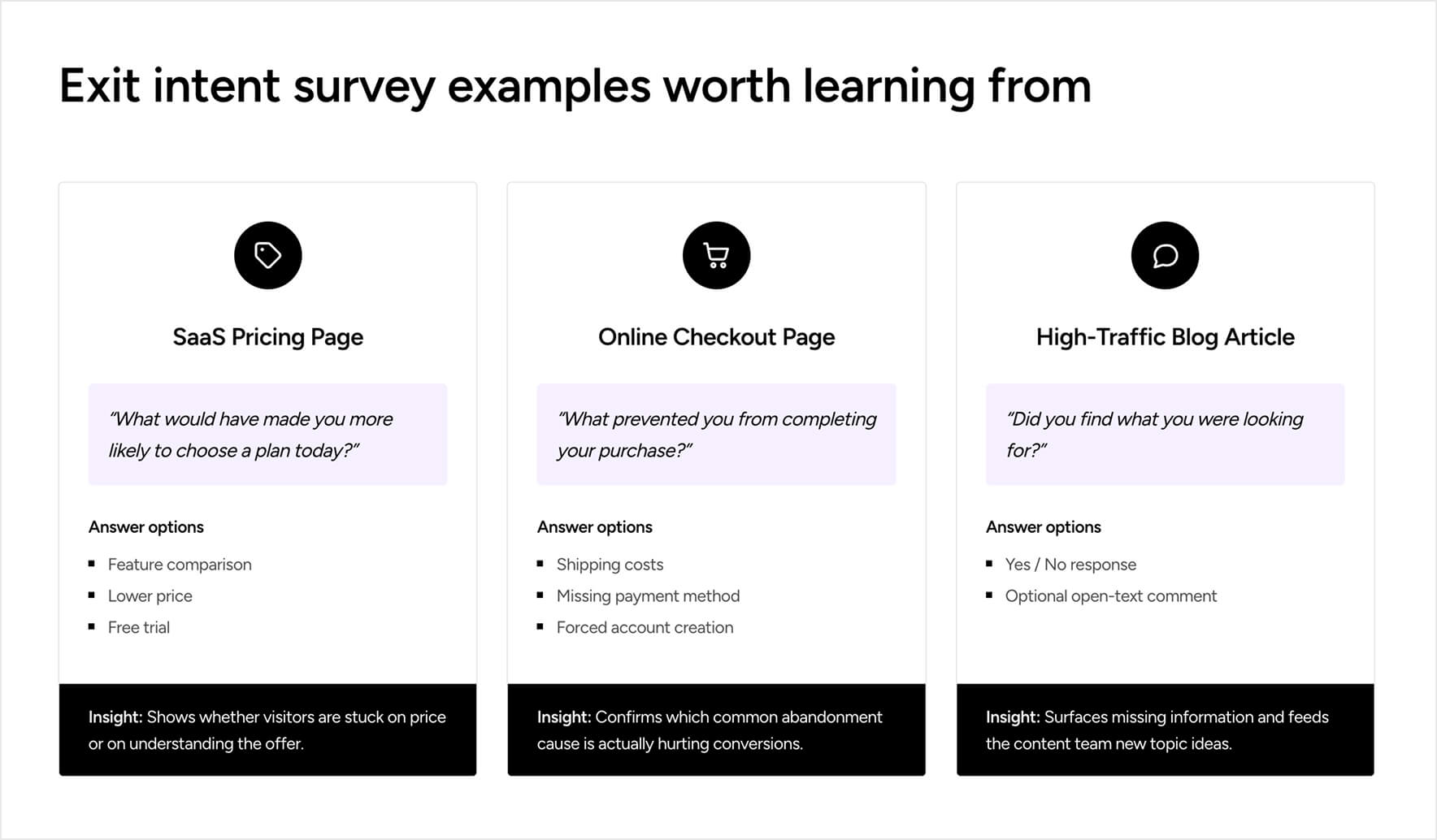
A SaaS company could place a one-question survey on its pricing page, asking what would have made the visitor more likely to choose a plan that day. The options are feature comparison, a lower price, or a free trial. After collecting responses for a few weeks, the pattern can tell the team whether people are mainly struggling with the pricing itself or whether they don’t understand what they’re getting. Those are two different problems and need different fixes.
An online retailer could do something similar on the checkout page by asking what prevented the visitor from completing the purchase. The answers might include shipping costs, not having the payment method they wanted, or being asked to create an account. Since these are fairly common reasons for people to abandon checkout, the survey can help confirm whether one of those issues is actually affecting customers.
A content site or SaaS blog could keep things even simpler on high-traffic articles. A question like “Did you find what you were looking for?” followed by an optional text box gives readers an easy way to say what was missing. It can work as an exit survey, but the responses can also give the content team ideas for articles or topics to cover next.
Setting this up without slowing the site down
It’s easy to see why exit-triggered pop-ups can be a concern. Show the survey too soon, before someone has really had a chance to look around, and it can come across as annoying rather than useful. The same goes for performance. If the survey slows the page down, you’ve created the kind of bad experience you were trying to avoid in the first place.
Zoho Survey's embeddable survey widgets are lightweight enough to sit on a page without affecting load time, and can be configured to trigger only after a minimum time on page or scroll depth has been reached. So the survey only appears for visitors who've actually engaged with the content rather than everyone who lands and immediately bounces. Skip logic lets the survey branch based on the first answer. This way, a visitor who selects "price" as their reason can be shown a quick follow-up about what price point would have worked. In contrast, a visitor who selects "technical issue" gets a different follow-up entirely.
Also, with Zoho Survey, response data can be routed automatically into reporting dashboards segmented by page. With this feature, a team can see at a glance whether pricing page exits and checkout exits are actually driven by the same problem or two completely different ones.
Turning exit survey responses into actual fixes
A handful of responses citing the same friction point is a pattern worth investigating. A single response is just one visitor's experience. The real value shows up once a team has enough responses on a specific page to see which reason keeps coming up. Cross-tabulating exit survey data by traffic source, device, or visitor type often reveals that the same page is failing different segments for different reasons, which a single aggregate number would completely hide.
None of this replaces the rest of a conversion optimization process. It just makes the starting point far more accurate. Instead of running an A/B test on a hunch about what might be wrong with a page, a team can test a change that visitors have already told them would matter. That's a meaningfully different starting position, and it tends to shorten the distance between noticing a conversion problem and actually fixing it.