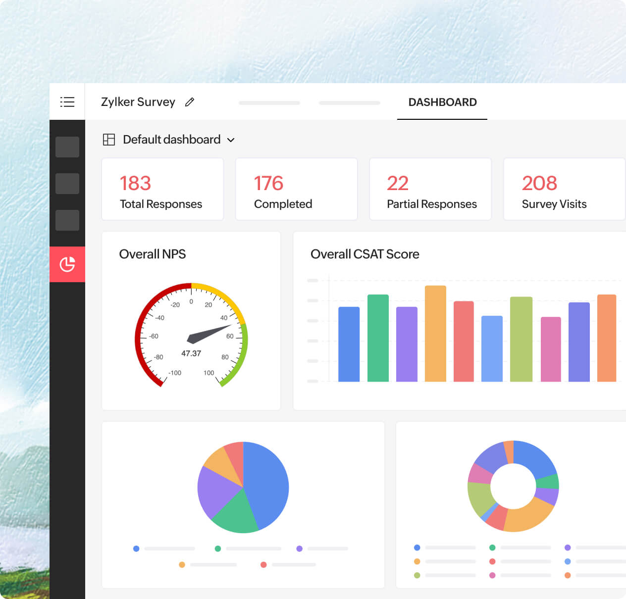
Get started instantly with the default dashboard
Every survey comes with a ready-made default dashboard. It gives you a bird’s-eye view of your overall response data, complete with visual summaries of key metrics. It’s a handy starting point that's perfect for quick overviews or sharing a snapshot with your team.
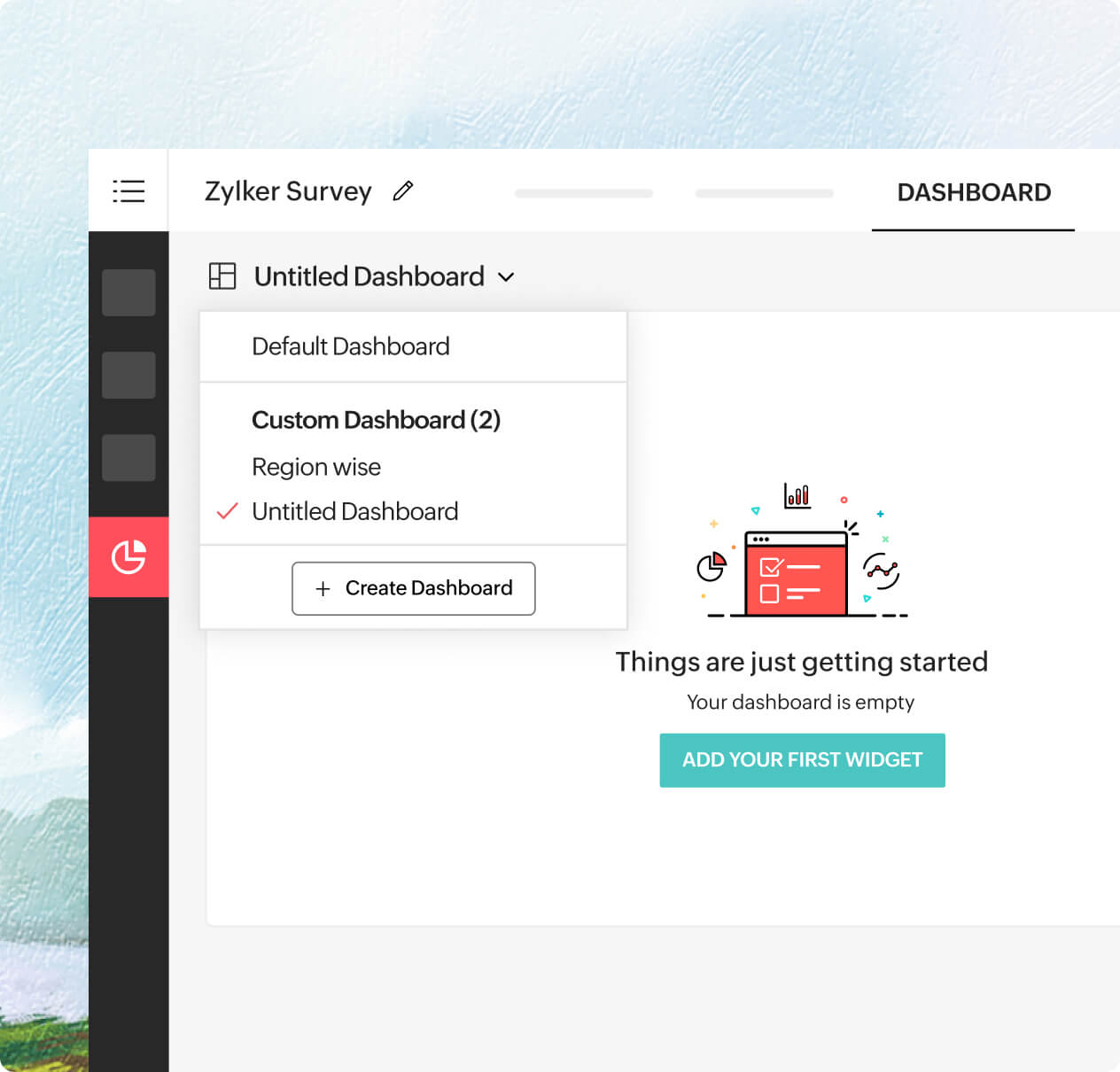
Create a custom dashboard that fits your workflow
Need something more specific? Build your own. Create a custom dashboard and choose which reports to add. You can add cross-tab reports, trend lines, or sentiment charts. You decide the layout and the order.
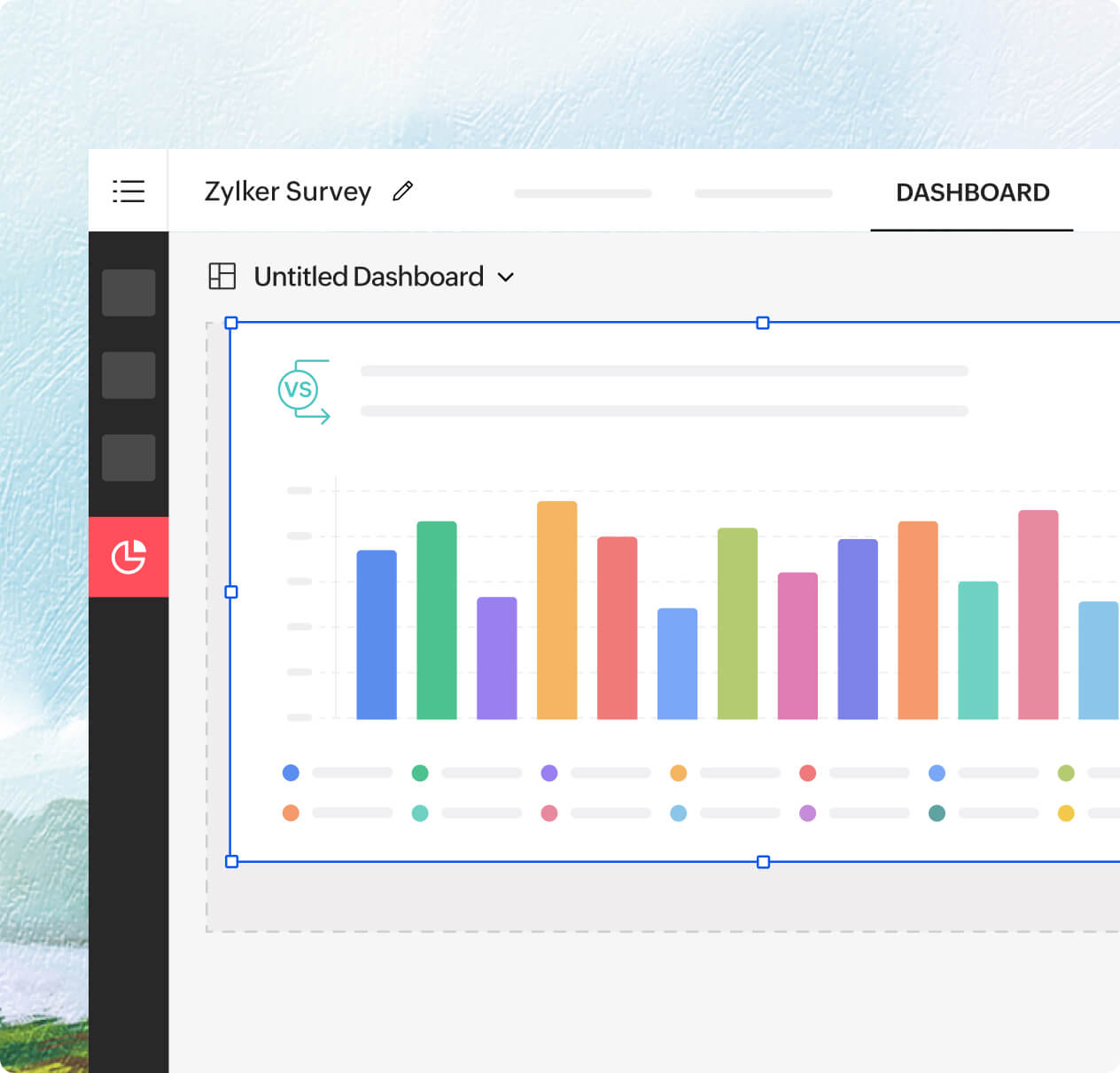
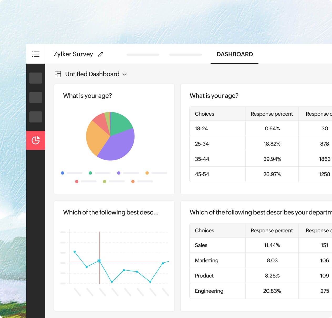
Add any chart or table as a widget
Found a chart that tells a compelling story? Pin it to your dashboard. Whether it’s a CSAT score over time, a breakdown of responses by region, or a word cloud of open-ended feedback, just one click adds it as a widget.
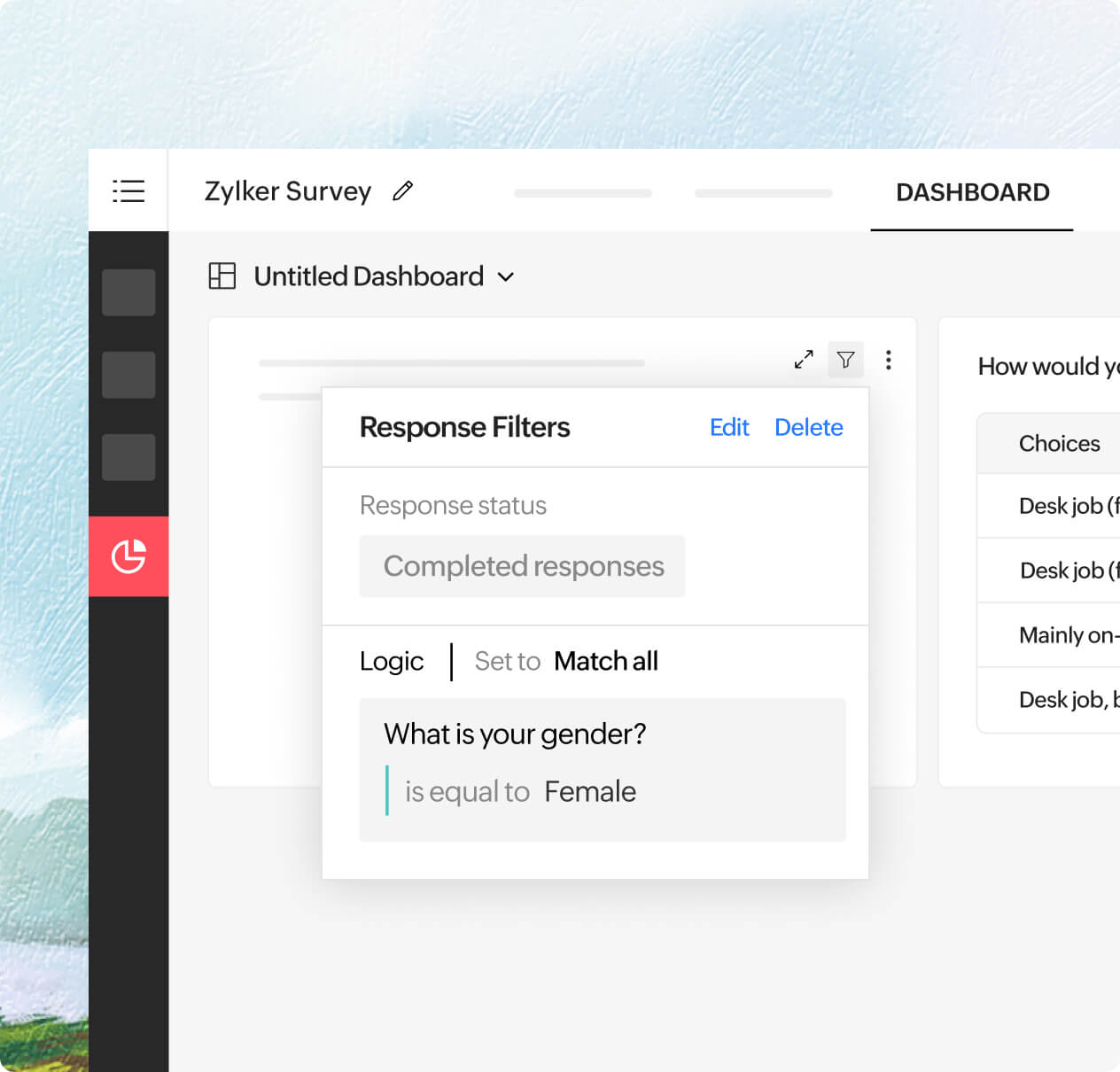
Layer custom filters in reports, dashboards, and widgets
Start by applying a filter to a report (say, only Gen Z respondents). Then add that report to your dashboard and apply another filter (like responses from urban regions). You can also apply simple filters to each widget. This layered approach lets you combine multiple filters in a way that gives sharper, more refined insights without touching your original data.
Resize, reorder, rearrange
Dashboards aren’t static—they’re as flexible as your needs. Stretch a chart to highlight a key trend, move a widget closer to a related metric, or drag sections around to better tell your data story. Rearranging is as easy as dragging and dropping.