There are two kinds of reports for any organization. The first one gives visibility across the whole product, providing a quick snapshot of your progress to someone who isn’t constantly in touch with the team. It’s big picture stuff. The second kind gives a deeper analysis and has an immediate impact on team decisions.
Whether you’re an agile team, a traditional team, or somewhere in between, building and monitoring reports is an essential process the team is always a little wary of. There are usually some reports with no one knowing their exact purpose. Maybe it’s a template or maybe it’s what the previous employee was doing. It’s important to focus on the right agile metrics that directly benefit your product’s progress, and not blindly add reports without questioning them.
Key metrics of agile reporting
Below are some key metrics to keep in mind when it comes to agile reporting:

Success rate: Reporting helps teams measure their success rate against their goals.
Defects: The time invested in detecting and resolving issues can spark useful conversations on the processes and techniques applied during sprint retrospectives.
Time to market: This is the amount of time that the agile project takes to provide value to a business.
Total project cost: An agile project’s total cost is directly related to its duration. Since agile projects typically deliver results more quickly, this usually leads to a reduction in overall cost.
Importance of agile status reporting
Reports provide agile teams with greater visibility. They display team efforts, help teams monitor their progress toward key goals, and allow users to plan effectively. Agile status reporting can show teams how to incorporate timely changes so they can keep up with changing business environments. Product owners can leverage agile status reports to initiate constructive conversations, as well as set standards with their team and external stakeholders.
Here are some fundamental agile reports you can’t go wrong with
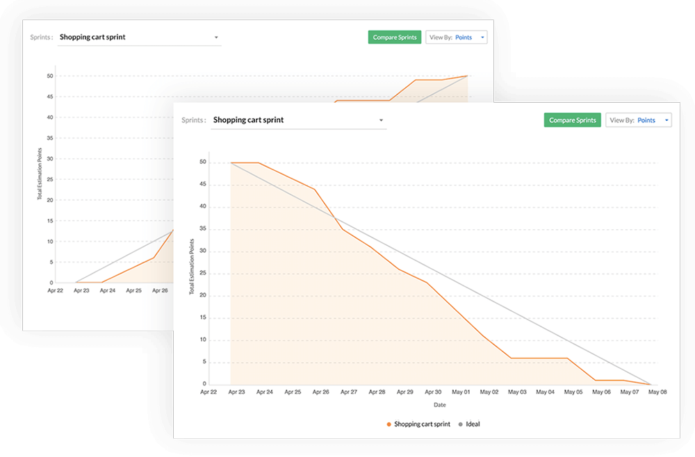
Burndown and burnup charts
A burndown chart maps the remaining amount of work left against a timeline. A burnup chart maps the the amount of work completed over a timeline. Both charts can be mapped for a sprint, an epic, or a release.
At one glance, an agile burndown chart shows you how much work you’ve completed, how much work you have left, the ideal rate of completion, and a forecast of how much you need to complete each day if you are to complete your goals, given your current progress. It’s a simple yet powerful report.
Velocity graph
For every sprint, a velocity graph compares the amount of committed estimation points and completed estimation points. Using this data, the amount of average velocity is calculated.
The velocity of a team is a measure of their capacity and gives the team an idea of how much they can take on in the next sprint. A team’s velocity is bound to fluctuate initially while the team finds their stride and refines their estimation technique.
A crucial aspect of Scrum methodology is making decisions based on the knowledge you have, and an agile velocity graph helps you do just that. The premise is that the previous sprint’s velocity should nudge a team in the direction of finding the perfect amount of work so they can complete all their sprint goals within the time box. After the initial fluctuation, a team’s velocity eventually tapers to a definite number or range.
Cumulative flow diagram
A cumulative flow diagram maps the number of work items in each status over a period of time.
In a typical example, the number of work items under “To do” goes down over the period of the sprint, and the number of work items under “Done” should plausibly start to increase, at least from the middle of the sprint.
A cumulative flow diagram helps you identify bottlenecks in your workflow. By comparing different statuses in your workflow, you can see at which stage they stagnate the most and, consequently, which part of the workflow needs to be more efficient.
Status timeline and item process time
The status timeline tracks the journey of a work item through its stages, along with information on how much time it spent in each, and the members who made the transitions. It also shows you the stage in which the work item spent the maximum and the minimum amount of time.
The item process report gives the same information the status timeline report does, but on a sprint level.
In a sense, the item process report gives you the same information the cumulative flow diagram does from a different perspective. Cumulative flow diagrams show you how your entire sprint is progressing. If you want an item-by-item analysis, the item process report is more useful.
User Profile
Accessibility and visualization make all the difference when it comes to data. Having a personal agile metric dashboard for each teammate is often incredibly useful.
Numbers can tell you everything
A metric belongs in a report only if it directly aids some decision or is a clear indicator of progress. An ideal agile status report focuses on actionable information. Ensure your reports are concise and functional at the same time to get the most of each sprint/ to help your team make every sprint a success.