Simply built, but built different
A bar race chart is just as easy to bulid as any other chart.
Complete customization
From the chart legend to the speed of the animation, you can customize every element of the Race Chart, all from the chart side pane.
The smoothest and the smartest
With automatic smart axes labels, and options to enable interpolation between data points, Zoho Sheet lets you build the smoothest, most comprehensible Race Charts.
Accumulation accounted for
Not every time series is the same, and there might be data sets that need accumulation. With options to cumulate values over the year, you can build the most accurate animated representation of your data.
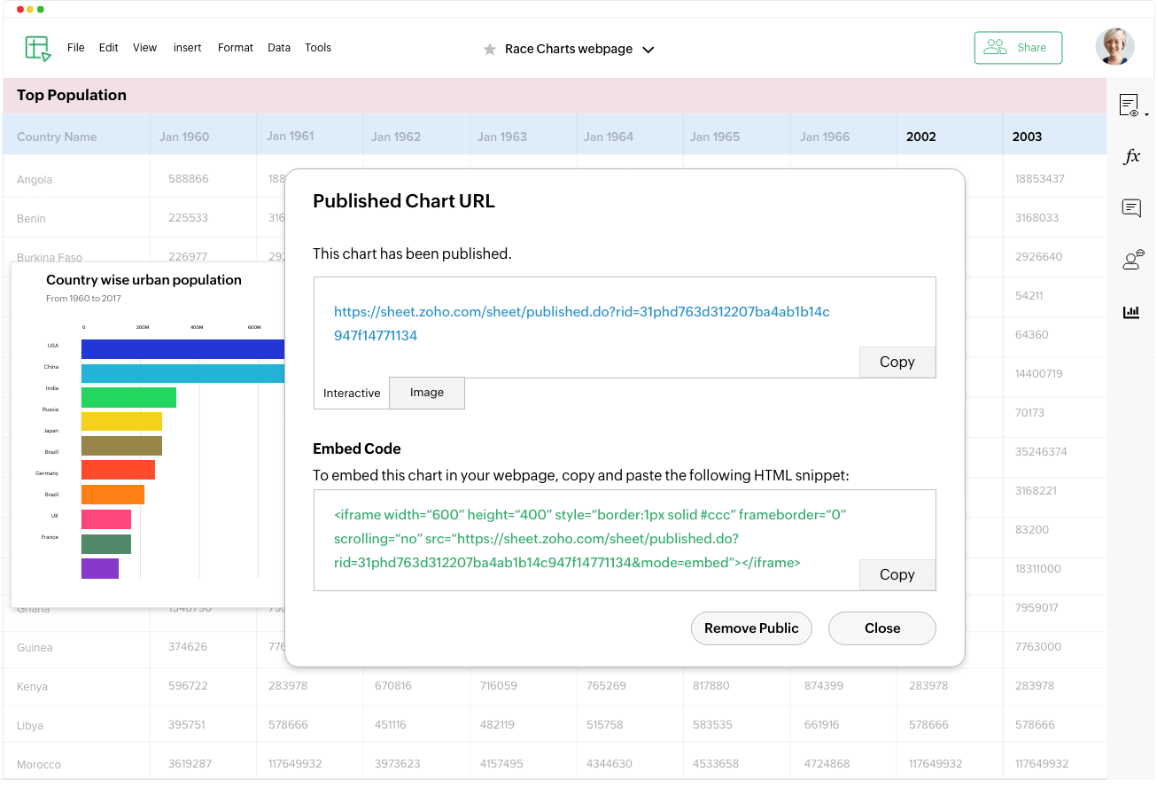
Share your work
Zoho Sheet makes it easy to publish or embed these animated bar charts in your blogs or reports, making for an interesting data visualization. Any changes made to your original data will be reflected in these embedded or published charts as well, so your work is always up to date.
One Place
Visualize, analyze, and work on your data from anywhere, anytime, on any device. Work together on your spreadsheets with Zoho Sheet.

“For almost a decade, I’ve been using Zoho Sheet for my work. The teams aim to solve problems quickly, and the assistance for the client means that we can do our jobs more successfully.”
Hans Rieder
Darley and Nutwood Local Nature Reserve