Slice, summarize, and understand data with ease
Got rows and columns of data in your spreadsheet and don't know how to group and analyze it? Pivot it!
Make sense of data with pivot tables
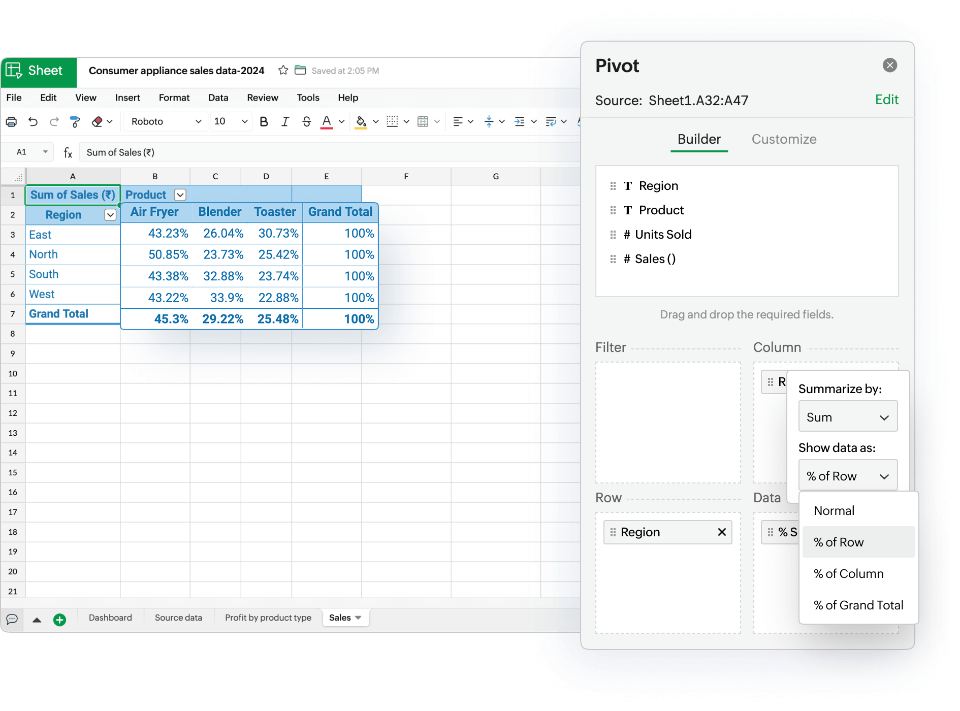
Pivot tables help you group and analyze key data points in an easily digestible snapshot. If you're a financial analyst, salesperson, or marketer looking to create reports or dashboards, pivot tables are often the best way to do it.
Beyond just grouping data, pivot tables let you add subtotals to see how each group contributes to the whole, or display values as a percentage of rows and columns to spot trends quickly and gain deeper insights into your data.
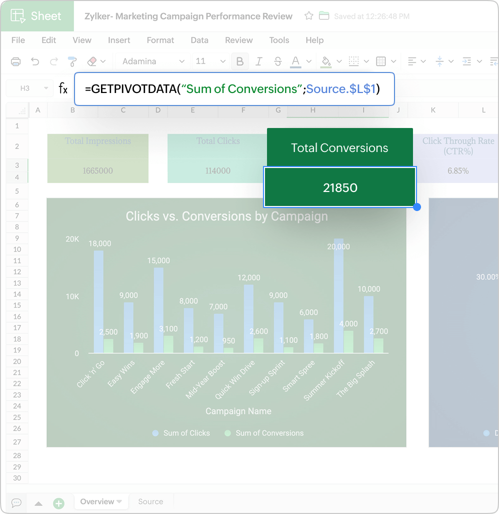
Fetch data from pivot tables dynamically
The GETPIVOTDATA() function helps you fetch summarized data from the pivot table dynamically, instead of manually locating values in the pivot table, even if the layout of the pivot table changes
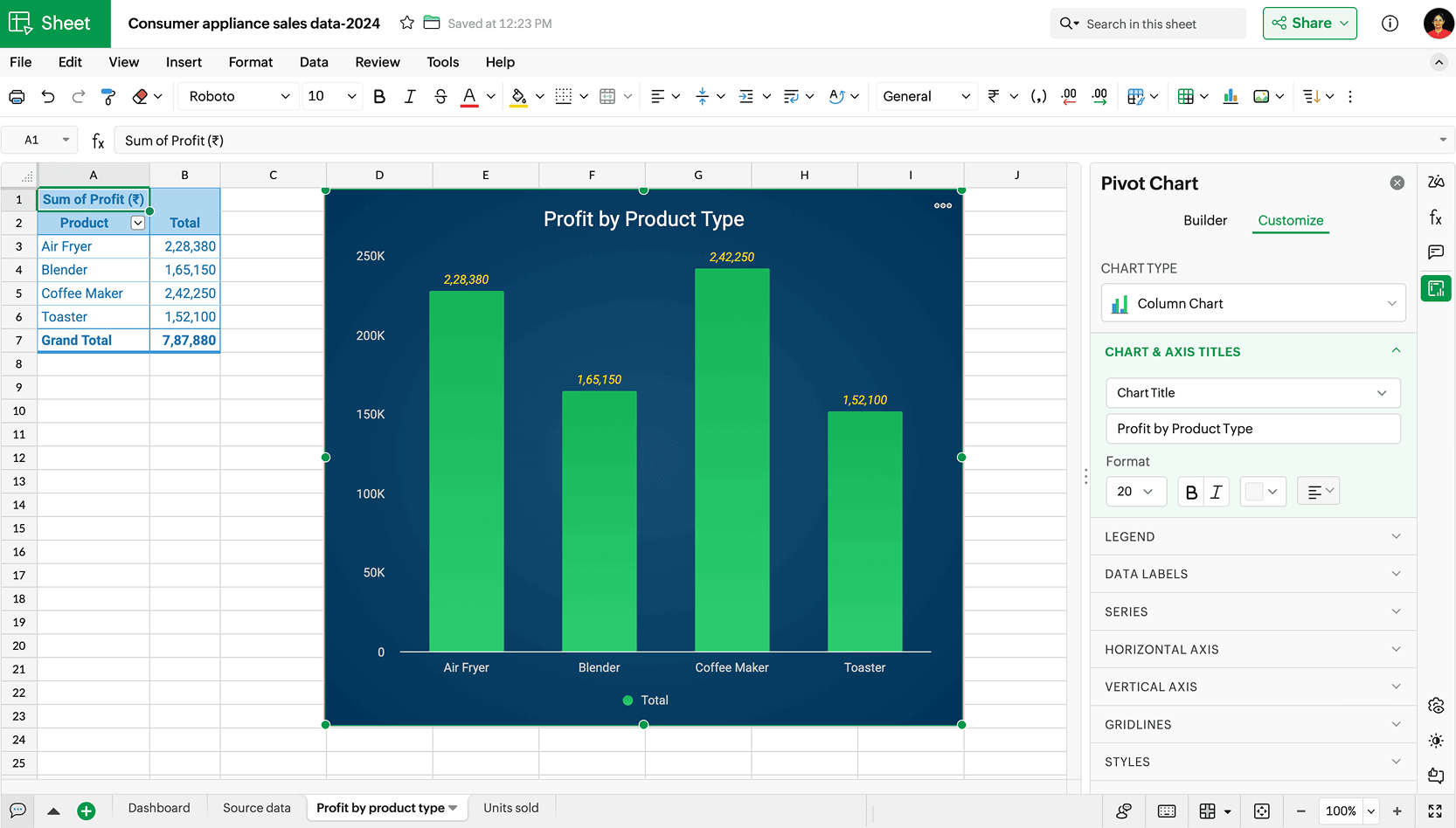
See the picture behind your data
Pivot charts transform pivot tables into visual summaries, making it easier to spot trends, observe patterns, and highlight key metrics.
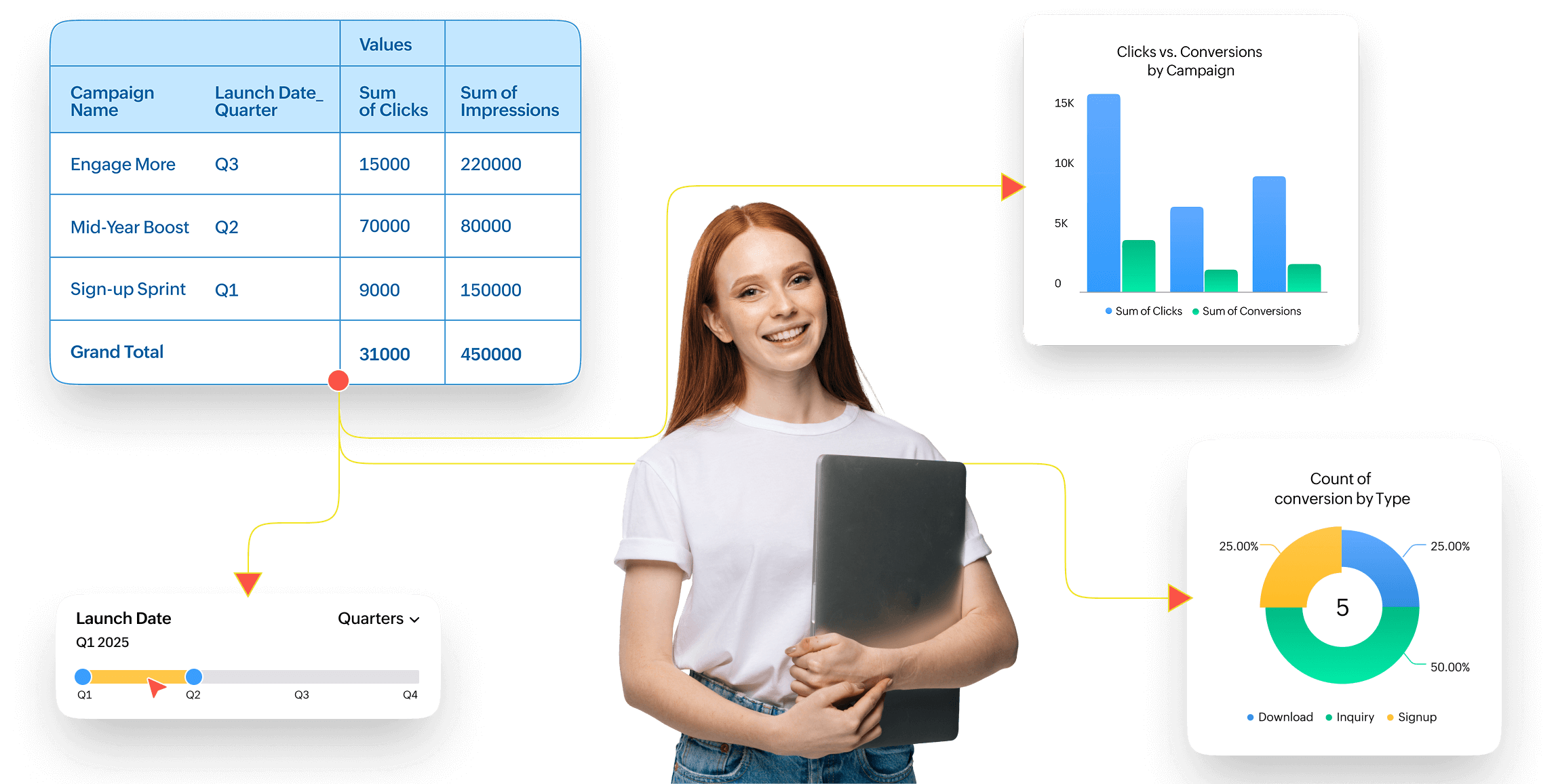
Let Zia build the best pivot tables and charts for you
Need quick insights for a meeting? Zia, our in-house AI, suggests the best pivot tables and charts based on your data. Save time by skipping the manual setup so you can get straight into using your pivot tables and developing insights.
Filter data but with style
If you're building an interactive dashboard, you want it to be obvious where filters or other interactive elements are. If you want to control multiple pivot tables from one place, you'll probably want to use slicers—they help make data interactive, visible, and clear.
Learn how to create and edit slicers
View your data in a timeline
Analyze the trends in time-based data by zooming in or out on a specific date range with timelines. A timeline is a visual date filter that allows you to filter data based on days, months, quarters, and years using an interactive slider.
Learn how to create and edit timelines
Pivot tables work best when paired with interactive visual elements, such as pivot charts, slicers, and timelines, to create useful and engaging spreadsheet dashboards.