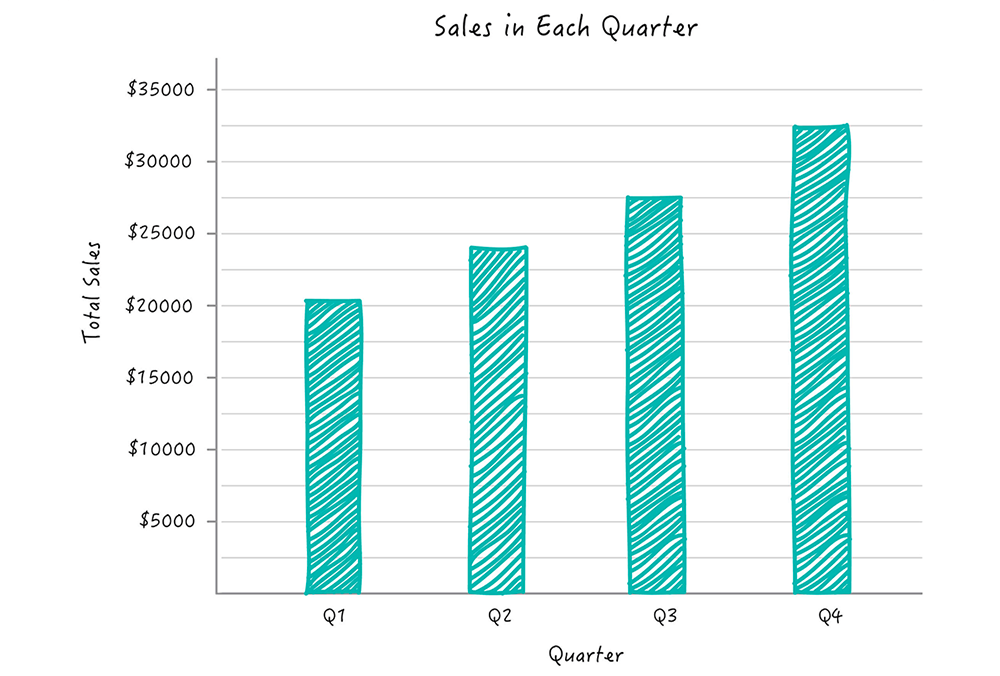
Column/Bar Chart
Pick this chart to compare data classified into discrete groups. Be it your sales in each quarter, or say scores comparison among teams.
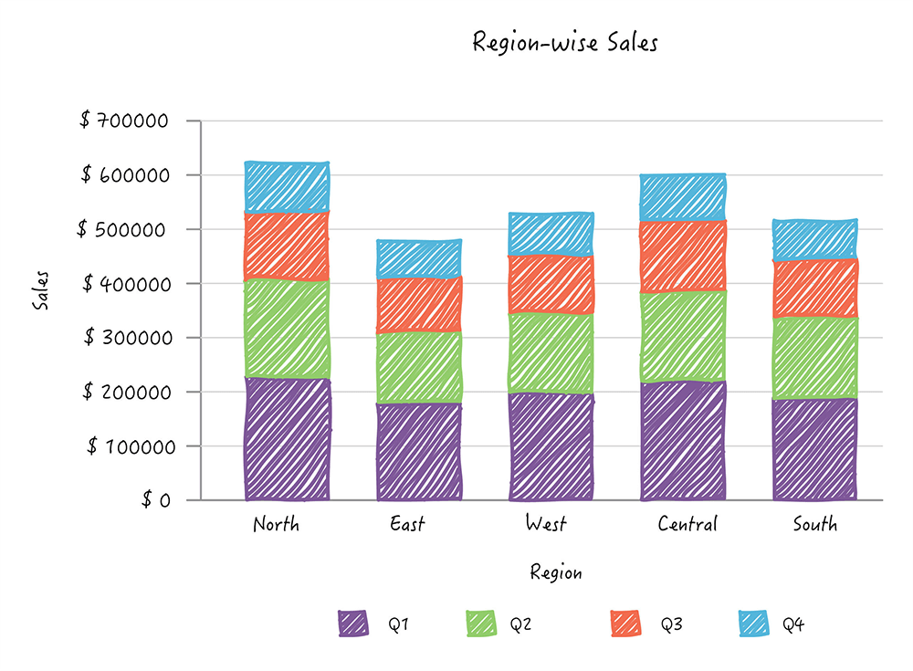
Stacked Column/Bar Chart
This chart shows the contribution of individual stacks that make up the columns. For example, quarter-wise sales (represented as stacks) for each region
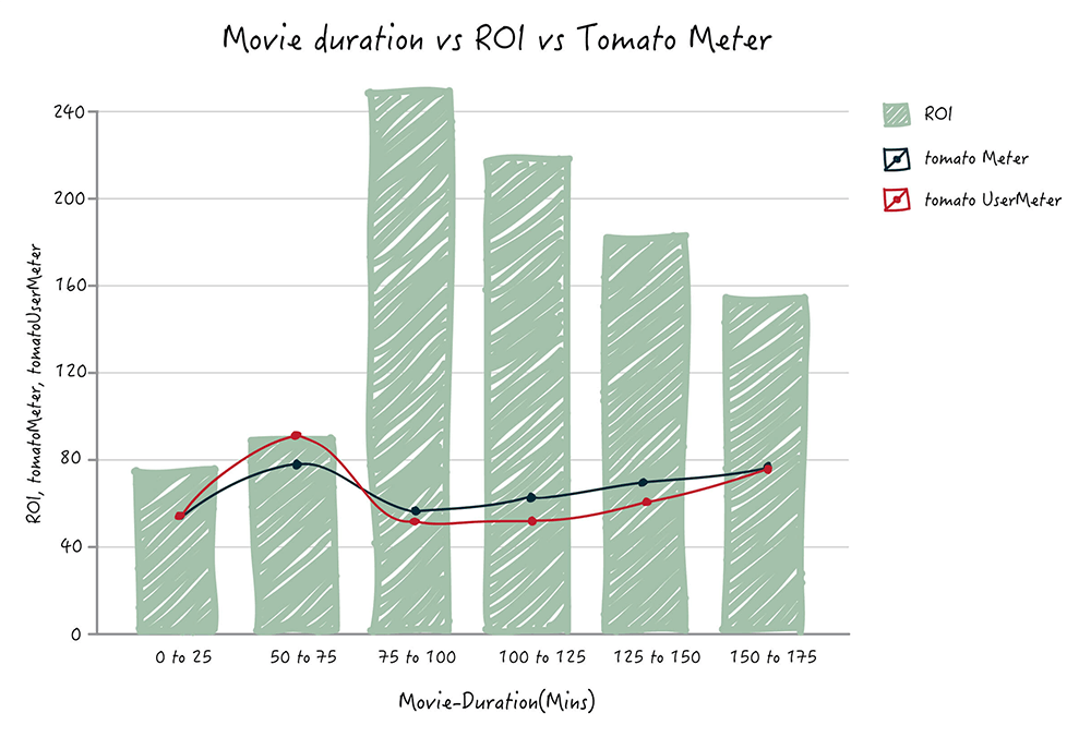
Combination Chart
As the name suggests, this is a combination of bar and line charts. Pick this chart when you have mixed types of data series. Or, to represent a complementary data series along with the main data. For example, if total sales across regions is represented in bars, the average sales and ROI can be represented as individual lines in the same chart.
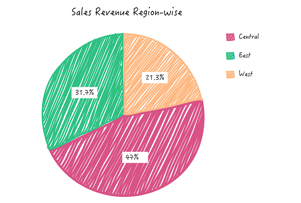
Pie Chart
Use this chart to find out the contribution of parts to a whole set. Like which expense this month has eaten up your income-pie the most. Or say, sales distribution across regions.
Variant: 3D Pie.
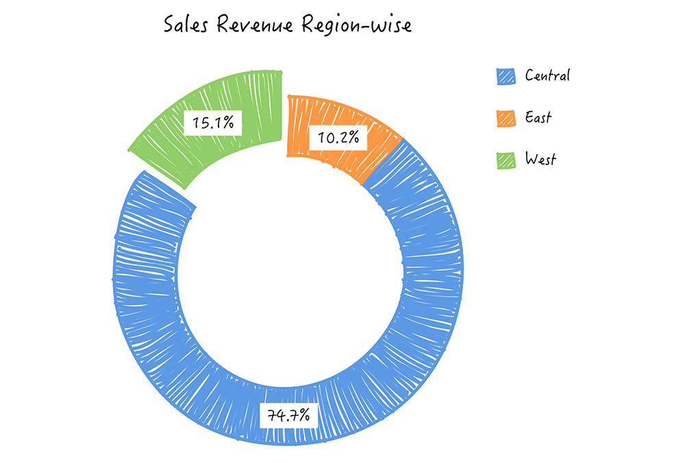
Ring Chart
A doughnut chart is akin to a pie-chart represented in the form of a ring/dough-nut. This chart too displays the contribution of parts to a whole set.
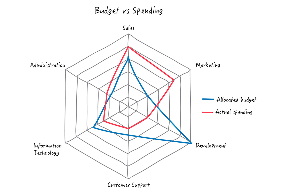
Web Chart
Pick this chart to study the comparison of different data series. A radar chart compares the values of a number of data series represented with data markers, relative to a center point.
Variant: Filled Web.
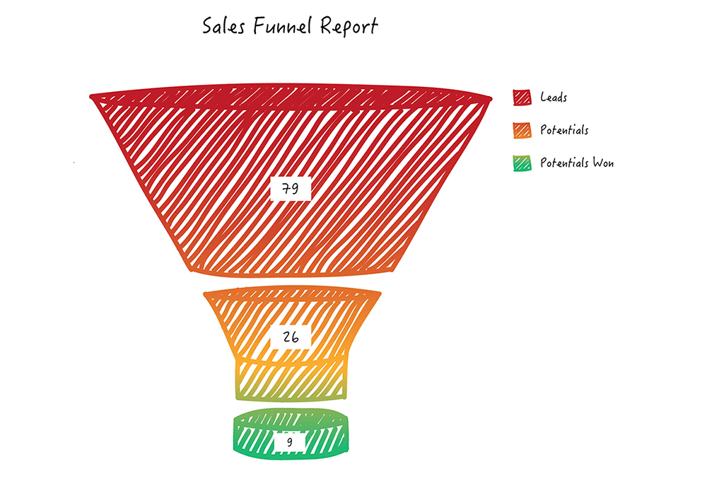
Funnel Chart
Pick this chart to represent progressive flow/reduction of a business metric across phases. For instance, visualize the conversion of your leads into actual sales across stages like marketing qualified leads, sales leads & won leads.
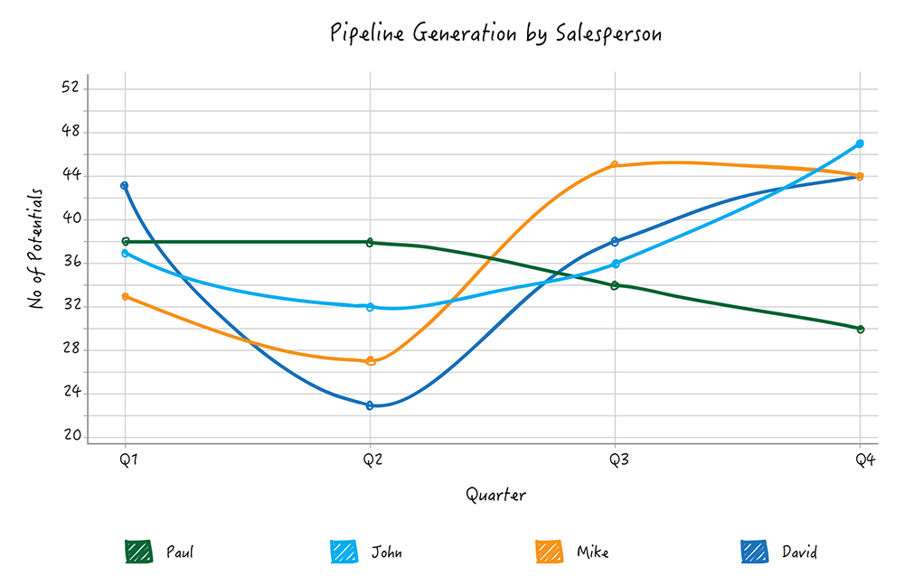
Line Chart
Pick this chart to visualize the trend of any data series across any time period. Just like visualizing the roller-coaster ride that your favorite stock went through in the last quarter.
Variants: Smooth Line, Steps.
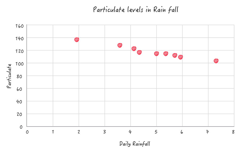
Scatter Chart
Typical use of the scatter chart is to plot sporadic data with uneven intervals. It is used for the comparison between two numerical axes unlike the line chart, where one axis is never numerical.
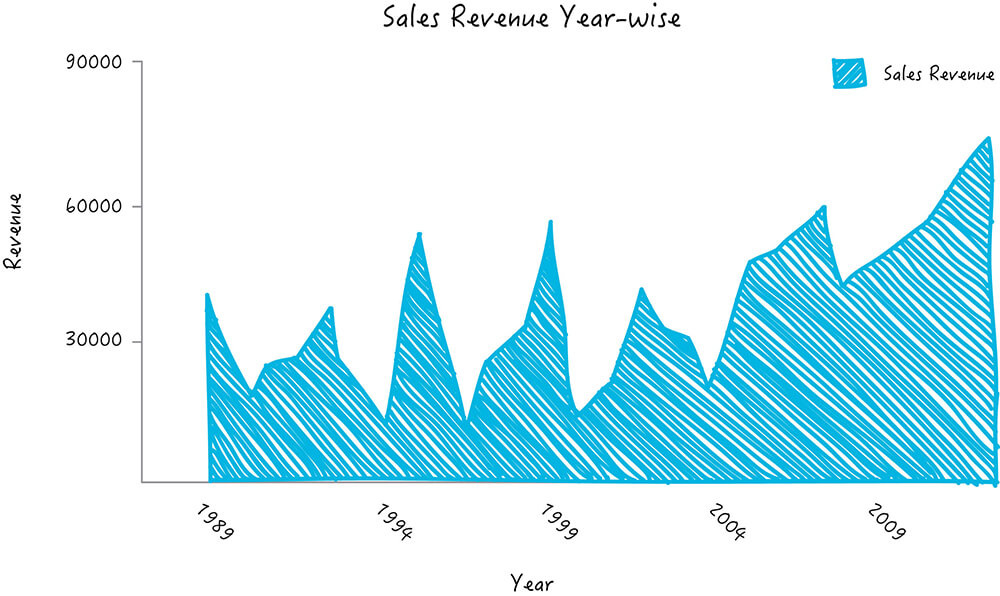
Area Chart
Area charts shade the area beneath the lines and therefore help you more readily compare data magnitudes. They are mainly useful for emphasizing the change in metrics across time. For instance, change in sales figures over a particular time period.
Variants: Area with Points, Smooth Area, Smooth Area with Points.
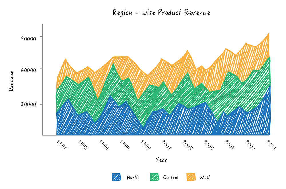
Stacked Area Chart
A stacked area chart shows the relationship of parts to a whole. With this chart, find how much the individual stacks or factors have contributed to the total value, across time.
Variants: Stacked Area with Points, Stacked Smooth Area, Stacked Smooth Area with Points.
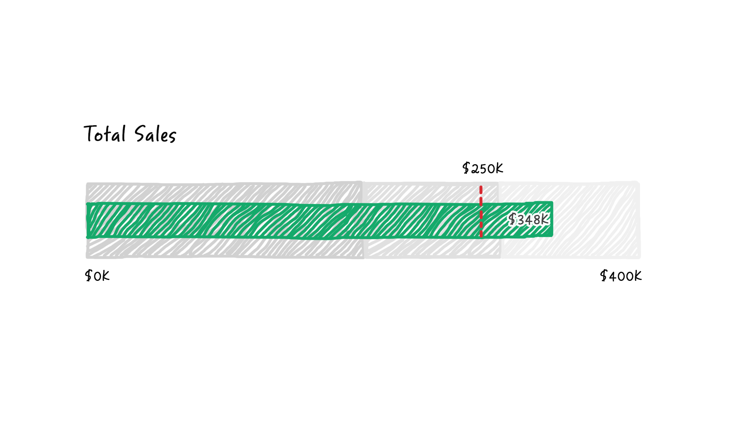
Bullet Chart
A bullet chart highlights a primary measure and compares it with a target value, with respect to qualitative ranges of performance, such as poor, satisfactory, and good. Bullet charts can be typically used as widgets in dashboards as they pack a lot of information within a smaller space.
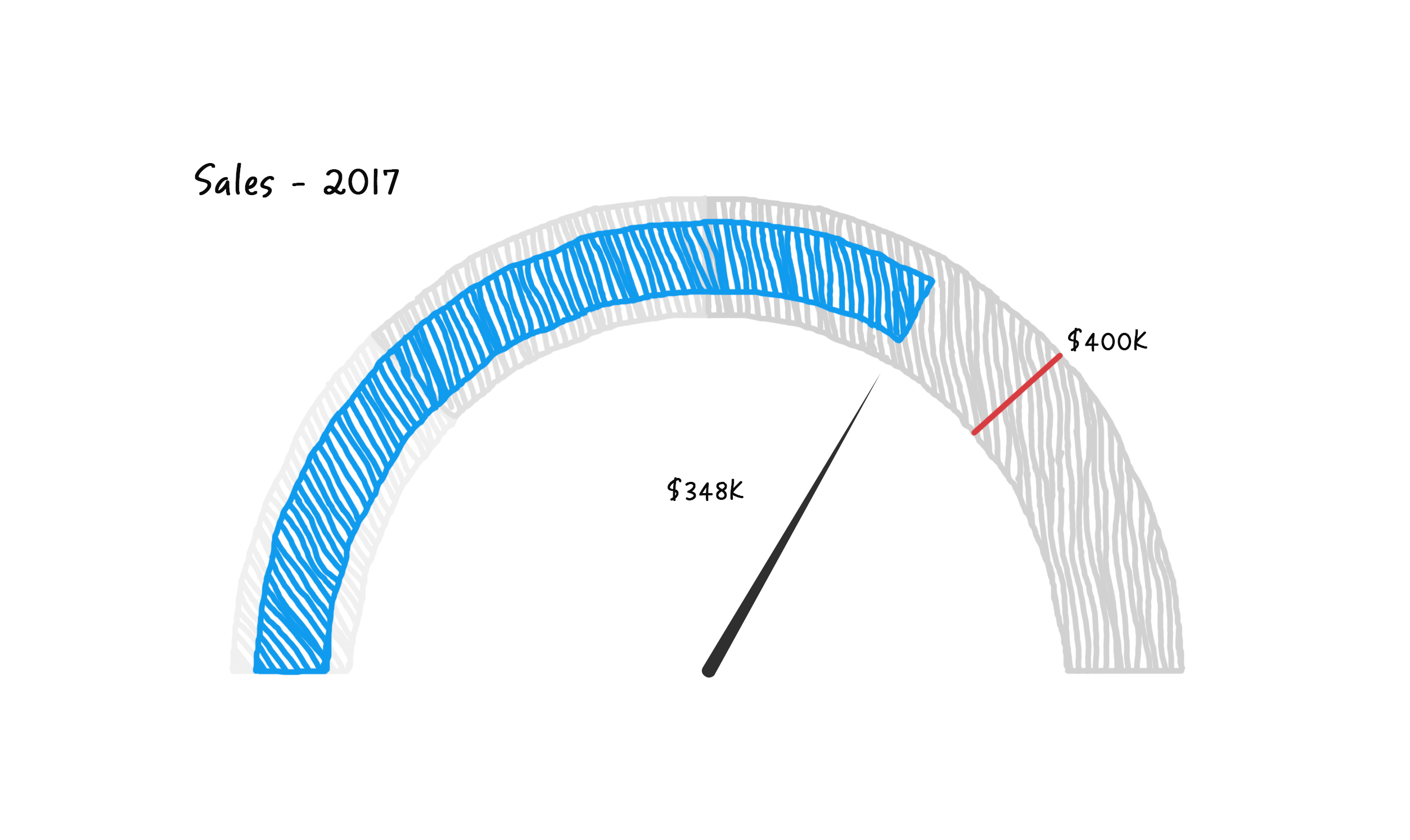
Dial Chart
Pick this chart to indicate the current value in a range. It is similar to a bullet chart, but the values are displayed on a dial. Dial charts are a perfect fit for your business and executive dashboards.
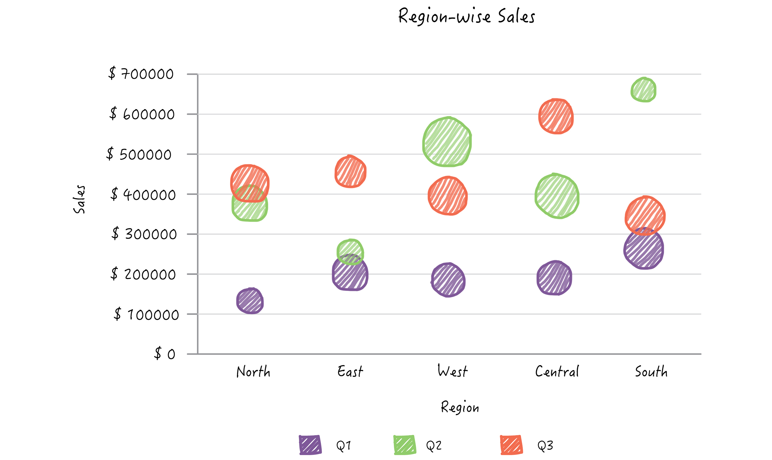
Bubble Chart
Pick this chart if you would like to add another magnitude - size to your visualizations. Bubble charts are extremely useful in highlighting the weightage of a data metric.
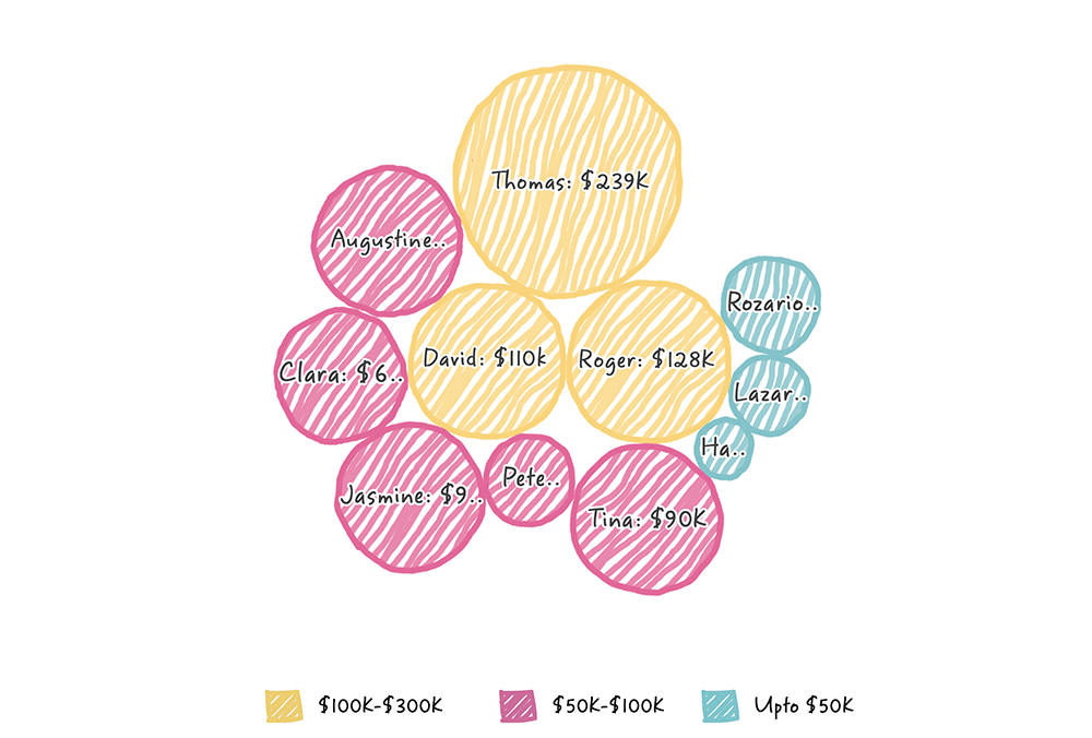
Packed Bubble Chart
Packed Bubble, as the name suggests displays data in a cluster of circles or bubbles. They are used to display the values disregarding the axes. You can use a packed bubble chart to visualize large amount of data in a small space.
Hope you find this chart-picker guide useful. You can transform any raw data into beautiful and insightful chart visuals like the above, with Zoho Analytics.
How has Zoho Analytics helped you? Share your experience with us