Does your form ask every question at once?
Here's why this approach is LOSING people.
Cognitive overload
Seeing all questions at once forces the brain to pre-process the entire form before answering the first field.
High abandonment rates
Forms that look long get abandoned. Even when the actual number of questions is manageable, the visual impression of length is enough to make people leave.
Shallow, rushed answers
When respondents can see all fields simultaneously, they rush through to finish, giving short, low-quality answers instead of thoughtful, useful ones.
Scroll into focus. Naturally.
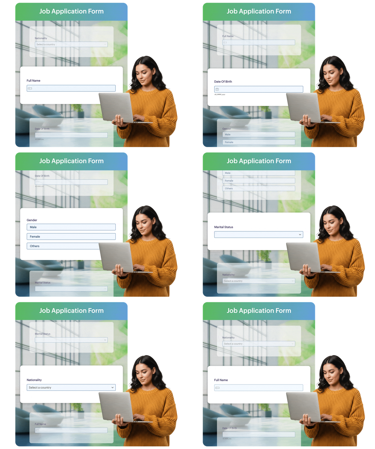
All fields exist on one scrollable page
No clicks. No interruptions. No page refreshes. Every question lives on a single, scrollable page, allowing respondents to focus on one answer at a time while moving effortlessly through the form.
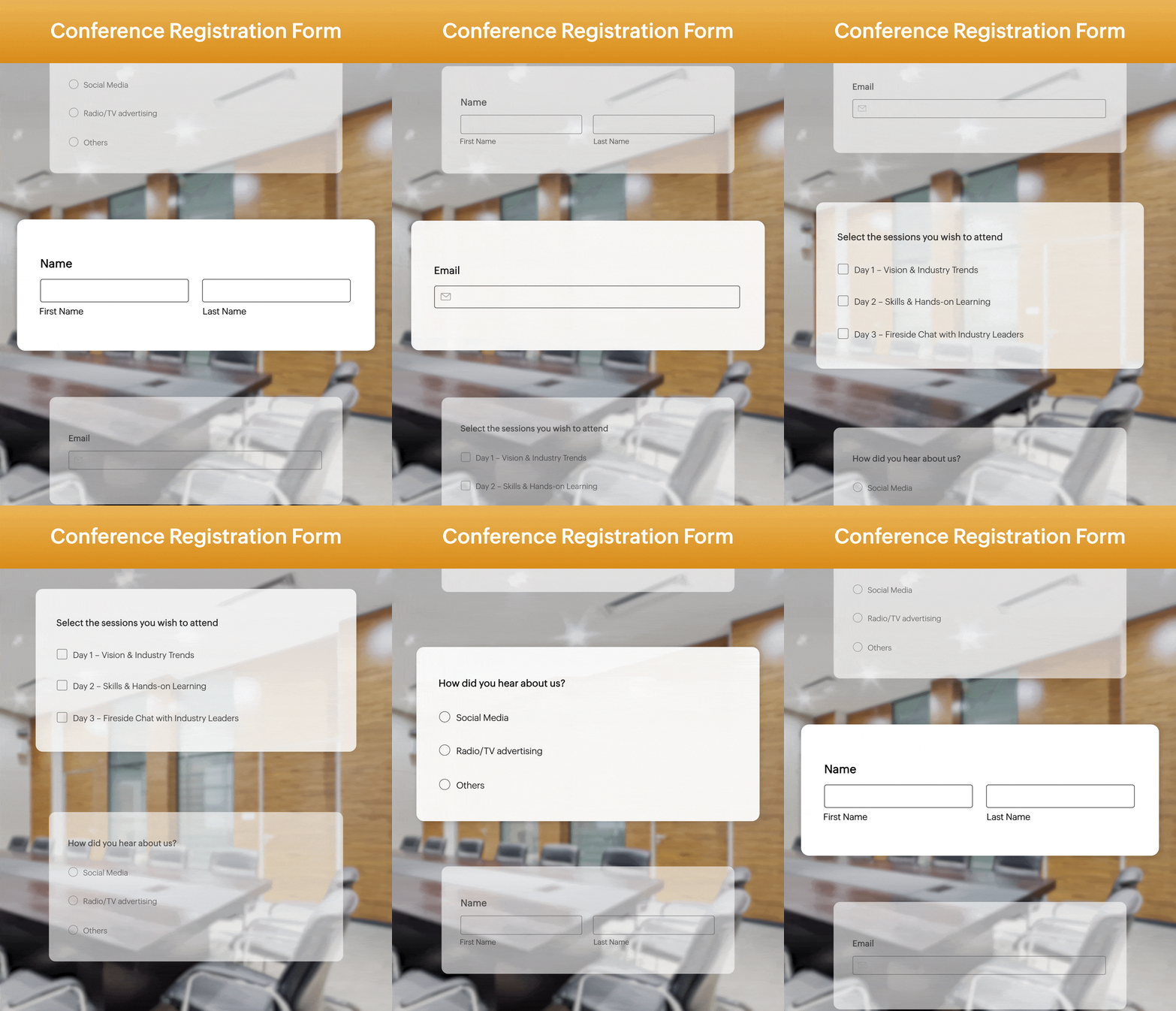
Each field gets its own dedicated visual card
Each field sits on a dedicated card with generous spacing, creating a clean, modern interface that's easy on the eyes. Instead of facing a crowded wall of fields, respondents focus on one question at a time, making the entire form feel lighter and more approachable.
The active field is focused & fully interactive
Every scroll shifts the spotlight. The current question moves to the center of the form, becoming bright, clear, and ready for interaction, while the rest quietly steps aside. It's a natural, distraction-free experience that keeps respondents focused from the first question to the last.
Surrounding fields dim into the background
Only one question takes the spotlight at a time. The fields above and below gently fade into the background, staying visible without demanding attention. This creates a calm, distraction-free experience that naturally guides respondents through the form.
Stop showing everything. Start spotlighting.
Better form UX isn't just a nice-to-have anymore. It directly impacts the quality of data you collect, the experience your respondents have, and ultimately the decisions you can make from that data.

Dramatically higher completion rates
When respondents only see one question at a time, they start, they get into a rhythm, and they finish the form at far higher rates.

More thoughtful, honest answers
When there's nothing else competing for attention, respondents actually think about each question. It encourages engagement with each field before moving on, reducing skip rates significantly.

A form that reflects your brand quality
A Spotlight Form tells respondents you respect their time and attention. It creates a positive impression of your brand before they've even submitted.
Choose the right form for the right moment
Every interaction. One goal.
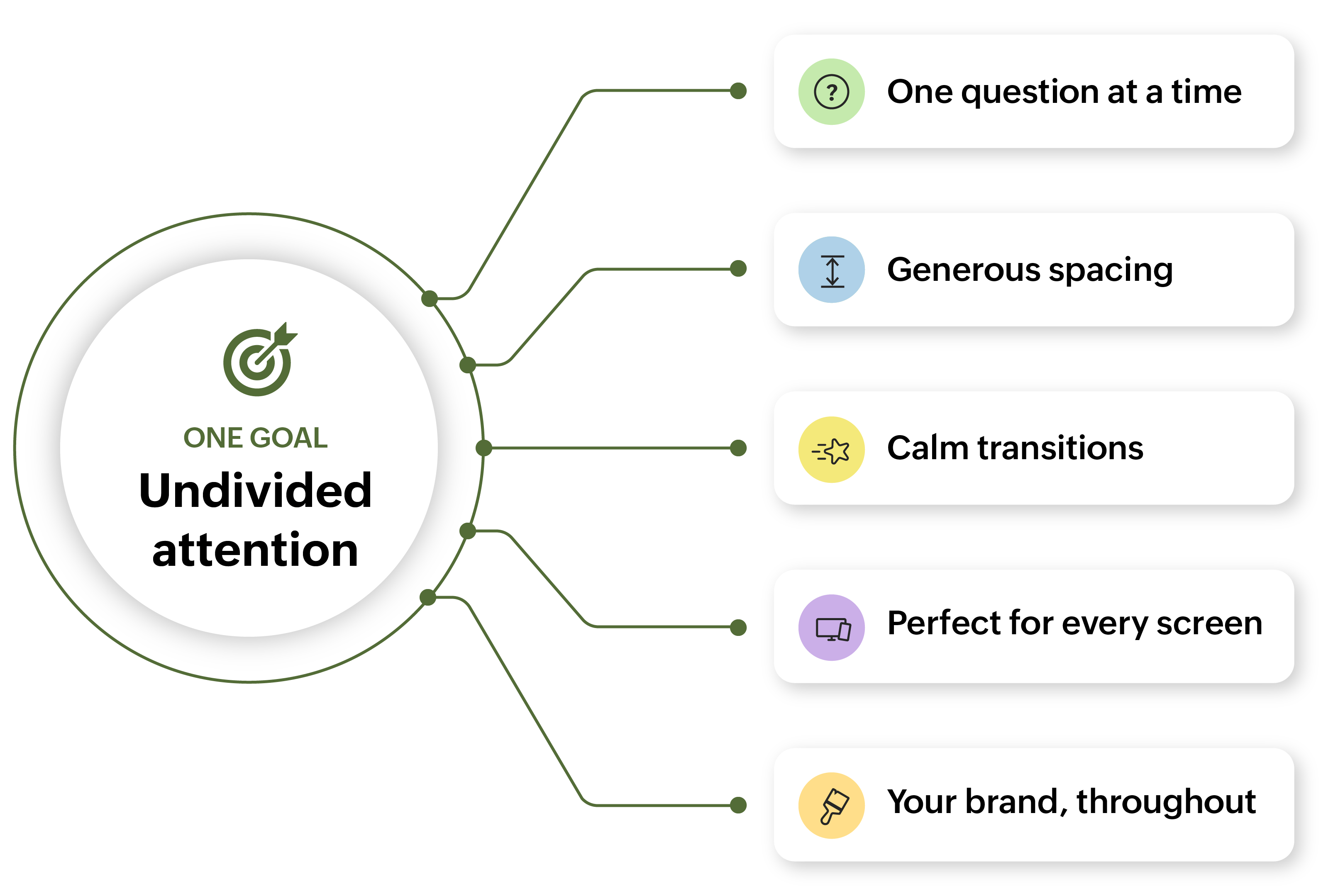
Better UX is no longer a nice-to-have.
Fewer skipped questions
Spotlight subtly encourages engagement with each field.
Better data quality
Make decisions on signal, not on rushed clicks.
Native-feel on mobile
Designed for thumbs. Excellent on every screen, every device.
Zero migration
Switch any existing form to Spotlight in one click.