Your event website ensures that your event exists online, but it can do much more than that! In fact, research from Sweor shows that 75% of users judge a brand's credibility based on its website design. For events, this credibility can directly influence whether someone decides to register or move on.
Nobody says, "Wow, that was a great event website." But they do say, "I couldn't find the agenda." Or worse, "I tried to register, but it took too long", or "was too confusing."
In 2026, your event website design is not just a digital brochure. It is your first impression, your registration engine, your brand experience, and your data collection tool, all in one. If it feels slow, cluttered, or outdated, people leave. And when they leave, they rarely come back.
The good news? Event website design is evolving fast. New event website trends are making websites smarter, more personalized, more accessible, and fully mobile-first. And with modern website builders, iteration is faster than ever.
We'll now look at what modern event website design needs to deliver in 2026, the trends shaping the next wave of event experiences, and how personalization and mobile-first thinking are redefining event page UX. We'll also see how today's event website builders make it easier to launch, test, and refine pages quickly and efficiently while keeping your event branding consistent from the first click to registration.
2026 event website trends you should know
Where event websites usually go wrong
Small design decisions can impact the overall event registration experience, and all the effort and time invested in the event website pages could fail. For example, if the registration call-to-action button blends with the layout, visitors may have to hunt for the next step. If the primary action is not immediately visible,there are page hits, but no conversions, leaving organizers wondering why.
Similarly, agenda pages can be overwhelming if not optimized. Long content blocks make it difficult for website visitors to scan the details, and if they can not quickly spot points of their interest, they often leave even before exploring further.
Mobile experience is another common concern. A page may look polished on a desktop, but it might present a completely cluttered or broken look on the phone. In a world where mobile traffic accounts for almost 70% of event page visits, this screen anomaly could result in lost registrations.
Page performance plays a big role, too. Heavy animations in your banner, large images, and unoptimized elements can slow down loading time. Even a second or two of delay could disrupt momentum and push visitors away.
None of these problems arise due to intentional decisions. These usually occur when the event website design focuses too much on appearance and not enough on usability, accessibility, and navigation. And for event organizers, fixing these issues starts with understanding the design principles shaping modern event websites.
11 modern principles shaping event website design in 2026
Event website design should focus on making every visit feel intuitive, purposeful, and easy to navigate. The best websites do not overwhelm visitors with too many choices or unnecessary complexity. Instead, they help users quickly understand what the event offers and where they should go next.
1. Clarity and simplicity come first
A visually impressive website does not always guarantee a smooth user experience. If visitors struggle to understand what to do next, even the most polished design can lead to missed opportunities. Clear layouts help direct attention to important actions such as viewing the agenda or registering for the event.
Platforms like Zoho Backstage, for example, emphasize the primary call-to-action prominently within the page structure, ensuring that visitors do not have to search for the next step. When the main action is visible at the right moments in the browsing journey, users are more likely to move forward with confidence rather than abandon the page due to uncertainty.
Simplicity plays an important role in reducing the mental effort required to navigate the website. Clean spacing, clear headings, and structured content help visitors process information faster and make decisions with confidence. When key actions are easy to find and understand, the website naturally supports conversions without relying on intrusive prompts or disruptive design elements. Instead of forcing attention, clarity allows the design itself to guide users toward meaningful engagement, creating a smoother path from discovery to registration.
2. Mobile-first layouts are mandatory now
Most visitors now access event websites on mobile devices, so layouts must be designed with smaller screens in mind from the outset. Mobile-first thinking encourages prioritizing essential content and removing elements that do not contribute to user understanding. This approach ensures that important details remain visible and easy to interact with, regardless of screen size.
Designing for mobile also changes how information is structured. Vertical scrolling patterns influence how visitors discover content, and each section should feel readable and well-paced as users move down the page. Buttons, links, and forms must feel comfortable to interact with using touch, creating a smoother experience that aligns with how users naturally browse today.
3. Accessibility improves usability for everyone
Accessibility has become a defining part of modern website design, shaping how easily visitors can explore and interact with content. High-contrast text improves readability across devices and environments, while descriptive alternative text helps screen readers interpret visual content more effectively. These choices make the overall experience clearer and more intuitive for everyone, not just for people with specific needs.
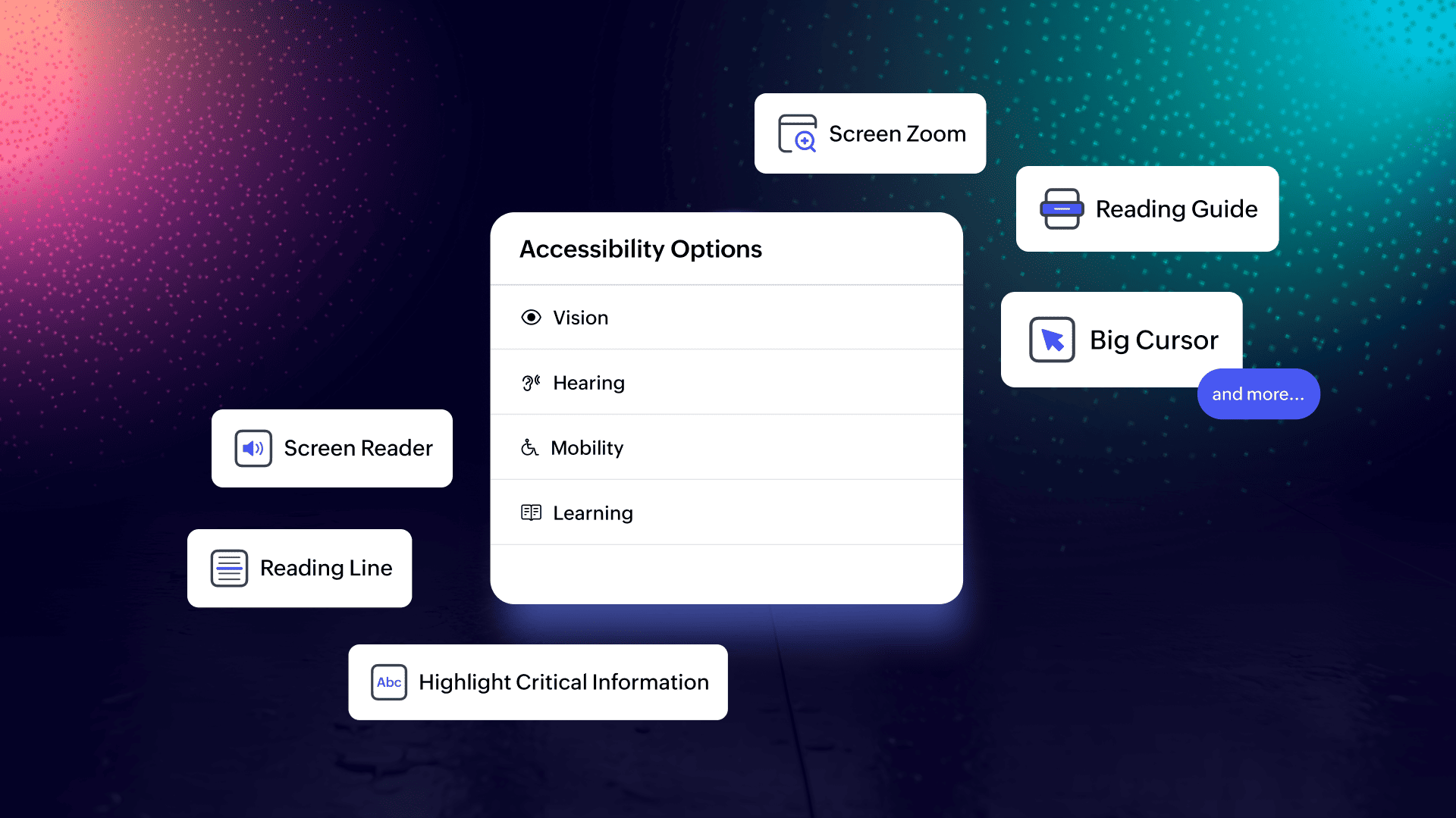
This shift is also making accessibility more adaptive within event websites. Whether someone is navigating the site, exploring the agenda, or engaging with content, they can tailor the experience to their needs. This includes vision-friendly tools such as high-contrast mode, grayscale and saturation controls, larger text sizes, dyslexia-friendly fonts, and reading aids like guides and focus lines.
Support extends beyond visual adjustments. Full keyboard navigation, larger cursors, focus highlights, and page-level shortcuts make browsing easier for users with mobility needs. Learning-focused features, such as critical information highlights and toast notifications, help improve comprehension, while navigation enhancements like "skip to main content" reduce repetitive actions and streamline movement across pages.
Designing accessible navigation structures continues to play a key role in maintaining consistency and predictability. When interactions behave as expected, users feel more confident exploring different sections of the website. Accessibility considerations often lead to more thoughtful design decisions, improving usability across the entire event journey.
In platforms like Zoho Backstage, these capabilities are built directly into the event website experience and align with WCAG 2.2 AA guidelines, helping organizers create more inclusive events without adding complexity.
4. Logical navigation improves user experience
Navigation works best when visitors can quickly understand where they are and how different sections connect. Grouping related content together helps users move between pages without confusion and creates a sense of continuity as they explore the event details. Familiar labels such as agenda, speakers, and tickets reduce cognitive effort and help visitors find relevant information faster.
Well-structured navigation also supports deeper engagement. When users can easily locate sessions or speakers that match their interests, they are more likely to spend time exploring the website and building interest in the event.
5. Fast load times reduce drop-offs
A website that loads quickly feels reliable and professional, while delays can create uncertainty and cause visitors to abandon the page before completing key actions. Optimizing images and minimizing heavy visual elements helps maintain a consistent browsing flow that supports engagement.
Fast-loading pages are particularly important for mobile users, where network conditions may vary. When performance is prioritized, the website feels responsive and dependable, encouraging visitors to continue exploring without interruption. Even small improvements in loading speed can have a noticeable impact on overall engagement and registration rates.
6. Conversion-focused elements that feel natural
Encouraging visitors to take action should feel like a natural extension of the browsing experience rather than a forced interaction. Calls to action work best when they appear at logical points in the content flow, allowing users to act when they feel ready.
Event websites built with Zoho Backstage often demonstrate this principle through prominently positioned registration buttons that remain visible as users explore the agenda, speakers, or event overview. For example, the structure of the Zoholics event website clearly highlights key actions such as exploring sessions or securing a seat, helping visitors move forward without needing to search for the next step.
This continuity between content and action reduces hesitation and keeps the decision-making process simple. Trust-building elements such as speaker credibility, session depth, and visible participation signals further reinforce confidence at critical decision points.
On Zoholics event pages, structured speaker listings and well-organized session information help attendees understand the value of the experience before they commit. This demonstrates how strong information architecture directly supports conversion.
Instead of interrupting the browsing experience with aggressive prompts, effective event websites allow interest to build naturally through clear structure, relevant information, and visible next steps.
This approach reflects a broader shift in event UX, where design quietly supports decision-making by removing friction rather than adding persuasion pressure.
7. Personalization supported by AI-driven content
Personalization is becoming a central layer of modern event website design rather than a future-facing enhancement. Websites are increasingly able to adapt content based on visitor behavior, preferences, or location, helping each user see the most relevant sessions, tracks, or event updates.
AI-assisted content generation further strengthens this capability by dynamically adjusting descriptions, recommendations, or highlights to match visitor interests. This level of contextual relevance reduces the effort required to find meaningful content and creates a more engaging browsing experience that feels tailored rather than generic.
8. Data-informed design decisions through behavioral insights
Data-driven refinement is shaping how event websites evolve over time. Instead of relying on assumptions, organizers are increasingly using behavioral insights such as interaction patterns, heatmaps, and conversion tracking to understand how visitors engage with content.
With Zoho PageSense integrated into Zoho Backstage, organizers can track how attendees interact with specific pages, sessions, and speakers in real time. Insights such as top-viewed pages, high-interest sessions, and drop-off points help teams understand what's working and what needs improvement.
Testing variations of layouts, messaging, or page structure then becomes more targeted. For example, heatmaps can reveal where users are clicking (or not), while funnel analysis can highlight where registrations slow down. These insights make it easier to refine the website based on actual behavior rather than guesswork.
This continuous optimization approach ensures that event websites improve with every iteration, becoming more aligned with attendee expectations and more effective at driving engagement and conversions.
9. Modular design systems that support flexibility and consistency
Component-based design systems are making event websites easier to adapt as event details evolve. Modular layouts allow sections such as speaker highlights, sponsor showcases, or agenda previews to be rearranged without requiring a complete redesign.
This flexibility supports faster updates while maintaining visual consistency across pages. When design elements follow shared spacing, typography, and structural patterns, the overall experience feels cohesive even as content changes closer to the event date.
10. Smarter content discovery through search and filtering tools
As event agendas grow more complex, discovery tools are becoming essential for helping visitors navigate large volumes of information. Search functionality and filtering options allow attendees to quickly identify sessions, speakers, or topics that align with their interests. Instead of scrolling through dense schedules, users can shape their own content journey based on relevance.
This improves engagement by making exploration more efficient and helping visitors focus on what matters most to them.
11. Conversational and immersive browsing experiences
Interactive technologies are gradually expanding how visitors engage with event information before the event begins. Instead of passively browsing pages, attendees can now interact with event websites in more dynamic and contextual ways.
Conversational interfaces, such as chat-based discussions and direct messaging, simplify how participants connect and find information. In Zoho Backstage, networking features like one-on-one chats, public and private discussion channels, and participant discovery create a more conversational layer within the event website itself. Attendees can ask questions, exchange ideas, or initiate meetings without needing to navigate across multiple pages.
Voice-enabled search is beginning to enable quicker session discovery through natural-language interaction, while immersive previews using AR or 3D environments are helping attendees visualize event spaces—especially in hybrid or virtual formats. Alongside this, features like meeting scheduling and matchmaking further reduce friction by helping participants move from discovery to meaningful interaction in a few steps.
These experiences reduce uncertainty and strengthen confidence by giving visitors a clearer sense of what to expect, who they can connect with, and how they can engage. Instead of waiting until the event begins, attendees start participating as they explore the website.
Together, these developments highlight how event website design continues to evolve toward more adaptive, responsive, and user-aware experiences. Rather than serving as a static information source, the event website is becoming an interactive interface that supports real-time discovery, connection, and decision-making.
Together, these developments highlight how event website design continues to evolve toward more adaptive, responsive, and user-aware experiences. Rather than functioning as a static information source, the event website is becoming an intelligent interface that continuously adjusts to support discovery, relevance, and confident decision-making.
Make event website design that evolves with your event with Zoho Backstage
Event website design in 2026 is not about chasing trends for the sake of it. It is about building websites that are usable, accessible, personalized, and adaptable. The best event website design ideas moving forward will start with mobile-first thinking, prioritize accessibility and clarity, use personalization wisely, and integrate smoothly with ticketing and engagement tools.
Zoho Backstage combines website building, event ticketing, engagement, analytics, and more into one connected ecosystem. That means your event website is not a standalone asset; it becomes part of a complete event experience.
If your layout, navigation, or mobile performance feels outdated, or your audience behavior has changed, it's time to refresh. A full redesign every 2–3 years is common, with smaller updates each event cycle.
Yes, you can reuse last year's event website but only if you update visuals, speakers, sponsors, and content flow. Reusing structure is fine, but outdated information or design patterns can reduce credibility.
Absolutely. SEO is very important for event websites as many attendees search directly on Google for event details, speakers, or dates. Optimized pages help you capture high-intent traffic beyond paid campaigns.
Ideally, your event website should go live 3–6 months before the event. This allows enough time for indexing on search engines, early-bird registrations, and sponsor visibility to make sure that you get the most out of your website.
Your event website and mobile app should feel visually consistent, but never identical. Each platform should be optimized for its device while maintaining brand alignment and making sure that it is always accessible.