Visualization Type
Ask Zia has the ability to create a wide variety of reports. As you type the question, Ask Zia will understand your intent, and reply with the best report type that suits your scenario. You can always change the report type by adding then in your question or by choosing the chart type.
This section lists all the report types that Ask Zia can come up with.
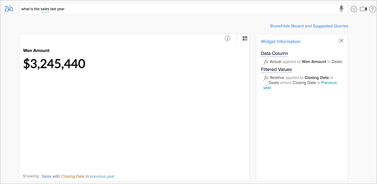
Numeric KPI Widgets
When you ask for a single metric such as last year's sales or profit, Zia will return the answer as a KPI. You can add this to your dashboard by clicking the Dashboard icon in the top right.
Charts
Zoho Analytics supports creating a wide range of chart types using Ask Zia.
Auto Selected Charts
Ask Zia will automatically identify the appropriate chart type based on the questions that you ask.
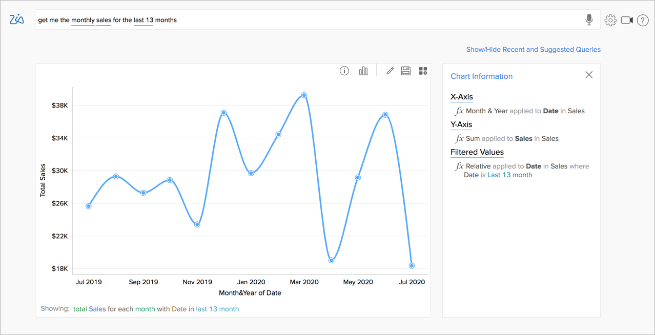
Line Chart
When you ask for a series trend across a period, Zia will choose a line chart.
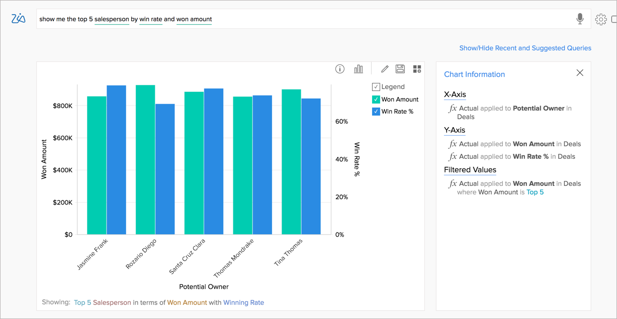
Bar Chart
Bar Chart will be selected when you want to compare metrics across discrete groups.
Selecting Charts
Apart from the auto-selected charts, you can also choose the appropriate chart type that best suits your scenario. You can choose the chart type by adding the corresponding keywords in the question. You can also select the chart type using chart chooser. The following table explains how to select various chart types.
| Chart Types | Examples | Keywords |
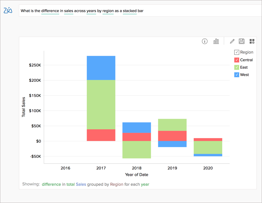
Stacked Bar Choose a Stacked Bar chart to analyze the patterns and trends in your data by comparing the parts of your dataset to the whole. | What is the difference in Sales across years by Region as a Stacked Bar?
|
|
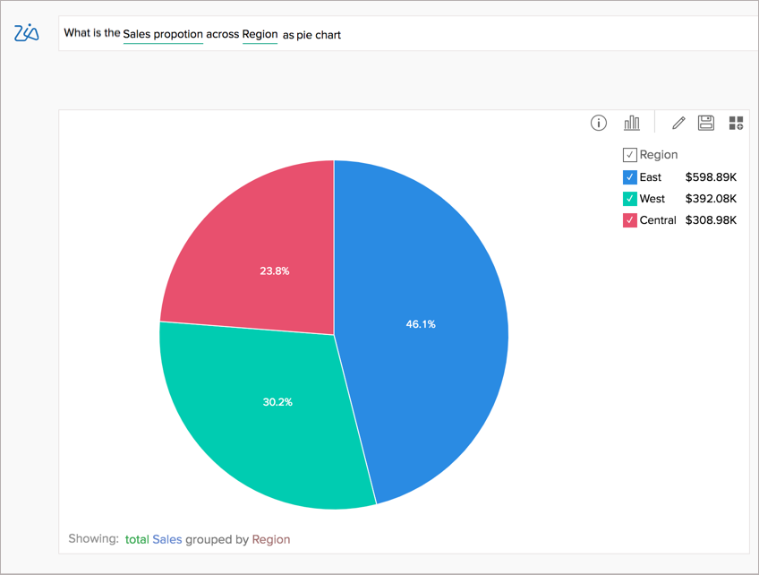
Pie Chart Choose Pie chart to represent the contribution of each value to the overall total expressed in percentage. | What is Sales contribution across the region as a pie chart?
|
|
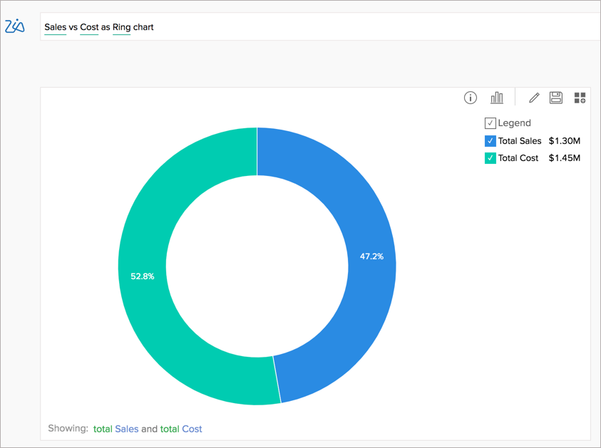
| Ring Chart | Sales vs Cost as Ring Chart
|
|
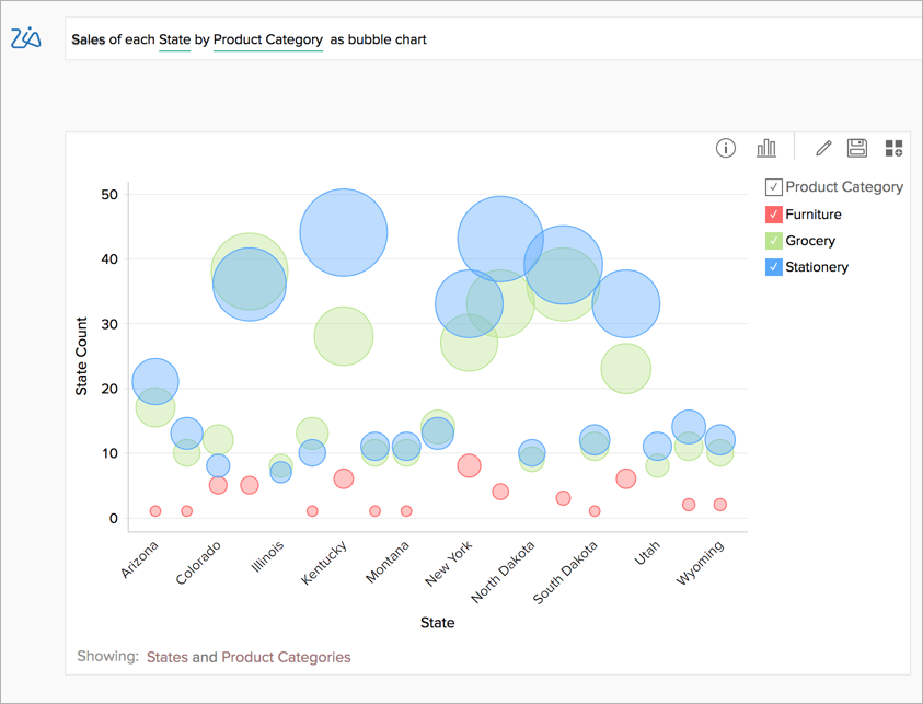
Bubble Chart Choose a Bubble chart to highlight the magnitude/weight of a data point, using the size (area) of the bubble. | Sales of each State by Product Category as a bubble chart
|
|
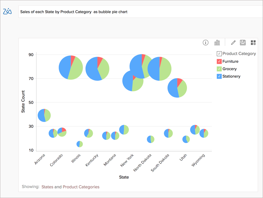
Bubble Pie Choose a Bubble Pie chart, when you want to plot a data series as a bubble chart, with each bubble sub-divided into proportional pies. | Sales of each State by Product Category as a bubble pie chart
|
|
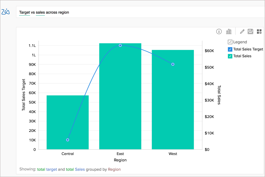
Combination Chart A combination chart with a bar and a line chart will be chosen, when you ask for a combo chart. | Target vs Sales across Region as combo chart
|
|
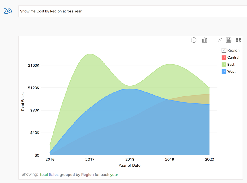
Area Chart Area chart shade the area beneath the lines and therefore help you more readily to compare data magnitudes. | Show me Cost by Region across the year as an area chart
|
|
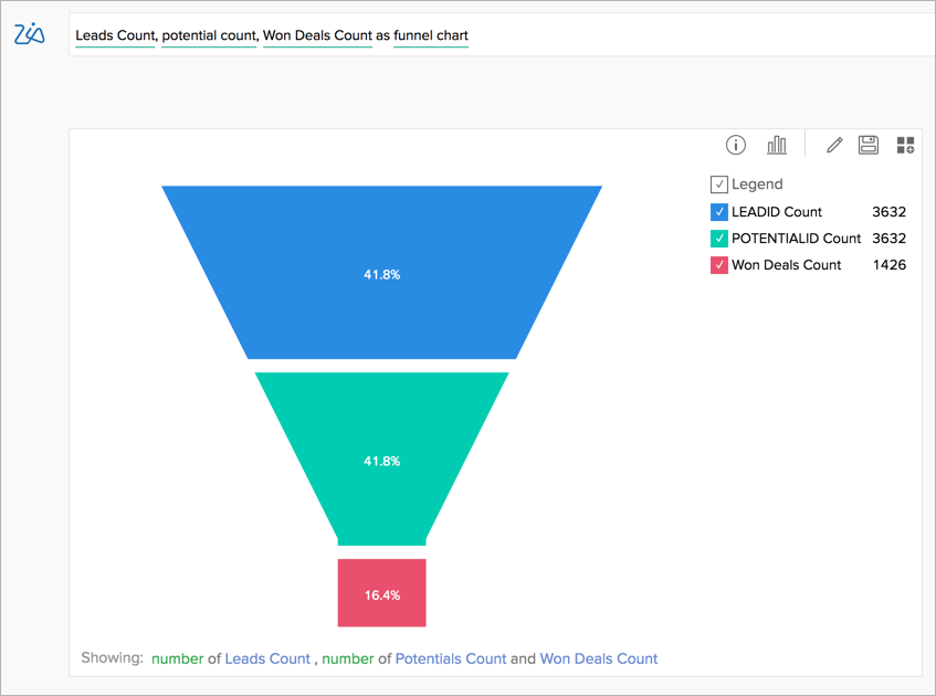
Funnel Chart The Funnel chart is used to represent a progressive flow/reduction of a business metric across phases. | Leads Count, Potential Count, Won Deal Count as funnel chart
|
|
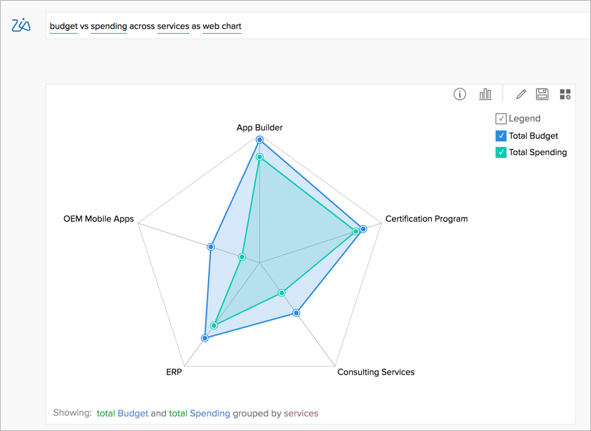
Web Chart Choose Web chart to study the comparison between different data series | Budget vs Spending across Services as web chart
|
|
Geo Map Visualizations
When your data set has Geodata and you ask for a metric across the region, Zia will choose Geo Charts. The following are the Geo Charts supported for Ask Zia.
| Chart Types | Examples | Keywords |
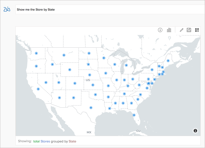
Map Scatter Chart Map Scatter chart will be plotted by default when you ask for data across the geo region. | Show me the stores by States
|
|
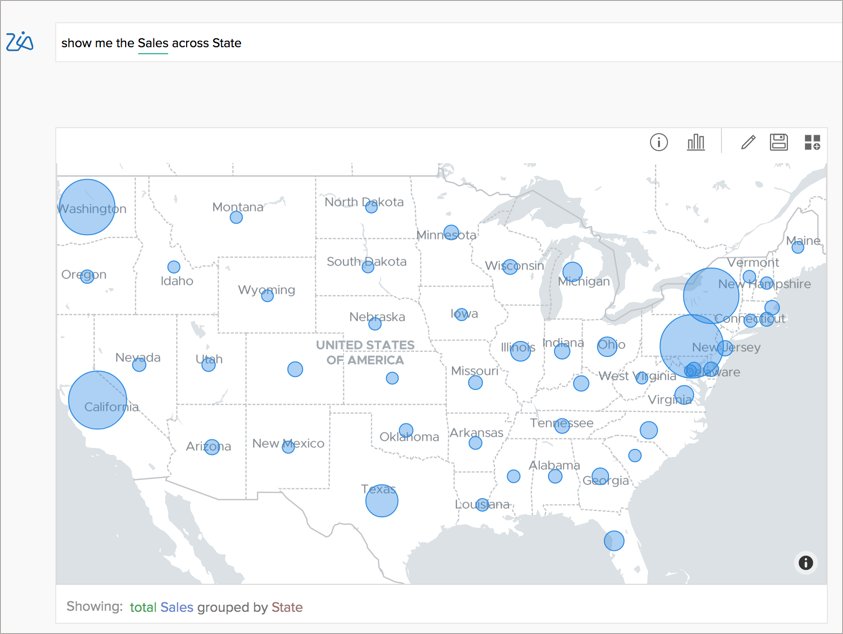
Map Bubble Chart You can choose a Map Bubble chart when you want to visualize the magnitude of the data across regions. | Show me the Sales across States as a map bubble chart |
|
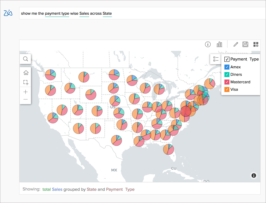
Map Pie Chart You can choose a Map Pie chart to plot multiple bubbles across regions, with each region represented as an equal bubble, sub-divided into proportional pies. | Show me the payment type wise Sales across States as a map pie chart
|
|
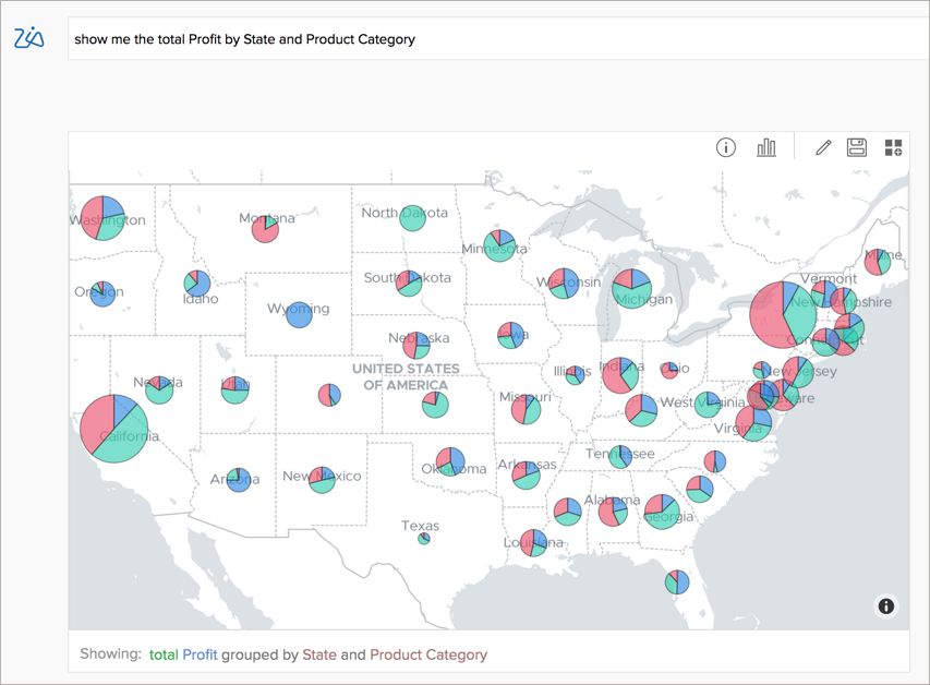
Map Bubble Pie Chart You can choose a Map Bubble Pie chart to plot multiple bubbles across regions, with each region represented as a proportional bubble by size (area), sub-divided into proportional pies. Zia will choose the aggregate column in the query to determine the magnitude of the bubble. Other columns will be used to categorize data. | Show me the total Profit by State and Product Category
|
|
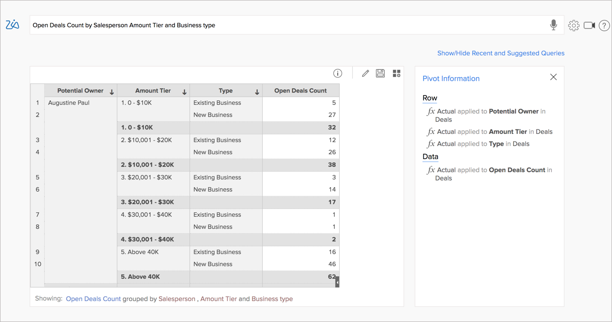
Pivot Views
When you ask for multiple metrics grouped by multiple dimensions, a Pivot Table will be created. You can also choose to create a pivot view by using the keyword pivot, pivot view, and pivot table in the query.
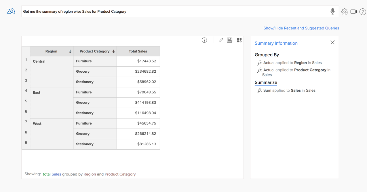
Summary Views
When you ask for a summary across multiple dimensions, a Summary View will be created.