Geo Data Visualization (Map Charts) for Zoho Analytics
A map chart can be used to tag metrics against geographical locations on a map view. You can create map charts using location specific columns in your data. This location information can be continent, country, county, state/province, city, zip code, latitude and longitude, or even IATA airport codes, which are used to identify airports and metropolitan areas around the world.
Geo Charts Basic
- Who can create a map chart and what do you need?
- What kind of data can be visualized in map charts?
- Will Zoho Analytics automatically identify the Geo data?
- How do I set the data type of a column as Geo?
- I have Latitude and Longitude specific information in my dataset, can I create a map chart using that?
- I have postal zipcode in my dataset, can I create a map chart using that?
- I have IATA airport code in my dataset, can I create a map chart using that?
- What are unresolved locations and from where do I access the list?
- I have created a map chart but there are some unresolved locations, how do I resolve them?
Creating Geo Charts
- What are the supported map chart types?
- How do I create a map chart?
- How do I create a Geo Heat Map chart?
- Can I create a map chart for specific countries alone and hide the rest of the map?
- Can I create state specific charts?
- How do I create a map chart using the latitude and longitude columns?
- How do I create a map chart using the IATA airport code columns?
- I have a column whose data-type I do not want to change to "Geo". Can I still create a map chart using it?
- What are the interaction options available on map charts?
Customizing Geo Charts
- How do I customize the map chart settings?
- How do I customize the map chart Theme?
- Can I create the map chart over the satellite map?
- Can I use a continuous color range legend for map chart?
- Can I customize the default home screen of the map chart?
- How do I customize the marker used in a map-scatter chart?
- How do I customize the color of the charts plotted in the map?
- How do I customize the legend settings in a map chart?
Geo Charts Basic
1. Who can create a map chart and what do you need?
Any Zoho Analytics user who wishes to visualize geographical data can create this chart. You will need a location-specific data column to create this chart.
2. What kind of data can be visualized in map charts?
If your dataset contains location information (say, country, county, city etc) then you can use map charts to visualize your data. Zoho Analytics will auto-identify the columns types while importing and set the corresponding Geo data type. Currently, Zoho Analytics can auto-identify five types of Geo data.
- Continent - If your column contains the names of the continents
- Country - If your column contains the names of countries or their codes (alpha 2-code, alpha 3-code).
- County - If your column contains the names of counties
- State/Province - If your column contains the names of states/provinces
- City - If your column contains the names of cities
- Zip Code - If your column contains postal code of locations
- Latitude and Longitude - If your column contains latitude and longitude of locations. Click here to know about the supported DMS formats.
- Airport - If your column contains airport IATA code
3. Will Zoho Analytics automatically identify the Geo data?
Yes. When you import the data into Zoho Analytics, if your dataset contains a geographical column (continent, name of countries, Alpha-2 and Alpha-3 country codes, county, state, or city) it will be automatically set to the corresponding Geo data type.
If the latitude/longitude column is in Degrees Minutes Seconds (DMS) format, then Zoho Analytics will automatically identify the data type of the column as latitude or longitude; otherwise it will be identified as decimal number. You can change the data type in the Data Preview section during import or from the table using the Change Data Type option.
In case your dataset contains zip code data, you will have to change the data type to a Geo-location manually either at the time of import or later, using the Change Data Type option. Refer to this question to learn how.
4. How do I set the data type of a column as Geo?
When you import the data into Zoho Analytics, if your dataset contains a geographical column (continent, country, state, city, or district) it will be automatically set to the corresponding Geo data type. If your existing table contains a geographical column and you wish to change the data type,
- Right-click the column header and select Change Data Type
- Select the correct Geo data type from the Data Type drop-down
- Click OK
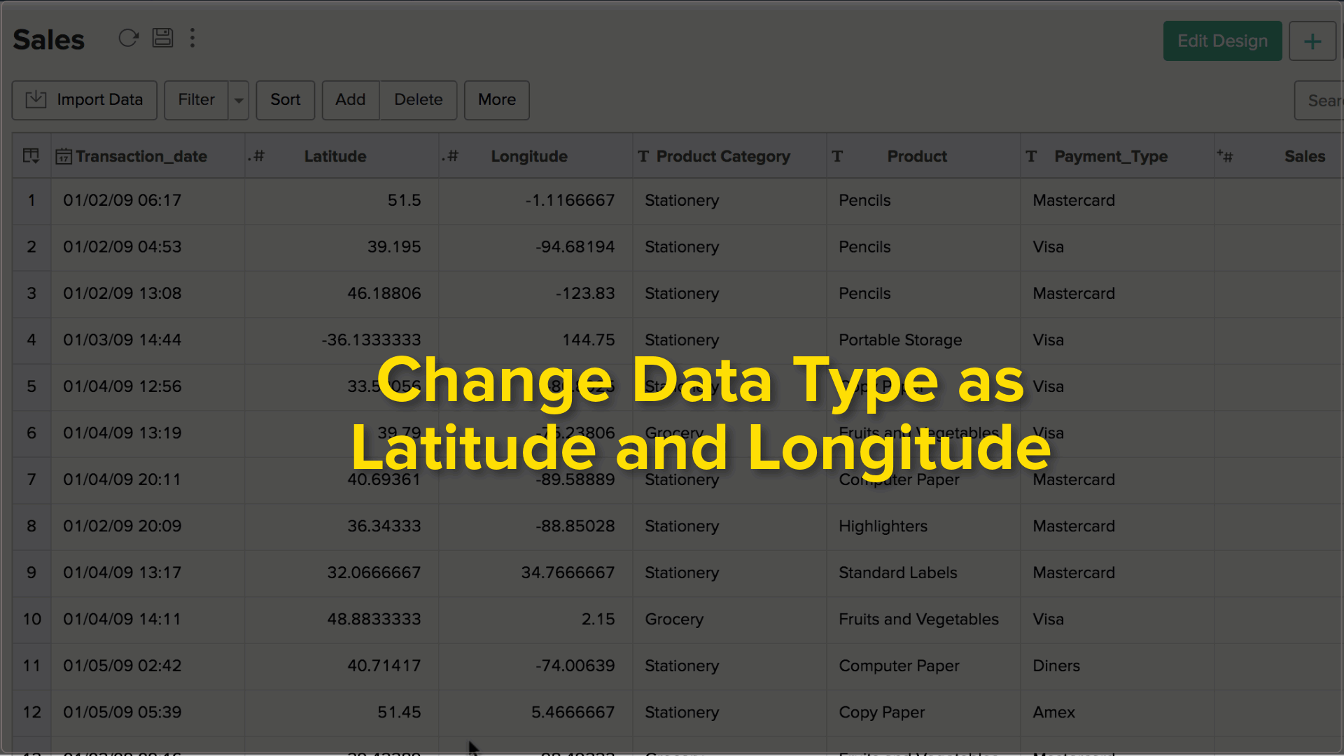
5. I have Latitude and Longitude specific information in my dataset, can I create a map chart using that?
Yes, you can. To create a map chart using latitude and longitudes, you need both latitude and longitude data as different columns in your dataset and set the data type of the columns to Latitude/Longitude.
Follow the steps below to change the data type of your column.
- Right-click the column name and select Change Data Type.
- Select the Latitude/Longitude from the drop-down.
Click OK.
- You can choose the format for the latitude and longitude columns using the Format Column option.

Note: Ensure that the data type is changed to Latitude or Longitude to use the format specific to the latitude and longitude columns.
- Right-click the column name and select Format Column from the drop-down.
- In the Format Column dialog that opens, Specify the Alignment.
- Choose the preferred format from the Display Format drop-down. Supported formats are,
- Decimal
- (+/-) 12.3456789
- Degrees Minutes Seconds (DMS)
- (+/-) 12° 34' 56"
- 12° 34' 56" (N|S|E|W)
- (+/-) 12d 34m 56s
- 12d 34m 56s (N|S|E|W)
- (+/-) 12.3456°
- 12.3456° (N|S|E|W)
- Decimal
- Click OK.
Once you have set the data type as latitude and longitude, you can create reports using this.
6. I have a postal zip code in my dataset, can I create a map chart using that?
Yes, you can. To create a chart using this you need to change the data type of the column to Zip code.
Follow the below steps to change the data type of your column to Zip Code.
- Right-click the column name and select Change Data Type.
- Select the Zip Cope from the drop-down.
- Click OK.
Once you have set the data type as Zip Code, you can create reports using this.
7. I have airport IATA code in my dataset, can I create a map chart using that?
Yes, you can. Zoho Analytics will automatically identify your data as IATA code. In case it is not identified, you need to change the data type of the column to Airport.
Follow the below steps to change the data type of your column to Airport.
- Right-click the column name and select Change Data Type.
- Select the Airport from the drop-down.
- Click OK.
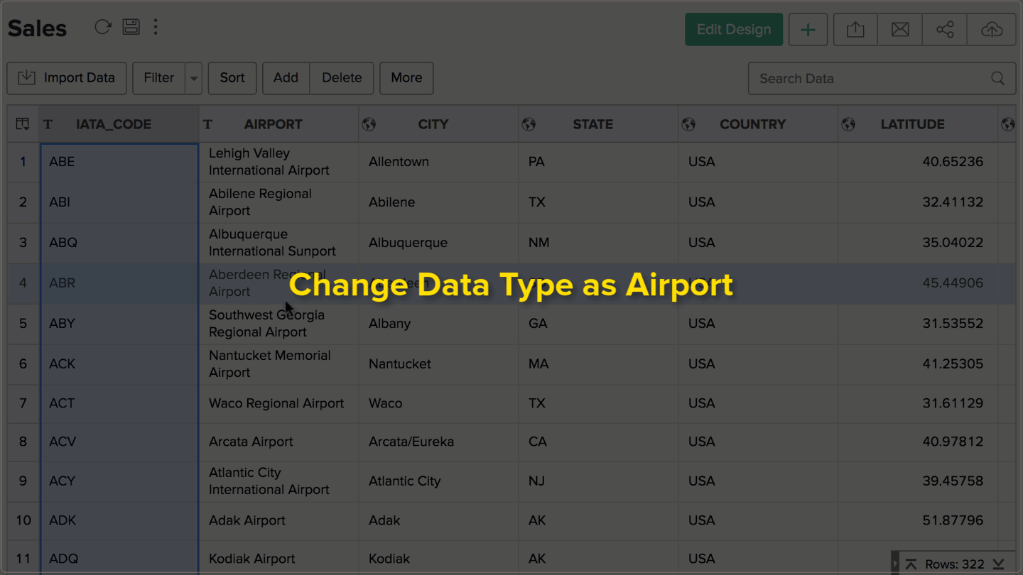
Once you have set the data type as Airport. You can create reports using this.
8. What are unresolved locations and from where do I access the list?
When you plot a map chart, sometimes Zoho Analytics might not plot all the data points in the map. This could be due to issues in resolving the geo location such as duplicated/ambiguous location names, misspelled locations, the colloquial name for places etc.
When Zoho Analytics is not able to identify a location, it is listed as an Unresolved Location(s) for the user to rectify the issue. You can find the list of unresolved locations by clicking the Unresolved Location(s) icon that appears in the Map toolbar when you mouse over the chart in the Edit Mode. Refer to the next question to learn about resolving them.
9. I have created a map chart but there are some unresolved locations, how do I resolve them?
Unresolved locations, as mentioned in the previous question, are Geo locations (places) that Zoho Analytics is unable to identify. You can help Zoho Analytics to resolve them, by providing the required/missing information, as described in the below steps.
Resolving through Geo Column Mapping
Mapping it to a country column: This will allow Zoho Analytics to identify the country in which the unresolved place is located and plot it appropriately. If you have a country column in your data-set, you can map it to resolve the unresolved locations.
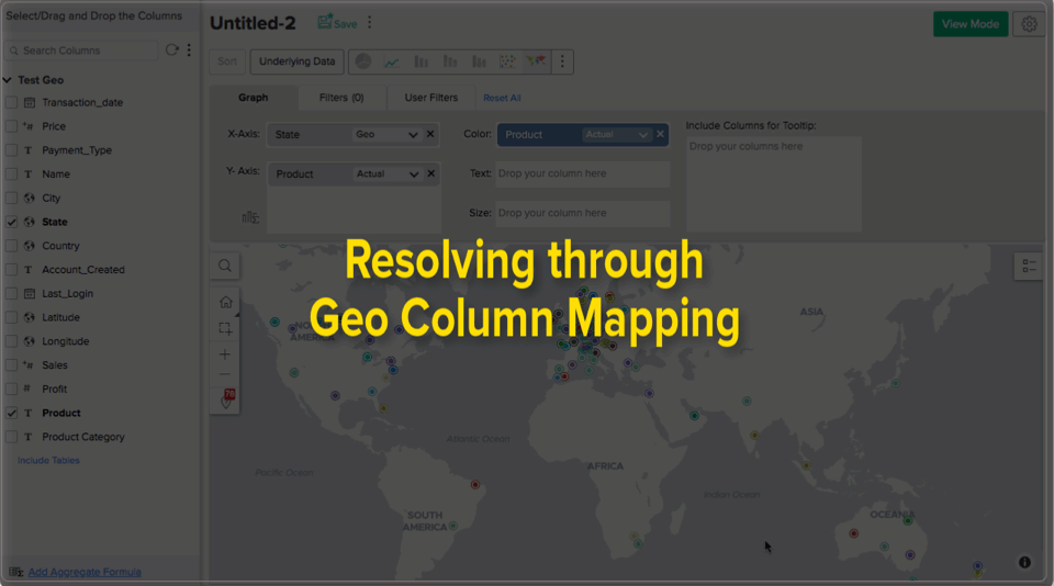
In case you do not have a country column, but all the state/cities belong to a single country, you can use Provide the Location option and enter the name of the country.
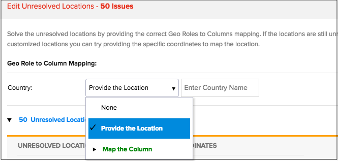
Mapping it to a state column: This is in addition to mapping the location to a country column. If your dataset contains a state column further mapping it to a state column will help Zoho Analytics identify the state in which the unresolved location is located.
In case you do not have a state column, but all the cities belong to a single state, you can enter the name of the state by selecting Provide the Location option as described above in the case of a country.
Note: You can also resolve these issues from the parent table.
Correcting Misspelt Locations
Zoho Analytics will not be able to identify the location if the spelling of the location is not correct. For example., Hong Kong spelled as Hongkong or Brooklyn being spelled as Broklyn.
In this case, we recommend you to correct the spelling either in the original data and then import it into Zoho Analytics, or make the necessary corrections in the Zoho Analytics table.
Plotting the Latitude and Longitude
You can also resolve the issues by specifying the latitude and the longitude values of the corresponding location from the unresolved locations page.
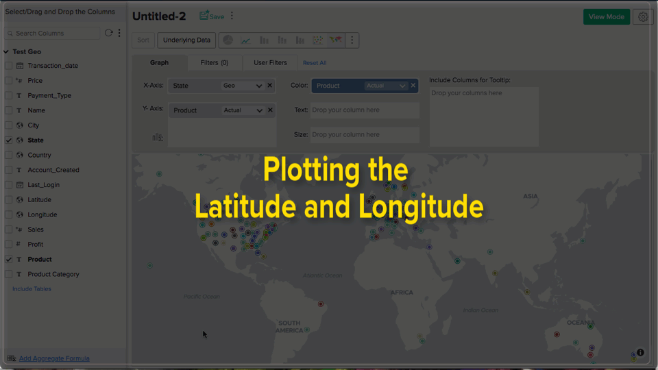
Pick the Location
You can also pick the location by clicking the Pick Location link. Search for the location in the map using the given search field. Place the picker in the correct Geo location in the map and click Apply. The latitude and the longitude values for the selected location will be auto-filled in the respective fields.
Creating Geo Charts
1. What are the supported map chart types?
Currently, Zoho Analytics supports 5 types of map charts,
- Map Scatter
- Map Bubble
- Map Pie
- Map Bubble Pie
- Map Filled
- Geo Heat Map
Zoho Analytics will auto identify the appropriate Geo Map type from the columns used in the chart. You can also change the chart type using the Other Charts option.
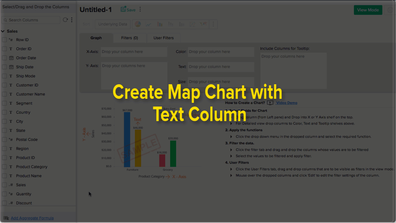
2. How do I create a map chart?
You can create a map chart by dragging and dropping a geographical column (a column of type "Geo") into the X- Axis shelf and the required columns in other shelves. The below animation shows how to create a map chart.
3. How do I create a Geo Heat Map chart?
Geo Heat Map chart displays data in a map, color coded based on the density of data points. The below animation shows how to create a Geo Heat Map chart, illustrating regions with high level of earthquakes in North America based on its magnitude.
4. Can I create a map chart for specific countries alone and hide the rest of the map?
Yes, you can create a map chart for specific countries with the help of the country-specific map. You can change the map type from the Maps tab of the Settings page.
The below animation shows you how to create a chart over specific countries.

Note:
- In this mode, you can plot the chart for both across the world or for specific countries.
- To create a map chart using the latitude and longitude information, you need to ensure that the data type of the column is set to Latitude and Longitude. Refer to this section to learn how.
- The below animation shows you how to create a chart using Latitude and Longitude data. In this chart, we have plotted the total profit gained in a location grouped by product category.
5. Can I create state specific charts?
Zoho Analytics allows you to choose specific state maps within the selected country. By visualizing geographical data on these state maps, you can get a more impactful analysis of specific regions. Follow the below steps to display the state map.
- Select the Display Specific Country Map checkbox.
- Select the type of Projection from the projections drop-down.
- From the Countries drop-down, select the required country.
- Choose the required states from the State drop-down.
- Enable the Display the entire country map checkbox to showcase the political representation of the state map within the encompassing country map.

The following is an example map for analyzing the Open alarms based on Location in the north eastern parts of the United States of America.

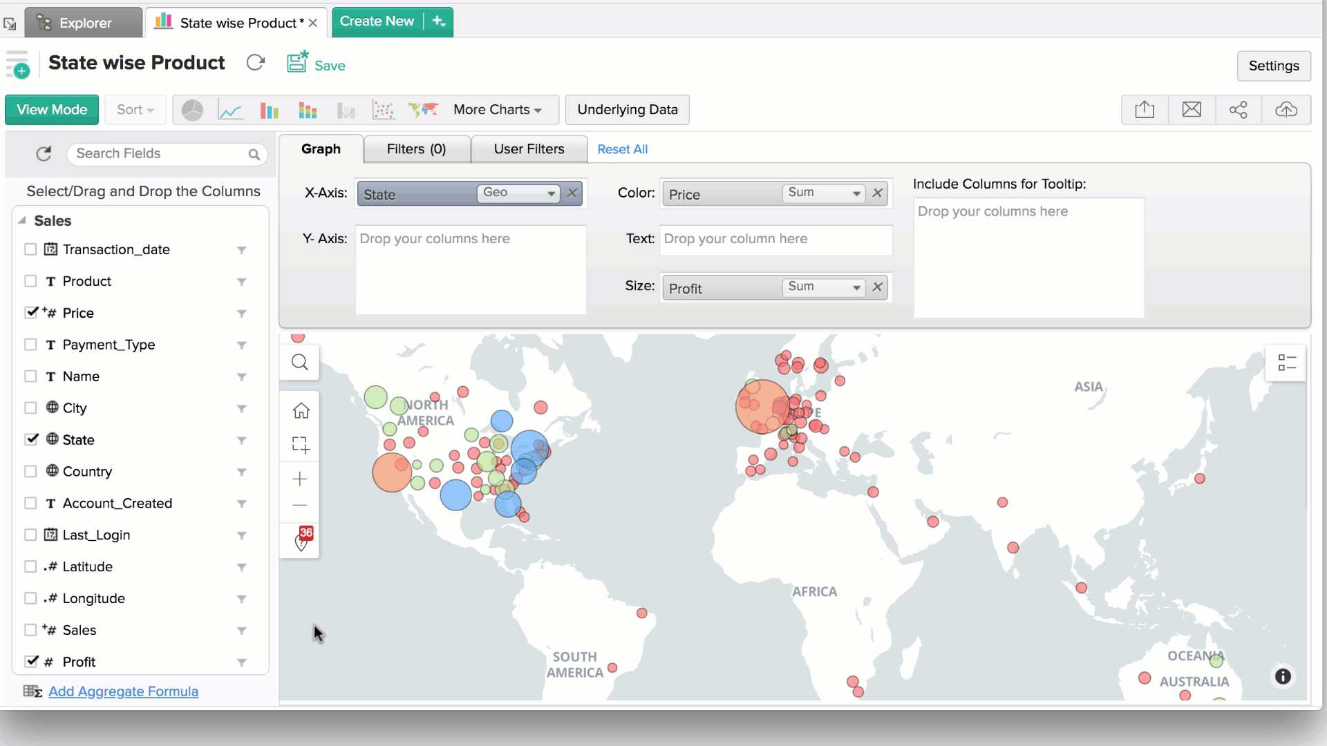
6. How do I create a map chart using the latitude and longitude columns?
To create a map chart using the latitude and longitude information, you need to ensure that the data type of the column is set to Latitude and Longitude. Refer to this section to learn how.
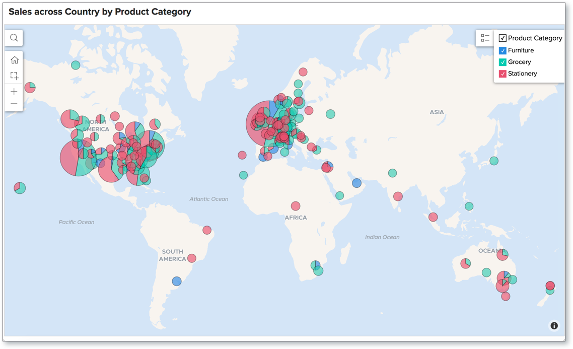
The below animation shows you how to create a chart using Latitude and Longitude data. In this chart, we have plotted the total profit gained in a location grouped by product category.
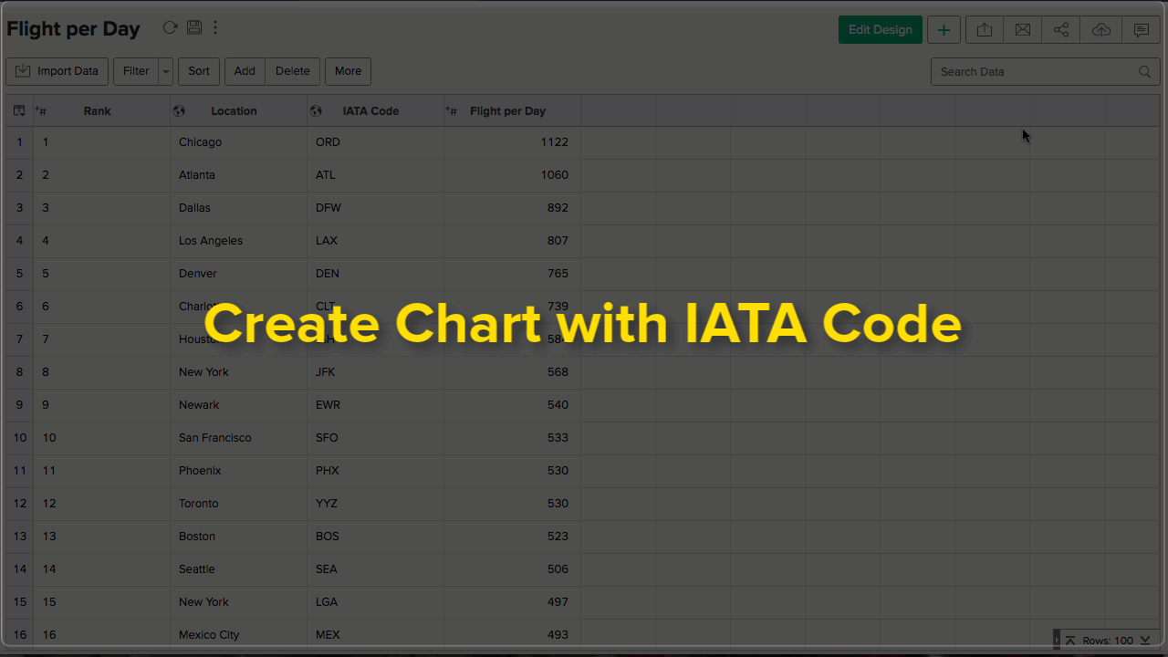
7. How do I create a map chart using the Airport information (IATA Code)?
To create a map chart using the airport information (IATA code), you need to ensure that the data type of the column is set Airport. Refer to this section to learn how.
The below animation shows how to create a chart using Airport data. This chart plots the busiest airports in the US, based on the number of flights per day.
8. I have a column whose data-type I do not want to change to "Geo". Can I still create a map chart using it?
Yes, you can do it using the Treat as Geo option in the chart designer. When you use this option, the data type of the column used in creating the report will be considered as a Geo Data Type only for that particular report.
In the below animation, the column 'State' is of string data type. We have created a map chart using this column using the option 'Treat as Geo'.
9. What are the interaction options available on map charts?
Zoho Analytics provides an immersive Geo map visualization with its wide range of interaction options. You can interact with the overall map chart using the map toolbar options that appear on the left corner of the map. Regular chart marker and legend specific interactions are also available.
Interactions using the Map Toolbar
- Search - This option allows you to search for any location on the map.
- Home - This option returns the map chart to its original dimensions. You can also customize the map chart's default home screen.
- Grab Area - You can use this option to select a required area on the map, and zoom in.
- Zoom in
- Zoom out

Chart Interactions
In addition to these map chart interactions, options such as drill down, view underlying data, and legend filter will also be applicable.
Customizing Geo Charts
1. How can I customize the map chart settings?
Zoho Analytics allows you to easily customize the look and feel of your map chart from the settings option.
- Click the Settings option in the toolbar.
The Map Chart Settings page will open as shown below. Please note that the options on this page will differ based on the type of the map chart selected.
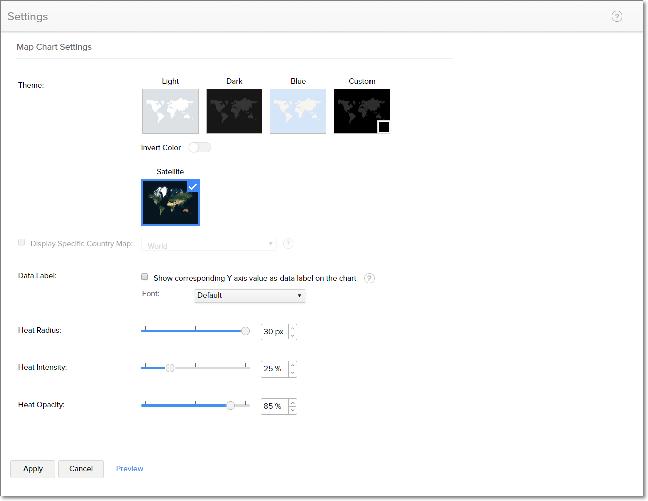

- Theme: This option allows you to change the theme of the map. You can also change your map chart to a satellite chart using the Satellite option.
- Invert Color: This option allows you to invert the colors in the map chart, and is not applicable for Satellite themed maps.
- Data Label: Displays the Y-axis values on the map.
- Fill Opacity: You can specify the opacity of the chart series color. This option is not applicable for Map - Scatter charts.
- Markers Type: You can select the type of the marker that you wish to display. This option is applicable only for Map - Scatter charts.
- Display Specific Country Map: This option allows you to display specific countries in the map chart. To learn more, click here.
- Heat Radius: You can specify the boundary to combine the data points for heat calculation. This option is applicable only for Geo Heat map charts.
- Heat Intensity: This option allows you to customize the intensity of heat, and is applicable only for Geo Heat map charts.
- Heat opacity: You can customize the opacity of the heat map. This is applicable only for Geo Heat map charts.
3. After modifying the necessary settings, click Apply.
Zoho Analytics offers a wide range of options to customize the chart. Refer here to know more chart setting options that improve the overall appearance of your chart.
2. How do I customize the map chart Theme?
Zoho Analytics provides the following themes for the map chart.
- Light - Applies a light grey theme.
- Dark - Applies a dark grey theme.
- Blue - Applies a blue theme.
- Custom - Applies a theme based on custom chosen color.
- Satellite - Applies a satellite map.
Follow the steps below to customize the theme.
- Open the chart you want to customize.
- Click the Settings icon. The Settings page will open.
- Open the Maps tab.
- Select the required theme.
You can choose to invert the land and water color using the Invert Color toggle button. This is applicable for all themes except Satellite map.
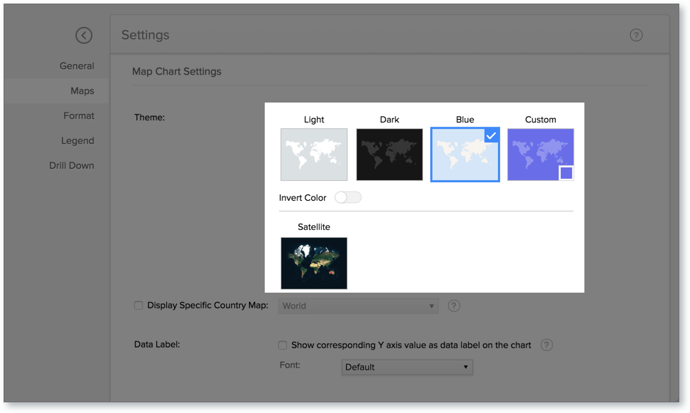
Click Apply. The selected theme will be applied.


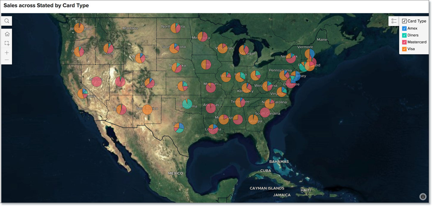
3. Can I create the map chart over the satellite map?
Yes, you can create a map chart over the satellite map. Follow the below steps to apply the satellite map theme.
- Open the chart to which you want apply satellite map theme.
- Click the Settings icon. The Settings page will open.
- Open the Maps tab.
Select the Satellite Map as Theme.
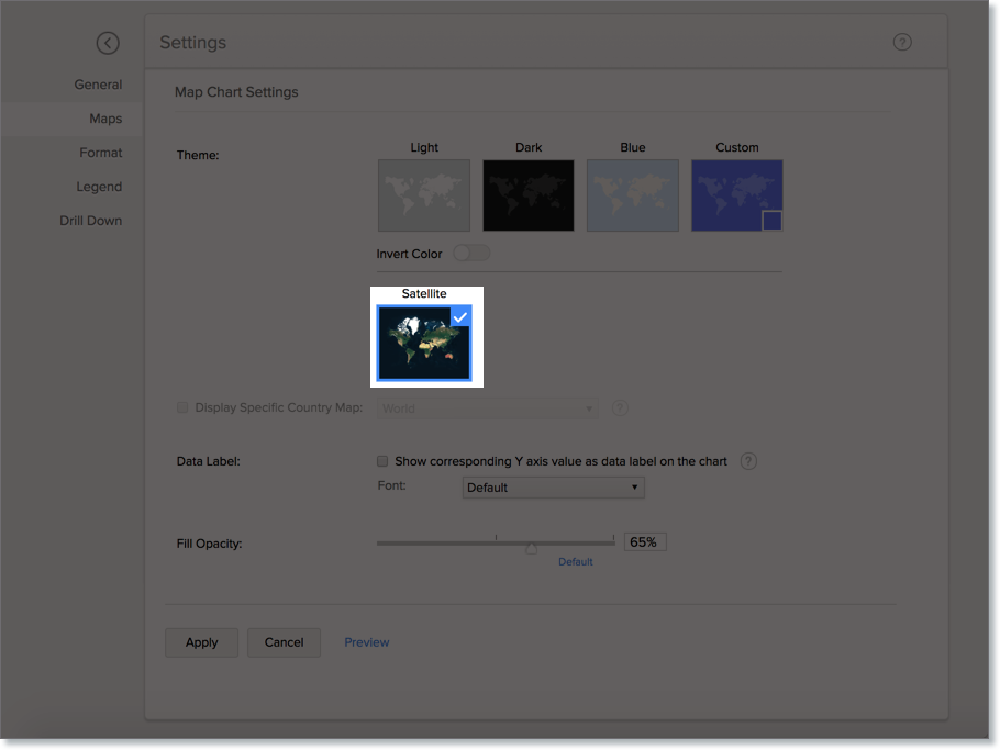
Click Apply. Chart will be plotted over satellite map.


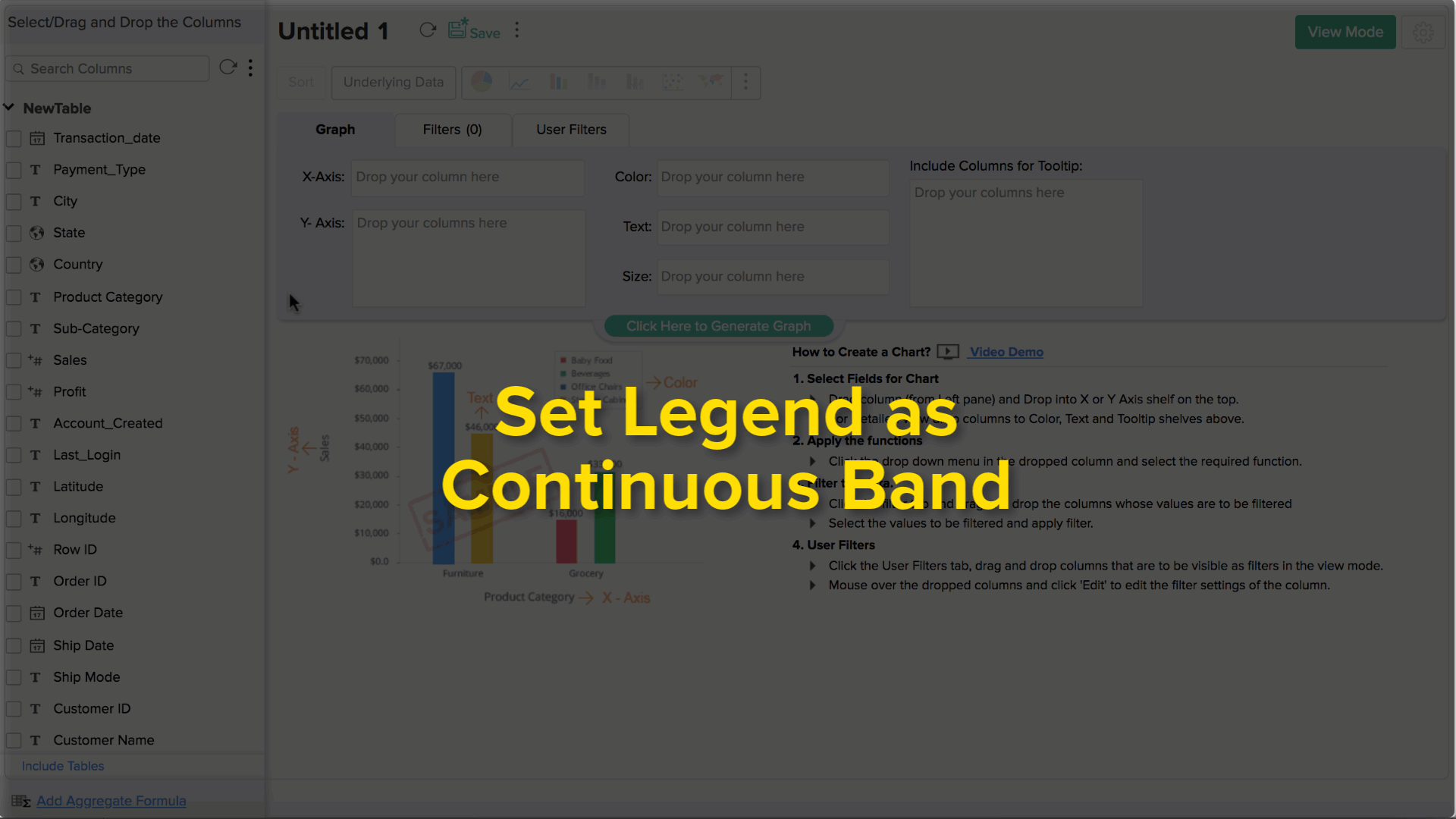
4. Can I use a continuous color range legend for map chart?
Yes, you use a continuous color range legend for map chart and categorize the data values using color range. This will be useful to differentiate data based on the volume of occurrence.
The below animation shows how to do set continuous band as the legend.
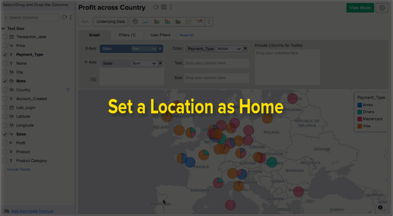
5. Can I customize the default home screen of the map chart?
Yes, you can set the default home screen of the map chart.
The below animation shows how to do set default home screen.
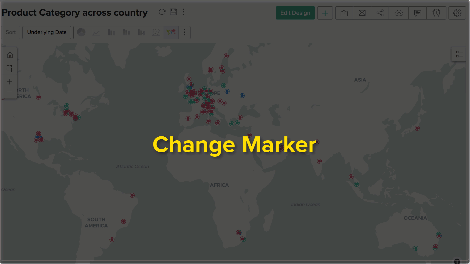
6. How do I customize the marker used in the Map - Scatter Chart?
Markers are used to identify the location in a map. Zoho Analytics provides you six types of marker types to choose from.
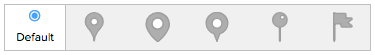
The below animation explains how to change the marker type in a map-scatter chart.
7. How do I customize the color of the charts plotted in the map?
You can customize the chart color of your map charts as you do for other chart types. Please refer to this documentation to learn more.
8. How do I customize the legend settings in a map chart?
Refer to the legend settings documentation in charts to learn customizing the legend settings in map charts. Please note that you cannot change the legend position in a map chart.