KPI Widgets
Zoho Analytics offers a widget-based model for adding single numbered widgets and chart type widgets within dashboards. These are called KPI Widgets.
Zoho Analytics offers 2 types of KPI widgets
- Single number widgets
- Chart type widgets
- Adding images and icons to KPI widgets
- Adding Descriptive Tooltip
- KPI widget with images
- KPI widget with forecast
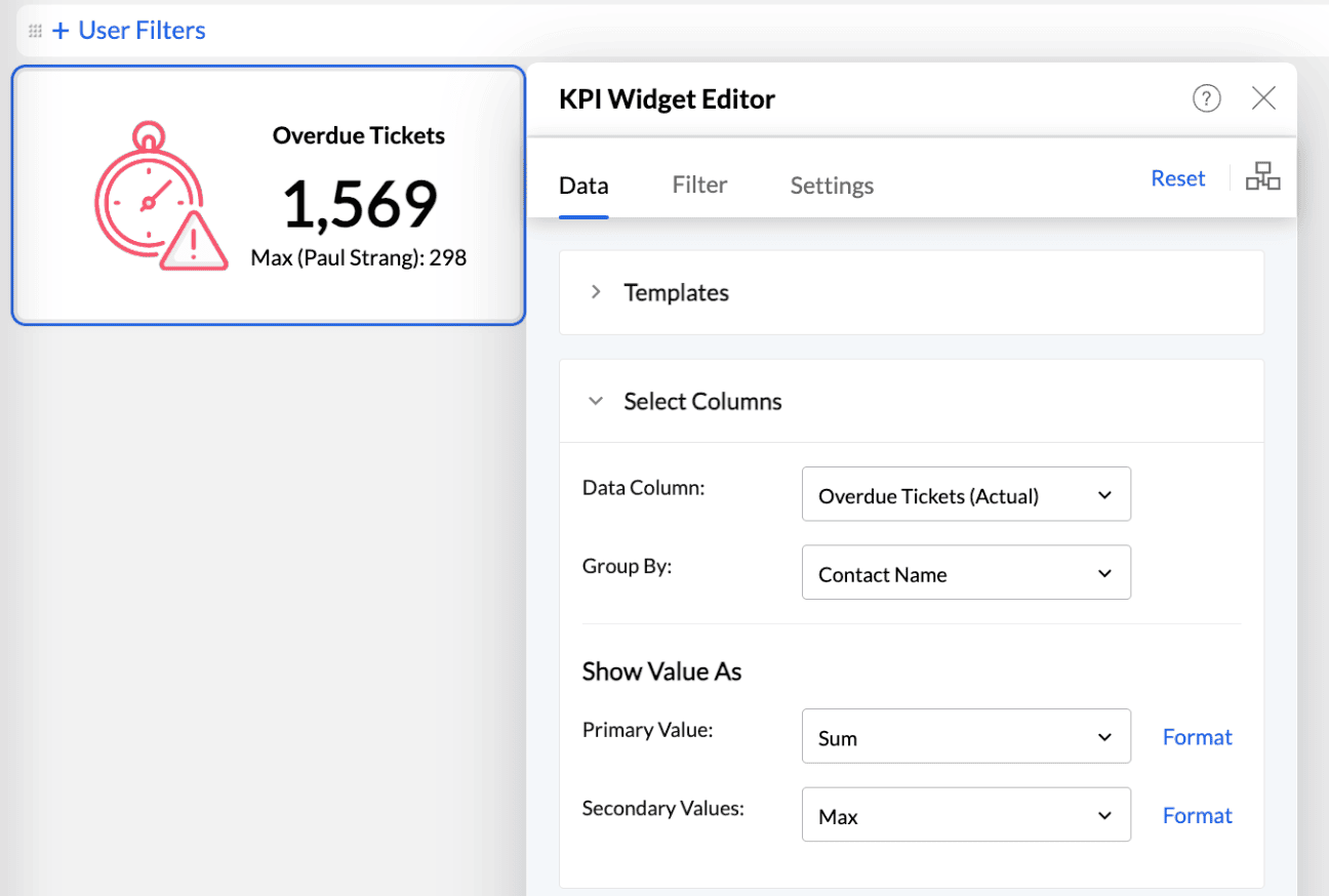
Adding Single Number Widgets
Single number widgets are used to display a single numeric value in a formatted text. They are useful to highlight key metrics in a dashboard. The key metric can also be accompanied by comparison indicators to highlight the trend. Zoho Analytics currently offers 6 types of single number widgets with or without comparison indicators.


Adding a Numeric Widget
The below presentation shows how to create single numeric Widgets.
Chart type Widgets
The chart type widgets of Zoho Analytics enables you to highlight your data metric using chart visuals. These are different from the actual charts and are focused on displaying a single value. Currently, Zoho Analytics supports three types of Chart Widgets.


Bullet Chart
A Bullet chart is best suited to highlight a metric and compare it with a target value. You can also specify qualitative ranges of performance, such as poor, satisfactory, and good. The qualitative ranges are displayed as varying intensities of a single hue.
A Bullet widget in Zoho Analytics looks as shown below. The red arrows in the image highlight the various components of the bullet chart.

Dial Charts
A Dial chart is used to indicate the current value of a metric in a given range. Although similar to a bullet chart, it displays the values in the form of a semi-dial. You can also specify qualitative ranges of performance using dial charts.
The following types of dial charts are available in Zoho Analytics:
Simple: This is a basic dial chart which consists of chart range, target, key metric plot, and its value.

Speedometer: The speedometer is a dial chart with an indicator that marks the position of the key metric value in a given range. By default, the qualitative ranges in the speedometer don't follow the same hues. The red, yellow, and green colors prove beneficial in indicating your performance range.

Conditional: In conditional dial charts, the color of the key metric plot is based on the specified conditions. This helps in categorizing key metric values into different qualitative buckets.

Zoho Analytics allows you to specify a default color for the key metric plot, and different colors when a condition is met. For instance, to measure the progress of sales over a month, you can assign various colors for instances when the sales reaches 25% and 50% of the overall sales. The default color will be applied when the sales value is above 50%.

You can choose the required dial chart from the Settings tab in the KPI editor. Refer to the adding chart type widgets section to learn more.
Full Dial Chart
Full Dial Chart is a gauge chart with full ring. This is similar to Dial Chart. The Maximum Range value will be set as the value of the full ring.
Shown below is a sample Full Dial Chart. The red arrows in the image highlight the various components of the full dial chart.

Adding Chart Type Widgets
The below presentation shows how to create Chart Type Widgets.
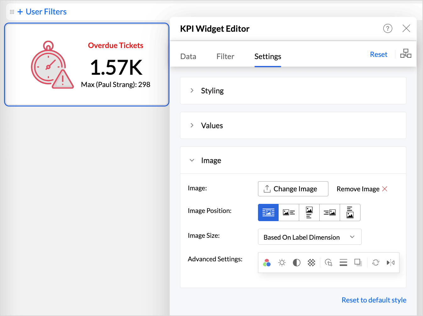
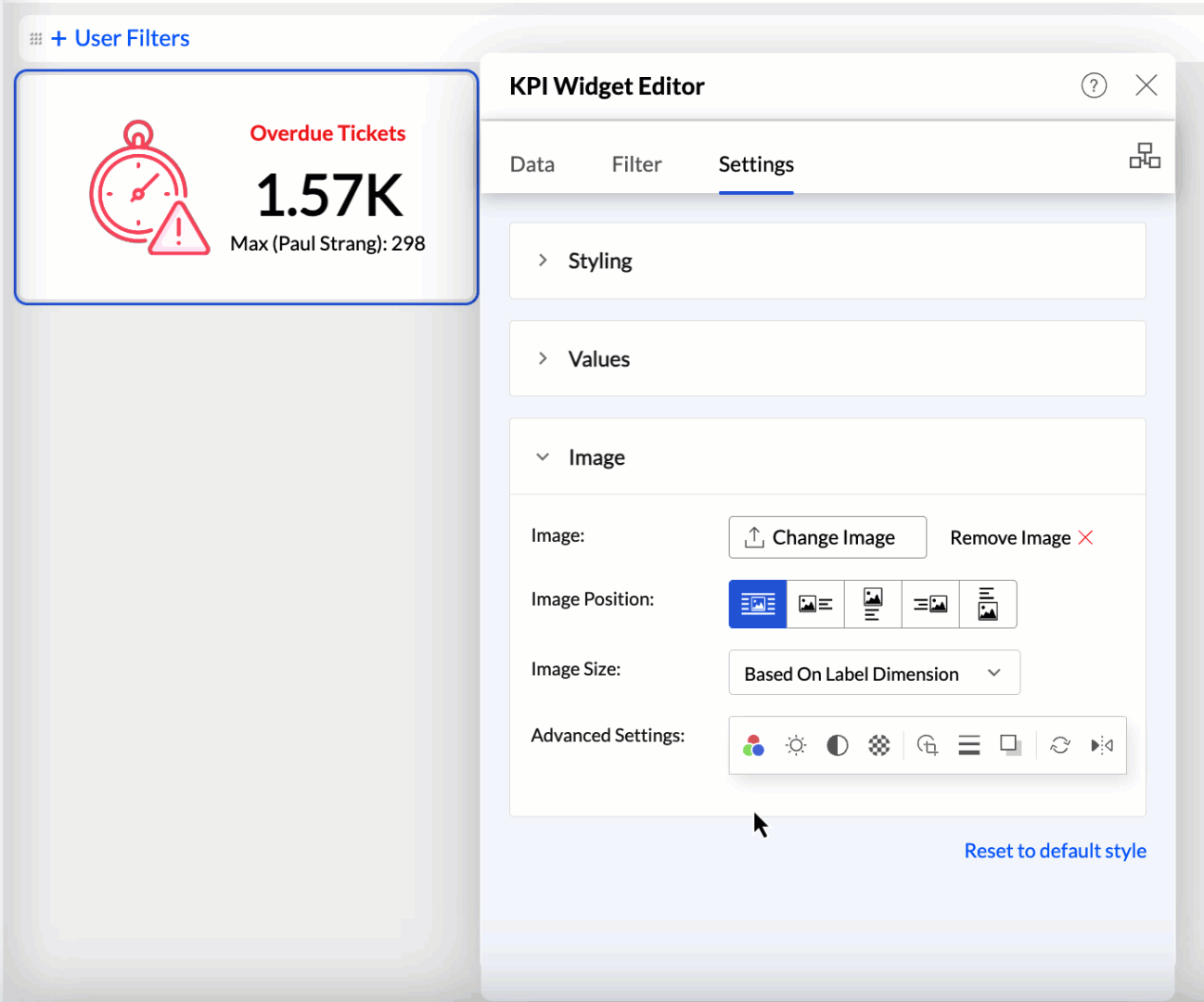
Adding images and icons to KPI widgets
Analytics Plus enables you to enhance your dashboard widgets by adding image and custom icons to provide visual cues about the type of information they display. This feature helps convey information more effectively without requiring lengthy descriptions. Follow these steps to add images and icons.
- Click the Choose Image button to browse and select the desired image or icon.
- Choose the desired position for the image, such as left, right, top, or bottom, to place it within the widget layout.
- Use the Image Size option to adjust the image or icon size. The following are the available options:
- Original Image: Displays the image or icon at its actual size.
- Based on label dimension: Resizes the image or icon to fit the dimensions of the associated label.
- Custom: Allows you to manually specify the desired dimensions for the image or icon.
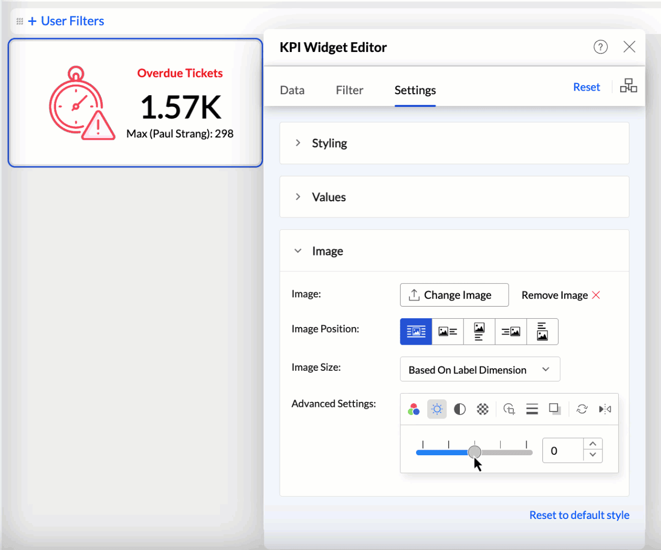
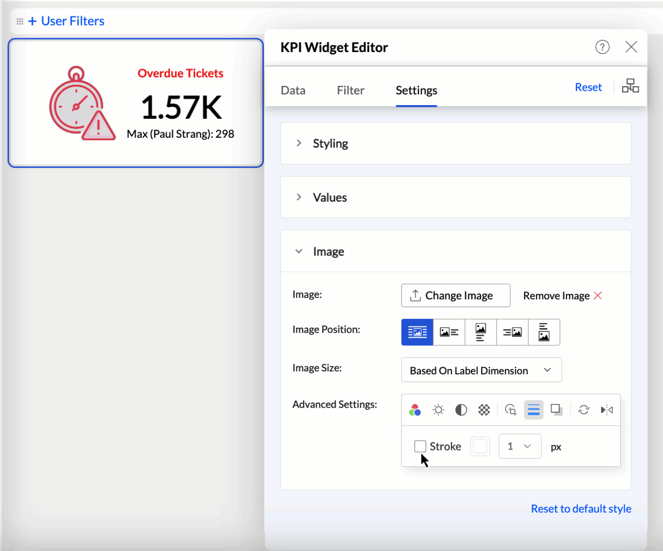
You can also customize or edit the image using the following options:
- Color: Set a different color to the icons.
- Brightness: Modify the brightness level to enhance visibility.
- Contrast: Change the contrast to make details more pronounced.
- Transparency: Set the image's transparency to blend seamlessly with other elements.
- Crop to Shape: Crop the image into predefined shapes to fit your design needs.
- Stroke: Add or adjust the border around the image.
- Drop Shadow: Apply a shadow effect to give the image a three-dimensional appearance.
- Rotate: Rotate the image to the desired angle.
- Flip: Flip the image horizontally or vertically for the desired orientation.
To revert any changes made to the image or icon, click the Reset to default style link at the bottom of the image editor.
Adding Descriptive Tooltip
Analytics Plus allows you to equip widgets with an informational tooltip. This is achieved by enabling an information icon and providing a concise description.
To add informational tooltip to your widgets:
- Access the KPI Widget Editor.
- Navigate to the Settings tab and select the Values section.
- Enable the Widget Info checkbox. This activates the info icon on your widget.
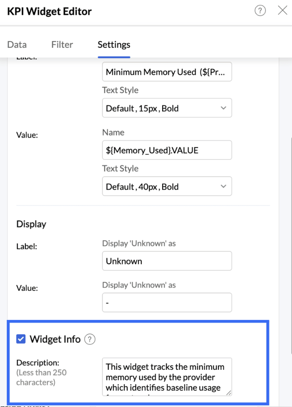
- In the Description box, enter a description for your widget (less than 250 characters).
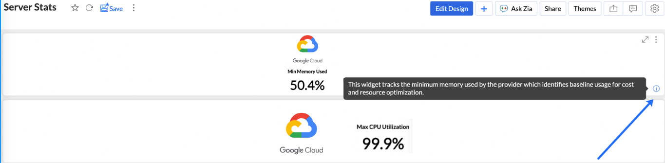
Once finalized, close the widget editor. In View mode, users can hover over the new info icon on the widget to read your description as a tooltip.


KPI widgets with images
Images help process information far more efficiently than numbers and lengthy text descriptions. They also improve the visual appeal and aesthetics of the dashboard, resulting in increased engagement and attention span from users.
Analytics Plus allows you to incorporate images into dashboard widgets. This can be done in two ways:
- Static Images in Widgets: These images indicate the type of data and information displayed in the widget. The images do not change based on data fluctuations.
- Dynamic Images in Widgets: Data values are grouped by the Image column, resulting in images changing dynamically based on the groupings defined in that column.
Creating Widgets with Static Images
- Open the dashboard in Edit mode and click the Widget button.
Choose the suitable Widget Type.
- Choose the Data Column for computing and the column to be used for Group By.
- Access the Settings tab and click Image.
- Click Choose Image. You can upload a locally stored image, GIF, or an image URL.
- Customize the Image Position and Image Size. By default, the image is positioned at the center.
- The Navigation Bar below the Preview section provides the following customization options:


Easily change the color of the image to suit the dashboard theme. You can also apply the Font Color to the image.
Adjust the Contrast, Brightness, and Transparency to enhance image visibility.
Include Stroke and Shadow to make images more prominent.
- Use the Rotate and Flip options to change the orientation for better alignment within the dashboard layout.
- Click Apply.


Creating Widgets with Dynamic Images
To create widgets with images:
- You need a column that contains image URLs.
- Each image size should not exceed 200 KB.
The Display As option under the Format Column menu must be set to Image. The presentation below shows how to create widgets with images.
KPI widgets with forecast
KPIs are beneficial for measuring progress toward goals. By combining KPIs with forecasting, you can better understand how close you are to achieving your goals based on current data trends.