Customizing Geo Charts
Zoho Analytics provides extensive possibilities to customize the map settings. This section discusses the different options available in Zoho Analytics to customize the appearance of a Map view.
General Settings
The General tab in the Settings page allows you to customize the general settings of the map view. Follow the below steps to customize the map.The General Settings page has four main sections
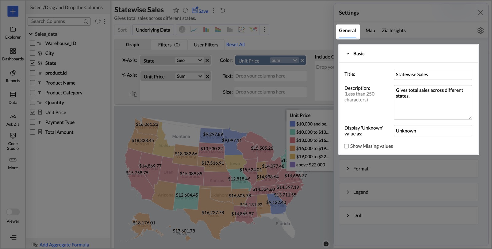
1. Basic
The Basic section under the General Settings tab allows you to modify the title, add a description for the created map view, and choose whether to display missing values.
Follow these steps to customize the map settings:
- Click the Settings icon in the top-right corner.
- The Settings dialog will open on the right.
- In the Basic section under the General tab, you can adjust the basic settings as needed.


2. Format
You can modify the Format of the columns used in the reports whenever needed.

3. Legend
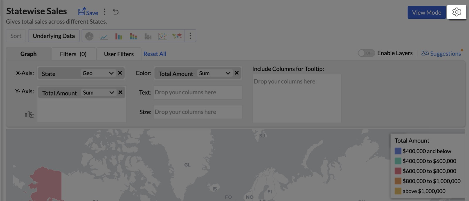
The legend in a chart provides a quick overview of the different data series involved in the chart along with the color associated with each series. Legend comprises Legend Title and Legend Items. Each legend item comprises a colored box that indicates the data series and the name of the data series.
In Zoho Analytics, by default, the legend will be placed on the right side of the chart, and legend items will be added to it depending on the data series involved in the chart. You can customize the legend position, legend title, legend filters, and the colors of each data series easily.

The following table describes the options available in the Legend tab:
Option | Description |
Legend Position | This option allows you to set the position of the Legend in a chart. Supported positions are:
Enable the Collapse by Default checkbox to have an expand and collapse type legend. |
Title | This option has two fields. The checkbox allows you to show or hide the legend title. In the text field, you can change the default and customize the font style of the legend title. |
Font | Using this option, you can customize the font style of the legend items. |
Legend Filters | Select this option to enable legend items to act as filters in chart view mode. This allows users to dynamically filter the data series using the legend items. |
Palette Type | Select the Palette type. Zoho Analytics offers four types of palettes. They are:
|
Color Palette | Select the color palette to apply color for your data series. You can also select a color palette based on the palette type that is selected. Zoho Analytics has a predefined set of color palettes that you can choose from. Apart from this, you can also add new color palettes. |
Colors | Using this option, you can override the colors of the individual series of the chart. Once you override the palette, you will find the following options.
|
4. Drill
The drill capability allows you to view data at different levels of granularity. It facilitates comparison between different segments of the data.
- Drill down- Enables users to click on a data point within a chart to explore underlying data in greater detail, facilitating deeper analysis.
- Drill through - Allows users to navigate from a specific data point in a chart to a related, detailed report or dashboard, providing comprehensive insights into that particular data segment.
For more details about the Drill capabilities in Zoho Analytics, click here.
Map Chart Settings
The Map tab in the Settings page allows you to customize the Map view. Follow the below steps to customize the map.The Map Chart Settings page has four main sections, which allow you to customize the Map view.

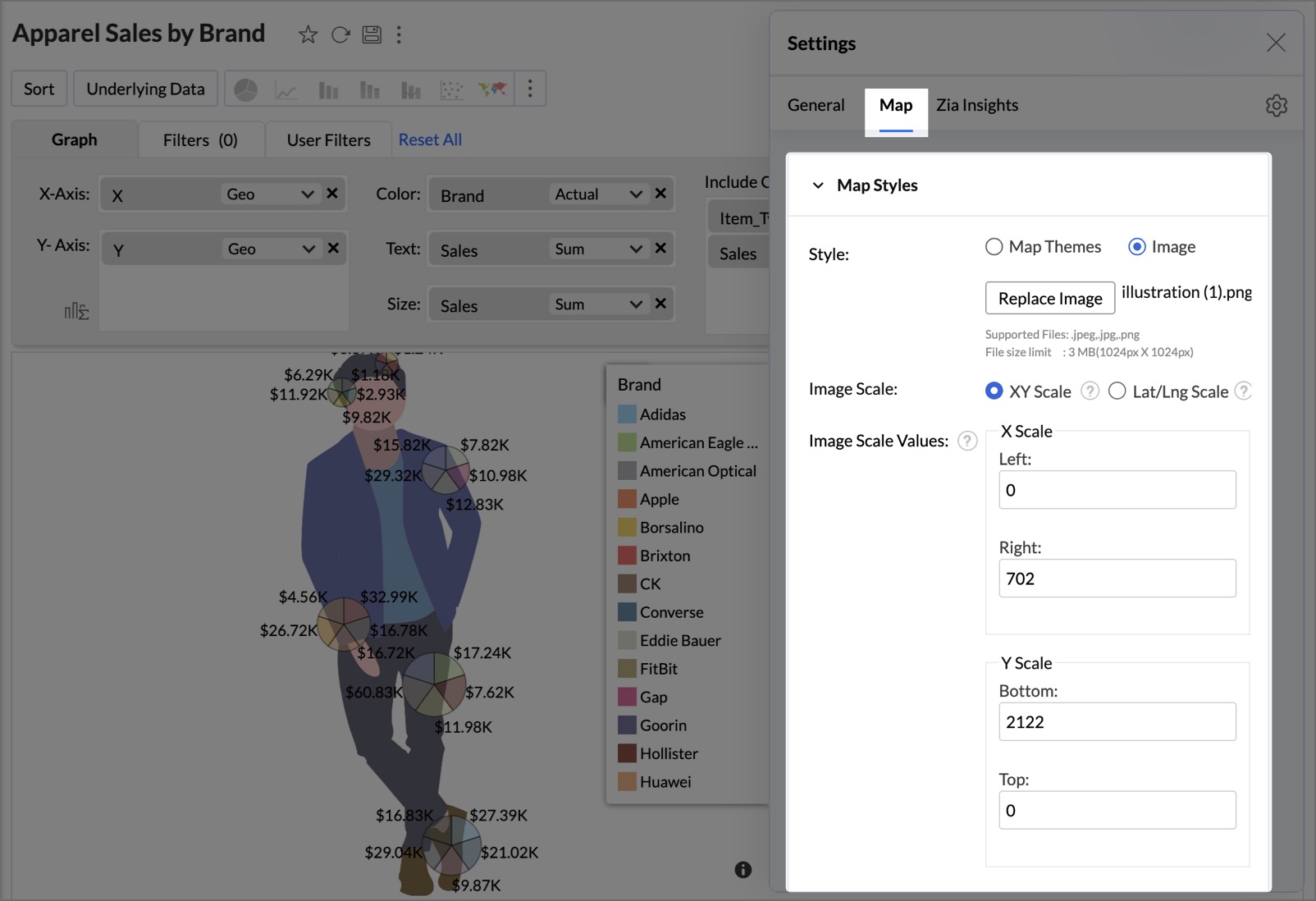
1. Map Styles
You can choose the Background for the chart you create or use a custom image to analyze data. The following are the options available to customize the backgrounds of the views you create.
You can switch between these options in the Style section.
Map Themes
You can switch between different themes while creating a map view.
- Light: Applies a light gray color to the water areas and a white color to the land areas.
- Dark: Applies a dark gray color to water and a white color to land.
- Blue: Applies a light blue color to water and a white color to land.
- Custom: Applies a darker shade of the selected color to water and a light shade to land.
- Satellite: Applies a satellite map.
- The Invert Color toggle button, when enabled, switches the colors between water and land area.

You can adjust the opacity of the background map using the Washout option. This allows the data points or layers overlaid on the map to stand out more clearly against the less prominent background.
Image
Zoho Analytics allows you to overlay geographical data - such as coordinates or geo locations onto custom images, enhancing your data visualization capabilities.
Plotting Geo Data on an Image:
In the Chart Design Area, drag your X and Y coordinate columns to their respective shelves. Ensure these columns are set to the Geo data type.
If not, click the summary function drop-down on each column and select X - Geo > Longitude for the X-axis and Y - Geo > Latitude for the Y-axis.
Customizing Geo Charts with a Background Image:
- Access Map Settings: Navigate to the Map Style section within the Map Settings tab.
- Replace Image: Upload or select a new image to serve as the map's background.
- Image Scale: Adjust the scale of your image using XY Scale or Lat/Lng Scale to ensure data points align correctly.
- Image Scale Values: Define the plot area boundaries to control where data points appear on the image.
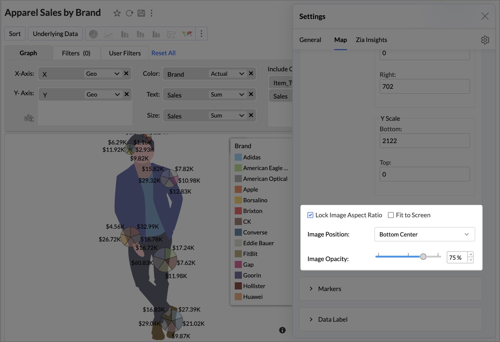
- Lock Aspect Ratio: Enable this to maintain the image's original proportions; disabling it may distort the image as the chart size changes.
- Fit to Screen: Select this option to expand the image to full-screen mode. For proportional scaling, use it in conjunction with Lock Aspect Ratio.
- Image Position: Determine the placement of the image within the drawing area using the Image Position drop-down menu.
- Image Opacity: Adjust the transparency of the background image to balance visibility between the image and overlaid data points.


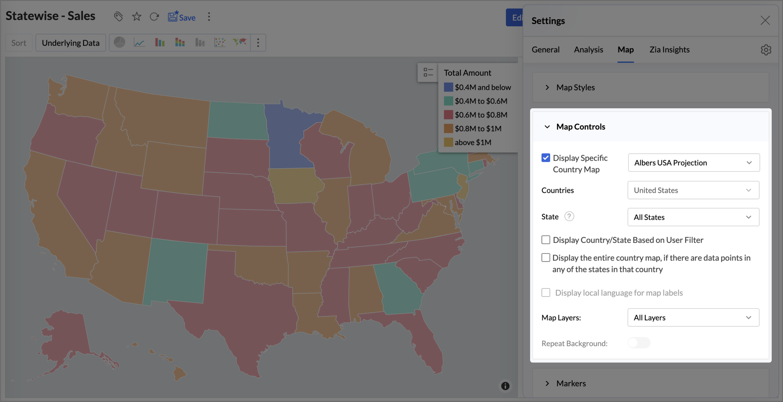
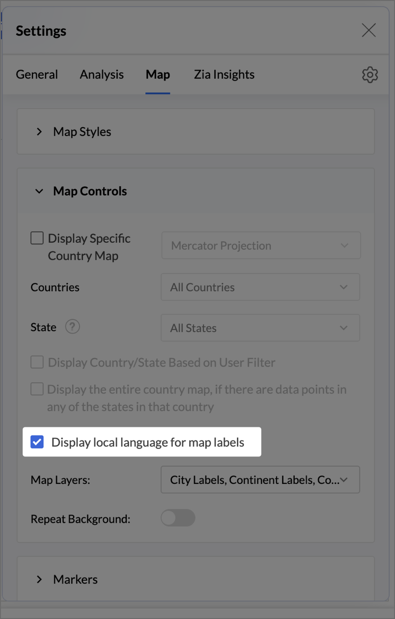
2. Map Controls
The Map Control section allows you to customize the map features by displaying specific country and state maps and adding map layers.
Display Specific Country Map
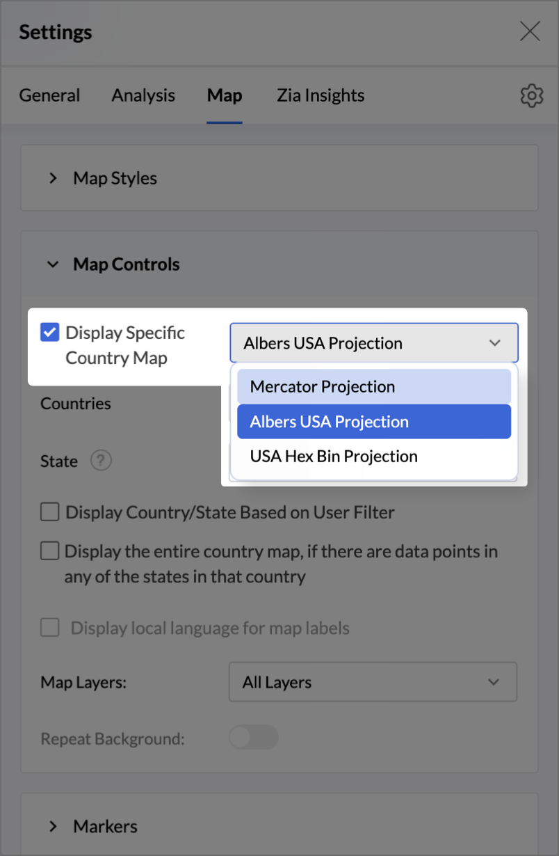
Zoho Analytics offers three map projections to plot data on a map view. You can choose the projection based on your needs.
- Mercator Projection - This is a conformal cylindrical projection that is widely used and is the default projection used while creating a map view in Zoho Analytics. By default, the world (all the countries) map will be displayed. You can choose a specific country map to be on display.
Albers USA Projection - This projection could be the ideal choice for visualizing US-centric data, as it shows Alaska and Hawaii in close proximity to the other states.
Note: If the data has values of other countries, using Albers USA Projection will display only the US data and ignore the other countries' data
USA Hex Bin Projection - This projection represents each U.S. state as equally sized hexagons arranged in a structured grid, regardless of their actual geographic size. It helps eliminate visual size bias and enables clearer, more accurate comparison of data values across all states.
Note:
- This works similar to the Albers USA projection and supports only State-level visualization; city or county-level mapping is not supported, and non-US locations will be automatically filtered.
- Only State labels will be displayed in this projection.

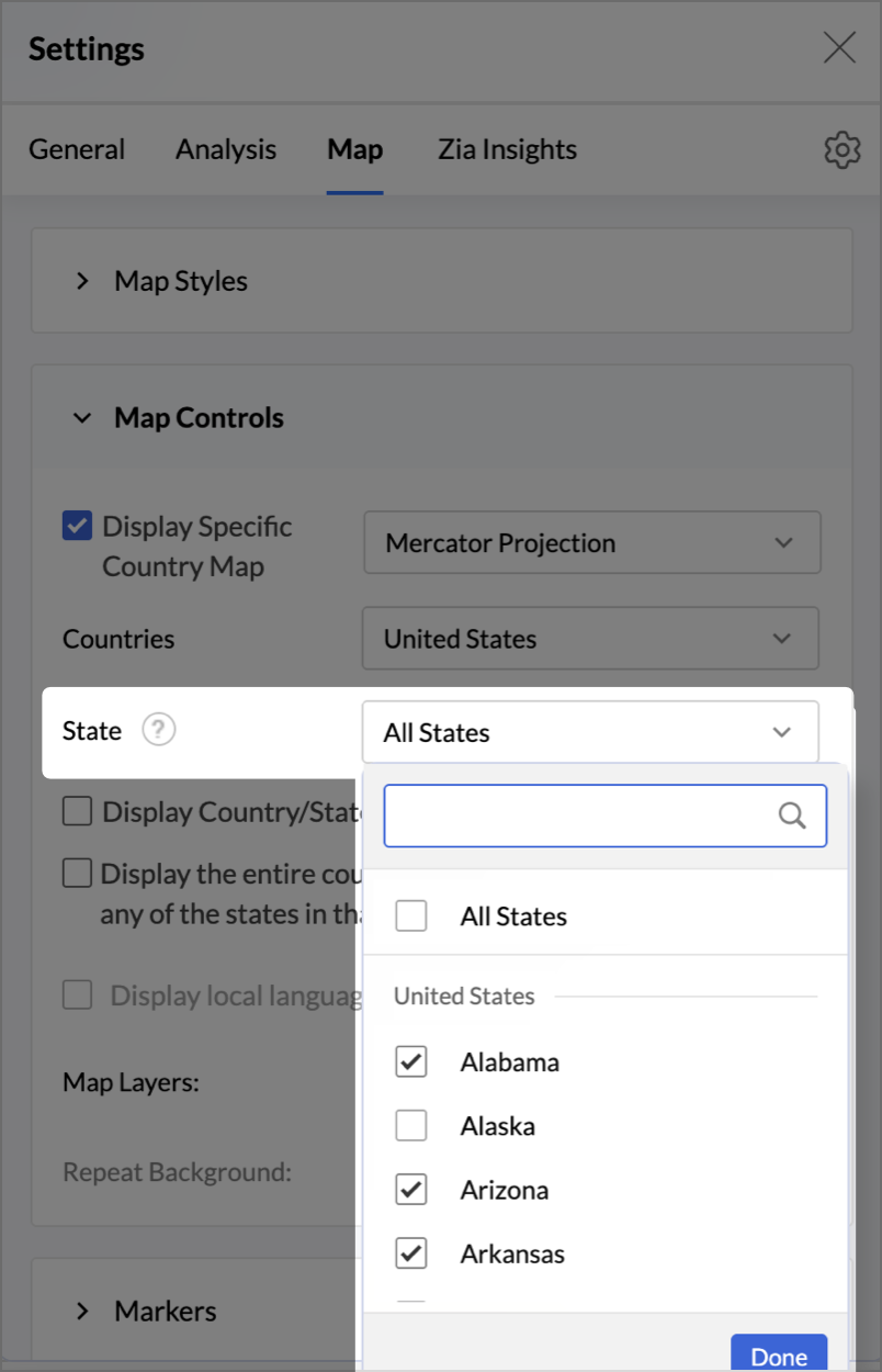
To display a specific country / state map,
- In the Settings dialog, navigate to the Map controls section under the Map tab.
- Select the Display Specific Country Map checkbox.
- Click the drop-down and select the projection of your choice from the list.
- From the Countries drop-down, select All Countries to visualize the world map or select specific countries to visualize a specific country map.
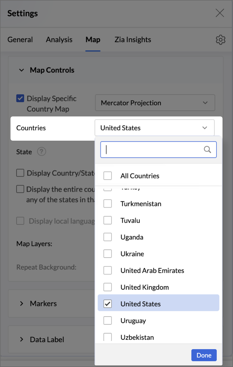
- Based on the Countries selected, you can choose to visualize all states or specific states of the country from the State drop-down.
Enable the Display Country/State Based on User Filter checkbox to dynamically adjust the map view based on the country or state selected in a user filter. When enabled, the user filter column containing country or state values is synced with the supported list of countries in the static map. In View mode, selecting a country or multiple countries from the user filter displays only the selected region(s) on the map.
 Note: This option is available only when Display Specific Country Map is enabled.
- Enable the checkbox Display the entire country map, if there are data points in any of the states in that country to show the full country map whenever any state within that country contains data points.


Display Local Language for Map Labels
Enable the Display local language for map labels checkbox to render map labels including country, state, city, and continent names, in the native language of each geographic entity.
When disabled, all map labels display in English, which is the default behavior.
Note:
- This option is not available when Display Specific Country Map is enabled.
- For Albers USA and USA Hex Bin projections, enabling this option produces no visual change, since US state and city names are displayed in English regardless.
- This setting applies only to map tile labels (geographic names). Data values, metric labels, legends, tooltips, and axis labels are not affected.
Map Layers
This option allows you to add/remove different layers of data and data labels in the selected geo map. You can add/remove data like country/state borders, water borders, roadway lines, airports, railways, etc.,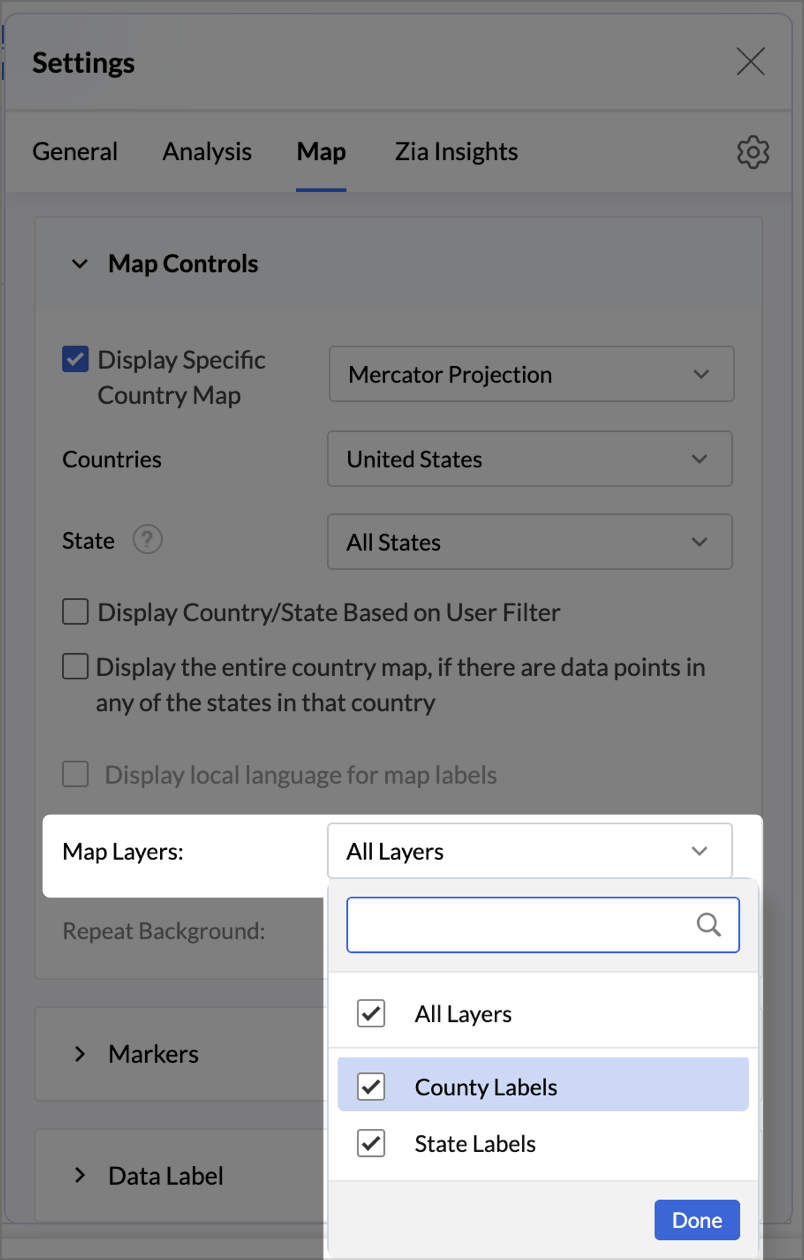
Note: When Display local language for map labels is enabled, labels for visible layers such as City Labels are rendered in their local script. Removing a layer from Map Layers hides its labels regardless of the language setting.
Repeat Background
Enabling this option allows the background map to tile or repeat itself across the chart area. This ensures that the map remains visible and consistent, even when zooming or panning to different regions of the chart.
Note: By default, the Repeat Background option is enabled for Satellite Maps, but it is not available for Static Maps.
3. Markers
The Markers section allows you to customize the markers used in the Map view. The Marker Settings available differ based on the chart type.

- Marker Type: Select a marker from the different types of markers available.
- Marker Fill Color: Select the marker color; you can choose either Solid or Pattern for your marker. The marker color cannot be changed if any column is added to the Color tab.
- Stroke Color: Define the outline color of the markers for enhanced visibility.
- Fill Opacity: Adjust the transparency level of the marker's fill color.
- Marker Size: Modify the dimensions of the markers to emphasize data significance.
- Heat Radius: Specify the area around each data point that influences the heat map's intensity.
- Heat Intensity: Control the strength of the heat representation to highlight density variations.
- Heat Opacity: Set the transparency level of the heat overlay on the map.
The below table gives the list of available Maker Setting options based on the chart type.
Chart Type | Marker Settings |
Map - Scatter | Marker Type, Marker Fill Color, Stroke Color, Marker Size |
Map - Bubble | Marker Fill Color, Stroke Color, Marker Size, Fill Opacity |
Map - Pie | Marker Size, Fill Opacity |
Map - Bubble Pie | Marker Size, Fill Opacity |
Map - Filled | Fill Opacity |
Map - Heat | Heat Radius, Heat Intensity, Heat Opacity |
4. Data Label
Data Label - This option allows you to add the Y-axis value as a data label on the map chart. You can also customize the font, font size, font style, and color of the data label.
Data Label Opacity - This option allows you to adjust the opacity of the data label based on your need.
Overlap Data Label - Enabling this option allows you to overlap your data labels, allowing all your data labels to be displayed. By default, few data labels may be hidden to avoid overlapping.

Zia Insights
Zoho Analytics offers customizable insights to align with your specific business requirements. Zia Insights provides answers (narratives) to the various questions that arise while trying to interpret data and directs towards meaningful conclusions by offering Descriptive, Predictive, and Diagnostic insights.
Zia Insights tab offers two customizing options:
1. Explain by Columns
You can select the key metrics and dimensions that Zia will analyze to generate relevant insights. All the columns in the report are selected by default.
Choose at least one metric (numerical data) and one dimension (categorical data) to ensure comprehensive analysis. Click Add Column to include additional relevant metrics or dimensions for Zia to consider.

2. Insight Categories
Determine the types of insights Zia generates, allowing focus on areas most pertinent to your analysis.
You can customize the following insight categories.
- Contribution Analysis: Evaluates the impact of various factors on overall results, identifying key contributors.
- Time Series Insights: Analyzes data trends over time, detecting patterns, anomalies, and forecasting future values.
- Comparison Between Dimensions: Compares metric performance across different dimensions to highlight relative strengths and weaknesses.
- Analysis of Measures: Examines relationships between multiple metrics to uncover correlations and proportional differences.

By tailoring these settings, Zia delivers insights that are both relevant and actionable, enhancing your data-driven decision-making process. To learn more about customizing Zia Insights, click here.