Tree Map Chart
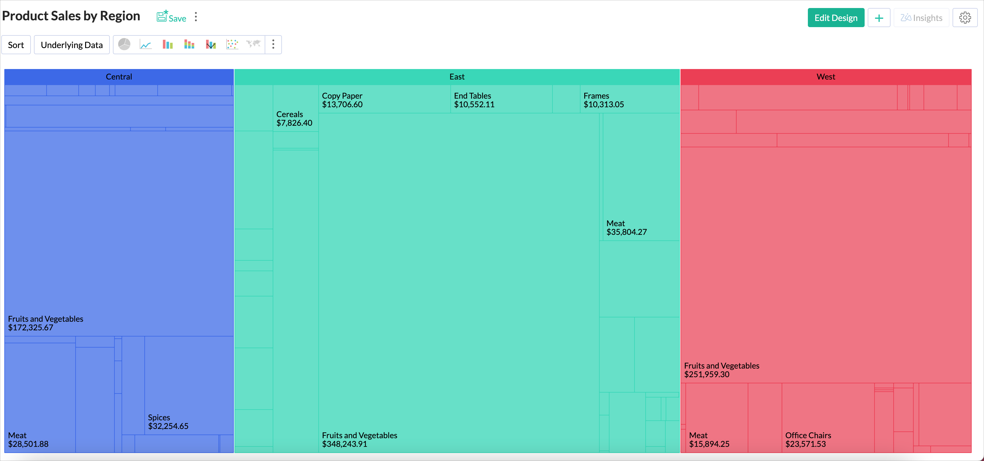
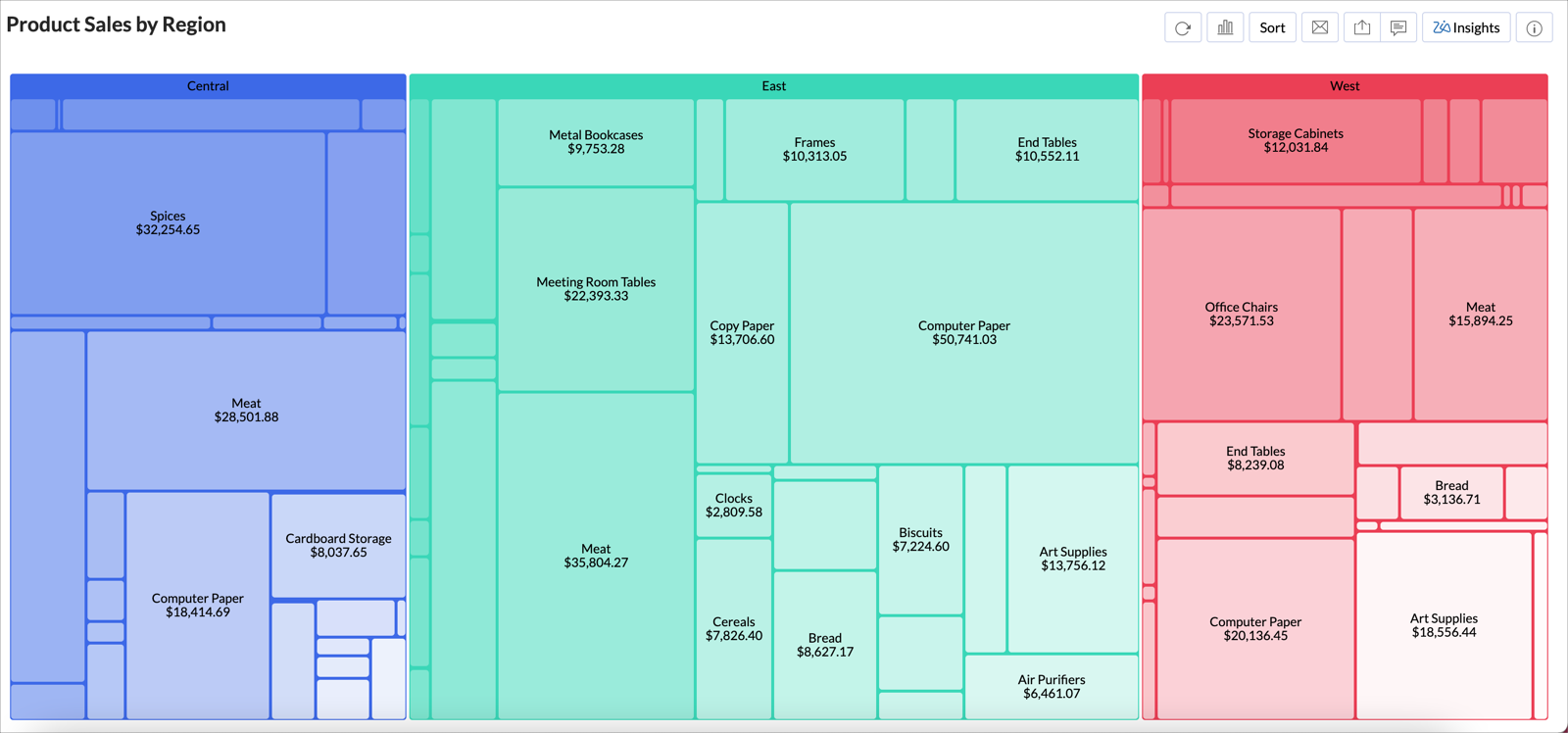
The Tree Map chart is a visualization composed of differently-sized rectangles that represent your data values. This is beneficial when you want to depict the part to whole relationship among various categories. When you analyze sales among products, the largest rectangle will represent the product with the highest sales and the smallest rectangle will represent the product with the least sales. You can choose to group the rectangles by a category.
Creating a Tree Map Chart
Follow the below steps to create a Tree Map chart.
- Open the table over which you want to create the chart.
- Click the New icon, and then click New Chart View.
- In the chart editor that opens, drop the columns as given below.
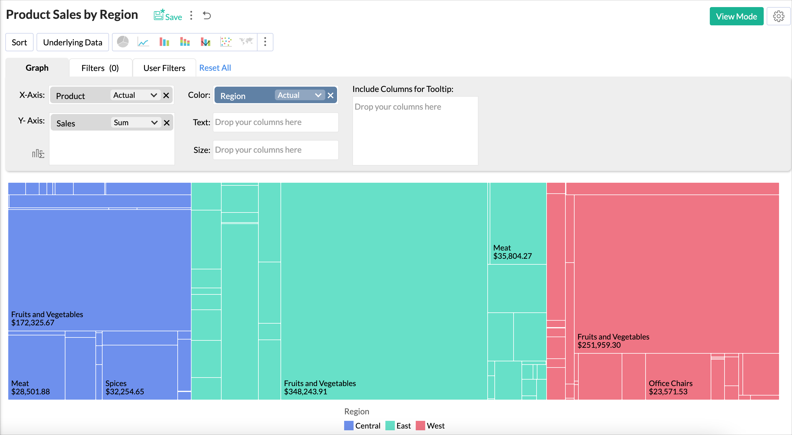
- X-Axis - Drop a dimension column to categorize the data.
- Y-Axis - Drop a metrics column.
- Color - Drop a categorical column.
- You can add multiple metrics columns in Y-Axis or add dimensional column in Color. Refer to this section to learn more on possible combination for creating a Tree Map chart.
- Click the Click here to Generate Graph button. A Bar chart will be created.
- Change the chart type to Tree Map.

Customizing a Tree Map Chart
Zoho Analytics offers extensive options to customize any chart. This section explains the customization options specific to Tree Map chart. For more information on customizing charts, refer to the Chart Customization section.
Follow the below steps to customize Tree Map chart
- Click the Settings icon.
- In the Settings page that opens, click the Tree Map tab.
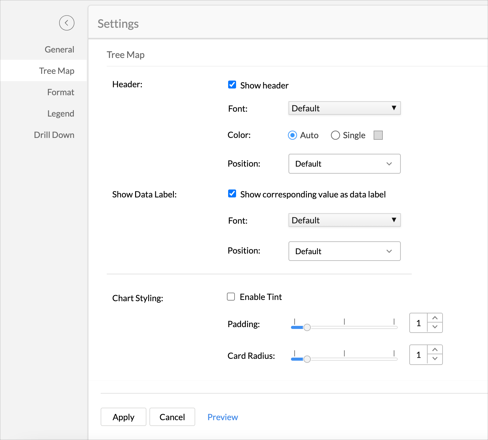
- In the Header section, select the Show header checkbox to add header to the category.
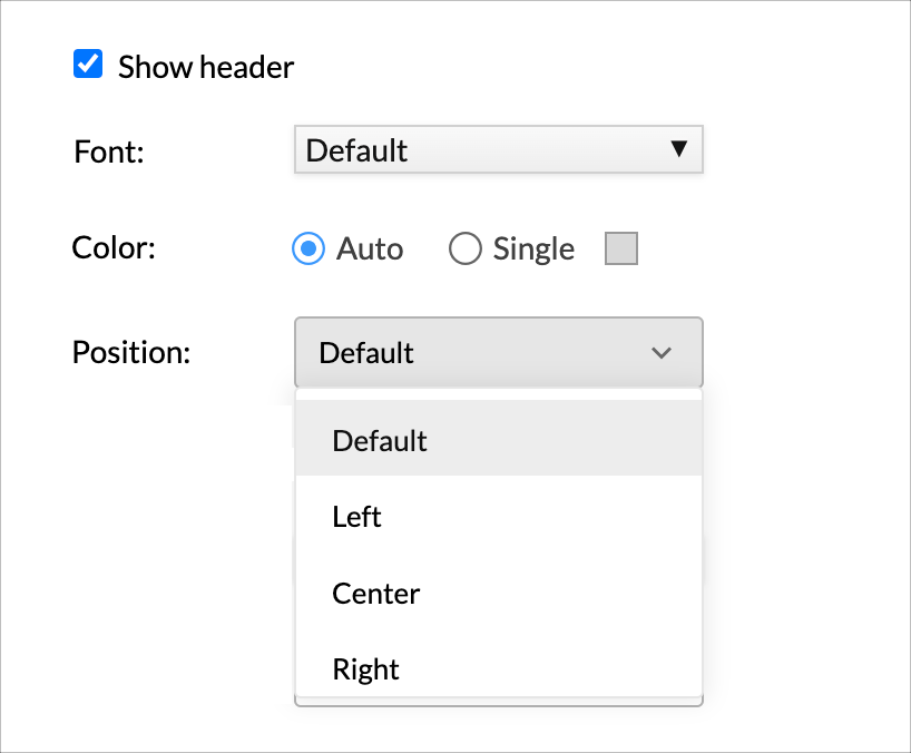
- You can also format the Font, Color, and Position of the header.
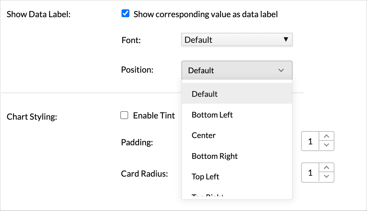
- In the Show Data Label section, select the Show corresponding value as data label checkbox, to add the data value for each rectangle as label.
- You can format the Font, and Position of the label.
- The Chart Styling section allows you to enhance the look and feel of the chart.
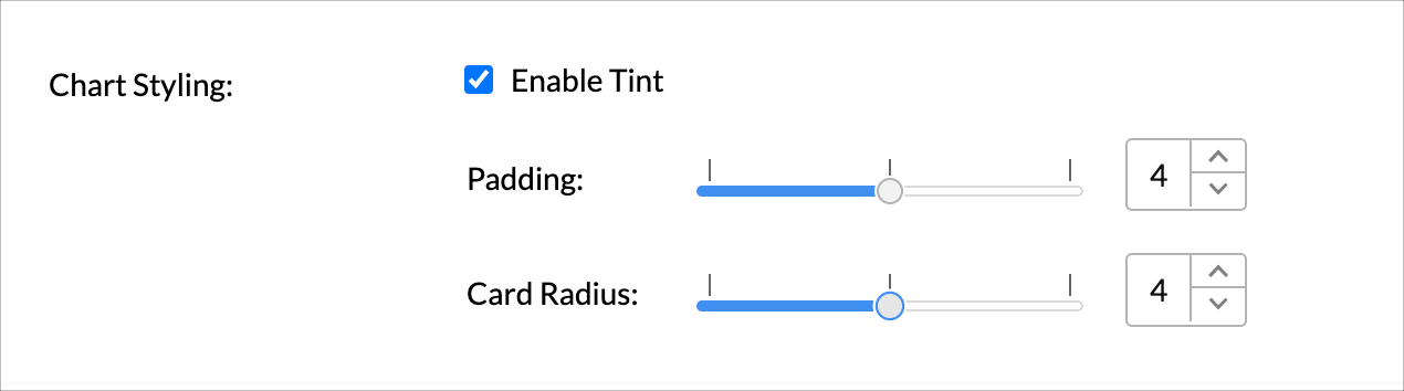
- Select the Enable Tint checkbox to add gradient effect for the chart filling.
Gradient will be applied from dark to light based on your chart sorting order. This will be beneficial to represent the intensity of each segment. - The Padding slider allows you to set the space between each rectangle.
- The Card Radius slider allows you to set the radius for the rectangle corner.
- Once you have set all options, click Apply. The chart will be customized.


Possible Combinations for Creating Tree Map Charts
The following combinations of column types are possible when creating Tree Map charts.
| X axis | Y axis | Color | Text | Size | Tooltip |
Case 1 | Dimension | Aggregate/ | Dimension/ | Aggregate/ | Aggregate/ | Aggregate/ |
Case 2 | Aggregate | Dimension/ | Dimension/ | Aggregate/ | Aggregate/ | Aggregate/ |
Case 3 | Aggregate/ | Dimension | Dimension/ | Aggregate/ | Aggregate/ | Aggregate/ |
Case 4 | Dimension/ | Aggregate | Dimension/ | Aggregate/ | Aggregate/ | Aggregate/ |
Case 5 | Dimension/ | Multiple Aggregate | - | Aggregate/ | Aggregate/ | Aggregate/ |
- Dimension: A column with Actual Value function applied over it. It is usually a text, date, or geo datatype column. If in case it is a numeric column, the Actual values will be divided into Actual Measure, Actual Dimension, and Actual Range.
- Aggregate: A column with an aggregate function applied (sum, average, count, etc) applied over it. It is usually a numeric column with the data type being Number, Positive Number, Decimal, Percentage, or Currency. It can be aggregate formula columns too.