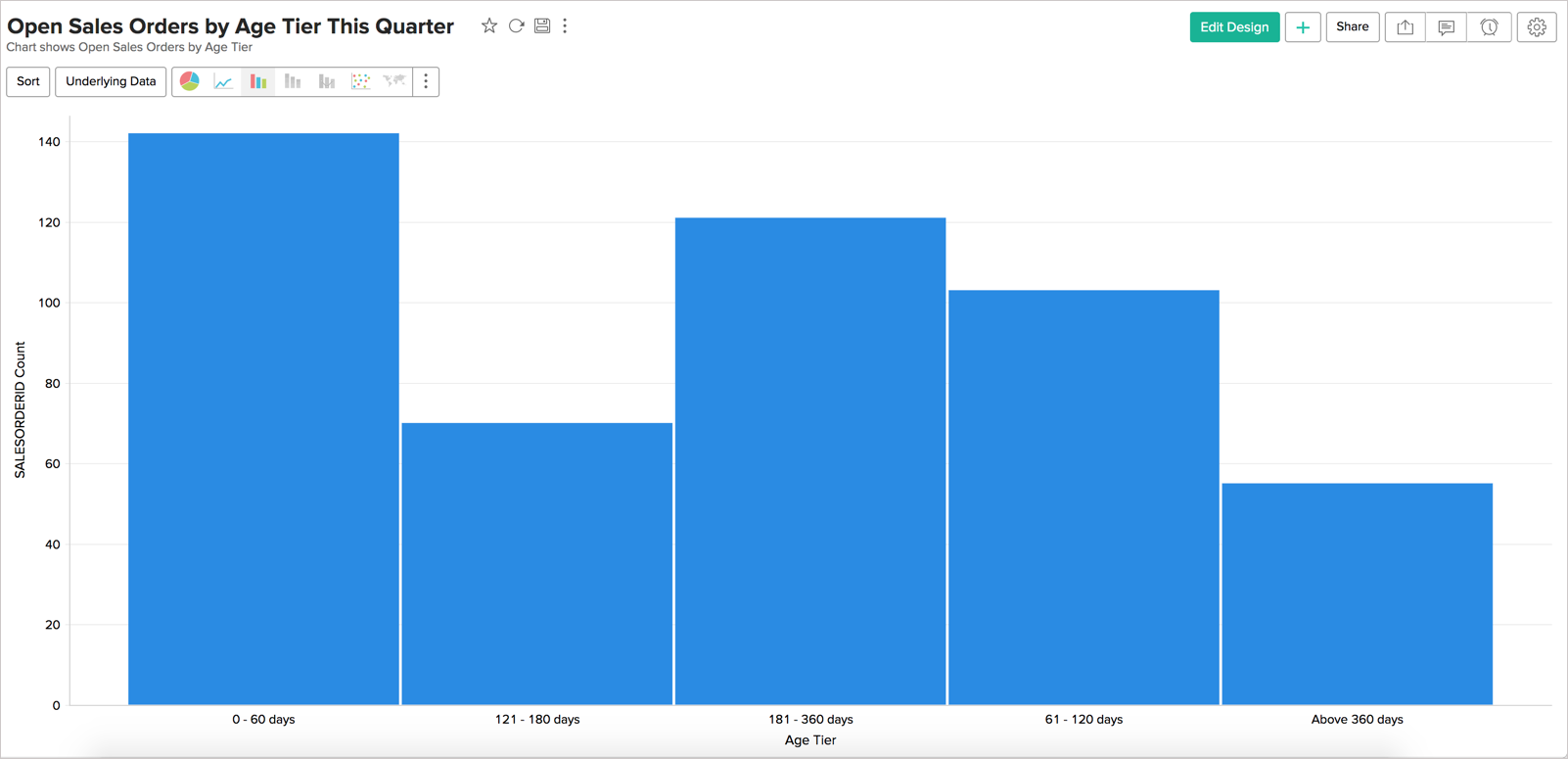
Histogram Chart
Histogram Chart is a special form of bar chart where the values are plotted over continuous rather than discrete categories and useful to plot frequency distributions.
Creating a Histogram chart
Follow the below steps to create a Histogram chart.
- Open the table over which you want to create the chart.
- Click New icon and then click New Chart View.
- In the chart editor that opens, drop columns as given below.
- X-Axis - Drop the column to categorize the data.
- Y-Axis - Drop the metric column.
- Click the Click here to Generate Graph button. A line bar chart will be created.
- Change Chart Type to Bar > Histogram.
Possible combinations for creating Histogram Charts
The following combinations of column types are possible when creating Histogram charts.
| X axis | Y axis | Color | Text | Tooltip | |
Case 1 | Dimension | Aggregate/ | - | - | - |
Case 2 | Optional | Aggregate | - | - | - |
Case 3 | Aggregate/ | Dimension | - | - | - |
Case 4 | Aggregate | Optional | - | - | - |
- Dimension: A column with Actual Value function applied over it. For numeric column, Actual value will be divided into Actual Measure, Actual Dimension, and Actual Range.
- Aggregate: A column with an aggregate function applied (sum, average, count, etc) applied over it. This also includes aggregate formula columns.