Bar Chart
Bar charts display values as individual bars whose height is determined by the value plotted and grouped by each category. This is best used to compare data classified into discrete groups. They are generally used to categorize data or represent two or more metrics of a particular category.
Creating a Bar Chart
Zoho Analytics supports the following types of bar charts.
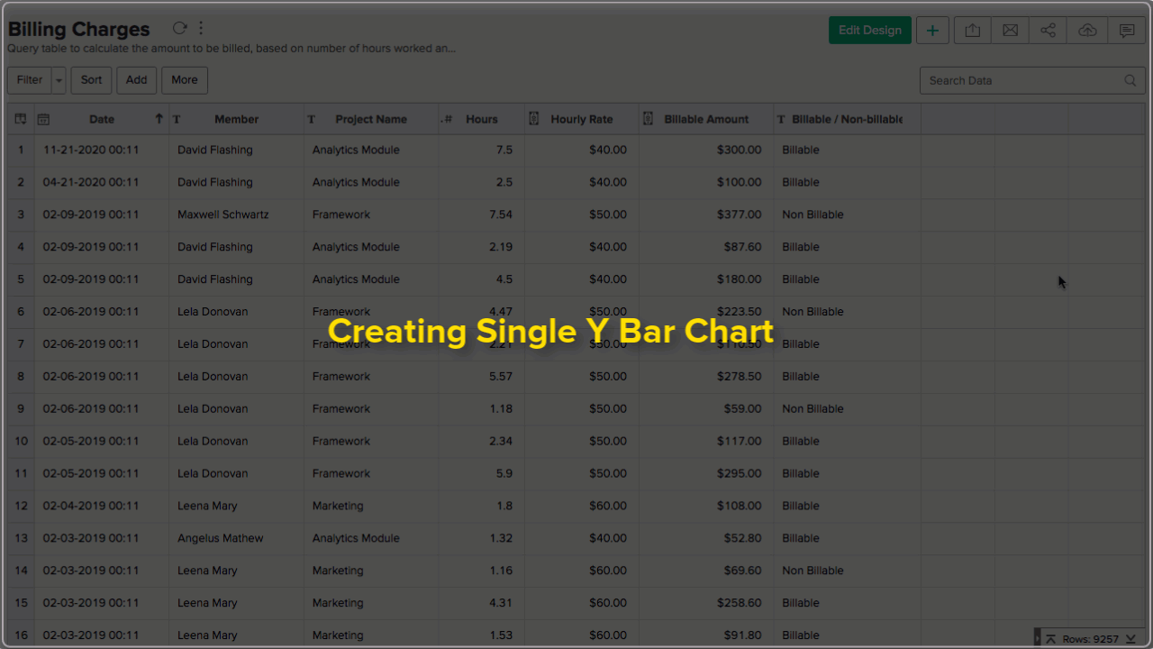
Single Series Chart
A single series bar chart allows you to classify single metric column into groups by X-axis dimension.
Follow the below steps to create a single series bar chart.
- Open the table over which you want to create the chart.
- Click New icon and then click New Chart View.
- In the chart editor that opens, drop columns as given below.
- X-Axis - Drop the column to categorize the data.
- Y-Axis - Drop the metric column.
- Click the Click here to Generate Graph button. A single series bar chart will be created.
The following animation illustrates how to create a bar chart with Top 10 Billed Members.
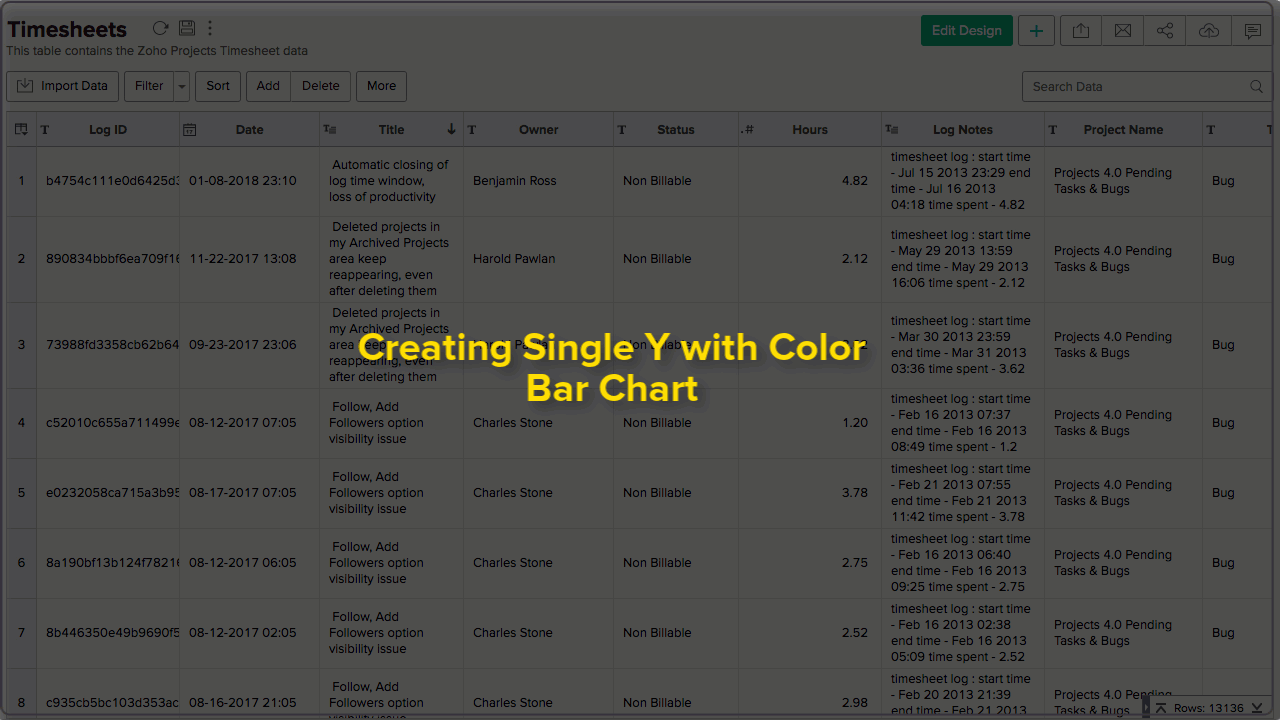
Single Series Chart with Color
You can choose to classify a single metric by multiple dimension (X-Axis and color).
Follow the below steps to create a single series bar chart with color category.
- Open the chart editor. Drop columns as given below.
- X-Axis - Drop the column to categorize the data.
- Y-Axis - Drop the metric column.
- Color - Drop the column to categorize by color.
- Click the Click here to Generate Graph button. A single series bar chart with the color category will be created.
The following animation illustrates how to create a bar chart with Billable Hours by Projects across Months.
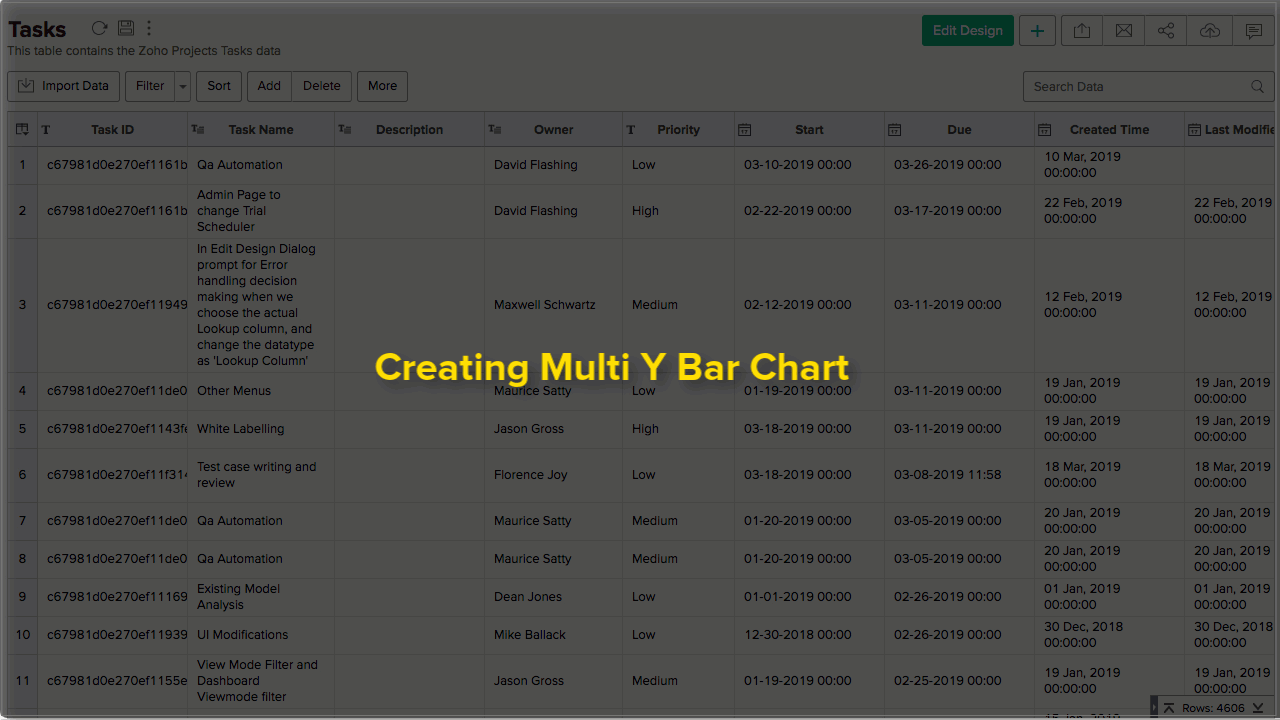
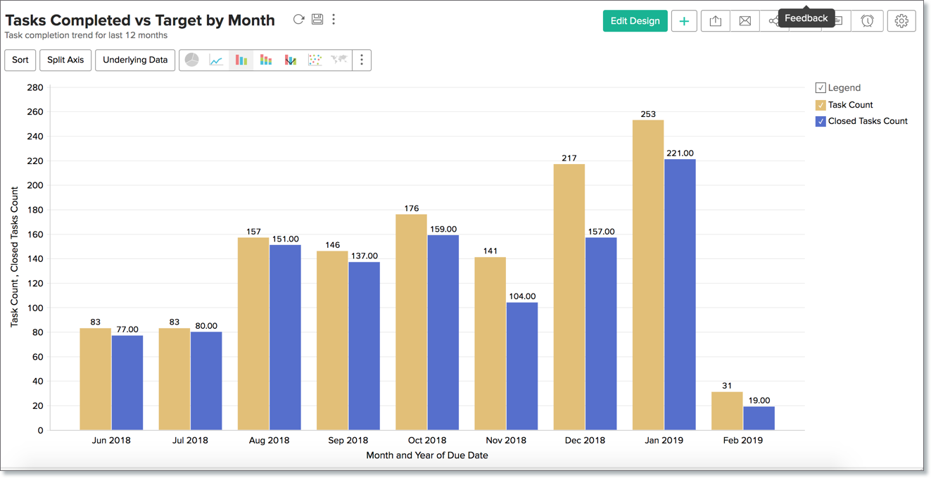
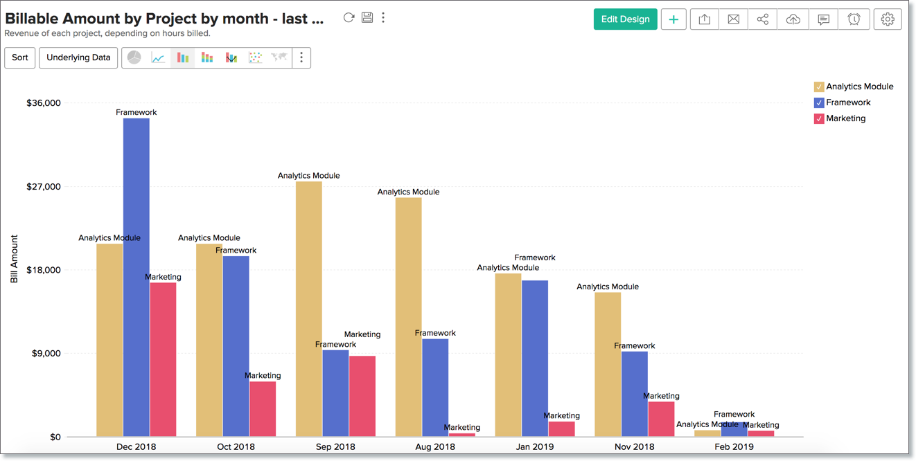
Multi-Series Chart
A multi-series bar chart allows you to classify multiple metric columns into groups by X-axis dimension. Each metric column will be represented by a color.
Follow the below steps to create a multi-series bar chart.
- Open the chart editor. Drop columns as given below.
- X-Axis - Drop the column to categorize the data.
- Y-Axis - Drop multiple metric columns.
- Click the Click here to Generate Graph button. A multi-series bar chart will be created.
The following animation illustrates how to create a bar chart with Targeted Tasks vs Completed Tasks.
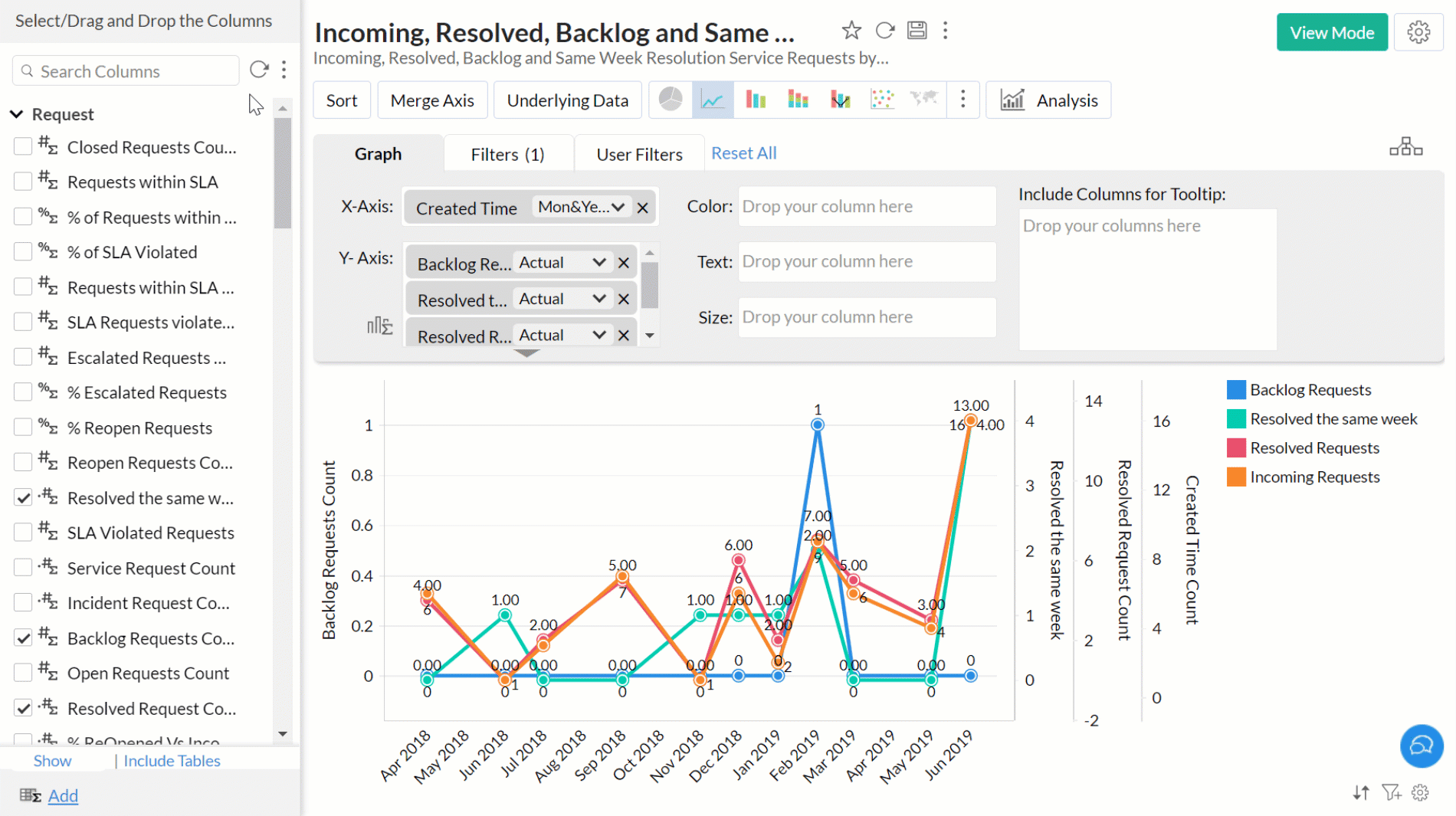
Split/Merge Axis
For multi-series chart, you can merge or split axis as needed.
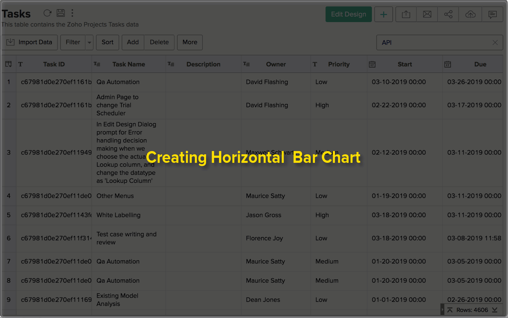
Horizontal Chart
In the Horizontal Chart, a single series is represented by horizontal bars. You can categorize with Color in this chart. Follow the below steps to create a Horizontal bar chart.
- Open the chart editor. Drag and drop columns as given below.
- Y-Axis - Drop the dimension column (to categorize the data).
- X-Axis - Drop the metric column.
- Click the Click here to Generate Graph button. A horizontal bar chart will be created.
The following animation illustrates how to create a bar chart that shows High Priority Tasks that are Overdue.
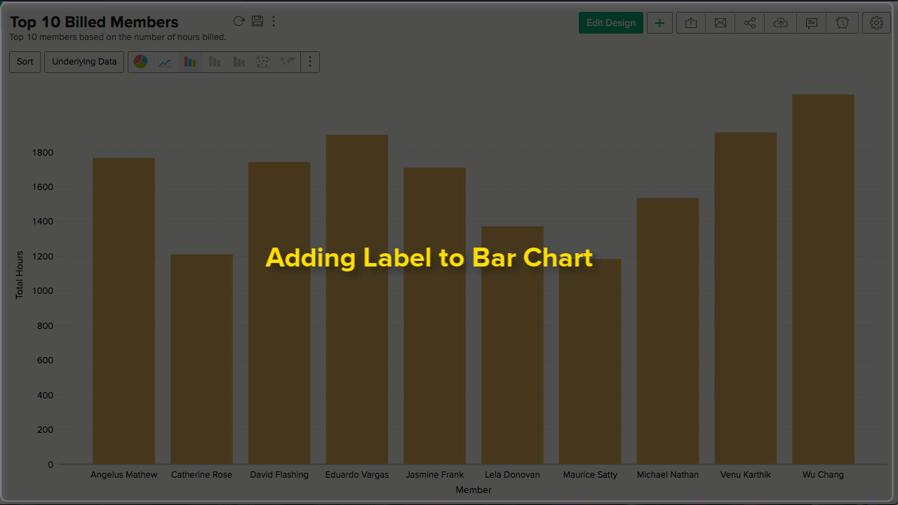
Adding Chart label
You can either add the Y-Axis value as a label or a column (X-axis or color column) as a label.
Add Y-Axis Value
Follow the below steps to add Y-axis value as a chart label
- Open the chart.
- Click Settings icon. The Settings page will open.
- Open the Axis tab.
- In the Data Label section select the Show corresponding Y axis value as data label on the chart checkbox.
- Click Apply. Y-Axis value will be added as a chart label.
Add a column value
Follow the below steps to add a column value as chart label.
Open the chart.
- Open the chart.
- Click Edit Design.
- Drop either the X-Axis or the Color column in the Text field.
- Click the Click here to Generate Graph button. The corresponding value will be added as the chart label.
Possible combinations for creating Bar Charts
The following combinations of column types are possible when creating bar charts.
| X axis | Y axis | Color | Text | Tooltip | |
Case 1 | Dimension | Aggregate/ | Aggregate/ Optional | Aggregate/ | Aggregate/ |
Case 2 | Optional | Aggregate | - | Aggregate/ | Aggregate/ |
Case 3 | Dimension | Aggregate/ | Dimension/ | Aggregate/ | Aggregate/ |
Case 4 | Dimension | Multiple Aggregate | - | Aggregate/ | Aggregate/ |
Case 5 | Aggregate/ | Dimension | - | Aggregate/ | Aggregate/ |
Case 6 | Aggregate | Optional | - | Aggregate/ | Aggregate/ |
- Dimension: A column with Actual Value function applied over it. For numeric column, Actual value will be divided into Actual Measure, Actual Dimension, and Actual Range.
- Aggregate: A column with an aggregate function applied (sum, average, count, etc) applied over it. This also includes aggregate formula columns.