KPI Widgets
Zoho Advanced Analytics offers a widget-based model for adding single numbered widgets and chart type widgets within dashboards. These are called KPI Widgets. This is a pretty useful feature to highlight any key metric in a dashboard for easy comprehension. The key metric can be accompanied with associated comparison indicator or plotted against a target to show progression.
Zoho Advanced Analytics offers 2 types of KPI widgets
- Single number widgets - Single number widgets are used to display a single numeric value in a formatted text. It can also be accompanied with comparison indicators.
- Chart type widgets - Chart type widgets enable you to highlight a data metric using chart visuals.
Single Number Widgets
Zoho Advanced Analytics offers a widget-based model for creating single number charts within dashboards. This is a pretty useful feature to highlight any key metric in a dashboard for easy comprehension. The key metric can also be accompanied with associated comparison indicators to highlight the trend. Zoho Advanced Analytics currents offers 6 types of single number widgets with or without comparison indicators.


Adding a Numeric Widget
The below presentation shows how to create single numeric Widgets.
Chart Type Widgets
Turn your KPI dashboards into more attractive visualizations using the Chart Type Widgets. Chart type widgets are similar to actual charts, except that only a single key metric value is plotted alongside a range, highlighting the current position of the key metric value.
You can create the following chart type widgets in Zoho Advanced Analytics:
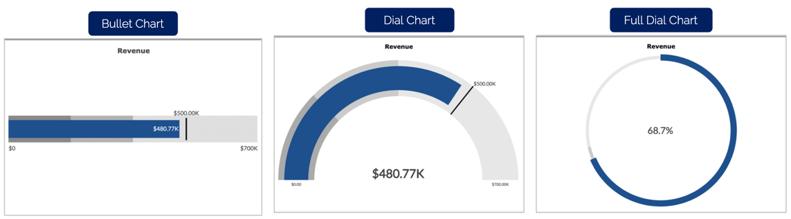
Bullet Chart
A Bullet Chart is from the family of bar charts, where the key metric is plotted as a bar alongside a range, with a defined minimum and maximum values. You can specify qualitative ranges that are plotted as varying colors, to measure the progress of your key metric value. By default, the qualitative ranges are displayed as varying intensities of a single hue.
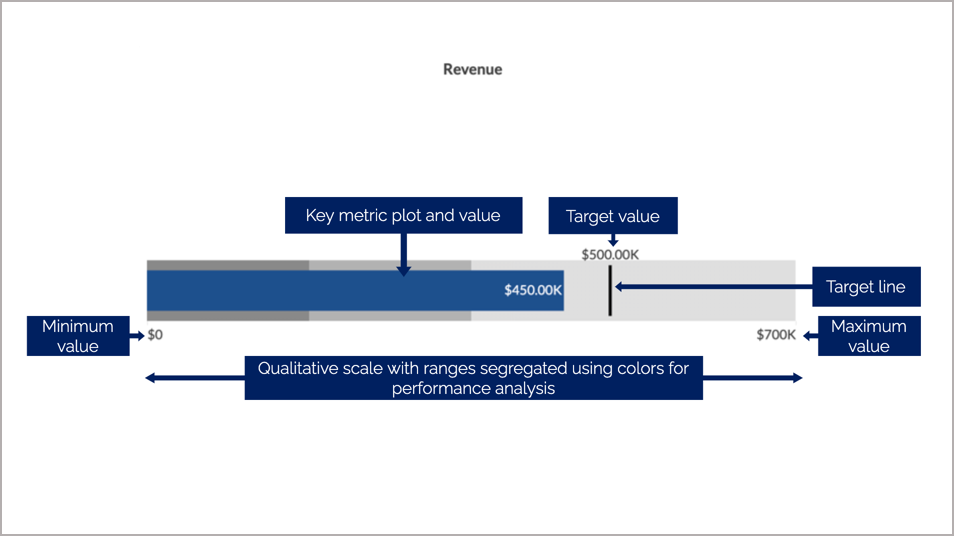
Learn more about bullet charts.
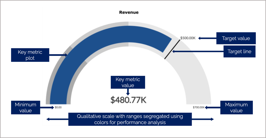
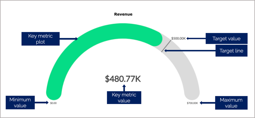
Dial Charts
The Dial Chart is used to indicate the current value of a metric on a given range. Although similar to a Bullet Chart, it displays the values in the form of a semi-dial. You can specify qualitative ranges in Dial Charts as well.
Zoho Advanced Analytics offers the following types of dial charts:
Simple: The simple dial chart is a basic dial chart consisting of the chart range, target, key metric plot, and its value.
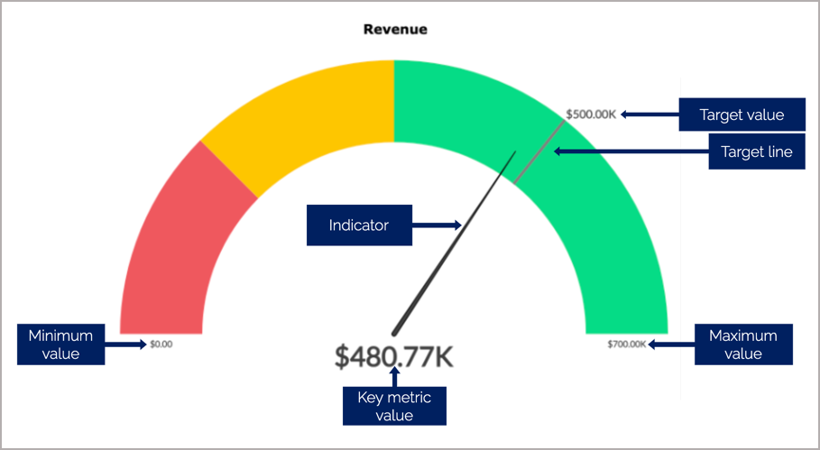
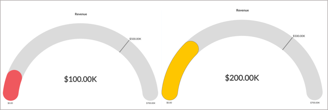
Speedometer: The speedometer is a type of dial chart that comes with an indicator to mark the position of the key metric value in a given range. By default, the qualitative ranges in the speedometer are NOT of the same hues. The color red, yellow, and green indicates your performance range.
Conditional: In a conditional dial chart, the color of your key metric plot is defined based on conditions. This will help you categorize the key metric values into different qualitative baskets.
Say, you want to measure the progress of your sales in a month. You can provide a color to be displayed as the default color and colors to represent the sales when reaching the 25% and 50% of the overall sales range. The default color will be the color of the key metric plot when the sales value is more than 50%.
The bullet chart and dial chart will help measure your current value, compared to your target value.
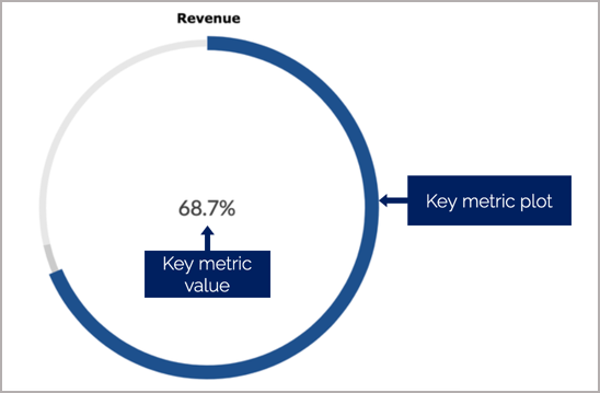
Full Dial Chart
Full Dial Chart is a gauge chart with a full ring. This is similar to the Dial Chart. The Maximum Range value will be set as the value of the full ring.
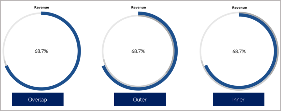
You can customize the view of the full dial chart by plotting the key metric plot to overlap the dial, outside the dial, or inside the dial.
Adding Chart Type Widgets
The below presentation shows how to create Chart Type Widgets.
Modifying Labels/Text in KPI Widgets
You can easily modify the labels/text available in your added KPI widget from the Settings page of the KPI Widget Editor dialog. To edit the text in your KPI widget, follow the below steps:
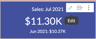
- Click the edit icon that appears on mouse-over your widget.
- Navigate to the Settings tab. Modify the text to be added in the Label field under the Primary Value and Secondary Values section.
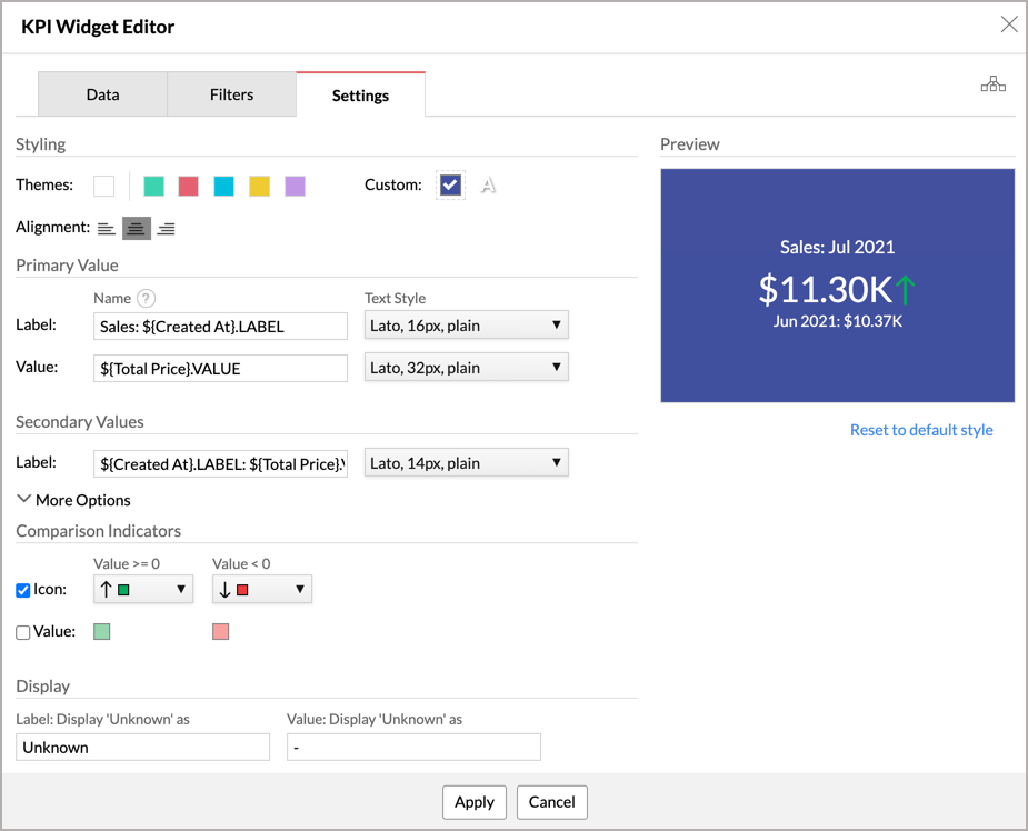
- Click Apply to make the changes.


For more information refer to the Customize Label and Customize Appearance sections of Adding a Numeric Widget and Adding Chart Type Widgets presentations to know more.