Applying Filters
Filters
Zoho Advanced Analytics app offers powerful Filtering options to filter the necessary records that are to be plotted in the report you create. The filtering options are the same for all types of reports that you create in the Zoho Advanced Analytics - charts, pivot tables, summary views, and tabular views.
Depending on the data type of the column, you can filter specific numeric ranges, date ranges, individual values, top10, bottom 10, etc., Zoho Advanced Analytics also allows you to apply multiple filters (based on multiple columns) on a report. The filtering options can be applied only when you are designing a report (i.e., when you are in design mode) and not in the view mode.
To create a filter, after you have created the required chart (pivot, summary, or tabular view):
- Open the required chart.
- Click the Edit Design option at the top-right corner.
- Click the Filters tab. You will notice the following three components:
- Filter shelf to drag and drop the filters column
- Filter options relevant to the filters added
- Filter item to be included/excluded
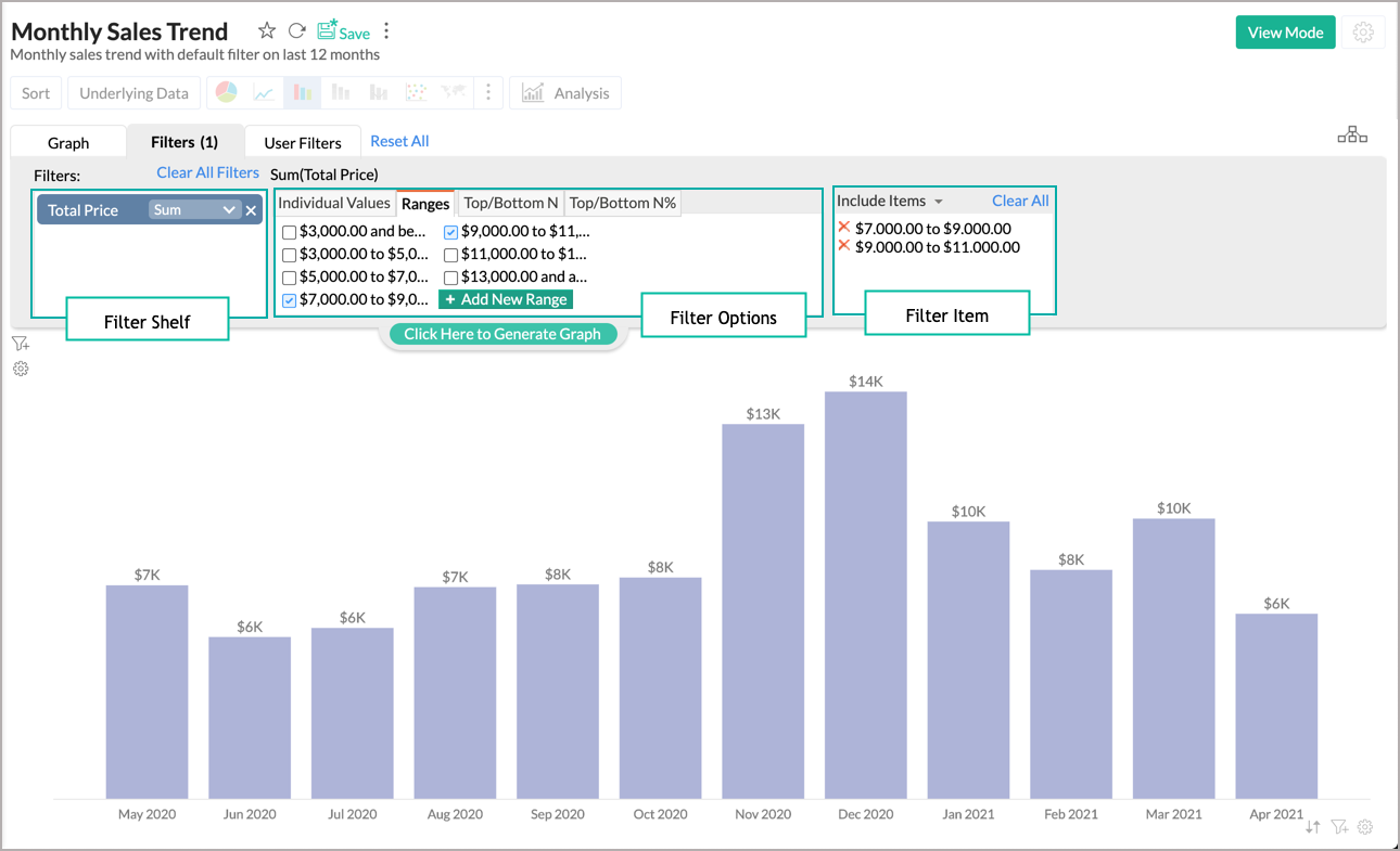
- Drag and drop the required columns in to the Filters shelf.
- A list of all possible options for filtering will be displayed in the (second) box right to Filters Shelf as shown in the above screenshot. Choose the required values.
Note: The filtering options provided varies based on the data type of the column dropped. - Choose if the selected range needs to be included/excluded from the Include Items/Exclude Items drop-down menu.
- Click the Click Here to Generate Graph button.

Filters based on Data Type
The following sections describe in detail the filters supported for various column types (data types).
Numeric & Currency Type:
The following table lists all the possible options for filtering numeric and currency column data types:
| Option | Description |
| Individual Values | This option allows you to filter data based on individual values of the selected numeric column. All possible individual values of the dropped column will be listed in the filter tab. You can select these values to filter them. |
| Ranges | This option allows you to filter data based on numeric ranges into which the values in the columns can be segmented Eg., 0 to 100, 101 to 250, etc., Ranges tab will list a suggested range of values for filtering. You can choose the required range to filter. |
| Top/Bottom N | This option allows you to rank the records and filter a specified number of Top/Bottom records. The chart will be sorted ascending or descending to illustrate the ranking. For example, Top 10 will filter the top 10 values in the column and Bottom 10 will filter the bottom 10 values in the column. The values will be computed based on the aggregate function applied to the filter column. |
| Top/Bottom N% | Top/Bottom N% is similar to the Top/Bottom N option, except that it returns N% of values from the column. For example, the Top 5% will filter the top 5% values of the column. |
Zoho Advanced Analytics also allows you to define your own custom values. You can add your custom Ranges, Top/Bottom N, and N% values by clicking Add New Range button under the corresponding option.

Text Type:
The text type column can be filtered using the following options.
Individual Value
This option allows you to filter the chart by the actual value. All the distinct values from the column will be listed with a checkbox. Select the value to include or exclude from the chart. You can select multiple values using the shift + click option. A Search box is also available to find the required values.

Wildcard
Wildcard filter allows you to filter by specifying filter criteria. The following table lists the possible conditions for filtering:
| Option | Description |
| Exactly Matches | Filters all the values that exactly match the search term. |
| Does Not Match | Filters all the values that do not match the search term. |
| Contain | Filters all the values that contain the search term. |
| Does Not Contain | Filters all the values that do not contain the search term. |
| Start With | Filters all the values that start with the search term. |
| Does Not Start With | Filters all the values that do not start with the search term. |
| End With | Filters all the values that end with the search term. |
| Does Not End With | Filters all the values that do not end with the search term. |
You can construct filter criteria with multiple conditions and join the condition using (AND) or (OR) operator. You can specify the join operator by clicking the link adjacent to the conditions.

By default, conditions from last to first will be grouped. i.e., when you have three conditions, the third and the second will be joined, and the result will then be joined with the first. You can change the default grouping of the conditions if needed. To modify, click the Edit link next to the Criteria Expression. Modify the filter criteria as required, and click OK.

Note:
- The search terms are not case-sensitive.
- You can specify up to 15 conditions for filtering data.
Date Type:
The following tables list all the possible options for filtering Date type columns.
When you apply the Actual Values function for a Date column dropped in the Filters shelf, the following are the options available for filtering:
| Option | Description |
| Year | Select this option to filter date values based on specific years |
| Quarter | Select this option to filter date values based on specific quarters |
| Month | Select this option to filter date values based on specific months |
| Week | Select this option to filter date values based on specific weeks |
| Date | Select this option to filter based on specific date values |
| Date & Time | Select this option to filter based on specific date & time values |
| Ranges | Select this option to filter values based on specific date ranges |
To enter a custom date range, under the Ranges section click the Add New Range button. In the Add New Range dialog box that appears, type dates in the From and To boxes or click the calendar icon to select the required dates from the calendar and click Add.

When you select the Seasonal function for a Date column dropped in the Filters shelf, the following are the options available for filtering:
| Option | Description |
| Quarter | Select this option to filter date values based on quarters present across all years in the column. E.g., Q1, Q2. |
| Month | Select this option to filter date values based on months across all years. E.g., January, February. |
| Week | Select this option to filter date values based on weeks across all years. E.g., Week 1, Week 2. |
| Week Day | Select this option to filter date values based on weekdays across all years. E.g., Sunday, Monday. |
| Day of Month | Select this option to filter date values based on the day of the month across all dates. E.g., 1 to 31. |
| Hour | Select this option to filter date values based on hours in a day. E.g., 0 to 23hrs |
When you select the Relative function for a Date column dropped in the Filters shelf the following are the options available for filtering:
| Option | Description |
| Common | Select this option to filter data values based on the common relative (relative to current time) periods. E.g., Last 1 Hour, Today, This Month, etc., |
| Quarter | Select this option to filter data values based on relative period quarters E.g., This Quarter, Last 3 quarters, Next Quarter, etc., |
| Month | Select this option to filter data values based on relative period months E.g., Last Month, Next 6 Months, etc., |
| Week | Select this option to filter data values based on relative period week E.g., This Week, Last 3 Weeks, etc., |
| Day | Select this option to filter data values based on relative period day E.g., Today, Next 5 Days, etc., |
| Hour | Select this option to filter data values based on relative period hour E.g., Last 1 Hour, Last 12 Hours, etc., |
After you have dropped the column and selected one or more values to filter, the selected filter items appear in the third box on the right. You can Include or Exclude the selected values from the report that you are designing by choosing the appropriate option from the Include Items/Exclude Items drop-down menu.
Once you are done with selecting the appropriate filters, select the Click here to Generate Graph link and click the View Mode button in the toolbar. Notice that only the data that matches the filters you have defined will be displayed.
Note: You could apply any number of filters for a report that you design. When multiple filters are applied, the data will be filtered by adding all the filter conditions i.e., all the filter conditions should be met for the data to be shown as part of the report.
User Filters
Zoho Advanced Analytics app allows you to include dynamic filtering capability in the reports view mode called User Filters. User filters enable your users who access the report, to apply filters on the report data displayed using the filter columns exposed as part of user filters. The filter columns included in the User Filters can be displayed using a variety of display components like drop-down boxes, sliders, date range chooser, etc., to suit your needs.
The following sections describe in detail the user filters supported for various column types (data types).
User Filters for String (Categorical) Column Type
To add a string (categorical) column as a user filter, follow the instructions given below:
- Open your report (chart) in Edit Design mode.
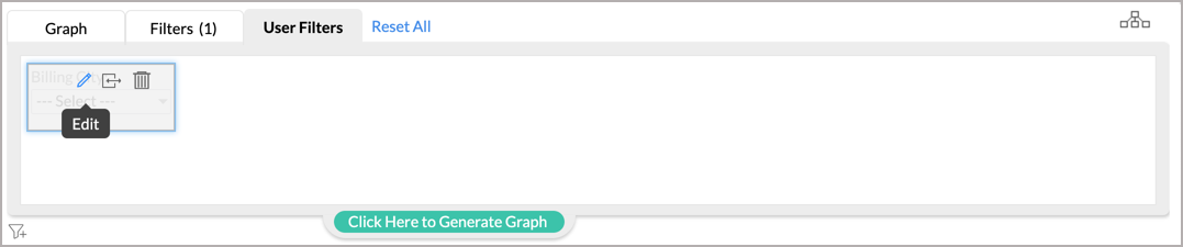
- Click the User Filters tab in the Design Area.
- Drag and drop the required category column which you want to add as a user filter in to the User Filters tab as shown below. In this example, we are going to filter by the Category column, Billing City.
- To edit the user filter you will have to mouse over the dropped column and click the Edit icon.


Choosing the Filter Display Name and Component Type
On clicking the Edit icon in the dropped user filter, it opens a dialog box with options to edit the Filter Display Name and Choose Component Type for the user filter, as shown in the screenshot below.

By default, dropped user filter column name will be displayed as the filter name. You can modify the name by providing the required name in the Filter Display Name text box.
Choose Component Type
Select the component type from the Choose Component Type drop-down. In the case of categorical (string) columns, you can choose between a single select drop-down box or a multi-select drop-down box.
- Single Select Box: Select this option to allow chart users to select only one item at a time to filter data against the selected column.
- Multi Select Box: Select this option to allow chart users to select multiple filter items at a time to filter data from the drop-down list. On selecting this option a check box will be provided next to each filter item allowing users to choose more than one filter item from the list.

Choose Values
Next, you'll have to choose the values that need to be displayed.

- List All Values: On selecting this option, all distinct values of the selected column will be listed as selectable items in the drop-down list of the User Filter. Users can select any item from the list to filter the report accordingly.
The resultant User Filter in reports View Mode would look like as shown below:

- List Selected Values: Instead of listing all the values of the column in the drop-down list, you can choose to list only selected values from the column by selecting this option.
To specifically select values to be listed in the User Filter:
- Select the List Selected Values option. On selecting this option all the distinct values in the column will appear under the Select Values box as shown in the below screenshot. The Search box can also be used to find the required values on need.
- Select the values to be listed by choosing the check box inline to each value. To remove the selected values from the list, uncheck the checkboxes inline to the selected filters.

- Others: On selecting this option an item Others will be added to the user filter list. When the user selects this option (in the reports View Mode) it will display data corresponding to all other remaining items that are not listed in the user filter dropdown.
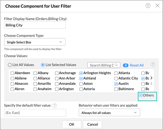
- Specify the default filter value: Use this option to set a default value to the filter that will be automatically applied when the report is loaded/opened. To set a default filter, type the filter value in the text box provided next to Specify the default filter value option. To apply multiple values as the default filter, you need to specify the values separating them with a comma.
- Behavior when user filters are applied: This option allows you to choose whether or not to cascade user filters. Values available for the option are:
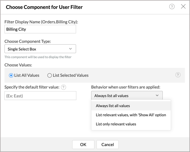
- List only relevant values: Use this option to set up cascading User Filters i.e., if you want the second (or subsequent) User Filter value to be dependent on the value that you have chosen in the preceding User Filter(s).
- List only relevant values, with 'Show All' option: This option is similar to List only relevant values, with a Show All link. You can choose to click Show All if you want to filter based on all the values available in the user filter.
- Always List All Values: Use this option to disable Cascading of User Filters and list all the values in the dropdown.
- After selecting the required options in the dialog box, click the OK button.


When you view the report in view mode by clicking the View Mode button in the toolbar, User Filters with a drop-down filter list appears on the top-left corner as shown in the below screenshot:


User Filters for Numeric and Currency Column Type
To add a User Filter for a numeric or currency column type:
- Open your report (chart) in Edit Mode.
- Click the User Filters tab in the Design Area.
- Drag and drop the column for which you want to add user filter into the User Filters tab.
- Hover your mouse over the dropped column and click the Edit icon.


Choose the Filter Display Name and Component Type
On clicking the Edit icon in the dropped user filter, it opens a dialog box with options to edit the Filter Display Name and Choose Component Type for the user filter, as shown in the screenshot below.

By default, dropped user filter column name will be displayed as the filter name. You can modify the filter display by providing the required name in the Filter Display Name text box.
Choose Component Type: The default component for a numeric column type is a Slider-Double. You can also choose to change to a Multi Select Box.
Choose Function To Apply: You can apply aggregate functions like Sum, Max, Min, Average, Standard Deviation, Count, and Actual Values on the numeric user filter column. to allow users to filter data based on aggregate value. Advanced Analytics app for Shopify provides the following component types for a numeric data type column.

Multi Select Box: All the distinct numeric values in the column will be listed in the filter. Users can select one or more values from the combo box.

The Choose Values to list in the filter component section for Multi Select Box provides different options to choose the type of values to be displayed in the user filter column. Each of these options is described in the table below.
| Option | Description |
| Individual Values | A list of all possible individual values of the dropped column will be displayed when you select this option. This option allows users to filter data based on individual values of the selected numeric column. |
| Ranges | A list of the suggested range of values will be displayed when you select this option. This option allows users to filter data based on numeric ranges into which the values in the columns can be segmented. Eg., 0 to 100, 101 to 250 etc., You can even add your own custom ranges for filtering. |
| Top/Bottom N | This option allows users filter data to only display a specified number of the Top/Bottom 'N' records in order. For example, Top 10 will display the top 10 values in the column and Bottom 10, will display the bottom 10 values in the column. |
| Top/Bottom N% | Top/Bottom N% is similar to Top/Bottom N values, except that it returns N% of values from the column. For example, Top 5% will display the top 5% values in the column. |
The rest of the options in the Choose Values to list in the filter component section for Multi Select Box are similar to the List Select Values option.
When you view the report in view mode by clicking View Mode in the toolbar, the User Filter with a slider or drop-down filter list appears on the top-left corner as shown in the below screenshot.

User Filters for Date Column Type
To add a User Filter for a Date column, follow the below steps:
- Open your report (chart) in Edit Mode.
- Click the User Filters tab in the Design Area.
- Drag and drop the required Date column which you want to add as a user filter into the User Filters tab.
- Hover your mouse over the dropped column and select the Edit option.

Choose the Filter Display Name and Component Type
On clicking the Edit icon in the dropped user filter, it opens a dialog box with options to edit the Filter Display Name and Choose Component Type for the user filter, as shown in the screenshot below.

By default, the dropped user filter column name will be displayed as the filter name. You can modify the filter display by providing the required name in the Filter Display Name text box.
Choose Component Type
The settings dialog also provides options to choose the component that is to be used to display the user filter using the Choose Component Type field. The following are the possible component types that you could choose from for a date column:
- Date Range: Select this option to allow users to select a date range and filter the data.
- Actual Period: Select this option to allow users to filter data based on the actual period present in the date column. For example:- 2014, 2015 etc.
- Relative Period: Select this option to allow users to filter based on relative period. For example:- Last 2 months, Last 3 months, etc.
- Seasonal Period: Select this option to allow users to filter based on repeating seasonal period. For example, All Sundays, All March months, All Q3, etc
The Choose Values tab provides different options depending on the component type you choose. Each of these options is described in the table below.
| Component Selected | Options in Choose Values tab |
| Date Range | Any Date Range: This option allows users to specify any date range for filtering the report data. Specified Date Range: This option allows you to specify a range of dates, to restrict users to filter only within that range. Include Time: This option allows to include time components along with Date in filters. |
| Actual Period | Select Values: This option allows you to select the actual periods like Actual Year, Quarter, Month, Week, Date, and Date & Time to list for filtering the report data. Specify Default Filter: This option allows you to set a default value for the filter that will be applied automatically when the report is loaded or opened. Behavior when user filters are applied: This option allows you to choose whether or not to cascade user filters. Choose List only relevant values option to set up cascading user filters i.e., the list of values available in one User Filter depends on the value that you have chosen in the preceding User Filter(s). |
| Relative Period | Select Values: This option allows you to select the relative periods like This Quarter, Last3 Months, Next Week, Today, etc., to list for filtering the data. Specify Default Filter: This option allows you to set a default value for the filter that will be applied automatically when the report is loaded or opened. |
| Seasonal Period | Select Values: This option allows you to select the seasonal values like All Q3 Quarters, All January months, Week 52 of every year, Every Sunday, etc., for filtering the data. Specify Default Filter: This option allows you to set a default value for the filter that will be applied automatically when the report is loaded or opened. Behavior when user filters are applied: This option allows you to choose whether or not to cascade user filters. Choose List only relevant values option to set up cascading user filters i.e., the list of values available in one User Filter depends on the value that you have chosen in the preceding User Filter(s). |
After selecting the required options in the dialog box, click OK to apply the settings.
When you view the report in view mode by clicking the View Mode button in the toolbar, the User Filter appears on the top-left corner as shown in the below screenshot. The following screenshot displays how a User Filter for Date column would look like when the Date Range component type is chosen.

How User Filters Work?
Zoho Advanced Analytics allows you to provide multiple user filters in a report. Users who view the report can apply any number of the provided user filters, in any order as required. When a user applies more than one user filter on a report, the data is displayed by AND'ing all the filter conditions i.e., all the filter conditions should be met for the data to be shown as part of the report.