
Think about the last time you gave your email address over to a company. What was your motivation? What was it in exchange for?
Maybe you wanted a reminder of something you planned to purchase. Maybe you found their content marketing useful so it made sense to have more of it delivered to your inbox each month. Maybe you were curious to see what products that business could curate for you out of the range of things it offers. Maybe they enticed you with a special deal (say, 25% of your next purchase) in exchange for your email. Maybe subscribing meant joining a group of people who receive special treatment, such as exclusive deals and special offers.
 The common thread for each of these motivations is that people only ever sign up for a mailing list if they feel there’s something in it for them. As you build your signup form, it’s important to bear this in mind. There are probably a wealth of incentives you could give your prospects, right now, for signing up for your email list. Maybe it’s a discount, sure; but maybe it’s also access to that awesome resource list, or ebook, or webinar, or report, or template, or SlideShare, or website audit… the list of possible lead magnets is long. (OptinMonster lists 69 of them, and even this list isn’t exhaustive.)
You might be approaching this content with your email signup incentive already firmly in mind… but it never hurts to put yourself in your users’ shoes one more time, and think about the motivating factors from their perspective.
Because a regular reminder that your business exists is one of the most important things you can do for both your prospects and yourself. And this is something you can only really offer them once they’ve given you their email addresses—which is their permission to remind them, at intervals, that you’re still making great products, performing excellent services, and offering valuable content.
Pro Tip: Subscriber permission is absolutely crucial across the board, particularly with new legislation—the General Data Protection Regulation—effective as of May 2018. The GDPR’s provisions include requiring businesses to have explicit user consent before collecting or storing their data; and allowing users to request both access to, and deletion of, that data. The UK’s Information Commissioner’s Office offers some resources to help businesses and organizations prepare for, and comply with, the GDPR.
This is why one of the primary goals of your company website should be capturing the emails of as many interested visitors as you can. This is one of simplest methods of lead generation, and one of the simplest web forms to offer (one form field, one CTA button)—not to mention that every new contact added to your email marketing platform means a way of reaching that prospect later down the road through email marketing campaigns or other offers.
And as you surely know, your email list is the cornerstone of your online business: Email marketing remains the most effective online means of converting prospects into customers.
So let’s get you started amassing those emails. Below are four tips and tricks for creating your business website’s best email signup form.
Place it prominently on your homepage
Of all the types of web forms we discuss in this chapter, your email signup should have pride of place on your homepage. That’s because it’s a low-commitment interaction (visitors aren’t giving you any money and they can unsubscribe at any time), which means it will capture the broadest range of visitors—even those who are only slightly interested in what you have to offer.
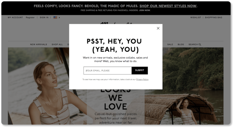
Your signup form or opt-in form can be built into the homepage itself. You might also decide on a pop-up signup form (also called a modal window) like Madewell does on their homepage. Though before you decide to go this route, it’s worth weighing the pros and cons of pop-ups… and we recommend having a separate signup baked into the homepage anyway, for prospects who click out of your pop-up and then change their minds:
 The benefit of a modal window is, obviously, that there’s no overlooking or neglecting it. At the same time, it gives visitors the sense that they’ll be back to browsing in a matter of seconds. Any sense of impatience or interruption disappears when a visitor realizes they can either click that “x” to get back to what they were doing, or quickly fill in their email and carry on.
One advantage to keeping your signup form directly on your homepage is that it allows prospects to decide how far down they scroll—often all the way to the bottom—without disrupting their experience; and they get to choose to sign up on their own terms, and in their own time. It’s worth remembering here that your visitors like to feel in control.
By the time visitors reach a signup form at the bottom of your homepage, they’ve already decided that your company offers something they need. So your form won’t need to prioritize persuasion; instead, it will need to prioritize minimizing the friction points in filling out that form. For instance, compare the copy on Madewell’s pop-up above with the copy on the signup form at the bottom of their homepage:
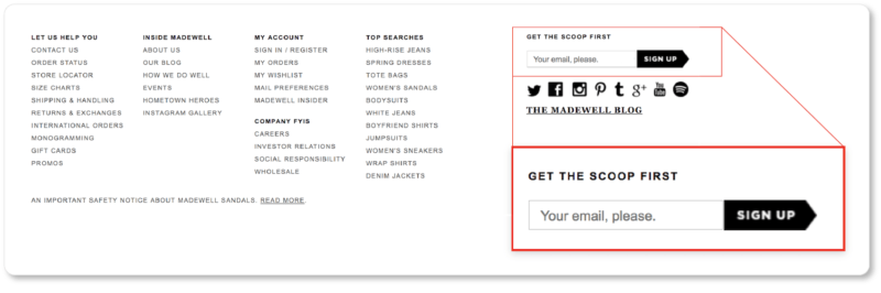
By the time they get to this second signup, prospects have already scrolled through the homepage and know more about what Madewell has to offer. The company can now offer the opt-in again, with only a fraction of the language (and at only a fraction of the size).
Remember that less is more, and fewer is better
This goes for the language you use in your email signup copy. Madewell nails it with their promise of updates on “new arrivals, exclusive collabs, sales and more.” So does Conversion XL, with short copy that packs a punch, as well as social proof (“95,000+” subscribers) and professional titles:
![]()
But “fewer is better” also goes for the number of fields in your signup.
If all goes well, your signup form will be the first step in a much longer relationship between you and your prospects-turned-customers. So for now, you only need the bare minimum when it comes to information from them. For most businesses, this will mean an email address and nothing more, as you saw with Madewell’s signup form. For other services that require an additional field, your signup might look more like GrubHub’s. (We show both the popup and the signup baked into the homepage footer here):
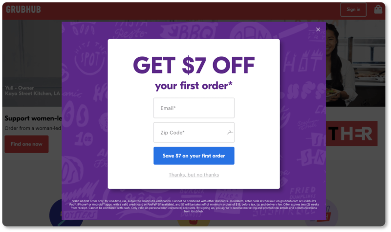
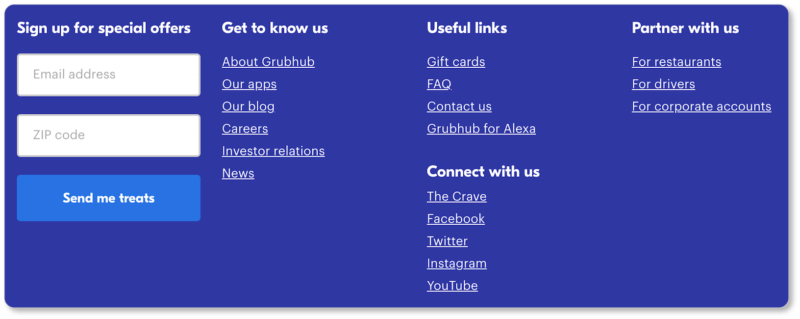
Notice that GrubHub asks for nothing more than the subscriber’s email and zip code. As a local food delivery service, the latter bit of information is necessary for GrubHub to know about its customers.
Remember, the goal is to get your prospects on your email list first; later calls-to-action in your email marketing can request more information from them in the future. It may very well take quite a few interactions to get all the data you’d like about your prospect. But since you’re building a long-term relationship with them, you won’t be losing anything if you don’t get all that information right away.
Consider including an image that represents your offer
Many of the signups we’ve shown above don’t include images (this is another reason pop-ups can be valuable: Notice how you can still see Madewell’s products in the background above?), but this is a design element that could very well impact your conversion rates.
Of course, the whole point of the email signup is to function as the quickest possible lead-generating form for your business, so you don’t want images that are going to distract from that efficacy. But a good image can often serve as one final incentive to users. Here’s the email signup on Smart Passive Income’s homepage:
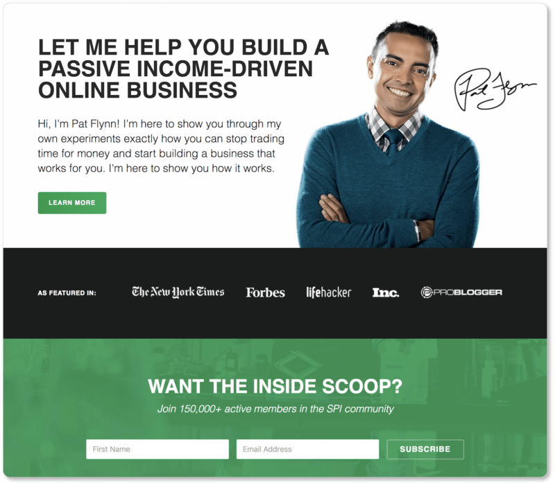
Pat Flynn is the face of the Smart Passive Income brand. Placing his image above the email signup authenticates the offering, and serves as an inspiration for those visitors who might otherwise not be so tempted to subscribe.
So while you may not be able to come up with an image that “represents” the series of emails prospects will get after they opt in, try thinking a bit outside the box (and then test your theories!)
Give new subscribers those benefits immediately
Look at the difference between Calvin Klein’s and Brooks Running Shoes’ homepage pop-ups:


Both signups promise a wealth of forthcoming information: for Calvin Klein subscribers, news about latest arrivals, promotions and events; for Brooks subscribers, training tips, perks, and information about new products. In neither case is the visitor told when they’ll receive that first bit of news or information. So Calvin Klein sweetens the deal by offering new subscribers 20% off their next order… a deal the visitor can use immediately by entering the store after subscribing.
When a visitor gives over their email address, they want something in return… and they want it quickly. Indeed, a good rule of thumb for signups in general is to ask for as little information as possible, and give your registrant as much as possible in return.
Your up-front incentive—or “lead magnet”—will depend on the nature of your business. Like Calvin Klein’s, it might be a discount on the visitor’s next order. It might be a free case study, a checklist, a podcast, a webinar… or something infinitely more creative and specific to your business. The point is instant gratification for your visitor.
As with everything else on your homepage, you’ll want to test your lead magnet to see how it performs against other offerings. The offer itself will often make the biggest difference in your opt-in conversion rate.
Of course, you’ll need to keep those incentives going over the long haul so your subscribers stay subscribed. So you might even consider having that lead magnet spaced out over time: maybe new subscribers have direct access to “Part 1” of your webinar, while “Part 2” will arrive in their inbox next Monday. This ensures that they won’t immediately unsubscribe after they get their freebie (something we confess we’ve done many times).
Don’t make your subscribers sorry
We don’t have to list for you the reasons why people unsubscribe from mailing lists: You’ve probably clicked that “Unsubscribe Me” button more times than you care to remember.
So the best advice we can give you for keeping your subscribers happy is to imagine yourself on the receiving end of your own emails. Are they relentless, or well spaced out? Do they speak directly to your prospects’ pain points and offer valuable solutions? Do they contain useful content marketing or just sales pitches? Can subscribers manage their preferences as easily as they were able to sign up in the first place?
These are questions you should continue to ask yourself with every email you send out, and with every batch of analytics you get back from your email marketing platform.
After all, it won’t really matter how many leads you’re generating through email signups if you can’t keep them on the other side.
So you’ve got your signup form down, and you’re amassing your email list—but your efforts don’t end at the lead. At some point, prospects will finally be ready to create an account with your business. In the next section, we offer best practices for that more complex set of account creation forms.