
Homepages have been described through a wide range of metaphors: They’re your online storefront, your virtual receptionist, the front door to your online marketing efforts, the proverbial cover of the proverbial book by which you’ll be judged. And the truth is that they’re all of these things… at the same time.

In many cases, your homepage will be your visitors’ first impression of your business and your brand. What this means for you is that your homepage has to wear a lot of hats: It’s got to speak to the full range of prospective customers (and prospective employees, and prospective partners) who land on your site. That means it’s got an even greater scope than your dedicated landing pages—greater, in fact, than most pages on your site.
The paradox of the company homepage is that it has to be compelling enough to draw new visitors in… but only for long enough to push them onto the next page of your site, so they can complete their journey through the sales funnel. If a visitor stays on your homepage all day, you may have gotten a lead (assuming your signup form or contact form is embedded on your homepage)… but you won’t have scored a sale.
If done well, here’s what your homepage should accomplish:
- It should attract traffic… and then immediately delight the visitors it attracts: the former through good search engine optimization (SEO) practices; and the latter through copy, multimedia, overall page design, and remarkable user experience (UX).
- It should explain what your business and brand are about. This will be done primarily through educational and prospect-oriented copy, including your headline, your value proposition, your catalog of features and benefits, and whatever social proof you display. Testimonials, for example, can often tell your visitors more about your offering than your own copy can.
- It should generate leads and direct visitors to other pages on your site. This happens through signup and contact forms, a clear navigation menu, interlinks, and skillfully placed CTA buttons.
- It should be unforgettable. This will be done through some combination of the above points, as well as stunning imagery, unique page design… and did we mention impeccable user experience?
Each of those homepage “shoulds” may seem abstract to you; and that’s okay. Given all it has to accomplish, the homepage can feel like an overwhelming project. That’s why, in subsequent sections, we offer shortlists of best practices, along with examples from business websites that do that element well.
The idea is that you’ll move through these lists one at a time and implement our suggestions sequentially. We hope this step-by-step strategy will make “The Homepage Project” feel less staggering and more achievable. In the end, these best practices will help your homepage deliver… which means more lead generation, more conversions, and—ultimately—more customers in your sales funnel.
An exemplary homepage study: Zerorez Atlanta
Before we dive into the details, let’s look at a stellar homepage from the carpet cleaning company Zerorez Atlanta (Zerorez won the 2016 “Best Small Business Website” award from the Web Marketing Association, so their homepage is worth paying attention to):
Zerorez is doing a lot of things right on its homepage, and it exemplifies how the essential elements in the list above can be accomplished in what’s ultimately a fairly short homepage:
1. They’ve put a guarantee and a special offer right next to their CTA button.
The company recognizes the importance of a trust signal positioned in just the right place. They’ve also added a banner at the top of the page, which promotes the great price they’re offering. What better way to draw prospects in than to offer them a deal the moment they arrive?

2. They leverage prospect psychology.
When a visitor first clicks into the homepage, a countdown appears. Like that special offer in the banner, these diminishing numbers catch the visitor’s attention right away, and evoke a sense of urgency. Also, notice how the countdown seems to rise up toward the reader as it approaches zero. Zerorez definitely gets points for attending to prospect psychology on this one:
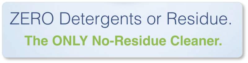
3. Their headline and sub-headline offer the company’s value proposition.
You’ll have noticed the two crucial words that distinguish Zerorez from its competitors are all in caps. Whereas the video below the fold describes their process in its complexities, Zerorez keeps their above-the-fold copy clear and concise: “No residue” is a condition everyone desires for their home… and it’s a concept everyone understands:
4. Their main navigation menu is simple and clear.
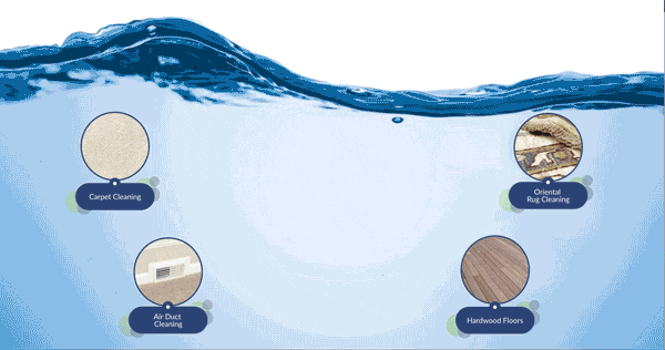
Zerorez has limited their main navigation to five menu items, and services are divided simply into “Residential” and “Commercial” so that site visitors know right away—depending on which category they fall into—where they need to go for more information.
What’s more, “Residential Services” and “About Us” are the only items with sub-menu items (at 5 and 2 items, respectively). There’s virtually no opportunity for users to get overwhelmed here:
![]()
5. The CTA above the fold becomes a floating CTA as users begin scrolling.
This “floating” feature allows the CTA to follow visitors down the page as they learn more about the company and its service. The same is true of Zerorez’s phone number and the CTA to email the company (which floats at the bottom of the page).
This means that if a visitor decides at any point to schedule a cleaning or contact the company directly, they don’t have to scroll back up to the top of the page. Zerorez definitely gets UX points for this design:

6. They include a delightful (and unforgettable) design element.
As a visitor scrolls down the page, a carpet cleaning machine tracks their movement, leaving a stripe of freshly-cleaned carpet in its wake. The designer even included a spilled cup of coffee that gets cleaned up along the way (depending on the size of your browser), which suggests the efficacy of Zerorez’s service.
7. They speak to a distinct customer persona.
By the time a visitor gets to the image of the boy and his dog, it’s clear who Zerorez’s target market is: prospects who are concerned about chemicals in their homes (whether from personal health or environmental points of view), and who prioritize the health and well-being of their families and the environment in their housekeeping decisions.
Prospects who are in alignment with these concerns are pretty clear that Zerorez’s service is for them by this point:
![]()
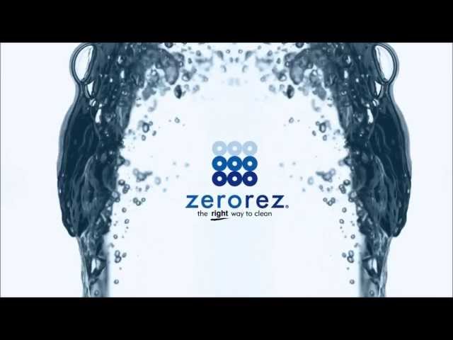
8. They include an explainer video that describes how their service works.
Multimedia is one of the most compelling elements you can offer visitors… and videos top that list. There’s little you can write that will capture visitor attention faster than the first few seconds of a good video—especially when that video breaks down a complex process that visitors have no desire to read about on their own.
Zerorez’s video goes further than simply explaining their process. It also describes the precise nature of the problem they solve (the problem, paradoxically, that other cleaning companies create), and explains how their cleaning process makes them unique. In other words, they use multimedia to rephrase their value proposition:
9. They offer multiple forms of social proof.
Social proof is the psychological phenomenon by which people rely on the actions and evaluations of others to determine the “right” choice for them in a given circumstance. As you can probably imagine, it can come in many forms.
We found at least three forms of social proof on Zerorez’s homepage: 1) the Carpet and Rug Institute’s “Seal of Approval” displayed near the coffee cup and the company’s claim to Platinum Certification; 2) the awards presented below the video (many of which Zerorez has won for consecutive years); and 3) the customer testimonials just below those awards. A prospect couldn’t ask for much more verification that Zerorez is as good as they say they are:

10. They include a contact form at the bottom of their page.
This is the last element you’ll have seen in the video of the company’s homepage. A Contact Us form is one of the most important elements you can have on your homepage if you’re trying to generate leads. By the time a visitor has read (and watched) everything on the homepage and determined that Zerorez is the right company for them, they’ll hopefully be prepared to initiate contact:
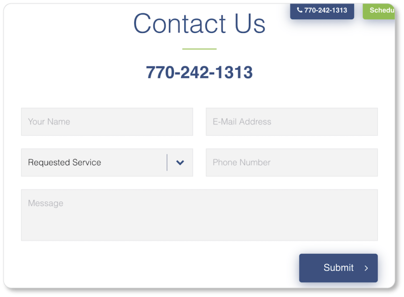 A contact form gives prospects who might not trust online scheduling another way to get in touch with Zerorez. It gives prospects who can’t call them in the moment a way to reach out to the company. It lets users ask any lingering questions they might have about the service. And—importantly for Zerorez—it gets them a lead in the form of an email address and a phone number.
The opening of the conversion funnel
All of this happens on Zerorez’s homepage in just over 500 words by our count (and that word count includes their testimonials!) Which is to say, your homepage shouldn’t be where you put all your words at once. When Zerorez’s prospects begin self-categorizing (by clicking into “Residential Services,” “Commercial Services,” “Carpet Cleaning,” “Air Duct Cleaning,” etc.), that’s where they’ll get the bulk of their information.
Remember, the homepage exists to draw your visitors in, help them understand how your product or service will improve their lives, and then send them on to the next page and into your conversion funnel. Zerorez has done this rather impeccably.
Of course, whether you’re able include more elaborate elements on your website (such as the vacuum cleaner on Zerorez’s site) will depend upon whether you’re coding your website yourself—or with the help of a developer—or using a CMS such as WordPress or Squarespace, or a website builder such as Zoho Sites, Weebly, or Wix.
Hiring a developer to build your site from scratch means you get to focus on running your business rather than learning the ins-and-outs of a platform—and a good developer will have the capacity to add more complex elements to your online presence. On the con side, hiring a developer can be a pricey endeavor… and they may not be available down the road when your website’s in need of maintenance. Using a website builder, on the other hand, is much less expensive (in some cases, free); and it gives you access to, and control of, the process at all times.
We’re not here to push you one way or the other; your decision will depend entirely on your business needs and your available resources. We’re just here to tell you what makes a good website. And so…
Now that you’ve seen how one company has won the “homepage game,” it’s time to turn (or return) to your own homepage. In the next section, we look at the fundamental matters worth considering before you even sit down to write the copy for your homepage: your customer persona and your keywords.