
Web design is more of an art than a science. If there were one perfect form of a homepage or a store catalog, we would never see any of the wonderful variety that we have on the internet. The truth is, each successful online brand got where they are today because they knew who they wanted to reach with their products and were able to create a sense of identity that speaks to those needs.
This is where your homepage comes in. It’s the very first impression you make on your site’s visitors, making it a defining moment for you to establish a connection with your own unique target audience.
We’ve selected five standout examples of homepages from this year that successfully use creativity and empathy to speak to well-defined target demographics. Let’s take a look at the different techniques these businesses have used to establish strong brands through design:
Storq
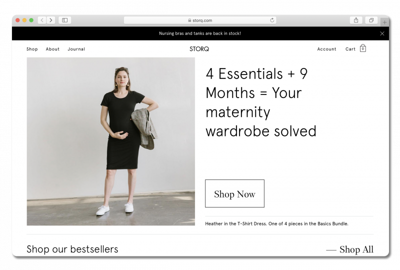
Storq is an online clothing store for pregnant women and new parents. They primarily sell maternity outfits, but they also offer postpartum essentials like changing kits and nursing apparel. Here is their homepage:
Storq is looking to attract women across different stages of pregnancy and raising newborns. More specifically, they are courting the attention of a younger generation of new and expecting parents, most of whom are likely in their twenties and thirties.
Best elements of Storq’s homepage:
They employ excellent product images and captions. Storq makes great use of product images on their homepage to showcase their clothing while clearly communicating their unique brand identity. The images feature real mothers—many of them well into their pregnancy—modeling Storq’s clothing.
These photos are composed with an air of individuality and confidence that wouldn’t look out of place in a mainstream fashion magazine. This approach sends a clear message that Storq has made the stylishness of their maternity clothing as much of a priority as its functionality.

Keen-eyed visitors will also notice that the names of the models have been listed in the photo captions. This adds an extra touch of authenticity, knowing that a real person can look cool and comfortable during a stage of life that’s completely new territory for many of Storq’s customers.
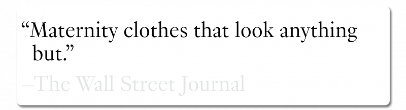
They establish credibility with their customers. Scrolling below the fold reveals a choice endorsement from a highly reputable source—the Wall Street Journal. The quote, “Maternity clothes that look anything but.”, works perfectly as a mission statement of Storq’s unique offering. That the quote comes from a well-established print publication is significant. As much as it’s grown, the internet can still feel like a nebulous space, especially for an inexperienced parent. Anything that can tie an online store’s reputation to a tangible institution like the WSJ is crucial in establishing trust right out of the gate.
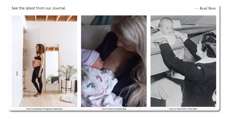
They make great use of their content marketing. Storq maintains interest and establishes their authority by featuring an educational blog for parents. They’ve placed links to their Journal articles near the bottom of the homepage, which means that if you’re here, you’ve already looked through the products and you’re still interested. Including a helpful resource like this has the potential to earn Storq a coveted spot in their visitors’ bookmarks, so they make use of this section to appeal to every segment of their target audience. Of the three articles featured, one is targeted at women who are newly pregnant, one for women who are further along in pregnancy, and another for parents raising newborns.
Want to learn more about creating an effective blog of your own? Head here: Introducing the Company Blog: Your Content Marketing Machine
How does it look on mobile?
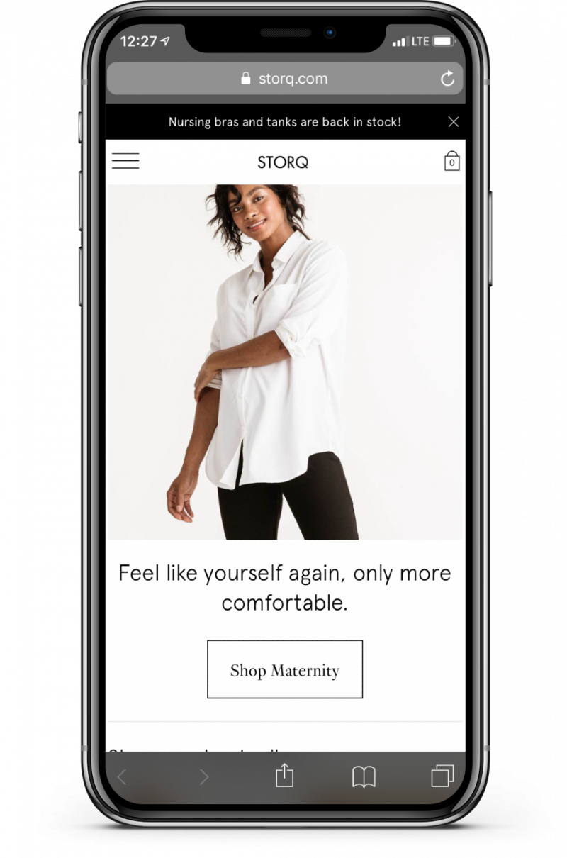
Storq’s mobile site is well-optimized, with the header elements consolidated into a hamburger menu, and employing a unique hero image and text that are different from the desktop version. This gives the mobile site its own identity without sacrificing Storq’s distinctive style.
Warby Parker
Warby Parker is an eyewear brand with both an online and retail presence. If you wear glasses, you may already be familiar with them. Here’s what their homepage looks like:
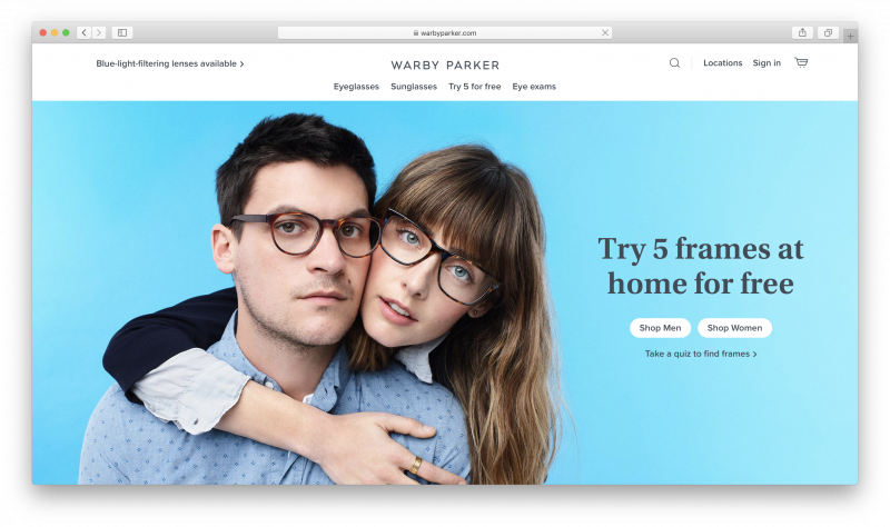
As a brand, Warby Parker is known for being stylish and accessible, with an emphasis on affordability. It’s just as important that you look good in their frames as them fitting properly and with the right prescription.
Best elements of Warby Parker’s homepage:
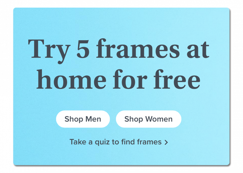
They have a strong hero message. When you visit the Warby Parker website, front and center, you see their high resolution hero image. Your eye is immediately drawn to the accompanying text filling the negative space. They make use of this prime real estate to headline their most unique offering—a free trial for frames.
This immediately addresses the top concern of people buying frames online: “How will they look on me?”.There’s also great subtle parallelism here between the CTA buttons and the hero image, with the “Shop Men” button on the left and the “Shop Women” button on the right, matching the man and woman in the picture.
They have good user segmentation. Just below the conventional CTAs that segment men’s and women’s products, there’s something more unique—a frame quiz. This a great opportunity for Warby Parker to get visitors to engage rather than mindlessly browse. Overchoice, or choice paralysis, is extremely prevalent in online shopping. Is there anyone who hasn’t found themselves comparing twenty near-identical microwaves on Amazon, wondering how they got there? Anything that reduces the number of choices a customer has to make can increase conversion rates and lower the time it takes to close a sale.
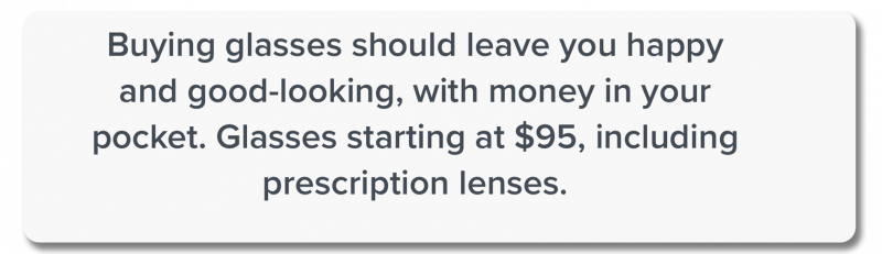
They have clear company values. Moving further down, the first thing you see past the fold is Warby Parker’s mission statement in bold print in the center of the page. In a market where you can pay anywhere from ten dollars for cheap frames to potentially hundreds for high-quality craftsmanship, it’s important to be direct in setting expectations.
How does it look on mobile?
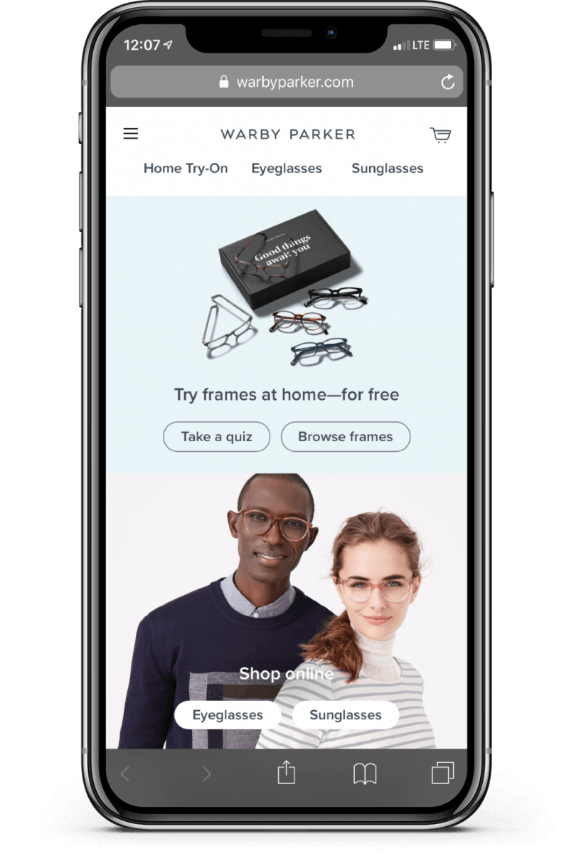
Warby Parker have taken a unique approach to their mobile site by employing a different layout than we see on the desktop version. Where the desktop site used larger images and empty space to draw the eye, the limited area of the mobile screen has driven them to be more economical, choosing to fit more images and CTAs above the fold.
Learn more about what constitutes good mobile design and how to optimize your site for mobile: Optimizing Your Homepage for Mobile Users
Hawkins New York
Hawkins New York is a stylish home goods brand that offers everything from dinnerware to desk sculptures. Check out their homepage:
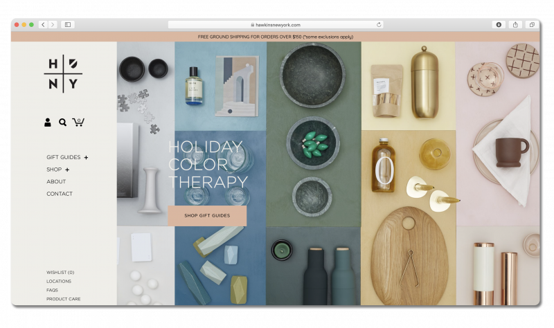
The wide variety within Hawkins’ inventory means that they have to be more creative in addressing their target audience. Instead of “millennial moms” or “eyewear enthusiasts”, Hawkins seeks to inspire anyone who may be interested in decorating their living space with a tasteful and clean aesthetic sensibility.
Best elements of Hawkins New York’s homepage:
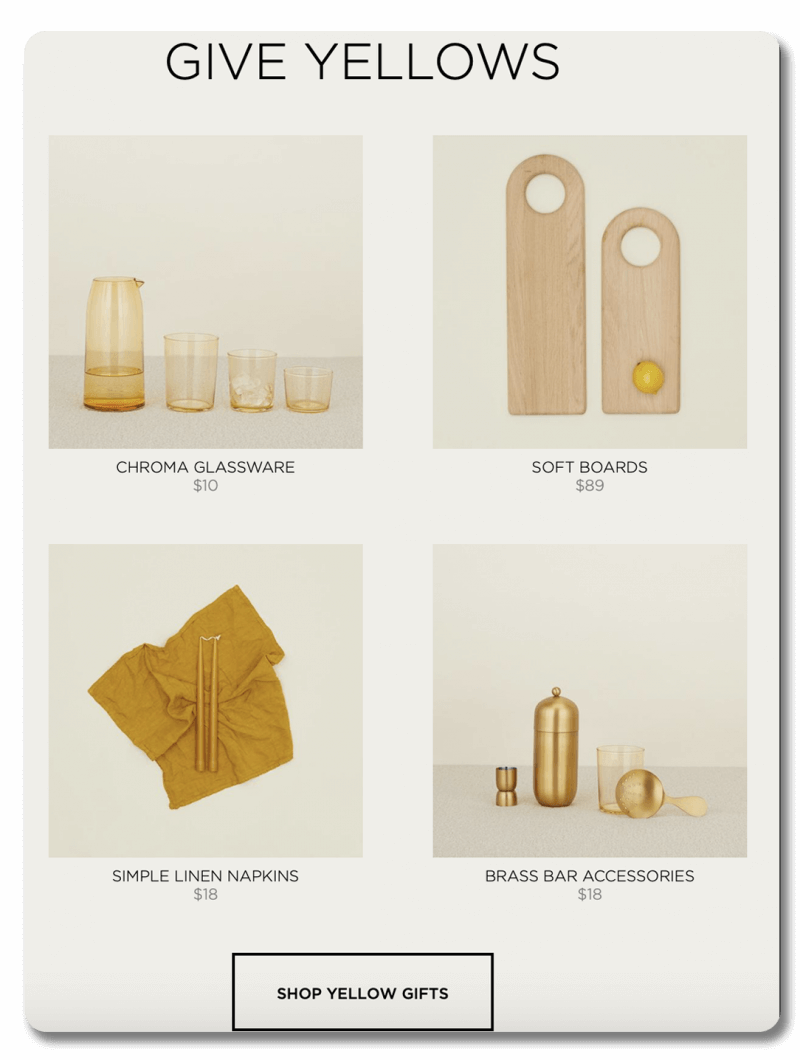
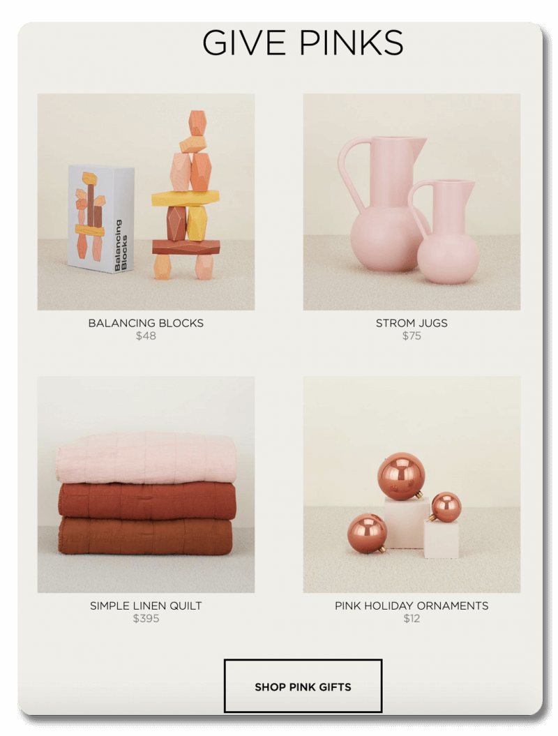
They make great use of color. Hawkins expresses their distinctive sense of style with inventive use of color in both their images and their messaging. Where a more conventional site might highlight specific categories like “kitchenware” or “bedding”, Hawkins issues a creative challenge to their visitors to “give yellows” and “give pinks”, using images that feature matching-color products from across multiple categories. On one level, it creates an eye-catching display and brand statement, but on another level, it also works as a demonstration of design synergy. A customer who may have originally been looking for a new set of dishes is now compelled to consider the possibilities of a whole room of matching (or even complementary) practical and decorative pieces.
They make it easy to keep in touch with leads. It wouldn’t be out of place to say that Hawkins’ main strategy is to inspire their potential customers—inspiring them to decorate, thus inspiring them to buy. With that in mind, it only makes sense that they should pursue every opportunity to keep their leads up to date with new products and new ideas. Then it should come as no surprise that they’ve utilized several options for lead gathering on their homepage. At the bottom of the sidebar, there is an email signup and shortcuts to their social media below an invitation to “Keep in touch!”. When you reach the bottom of the page, there is an even larger email signup box (“Stay in touch.”), accompanied by a preview of their most recent Instagram posts, with yet another invitation to follow them on that platform—it’s impossible to miss.

How does it look on mobile?
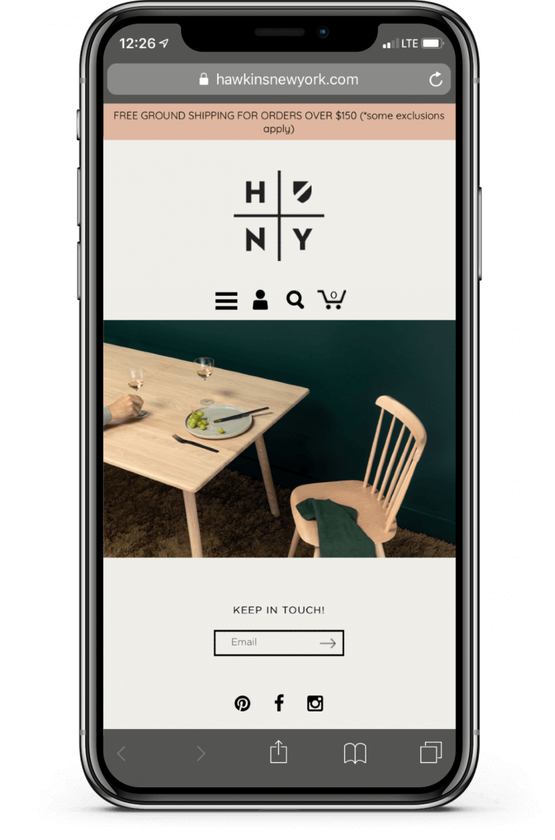
Hawkins’ restrained design translates naturally to the mobile screen. The emphasis on attractive images over text and interactive elements allows you to browse comfortably, while sacrificing very little in terms of user experience.
Frans Hals Museum
The Frans Hals Museum is located in the Netherlands, and features a mix of classic and contemporary visual art. Here is their homepage:
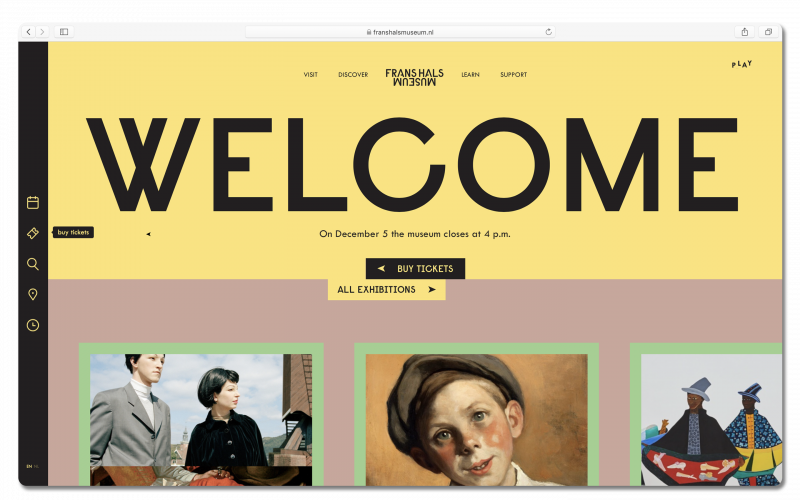
The Frans Hals Museum is in a position where, although their “target demographic” is the general public, they may need a boost with the younger generation who have access to a surplus of media available online. Their website has been designed to frame visual art as fun, interesting, and accessible (read: not pretentious). They’ve clearly strived to use their website as a tool for communicating a palpable sense of passion for their eclectic collection of artwork.
Best elements of Frans Hals Museum’s homepage:
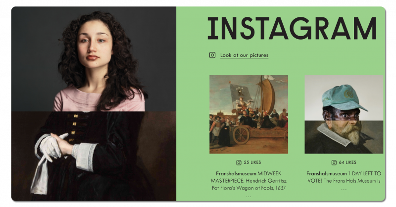
They artfully utilize social media. On a homepage with a lot of flair, the way social media is integrated into the page is an especially fun touch. One of the major challenges that the Frans Hals Museum—and many museums like it—faces is keeping traditional visual art relevant in the age of Instagram. This website chooses to react by fully embracing social media, and Instagram specifically, to give a taste of what the museum has to offer.
This section of the homepage provides visitors with a fully interactive horizontal scroll of their Instagram feed, subtly subverting the vertical scroll of IG. Their well-curated feed teases new exhibits, and sometimes features goofy crossovers of older works with contemporary art. This eclectic feed exudes a confidence that there’s still a place for museums in the digital world—that the act of viewing images is only one small part of the contextualized museum experience. Plus, there’s just something fun about posting centuries-old portraits on social media. Frans Hals Museum succeeds in playfully elevating Instagram into the realm of high art.
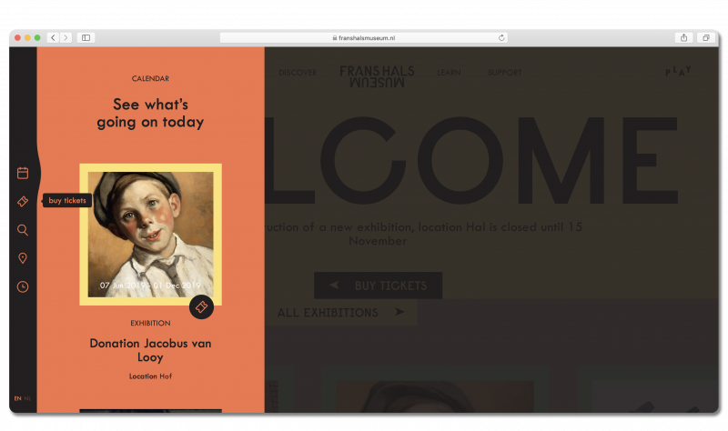
They balance creativity with stability. The Frans Hals homepage has a lot going on. There are numerous little details and moving parts that dynamically change as you explore the site that all combine to create a wildly creative experience. However, none of what makes the site fun to explore would work if they didn’t provide a stable backbone for navigation. As you scroll up and down the page, the only element that doesn’t move or change color is the sidebar. It’s incredibly functional while remaining completely unobstructive. You can use it to view the calendar, buy tickets, search the site, view museum locations, and check the opening hours—each element expanding only when you click it.
How does it look on mobile?
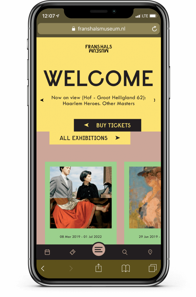
Frans Hals Museum have put just as much though into their mobile design as they have every other element of their site. The sidebar is modified and repositioned to the bottom of the screen for ease of navigation, and the horizontal scrolling elements are a natural fit on a touchscreen.
Europejski
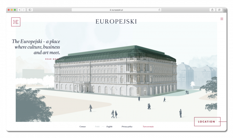
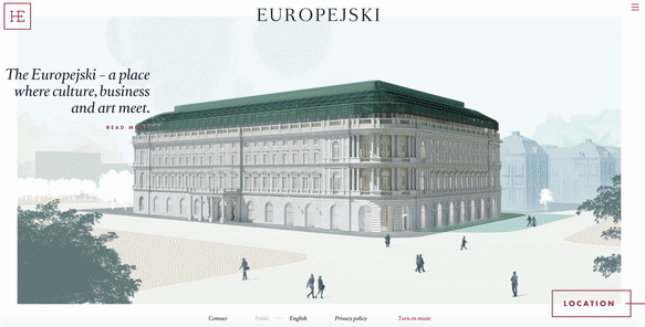
The Europejski is a 19th century hotel, office, and retail center in a prime area of Warsaw, Poland. The owners are looking to lease out space to potential business tenants. Here’s their homepage:
The Europejski wants to attract tenants who are interested in projecting a sense of luxury and stately refinement. (They’ve clearly thought a lot about their customer personas!)
They accomplish this on their homepage with an impressive custom design that’s just as much about the cultural and historical setting of the building as it is the property itself.
Best elements of Europejski’s homepage:
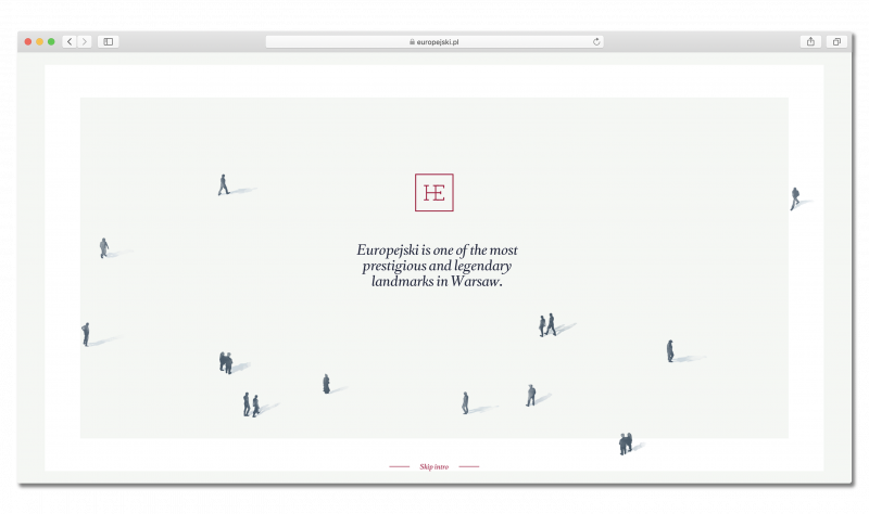
Introduction
The Europejski faces the interesting task of tastefully flaunting their own elite status to potential clients who seek to attain it by renting there. Nothing says class like a formal introduction. As their homepage first loads, an illustrated animation plays, opening with the impressive line, “Europejski is one of the most prestigious and legendary landmarks in Warsaw”. The animated intro goes on to extol the main bona fides of the location before seamlessly transitioning into the artwork layout of the homepage. This creates a strong first impression for anyone visiting the site. Introductions like this one aren’t necessary or practical for most businesses, but that’s exactly what makes it so impressive.
They’ve made an interesting twist on traditional navigation. The Europejski brands itself as a cut above the norm in real estate. So too, with their homepage. Rather than having you scroll up and down to navigate, they’ve framed every section of the homepage exactly the way they want you to experience it. When you gesture to scroll between each section, an animated transition plays that smoothly transports you from one to the next, each new section educating you on a different topic relating to the building’s storied history and current facilities.
On one level, this method of navigation provides an extra layer of flourish to the luxurious patina of the Europejski brand. On a more practical level, what this carefully conceals is that all visitors are made to sit through an elaborate pitch slideshow, moving from point to point in the exact sequence they want you to experience it. As fancy as it seems in this context, this technique could easily be used by a number of different businesses, from low-budget to upscale, provided that they’re comfortable sacrificing flexibility for the integrity of their pitch.
How does it look on mobile?
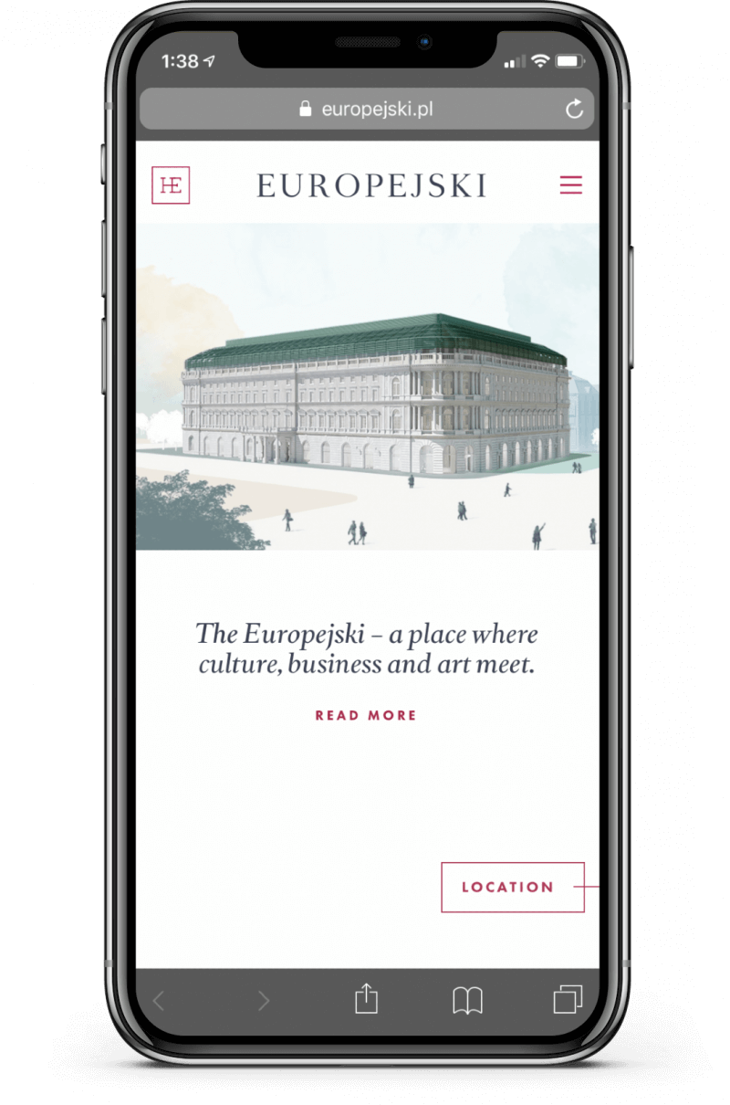
The illustrated slideshow concept employed on the Europejski site has been calibrated to work perfectly with the gestural navigation on mobile phones. All the transitions and animated flourishes have been successfully adapted, making it into a compact elevator pitch that manages to exude class, even on the smaller screen.
We hope this list has demonstrated the incredible freedom of expression you can have when putting together a homepage. There’s no need to be boxed in by convention as long as you’re able to connect with who you’re trying to reach. We encourage you to explore these sites, along with other online spaces, with a critical eye towards what works and what doesn’t. If you find a homepage particularly appealing, think of how the layout or the messaging has managed to resonate with your own taste or way of thinking. If you find yourself confused or put off by a site’s design, think about who it might be trying to appeal to, and imagine whether you’d appreciate it more or less if you were in their position.
If you’re feeling inspired, and you’re ready to get to work on your own website (or ecommerce store), we have some great resources for applying design thinking to your own homepage. Head to our guide on homepages to learn how to identify your customer personas, create user journeys, and more.