
In our section on FAQ content, we discussed best practices for your FAQ copy. But no matter how well written your FAQ content is, it’s not going to do your prospects (or yourself) any good if no one can find it—or worse, if once they’ve found it, they can’t navigate it.
In part, easy navigation is what we mean when we say “UX.” “User experience” is in some ways exactly what it sounds like… and yet it encompasses more than you’d imagine it would. It’s the process of creating a product with user satisfaction as the foremost priority in every stage. UX pioneer Peter Morville claims that there are seven qualities or facets of UX: The product (in this case, the website) must be useful, usable, desirable, findable, accessible, credible, and valuable.
Good UX demands an acute understanding of your site visitors and users, including what their pain points are, what they want, what they’re emotionally invested in, and what they value—as well as their abilities and limitations. It includes visual design, information architecture, and navigability; and each of these page elements must understand its user, fulfill their needs, and generate positive emotions in them as they interact with it.

What do they want out of this experience? This is a question you should be asking of your imagined users about every element of your website. Naturally, that includes your FAQ page.
The goal of UX is “to improve customer satisfaction and loyalty,” according to one study from Oxford Academic. But let’s not forget that “customer satisfaction” means fantastic ROIs for your business. IBM claims that “every dollar [they’ve] invested in ease of use returns $10 to $100.” According to UX design leader Peter Eckert, “Every dollar spent on UX brings in between $2 and $100 dollars in return.” On the other hand, 88% of online consumers say they’re unlikely to return to a site after a bad user experience. And these are just three of many statistics proving the remarkable ROI of good UX… and the dangers to your business of failing to attend to it.
So let’s prioritize UX on your FAQ page, shall we? Here are some things to consider once those Q&As are written and ready to go up on your site:
Make it easy to navigate
Because FAQs are such targeted documents, ease of navigation is essential.
If your FAQ page contains only a few questions, list them from most basic to most complex. If you have more than 15 or 20 questions, divide them into categories with informative subheadings for a more seamless user experience—for example, products, features, billing, shipping, returns and exchanges, etc.
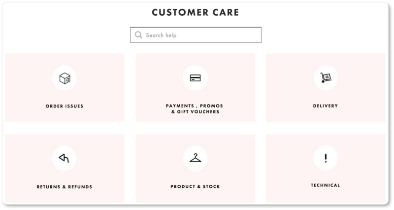
The fashion retailer Asos does this:
You might have a different category for each product or service, or categorize your questions by audience type (beginners to advanced users), or divide pre-sale from post-sale FAQs. However you decide to categorize, consider having a separate category of the most commonly asked FAQs, culled from among the questions you have.
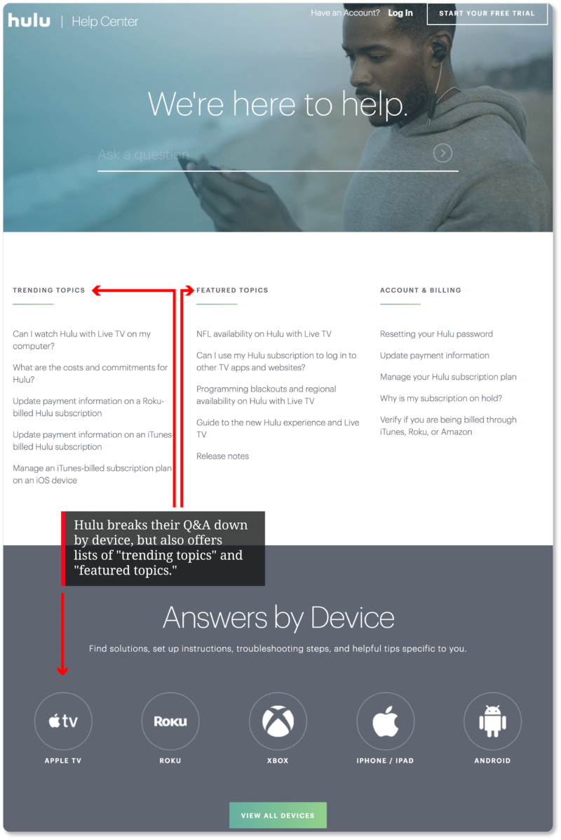
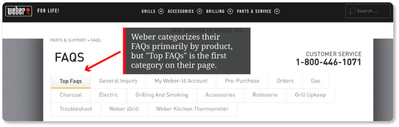
Hulu (a video-on-demand service) and Weber (a grill company) both offer FAQ pages that are intuitively categorized and easy to navigate:
Many FAQ pages we’ve seen have a pretty basic design: short lists of questions with the answers displayed directly beneath them. If your FAQ list isn’t long and your answers are concise, this is fine. Just be sure to distinguish the questions from the answers—whether through color, size, or font.
Still, considering the percentage of people who’ll be reading your FAQ page on their mobile device, we generally wouldn’t recommend this design. No one wants to scroll through a bunch of answers on their phone until they get to the question that’s relevant to them. There are three different page architectures we’d suggest to remedy this:
1. Use a jump-linked table of contents at the top of your FAQ page
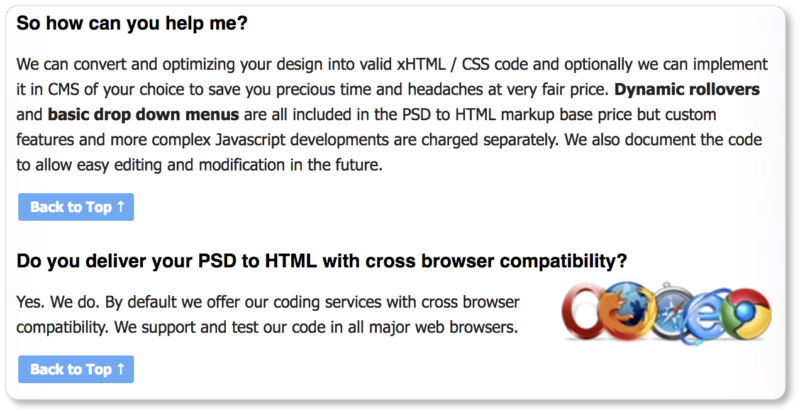
Rapidxhtml shows the power of this technique. Putting a clickable table of contents at the top of the page allows users to view all the questions at once and more quickly find the ones relevant to them. When they click on a question, they’re jumped down the page to the answer. Then, at the end of each answer, they’re given a link that says something like “Return to top.” Clicking on this jumps them back up to the list of questions.
2. Use clickable questions that are collapsed by default and open up to reveal the answers
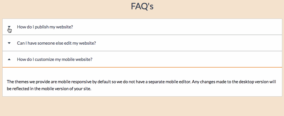 Here’s an example from Zoho Sites. (Notice, too, how Sites’ FAQ questions are organized from basic to more complex?) If you check out any FAQ that uses this architecture, you’ll observe pretty quickly how much nicer it is when the answers don’t take up any space on the page.
3. For longer answers, use hyperlinks to take the reader to other pages of your website
In this architecture, each question is displayed in anchor text, so when a user clicks on it, they’re sent to a dedicated page that answers that question. (Note that if you choose this design, you’ll want to make sure that each of your subpages loads quickly.)
This structure has one particular advantage: It’s great for SEO. Because it pushes traffic around to many pages on your site, it leads to a huge spike in page views, which Google tracks to determine how valuable your content is. Search engines like Google also tend to favor pages that are dedicated to a single theme or keyword rather than to many. (By contrast, a single-page FAQ has several themes.)
A single-themed page is easier for the Googlebots to crawl, “understand,” and index. So if you’re trying to optimize your FAQ page for search queries, we’d recommend this architecture.
Enable search
A search box is a vital feature of any FAQ page that contains many questions, categories, and subcategories. But search is also a generous tool to offer your visitors even if you don’t have many FAQs.
Pro tip: If you enable search for your FAQ, it should differ from the general search function for the rest of your website. This ensures that the results returned to the searcher are only pulled from your FAQ pages, and not from irrelevant pages elsewhere on your site.
On their individual FAQ pages, IMDb includes a search function that reads “How can we help?” This indicates to the user that they’re searching help, rather than searching the entire site:

Make it prominent
We all know how frustrating a fruitless search for a business’s FAQ page can be. You should be proud of your FAQ; don’t relegate it to that tiny type in the footer or, worse, bury it in your site map. Rather, link to it prominently from your home page—or from any page on which you think a visitor might realize they have a question.
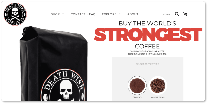
Death Wish Coffee does this beautifully: The “Contact + FAQ” at the top of the page is virtually impossible to miss:
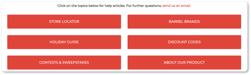
In fact, once you click into their FAQ page, you’ll see Death Wish has done just about everything right: from categorizing their questions, to including a prominent search tool, to displaying their contact information and offering a live chat feature—just in case a visitor can’t find the answer to their question:


Beyond giving your FAQ a prominent place in your main navigation menu, you should also consider where your visitor is in their journey and position a link to your FAQs where it matters most: on your pricing page or sign-up page, just before the sell or the commitment. (Remember, these FAQs might contain different “frequently asked questions” than your general FAQs: They might be geared more toward individual product features or returns policies.)
Price is nearly always the final hurdle that a prospect must jump over (“Which pricing option is best for me?” “Is there a company with a cheaper product?”) before they buy. Your pricing page is where a prospect is most likely to drop out of your sales funnel. It is, therefore, the most important page on which to make an FAQ visible.
The broad benefits of good FAQ UX
A well-written and well-designed FAQ page is a win-win for everyone. For your customers, it improves overall experience, both on your site and with the product or service you offer. It also allows them to answer their own questions and solve their own problems—which many customers prefer to calling a service center and sitting through a list of menu options.
For you, a well-written FAQ page keeps your business’s phone from ringing off the hook, and you (or your support team) from answering the same questions over and over again. Better UX on your FAQ means better customer confidence and higher conversion rates.
What’s more, you’ll educate both yourself and your team as you write and answer these FAQs… and—if you’re lucky enough—your answers may invite you to imagine how to offer a better product or a better service in the process.
In the next section, we recommend some additional elements worth adding to your FAQ page… both to make it a more valuable knowledge base for your customers and prospects, and to make it a more conversion-friendly page for your business.