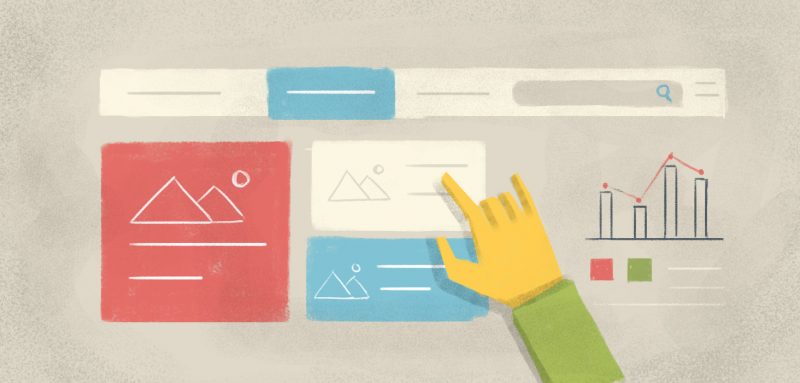
Your navigation menu is like a series of doors embedded above-the-fold of your website, which open—hopefully intuitively—to the information each visitor is looking for. While menus don’t receive a whole lot of attention from an aesthetic point of view, they’re one of the primary elements through which visitors will determine—consciously or not—the usability of your site. In other words, if your visitors can’t find what they’re looking for with minimal effort, they’re not likely to stick around long. On the other hand, efficient navigation menu design can boost traffic (and therefore SEO), increase page views, improve user experience, and grow sales.
You’re a web user; we think you know this from a consumer perspective. But it’s not always easy to turn it around and look at it from a web design perspective. So in this post, we start with the basics. Your homepage navigation should:
Include fewer than seven items
We’d recommend even fewer than that; you’re striving for simplicity here. The more items you have in your navigation, the more difficulty your visitors will have processing and remembering them. And of course, fewer items means each discrete item is more visually prominent… and thus more likely to be considered by your visitor.
Incorporate a drop-down menu if you must have more than seven items
Maybe you offer a diverse range of products or services, for example… and that’s great! Just keep in mind that drop-down menus present some difficulty for search engine crawlers.
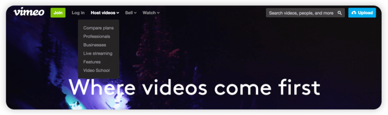
What’s more, do try to keep the drop-down menu to a single level (there’s no sense suddenly overwhelming your visitor at the hover), and signify drop-downs with visual clues, like the arrows Vimeo uses in their navigation:
Be descriptive
Menu items like “products,” “services,” “photos,” and “videos” aren’t going to do much for your site visitors—not to mention for your SEO efforts. (Why use the word “services” when you can say “skin care” and “reflexology”?)
Listing your primary products or services instantly communicates your business to your visitors, making it immediately evident what you do, and helping them determine whether they’re in the right place. So take a tip from Tesla and Bare Studio:


Include a search
Vimeo does this well in the above example. A prominent search function prevents visitors who come to your site knowing exactly what they’re looking for from having to click through a series of pages to get to it. (Search is especially useful for decreasing this kind of friction on eCommerce sites).
Including a search feature not only increases your conversions; it also gives you invaluable data about what your visitors are searching for, so that you know better what to offer them in the future.
Consider order
By “order,” we mean “hierarchy.” But we also mean that you should keep in mind the serial position effect: the theory that items at the very beginning and the very end of a list are more easily remembered than those items that fall in-between. (This is the “primacy effect” and “recency effect,” respectively).
In other words, the first and last items on your menu are likely to be most effective. So if you want to forefront your content marketing efforts, your blog might be the menu item farthest to the right. Your newest or best-selling product might be the menu item farthest to the left. And so on.
Reflect visitor behavior
This is really a way of saying that your navigation should be intuitive. You’ll refine this over time through analytics; but your main navigation menu should be reflective of visitors’ typical behavior by including the pages that they most often visit. After all, the menu is there to help visitors find what they’re looking for; and if you know what visitors are looking for, you may as well give it to them—simply and immediately.
Google Analytics, Clicky, and Zoho PageSense are all great platforms for website analytics. The data they’ll give you will help determine which menu items to remove (if they rarely get clicked and they aren’t crucial), rename (if they rarely get clicked and they are crucial), or move (remember those primacy and recency effects we just discussed).
So consider the structure and copy of your navigation menu carefully. What goes into it will affect traffic, UX, and conversions more than you might imagine. If you’re just starting out, you can always sit a friend down in front of your homepage and have them talk through their experience of navigating your site from there. Witnessing a new user try to move through your site from its “front door” will alert you, early on, to potential hiccups in the navigation.
If you’re not sure which pages to include in your menu, we recommend you start with these:
- Homepage
- About page
- Contact page
- The business’s blog
- The FAQ or Support page, if you have one
Whatever other menu items you decide to incorporate will depend upon your business and services/products. Maybe you’re a designer and you need a prominent menu item for your work portfolio. Or maybe your product is expensive enough that you need a dedicated testimonials page to help people move through your sales funnel. Experiment, analyze, test…and test some more. Like every other element on your webpage, your navigation should be fluid, changing to reflect your users’ desires and behaviors.