
Think of all the actions you take on business websites in a given day. (No, really; we’ll give you a minute to think about it). We bet they include giving over your credit card information to make a purchase or entering your email address to subscribe to a newsletter or download a lead magnet. Maybe they include contacting a company with a query directly through their website, or entering a testimonial into a text box to submit an online review.
Whenever you perform any of these interactions (among many others), you’re utilizing web forms. Most business sites offer multiple forms to their visitors, for a wide range of possible interactions.

A web form is an interactive online page (or an interactive element on a page) that essentially mimics a paper document, allowing users to input data and submit it to the business in question. As with paper forms, users input their data using text fields, radio buttons, and checkboxes, as well as drop-down lists. Once a user hits the CTA to submit, that information gets sent to a server for processing.
Web forms are an indispensable component of your business website for precisely this reason: They allow visitors to more or less directly interact with your company. They also help you gather crucial information—whether to generate leads, or to better understand your visitors’ wants and needs, or to close that sale from a customer on the other side of the world.
We mentioned above that the input users enter into your web forms will be sent to servers for processing. Depending on the type of data they’re entering—and on the way you’ve set up your website to process it—their information will be uploaded to any number of platforms (your CRM or your marketing automation platform, for instance) to be used by your business.
In the following sections, we discuss the four most common types of web forms. (Best practices about a fifth type—the checkout form—is in our content on online shop pages.) Regardless of your industry, we bet your website will include at least two of them. They are:
 Email signup forms. This is the most basic type of web form, and every business website should offer one. Email signup forms are powerful lead generation tools precisely because visitors don’t feel like they’re giving too much away by handing over their email addresses—especially when you offer something great in return. Input entered into email signup forms will typically be sent to your marketing automation platform (such as Zoho Marketing Automation, Marketo, or MailChimp) or your CRM (such as Zoho CRM or Salesforce); you’ll then use this platform for your email marketing campaigns.
 Account creation forms. These are more complex, multi-phase signup forms, and are often spread across multiple pages on a website. Account creation forms can be used for everything from a SaaS product to a gym membership to access to an online course. Users enter more personal information into these forms, including company information, addresses, and billing information. They create and input new passwords. Typically this data is then sent to a subscription platform, such as Zoho Subscriptions, Stripe, or Recurly. Depending on how your IAM (identity and access management) tool is configured, this platform may be integrated with your accounting or invoicing software.
 Contact Us forms. Contact Us forms will be more or less complex, depending on the nature of your business. While they’re valuable for customer support, they’re more typically used as a lead generation tool. With email signup forms, users indicate they’re willing to be passive recipients of your email marketing efforts; but with Contact Us forms, they’re asking for deeper engagement. For example, maybe they’re ready to discuss a project with you as a potential client. The data input into your Contact form can go into your CRM, or it can be emailed to you directly.
 Scheduling forms. Scheduling forms allow prospects to book appointments with your business and fill out all relevant information online. Data entered into these forms will be sent to an appointment scheduling platform such as Zoho Bookings, Booker, or Acuity. (Zoho Creator can also be customized to record and manage schedules.)
General best practices for web forms
In the following pages, we offer best practices specific to the four types of forms listed above. Before we dig into those details, though, there are some general best practices for web forms worth keeping in mind, no matter which forms your business website will ultimately offer.
Use benefit-driven copy
Remember that the web form is there to give prospects a chance to interact with your company. But no matter what the interaction is, they’ll likely need a little prompting to do so.
That’s where reminding them of the benefits of signing up for your newsletter, creating an account, or scheduling an appointment with you can make or break the conversion.
Here’s some powerful account-creation copy from LinkedIn:

LinkedIn’s benefit-driven headline reads like a challenge to the user—a challenge that LinkedIn can support them in realizing. The sub-headline then offers perhaps the ultimate benefit: The visitor can rise to this challenge at virtually no cost.
Or here’s the email signup that pops up on the homepage of M.Gemi:
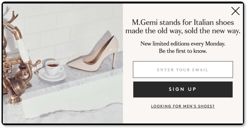
“Made the old way, sold the new way” is a phrase that promises tradition, craftsmanship, and care alongside the ease of modern ecommerce. Alongside the product benefits the headline offers, the signup copy offers prospects the opportunity to “be the first to know” about M.Gemi’s “limited editions.” The web form copy is thus only three short sentences; but they’re packed with the benefits that subscribers (and, eventually, customers) will receive.
Sometimes a simple list of benefits makes the best web form copy, as is the case on Wunderlist’s signup page:
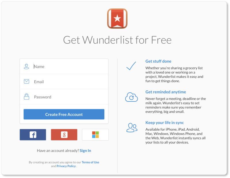
In all the web forms above—even when features are specified—the copy is short, and dedicated entirely to building value around the interaction. In just 2-3 sentences, your form copy should directly state what you’re offering and explain why a visitor should sign up, subscribe, register, or contact you. What’s in it for them? Which of their problems will interacting solve? What pain points will it dissolve?
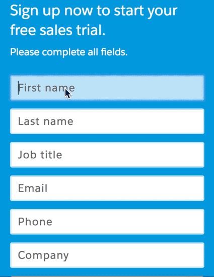
Go single-column… and go big
This best practice is for any web form that contains more than one field. Eye-tracking studies have shown that it’s easier for users to scan down a single column than it is for them to scan from left to right. Single-column forms are also less confusing to users who use the “tab” key to move between fields, because they know exactly which field the cursor will land in next.
So for best UX, keep your web form to a single column. And while we’re talking columns, make your CTA button width the same as your input field width. (If you need more recommendations about your CTA button, by the way, we’ve got a whole section on CTAs for you). Here’s Vimeo’s account creation form to exemplify this best practice:
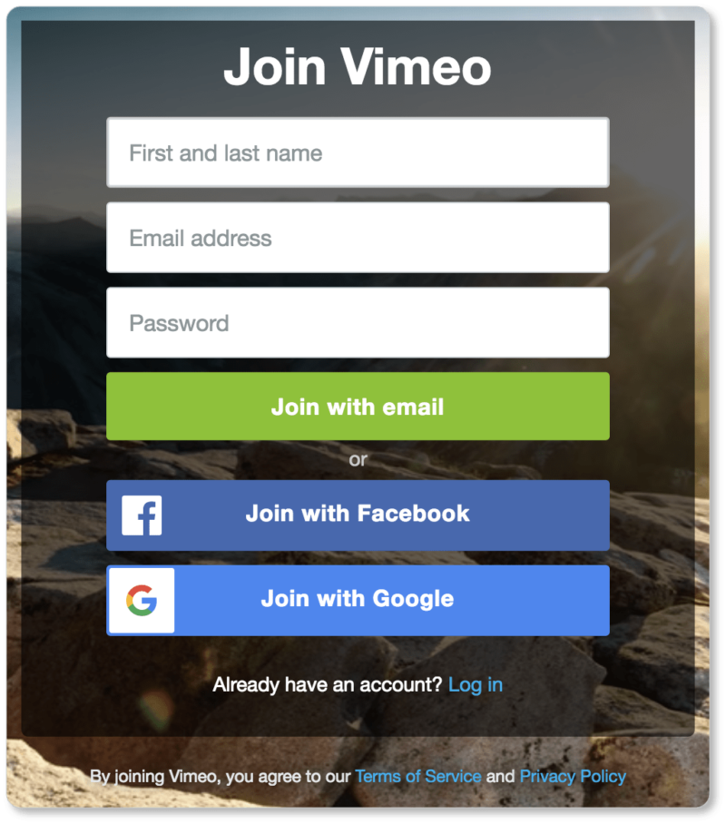
Of course, it’s not just your CTA button that has to be big. Virtually everything in your signup should be large and easy to read. This includes your form fields, the copy that describes what each field should contain, the typography elsewhere on the signup, any information buttons, and your company logo, should you choose to place it there.
The only copy that doesn’t have to be big and bold is the copy near the CTA that alerts registrants to the fact that they’re agreeing to your terms when they click that button. Make that copy legible, for sure… but since it’s copy that isn’t in the service of getting that lead, it won’t do you any good to make it as large as the copy elsewhere on your signup.
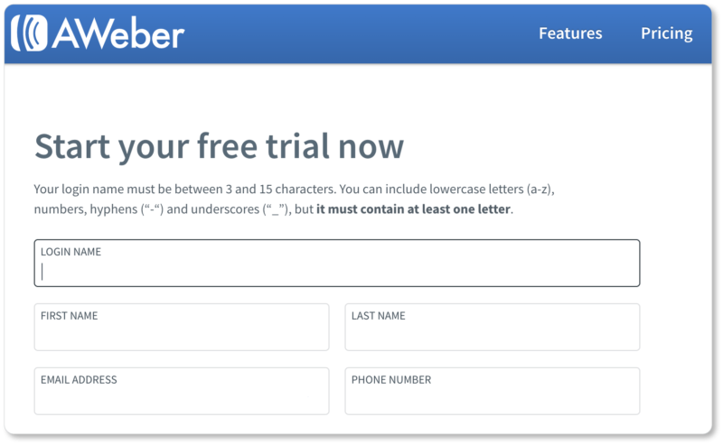
Large form field content lets users catch their mistakes more quickly. It also makes it easy for them to see what field they’re typing into to begin with. (A current field highlight is a great UX addition to web forms for this reason; here’s AWeber’s example):
Consider labels above the field rather than placeholder text
You’ll notice that when we took the screenshot of AWeber’s signup page, we’d clicked into the “Login Name” field to enter our information. This triggered the field highlight, and the outline around the field turned from grey to black. But notice that the field description (“Login Name”) didn’t disappear.
From a UX perspective, keeping your field descriptions visible is an excellent decision. In other words, abandon the placeholder text: that light grey string of characters that’s already in the form fields that tells users what to type there. (Salesforce uses it in their signup form if you need a visual of what we’re describing here. Indeed, so do some of the examples above: Not every example we offer in this content exemplifies every best practice we recommend):
We started filling in that third field, “Job Title,” but then got distracted by something. When we came back, we couldn’t remember what the field wanted; so we had to delete our answer and start typing it in all over again.
Indeed, according to the leading UX research company Nielsen Norman Group, displaying placeholder text in form fields strains users’ short-term memory, makes fields less noticeable, inadvertently encourages mistakes, and can keep users from fixing errors in their input.
Ditching the placeholder text and keeping the label and instructions (how many characters the password must contain, etc) above the field at all times keeps users from having to clear the field to reread the instructions. It also means that users tabbing through the fields to complete your form more quickly won’t obscure the placeholder text before they’ve had time to read it. And it keeps users from skipping right over certain fields, thinking they’ve been automatically filled in because the placeholder text is already there (You’ll notice the Salesforce form looks completed though we’ve only filled out three fields).
Both AWeber and LinkedIn (above) understand how placeholder text can create more friction on a form. We challenge you to experiment with this design, and see how it works for your conversions.
Clearly communicate user errors
Here’s what happened when we mistyped the email confirmation on Canva’s signup form:
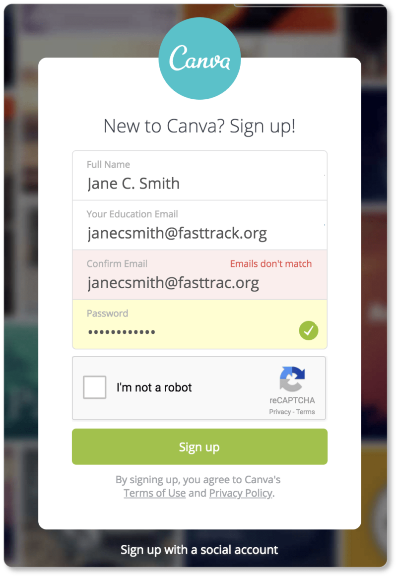
While we’re not stoked on their email confirmation field (your form mantra should be “as few fields as possible,” which means consolidating fields and eliminating “optional” ones), we do like that Canva tells us we’ve made a form field error—and tells us what that error is—before we even hit the “Sign up” button.
So take a tip from Canva. Be clear about which field the error has occurred in and display an explanation about what the error is—along with the correct way to fill out the field. The errant field and explanation should both stand out so the user doesn’t have to reread the whole form and determine for themselves where the mistake was made. Keep the field populated with the data they initially entered, so they can see exactly what the mistake was. This will keep them from making the same mistake a second time.
Ditch the Captcha
Captchas are those challenge-response tests that began showing up on secured websites in the ’90s that required users to retype words that had been distorted, and so in theory could be read by humans but not robots:

After criticisms that the texts were sometimes nearly unintelligible and discriminated against users with vision impairments, Google created the reCAPTCHA. (You saw this on Canva’s signup above: It’s the box a user checks to confirm they’re “not a robot.”) But as of March 2017, Google’s decided to ditch both the Captcha and reCAPTCHA, and is working toward making the system invisible: They’ll now be able to tell if a user is a human or a computer based on browsing behavior, as well as users’ behavior while filling out your form.
So make your human users happy, and don’t make them type that text or check that box anymore. It’s just one more friction point you can remove.
Clarify what’s next
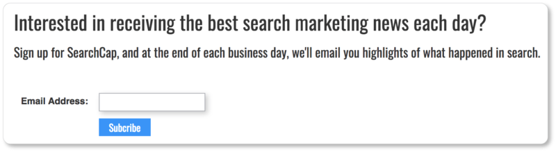
Let users know what will happen after they click that web form CTA. This is particularly true if your form isn’t, say, for a service that will be immediately available after they signup (think Netflix). If the user won’t be receiving your product or service immediately, don’t leave them hanging: Let them know when they’ll receive it, and what to expect from there on out. Here’s the signup for Search Engine Land’s daily newsletter:
If the web form in question is a Contact Us form, users should be told when they should expect a reply, and what method of contact you’ll use to get in touch with them. If it’s a scheduling form, users should see a confirmation page with the details of their appointment, as well as any additional information they might need (directions to your office, reminders of what to bring, etc). This page should also let them know if they’ll be receiving reminders of their appointment from your company—and if so, when.
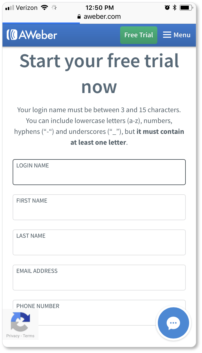
Make it mobile responsive
Mobile responsiveness simply isn’t optional at this point. Mobile searches surpassed desktop searches in 2015, which means it’s likely that a majority of your users will enter your site on their phones. It also means that you’ll lose conversions if your signup forms are inaccessible or inadequate on mobile. The UX on AWeber’s mobile signup is just as good as that on its desktop version. (Indeed, it’s even better, since it’s a single column on mobile):
Make it stand out
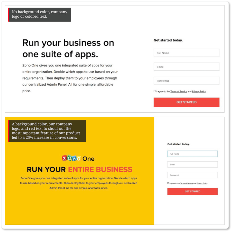
A web form can “stand out” in a lot of different ways. It might be a matter of size; it might be a matter of color; it might be a matter of contrast. It might not have anything to do with your web form itself, but instead with the elements surrounding it.
Recently, we saw a 25% increase in conversions on our account creation form for Zoho One—not for changing the form itself, but for adding color to the benefit-oriented copy beside it: a background color, our company logo, and red text to shout out the most important feature of our product (your entire business can be supported on it). Note that the form itself didn’t change at all… and yet all the additional color on the left side of the screen makes the form stand out by virtue of contrast:
Experimenting and more experimenting is what allowed us to see those improvements. Which brings us to…
Test like crazy
The tips we’ve offered above are only best practices for your web forms… which is to say, they’ve worked for the majority of business websites. But that doesn’t mean that doing something differently (or even contrary to what we’ve suggested above) won’t motivate your particular target market to click on those signup buttons. So get testing!
Use these best practices (along with your own intuition and user experience) as a starting point… and then remember you have potentially hundreds of iterations to experiment with. Sometimes the tiniest tweaks—a single word in your headline or button copy, for instance—can make a huge difference in your conversion rates.
The one type of web form that every company website should offer is an email signup form. In the next section, we offer best practices for this simplest of web forms, which should help amass your email list for even stronger email marketing campaigns.