
In the previous section, we gave you best practices for email signups—those low-commitment interactions that get prospects onto your email list and into your marketing automation platform for your future content marketing efforts. At this stage, consumers are curious but maybe not yet ready to purchase: They’re waiting until they know more about your product or service—or for the right deal to drop into their inbox—before they break out their credit card.
 By the time a prospect has clicked into your account creation form, however, we’re no longer simply talking lead magnets. Your prospect is now on the threshold of a full conversion… and it’s up to your account creation form to facilitate that.
The difference between an email signup form and an account creation form is certainly one of complexity. Account creation forms can be multi-phase forms spread across multiple pages; and they ask for much more information than an email address. It’s also a difference of placement: Your email signup form should be positioned on your homepage, while your account creation form should be one click away from your homepage. (The form will typically be positioned on a dedicated page that describes, in further detail, the product or service you’re offering.)
Finally, it’s a difference of platform. While the data from your email signup forms will get dropped into your marketing automation platform, the data from your account creation forms will get dropped into your subscription platform, which may be integrated with your accounting or invoicing software.
So how do you ensure that this form is as simple and expeditious as possible for your users, so as to capture as many prospects as possible? It may be worth taking a look at our introduction to web forms and our section on email signup forms for some of the more general best practices applicable to your account creation form. We won’t go into them in detail here, but those sections emphasize the significance of:
- featuring benefit-driven copy near your form
- including an image that represents your offer
- vertically aligning your form fields
- only asking for as much information as is necessary
- placing form field labels above the field rather than using placeholder text
- clearly communicating user errors
- making the form mobile responsive
- clarifying what comes next
That said, there are additional best practices that will make every bit of difference to your conversions if you employ them on these more complex account creation forms.
Consolidate fields, and eliminate anything “optional”
Here’s a relatively simple account creation form for the personal recommendation service Foursquare. Given the service it offers, the company needs to know certain information about its users to make the best suggestions possible—based not just on location, but also on demographic data:
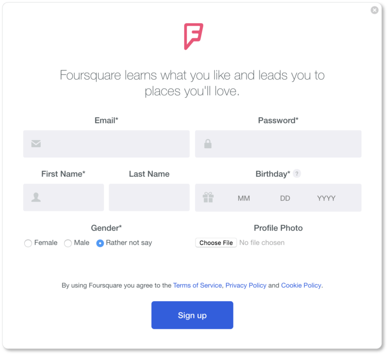
Yet the form could be made even simpler than it is now. Note that the “Last Name” field is the only field without an asterisk beside it, suggesting it’s optional information. Our question to Foursquare would be: If it’s not required, why ask for it?
Remember, your web form goal is to offer your users as little friction as possible; and eye-tracking studies have suggested that users don’t always pay attention to markers that delineate optional from required fields. Many users arrive at a form expecting they have to fill out every visible field. So offering your users a fifteen-field form, only four of which are mandatory, isn’t going to do you any good if your users are convinced they have to fill out all fifteen.
That’s because every additional form field means an increased chance of mid-form abandonment and reduced conversion rates. In other words, the fewer fields your registrant sees they have to fill in, the more likely they are to complete that form.
Unbounce has some great infographics about how numbers (and types) of form field affect conversion rates. Or you can take a tip from Expedia, who saw a $12 million-a-year increase in profit when they removed the “Company” field from their purchase form. Take only what you need. More than that will only confuse, frustrate, or overwhelm your visitors.
Here are the fields we’d recommend consolidating or eliminating altogether:
- Last name. If knowing your prospect’s first name is enough for the moment, leave it at that. If not, make the first-and-last-name one field on your signup form. Separate fields for first and last names only make the form look longer, which means increased friction for your user.
- Email and password confirmation. Allow registrants to see the password they’re typing in by offering a “show/hide password” feature, rather than making them type in a password twice with password masking technology (those bullet points or asterisks that show up when users are typing). The same goes for email: If your form field is big enough, users should be able to see for themselves if they’re typing in their email correctly.
- Username. Is a username necessary in the initial signup? If an email address and password are sufficient for the first step, stop there. When your new subscriber logs in for the first time, you can let them determine their username then.
- User agreement. Don’t make subscribers do the additional work of ticking a checkbox saying that they’ve read and agree to your terms. Instead, include a message above or below your CTA, as LinkedIn does:

If you need more data, go multi-page
It may be the case that your product or service demands more information than an email address, password, and date of birth. You may be asking for sensitive user information (banking information, credit card information, billing addresses, or social security numbers), meaning your users will need to create strong and complex passwords.
Or maybe you’ve decided that it’s important for your sales team to have diverse demographic data on each of your new subscribers—important enough that you’re willing to lose some conversions for the sake of strong data, since that data will help you move your prospects more efficiently through your sales funnel.
Regardless of your reasons, if it turns out that you need more information in the initial stages of signup, ask for it in organized steps. (This is called multi-form signup, or stepped questions.)
According to Formstack, “Multi-page forms that use features like page breaks and progress bars convert at more than triple the rate of single-page forms.” (The folks at Venture Harbour agree.) If you’ve ever been through a longer online registration process before, this probably isn’t surprising data: Multi-page forms make the signup infinitely less overwhelming for the user by dividing the process into a series of shorter steps. What’s more, more pages means each page can contain bigger fonts and fields, and more descriptive labeling than you’d be able to fit on a shorter form.
Pro tip: if you decide to use a multi-page signup for your lead generation, display a progress bar that shows registrants how many pages they’ve completed and how many remain.
Assuming you group your fields logically, multi-form signups provide great UX. What’s more, asking for the user’s email address before they hit “submit” to move on to the next page of the signup means that even if they abandon the signup after that initial question, you’ve still added another email to your list.
Signing up for Netflix’s service directly from their homepage requires 3 steps and 2 forms (of 2 and 6 fields, respectively) over 6 pages. 8 form fields, 8 clicks, and we were ready to watch:


Notice how clean Netflix’s flow is. At step two, they remind registrants that there are only “two more steps and you’re done!” The copy is minimal; the “Set up your payment” page contains a trust badge (that lock at the top) as well as two important click triggers (“No commitments. Cancel online at anytime”); the payment page has dispensed with billing address; and clicking on their “Start Membership” CTA simultaneously means agreeing to their Terms of Use and Privacy Statement… without having to click an extra box.
Netflix exemplifies a multi-form signup with excellent UX here.
Enable social sign-in / OAuth connect
Here’s the account creation pop-up on Duolingo’s site:
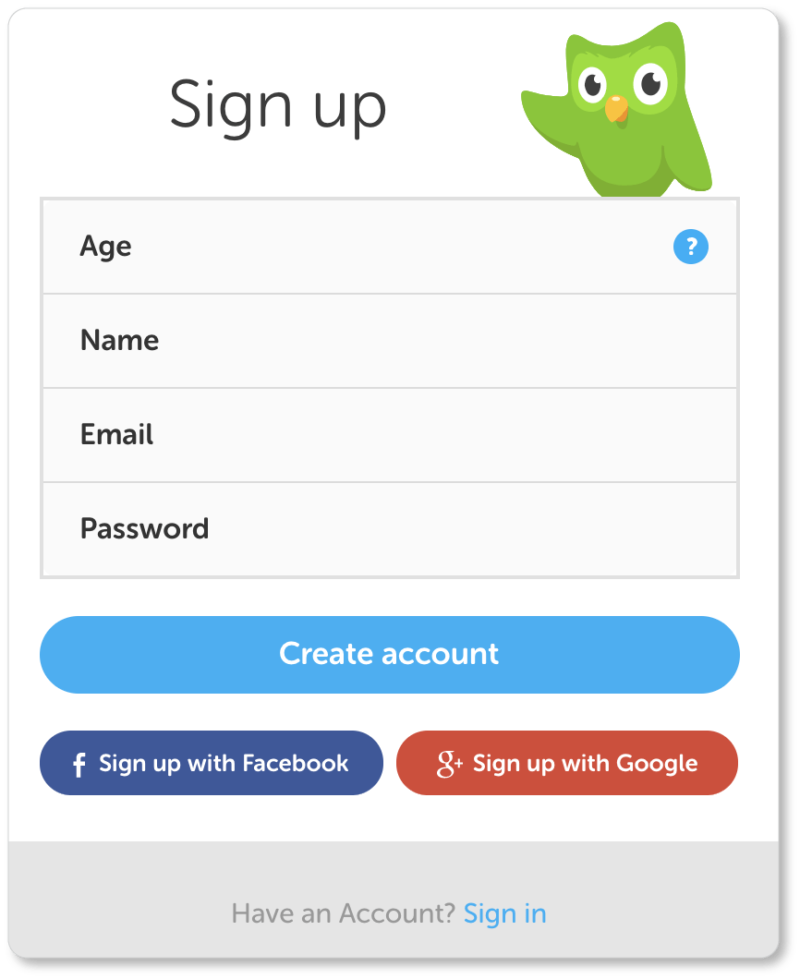
The language-learning app offers users the option to bypass signup with a single click by importing their personal information from either Facebook or Google. Social autofill (also called OAuth connect or social authentication) minimizes friction. In this day and age, there’s a good chance that the majority of your target market is on social media. Many registrants will choose this option for its ease—and because it doesn’t mean yet another password they have to remember.
Indeed, 86% of users report being annoyed by having to create new accounts on various sites; 77% of them believe social authentication is a good solution to account creation.
And social sign-in isn’t just good for your users; it’s also great for your conversions. Formstack increased its conversion rates by 189% when it included social autofill on its signup. What’s more, it ensures your business gathers more valid data from your registrants. (Did we mention that 88% of users have admitted to providing either incomplete or entirely incorrect information on signup forms? With OAuth, those numbers necessarily drop.)
Of course, don’t force your registrants to sign up solely through social. Some users will be wary of connecting their personal accounts to other platforms or networks; and you’ll want to cater to those prospects who prefer keeping things separate. But given the prevalence of social media, it will do you well to include social autofill in your signup.
Include links to your Privacy Policy and Terms of Use
We mentioned this above, so we’ll keep it short: No one is going to sign up for your product or service if they don’t trust your signup process. This means promising registrants that you aren’t going to spam them once you’ve got their email addresses. This also means giving your registrants easy access to both your Terms of Service and your Privacy Policy.
Registrants want to know that their information is safe with you and that your process is transparent. Of course this is especially important if your signup requires them to offer personal or sensitive information. So give them that assurance.
If you’re unclear about how to write a Privacy Policy or Terms of Service document, you can find tips from Opentracker, Social Media Examiner, and Legal Vision… but take a look at the sites of other businesses in your industry to see what their terms and policies include.
Use information buttons to explain what goes in the field
Information buttons usually look like that italicized “i” or a question mark, enclosed in a circle:

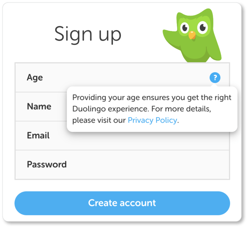
You may have noticed one by the “Age” form field on Duolingo’s signup; here’s what happens when users click on it:
These information buttons serve at least three purposes:
- They help users understand exactly what you’re asking for
- They explain why you’re asking for certain information
- They allow you to offer helpful information (tips for more secure passwords, for instance)
By including helpful and benefit-driven microcopy on the other side of these buttons, you’ll dissolve distrust and confusion. Why do you need your prospect’s phone number? A straightforward statement that it’s for resolving any account issues goes a long way to engendering trust.
That said, you may discover through A/B testing that your conversion rates improve when you display that information below the form fields, rather than hiding it behind an information button. In that case, go with what your users want… always.
Offer a “password strength” visual (and reasonable password requirements)
If your signup process requires new users to come up with a password, make the requirements secure… but don’t make them ludicrous. Here are Intuit’s requirements, which make for a strong-but-not-outlandish password:
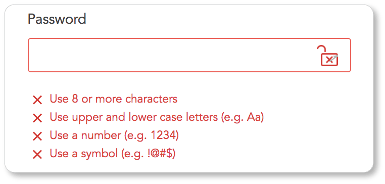
Users most likely have a few password variations that they draw from with each new platform they sign up for. If you stay reasonable, they won’t be frustrated by having to drop their go-to password to create something new for your site.
What’s more, some users will be more concerned than others about security (and of course this will depend on what information they’re being asked to give you). Others will be fine inputting their usual password—even if it’s weak—while others will want to come up with more complex passwords to ensure their information is safe. That’s why a “password strength” visual is such good UX.
Don’t be picky about format (or make your preferred format clear)
For example, if one of your form fields requires the user to enter their phone number, you have two options: Let them enter it the way they prefer—with or without dashes—or design the field so that they don’t have a choice but to enter their phone number the way you want them to. The same goes with dates. (Adding a calendar to your form is one solution to specificity.) The point is this: Don’t make it unclear how you want users to format their answers, and then hit them with a message that they’ve entered their information incorrectly.
Use drop-down lists and/or auto-complete fields
Both of these elements are great time-savers for your users. Which you choose will depend on how many options there are for a given field.
UX research at the Baymard Institute has shown that a drop-down list works well when there are between 7 and 15 options for a given field. For more than 15 options, consider an auto-complete feature. (For 6 or fewer options, consider radio buttons.) With auto-complete, when users begin typing their answers, the options that match the letters they’ve entered will display.
Use on-screen validation
Let users know that they’re filling out your signup form correctly as they move between fields. Here’s how Intuit does it. (The exclamation point and checkmark, respectively, were displayed as soon as we moved on to the next field):
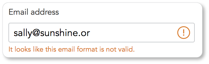
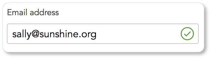
Even better, use on-screen validation to let them know how they’re doing as they’re typing.
Test your own patience
As with everything else on your website, you’ll be A/B testing, heatmapping, and attending carefully to analytics to see what you can improve with each new iteration of your account creation form.
Meanwhile, keep going back into the form yourself and asking about UX from that side of the interface. Are there any elements of the current form that test your patience? (Are there any elements that would test your mother’s patience?) If you were looking at the blank form as a wary prospect, what other information would you need to incite your desire? A list of benefits nearby? Some social proof to the side of the account creation form? A video demonstration of the product or service?
And perhaps most importantly: How could the whole process be made even more effortless than it already is?
In the next section, we offer best practices for an essential web form for amassing leads for your business: the Contact Us form. We also offer recommendations for the contact page itself, which your form will be embedded in. After all, your web forms are only as good as their context on the page.