
Web forms are your business website’s information-gathering machines. Without them, you’d never be able to capture visitor data—no email addresses, no personal or financial information, no user feedback… in short, no leads, no sales, no interactions.
So if you hope to interact with visitors in the virtual world, you’ve got to include these elements on your website. The type of forms you offer, of course, will depend on your business goals. If you run an online shop, you’ll need a checkout form; if you book appointments, you’ll need a scheduling form… and really, no matter what kind of business you run, your website should offer a Contact Us form and an email signup form.
We’ve given you best practices for each of these form types elsewhere; but sometimes it’s as useful to learn by example as it is to read about tips, tricks, and recommendations. Below are four of the best web forms we’ve seen this year:
1. AppSumo: Best email signup form
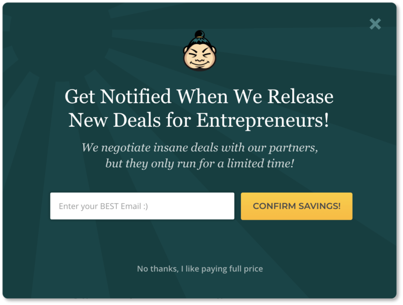
AppSumo offers its users daily deals for digital tools and online services. When a user clicks into their website, their email signup form displays as a pop-up:
Best elements of AppSumo’s form:
Their signup is unmissable. One thing about pop-ups is that users have to actively engage with them—whether to fill them in or to close out of them—before they can move on to your site. So while it’s worth weighing the pros and cons of this kind of presentation, it’s also worth keeping in mind that using one means every site visitor will notice it.
Their copy is short but powerful. Two sentences, two exclamation points, and lots of punch in-between. “New deals,” “insane deals,” and “limited time” are all phrases that evoke excitement, urgency, and—most importantly—prospect benefits. What’s more, the copy specifies AppSumo’s ideal customer: entrepeneurs who are looking to up their game. Visitors immediately know whether this call to action is for them.
They limit the form to a single field. AppSumo could ask for the prospect’s name and the company they work for; both of these data points would certainly be useful for future content marketing efforts. But they recognize that every additional form field increases friction and reduces the possibility of conversion.
They offer two pop-up exits. For those visitors who are irked by the pop-up—or for whom the call to action simply doesn’t apply—AppSumo gives two exit strategies: that “X” in the top right corner, and that great bit of copy at the bottom that reads “No thanks, I like paying full price.” This is our favorite sentence on the form: When we clicked on it (and we did), we felt a little irrational doing so… and that’s precisely the point.
If it were up to us, AppSumo would offer an immediate benefit (their first “insane deal” the moment the prospect signs up, for instance). But aside from that, this is a strong signup form, and we bet it does AppSumo well.
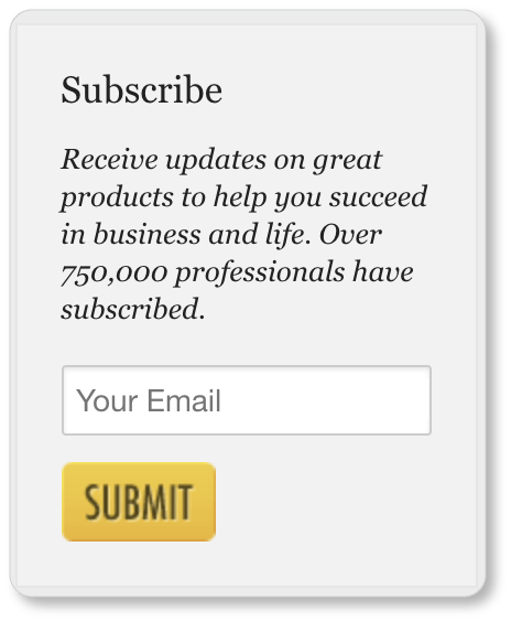
And for those visitors who don’t resonate with all that exclamatory copy (or for those who may have clicked out of the popup too quickly), the company displays a secondary, persistent email signup form on its homepage. Note the social proof strategy AppSumo uses on this one by mentioning the number of “professionals” who have subscribed:
2. MailChimp: Best account creation form
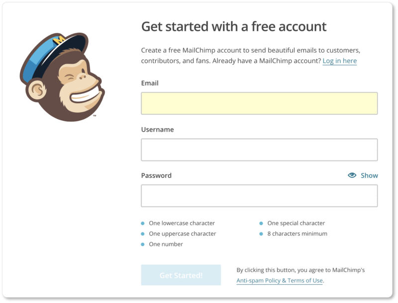
The initial form of MailChimp’s account creation process looks like this:
Best elements of MailChimp’s form:
They display a current field highlight. Notice how the email field above is yellow? That’s the field our cursor was in when we took this screenshot. This is an excellent UX feature that makes it easy for users to see what field they’re typing into.
They use form field labels rather than placeholder text. “Email,” “Username” and “Password” are all displayed permanently above each field, as opposed to inside the field (and disappearing as a user begins typing). This keeps users from forgetting what the field was asking for, and from having to delete their own input to be reminded. Less friction = faster form completion = more conversions.
They offer form field recommendations. Here’s what displayed when we clicked through the Username field:
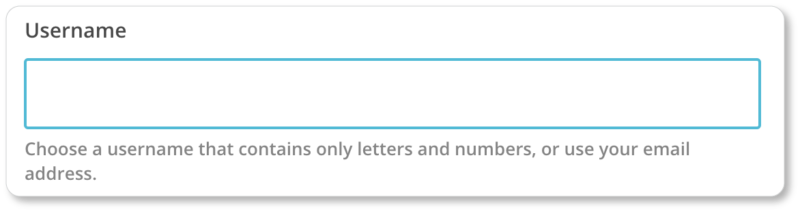
MailChimp recognizes that “Username” may not be enough instruction for some users. So it offers an example of one they might use (their email address), as well as directives for additional usernames.
They communicate user errors… comically. Here’s what happened when we entered an email address that probably belongs to someone at MailChimp, but certainly isn’t our own:
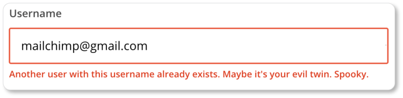
From a UX perspective, errors can be very frustrating. MailChimp’s humor possibly lightens the mood here… but the company also clarifies exactly what the problem is, rather than simply highlighting the field and leaving the user to determine what they’ve done wrong.
Their password form field is all kinds of great UX. In the first place, MailChimp doesn’t make users enter a password twice. Instead, they display a “Show” option, which lets users see the password as they type it. This means one less field to fill out:
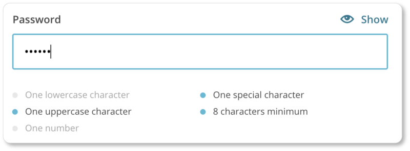
In the second place, as each password criterion is met, it fades into a light grey, so that only the criteria that have yet to be met stand out. Finally, an on-screen validation displays as soon as a password that meets the security criteria is typed in. From a user perspective, there’s no ambiguity here:
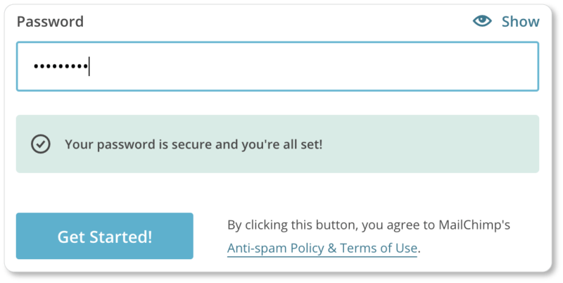
They display links to their Anti-spam Policy and Terms of Use. Even better? They don’t make prospects check a separate box saying they agree to both of these things. (That would only be a superfluous click, and more friction.)
After MailChimp’s prospects click the “Get Started” button, they’re taken through a 5-page process of very short forms (an average of just two fields each). There’s a progress indicator at the top of each page that lets users know where they are at all points in the process—which means they’re more likely to move through the forms with a sense of control, and with patience. All-around great UX on this account creation form, if you ask us.
3. Built by Buffalo: Best Contact Us form
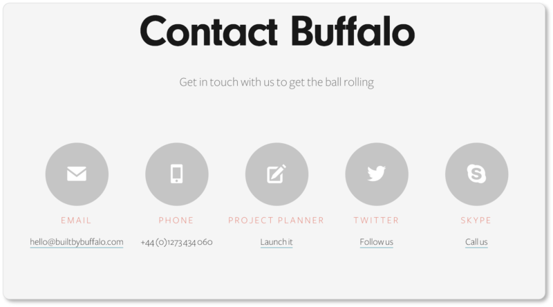
The web design company’s Contact Us form is directly accessible from its dedicated contact page, which looks like this:
The “Project Planner” button in the center leads to the company’s Contact form:
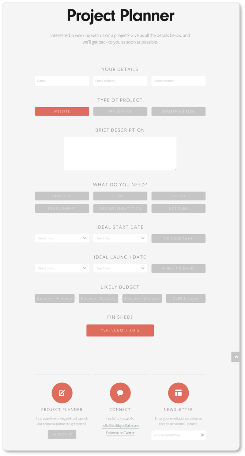
Best elements of Built by Buffalo’s form:
They specify the nature of the interaction. It’s helpful to explain why users would contact you by giving them examples of the kinds of questions you can answer for them (questions it may not otherwise occur to them to ask). While Built by Buffalo doesn’t exactly do this, in calling their contact form a “Project Planner” they’re clear about the kinds of inquiries they’ll accept through this method.
They include contact information and link to social media. The contact form doesn’t exist in a vacuum. Users arrive on the page with an intention; and if the form doesn’t appear to fulfill that intention, they’ll want other outlets. Here, users are given a phone number, an email address, and a Twitter handle—not to mention the option to subscribe to the company newsletter to learn more about them (a wise lead generation strategy).
They ask users to type as little as possible. One of our favorite things about this web form is that users primarily click on buttons and into drop-down menus, rather than type their answers. This means less labor for the user… and more remarkable UX.
They humanize their form. This is subtle, but important. We noticed it first on Built by Buffalo’s CTA (“Yep, Submit This”) and then saw it on their other buttons (“No Huge Rush”; “When It’s Done!”). What could be a formal bore suddenly takes a conversational tone, and the user feels as though they’re chatting their way through a short Q&A session with a designer.
They guide users through the form with descriptions and supplemental information. Here’s what a user sees when they hover over the buttons for the services Built by Buffalo offers:
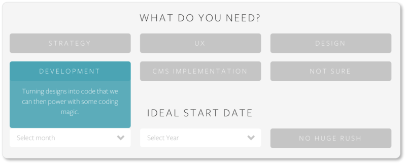
The button responds by displaying some copy that describes exactly what that particular service entails. This allows Built by Buffalo to keep its form looking clean; it also lets them reflect their company personality a bit more (“some coding magic”). And the fact that the company turned a web form into such a work of art speaks volumes for the kind of design they might offer their clients.
Now it’s your turn to explore a little. It may be worth it to you to click into these sites (on both your computer and your phone) to experience for yourself what the UX feels like. Maybe by the time you read this, the forms will have undergone some changes; and you can reflect upon why you think the company made those changes.
Either way, when it’s time to turn back to your own website and imagine what your web forms could be doing better, we’ve got you covered with our best practices and web form checklists.