
Think about the last time you walked past the window of a brick-and-mortar store, stopped in your tracks on the sidewalk, and then walked through that business’s front door—despite the fact that you were in the midst of running another errand entirely.
That’s the kind of response you want your site visitors to have when they land on your online shop homepage. So really, think about it: Was it the way a particular product was positioned? Was it the way two products were juxtaposed, suggesting that the store could offer you something in the way of a curated shopping experience? Was it the text on that sale sign in the window (urgent language, exclamation points)?
Your online shop homepage is an analogue to that store window… except your prospects may decide whether or not they’re interested in your online offering in even less time (50 milliseconds or less) than it would take them to walk past a storefront. What’s more, if they decide to stay past that initial glance, you’ve got to offer them awesome homepage UX to move them into the next stage of their visit. Of course, not all visitors will enter your ecommerce site through your homepage. But for those who do? You’ll need to effectively introduce your business and your online offering by simply and concisely explaining what you sell and how you’re different from the competition. And you’ll need to give every user persona the obvious next step for their journey.
So it’s time to play the make-your-best-virtual-storefront game. Here’s how:
Prioritize imagery… but sparingly
We’ll just go ahead and say it: The most important components of your ecommerce homepage are the high-quality images you use. (Indeed, that’s why we’ve written an entire ebook on product photography for you.)
Prospects won’t have the benefit of picking up, handling, and closely examining the products you offer. This can be a big disadvantage for digital stores because, as studies have shown, simply touching an object increases the sense of “perceived ownership,” which is a crucial step toward purchase.
Since they can’t physically interact with your products as they would in a store, the best alternatives you can offer prospects are high-quality product images that communicate the value of what you have to offer.
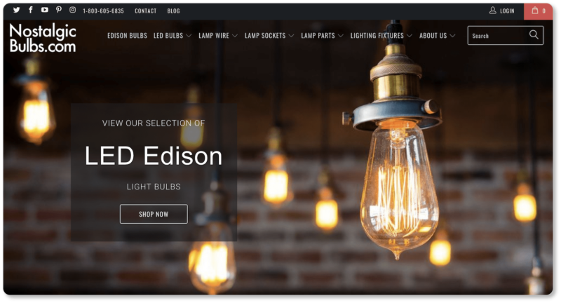
Nostalgic Bulbs offers stunning product photography above the fold of its homepage:
We understand the impulse to show every product you sell on your homepage. You’re proud of your offerings, after all, and you want your visitors to see the full range of products available to them.
But remember: Your homepage is your virtual storefront. It’s where new visitors who are unfamiliar with your product offering will be “window shopping”; and you only have so much space to show them your best product and draw them in. Don’t overwhelm your visitors with images; it’ll only lead to confusion and low conversion rates. Instead, just give your newest or best-selling products the place of honor in that portion above the fold. If you design your “storefront” well, visitors will walk through that front door to see what other products you have to offer.
Alongside our ebook on product photography, you might want to take a look at our content on homepage imagery. After all, your product page images are a different animal than your homepage images will be.
Categorize intuitively
Keep the area below the fold as minimal as the area above it. You can do this by categorizing your products intuitively, with a single title and no more than a few images for each category. Shoppers will understand that those images represent a broader group; they’ll click in if that’s the kind of item they’re looking for. By “intuitive,” we mean you’ve got to know how your prospects would categorize the products you sell. You also need to know what they would call those categories. (The keyword research you did for your product pages should help with this.)
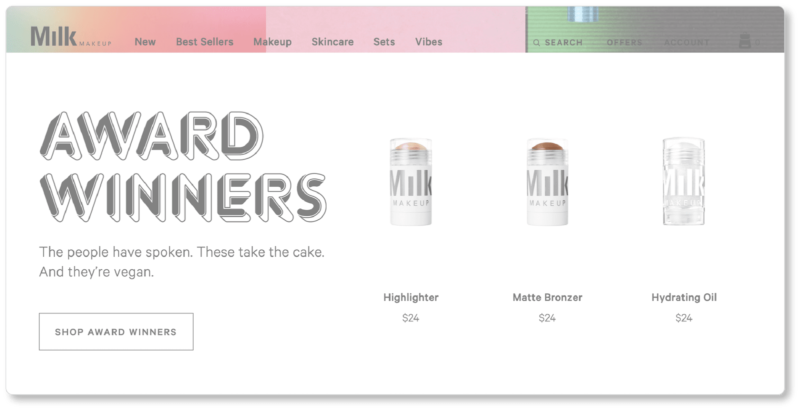
Milk Makeup displays its categories beautifully. When a visitor first arrives on Milk’s site, they’re presented with the company’s newest, most “exclusive” product above the fold, and then its “Best Sellers” and “Award Winners.” (Note that Milk’s main navigation is static and perpetually available to visitors as they scroll): 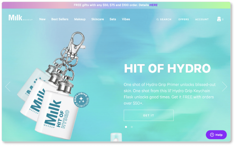
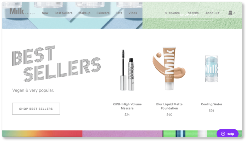
But for site visitors who know more specifically what they’re looking for, and don’t need to browse categories, Milk offers a variety of other categories—including “Makeup,” “Skincare,” and “Sets.” Here’s how simply their “Makeup” category breaks down:
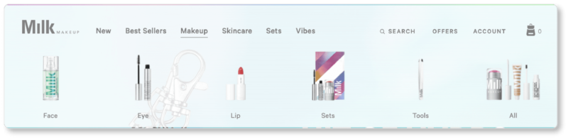
The category images evoke the breadth of Milk’s product offering, but they don’t show everything in that category. That’s what prospects click into “All” for.
Klean Kanteen displays their categories simply, in a horizontal menu that the visitor can take in at a glance, without having to scroll. Notice the company chose only one product to represent the entire category, rather than Milk’s three:
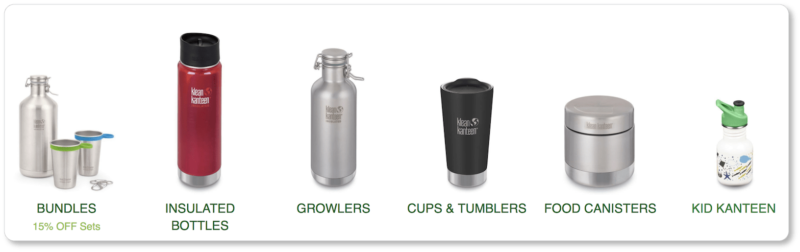
Klean Kanteen offers clear category distinctions with lots of white space, sharp images, easy navigation, and a sense of the range of products on the other side of the links. Combined, these things are a recipe for excellent homepage UX.
You’ll decide—depending on the range of products you offer, and then through A/B testing—how to divide your categories and how to position them on your site. Milk and Klean Kanteen are just two examples to show you the range of possibility when it comes to category presentation.
Optimize your navigation bar
Your categories will help move prospects through that sales funnel. So will a prominent, simplified, intuitive navigation bar. Just remember: Your navigation bar isn’t specific to your homepage. It should allow visitors who land on any page of your site to navigate to where they want to go. So while we’re considering your homepage here, your mantra should be: “Provide a high-level overview for visitors on all pages.”
Make your parent categories simple, yet sufficient. The case study of the watch company Saat & Saat is worth considering: It increased conversions by 62.5% by changing the options on its menu from “Watches” to “Men’s Watches,” “Women’s Watches,” and “Children’s Watches.” You can imagine why this is the case: When it comes to products like watches, consumers typically search by gender when they’re shopping online. Of course, what they don’t search for is “products”; so don’t make this one of your parent categories! Call your products what they are.
The best way to keep your navigation simple is to have a set of broad parent categories, each with their own subcategories. (Subcategories don’t have to be confined to a single parent category.) Your parent categories should be bold and stand out above the fold of your homepage. Don’t offer more than 7 of them; more options will only debilitate visitors, keeping them from clicking on any of them. And while we’re at it, play around with item order: Visitors will subconsciously assume the items that appear first and last indicate importance; so if there’s a category page you want users to click into, try those positions.
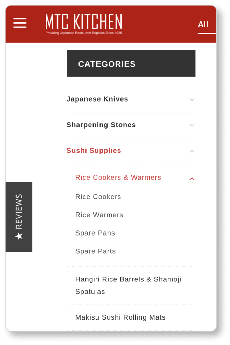
For best UX, make the navigation menu persistent (this is called “sticky navigation”), and have subcategories appear when users hover over each parent category. MTC Kitchen offers two levels of subcategories—all of which are sorted in a simple, clean system:
Of course, your main navigation doesn’t have to be positioned horizontally at the top of the page—though 88% of websites choose this strategy, so it’s not a bad idea to stick with convention. You might consider a vertical navigation menu, with the items running down the left side of the page (if you’re using Zoho Commerce, look for “Header Style” in the visual editor); and it’s a best practice to offer a hamburger menu for mobile users. And of course, you’ve got a second “navigation menu” to consider in your footer, where you’ll keep your shipping policy, Returns & Refunds policy, privacy policy, Terms & Conditions, contact information, and social buttons.
Pro tip: If you offer items in your navigation menu that aren’t product categories (“Contact Us” or “About Us,” for example), give them a different visual treatment so that visitors know they’re there for a different purpose.
Include a prominent (and persistent) search box
Regardless of how simple and intuitive the navigation menu is, a search function is a must for any online store that offers a range of products. After all, your navigation serves the “browsers” best; but you should offer something for those shoppers who arrive on your site knowing exactly what they’re looking for. According to Econsultancy, up to 30% of your visitors will use your site’s search box. These are visitors with an intent to purchase: They’re not simply browsing; they’re on a mission for something specific… and they have no desire to navigate between categories to find it. You want the least possible amount of friction here: Let returning customers get to the product they know they want as quickly as possible.
Like your navigation bar, your search bar should be prominent (standing out above the fold) and persistent (following your visitor as they scroll).
Pro tip: Never serve up a “No Results” page! Instead, give visitors other options (suggested categories, for example), or a way to get in touch with you right away (“Can’t find what you’re looking for? Contact us at xxx-xxx-xxxx”).
Include a promotional area for sales, deals, and specials
Below are the current above-the-fold elements for UNIQLO and Cabela’s:
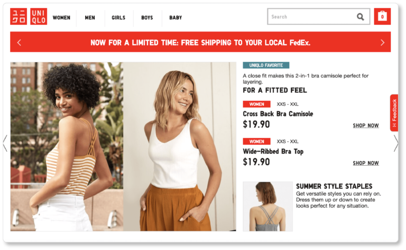
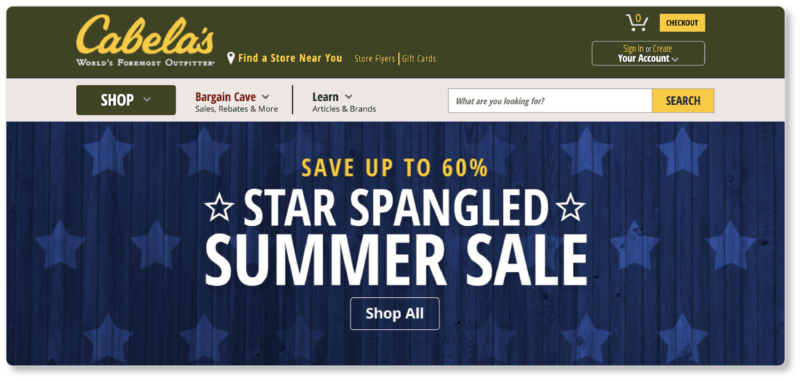
You’ll note that at the top of UNIQLO’s homepage is a banner announcing free FedEx shipping. And it’s hard to miss that Coleman is having a 4th of July sale—60% off is no small discount. (Note, too, how there’s a sense of urgency in the messaging for both businesses: Uniqlo’s free shipping is “for a limited time”; Cabela’s urgency is more subtle; but the fact that it’s a holiday sale makes it necessarily temporary.)
The point is that your ecommerce homepage—specifically that real estate above the fold—should be where you promote your specials, offers, and sales. According to Statista, 64% of online shoppers will wait for items to go on sale before making a purchase. So give those shoppers what they’re waiting for—and say it loudly.
You’ll also notice that UNIQLO has a standout “Sale” item on their navigation menu. We all get excited by different kinds of promotions; and showing all the ways your prospects can save money on a single page (free shipping, discounted items, promotions, and so on) will ensure that you hit every sweet spot.
It’ll also make the bargain-hunters (those who head first toward that discount rack at the retail store) feel seen and heard, and thus particularly attached to you.
Have “Best-Sellers” and “New Arrivals” sections
Best-sellers are a form of social proof: Many of your prospects won’t believe in the quality of your products until they see that others have been willing to invest in them. A “Popular Products” section is a way of putting your best foot forward. It may also cause your prospects to linger on your site a little longer.
While your “Best-Sellers” section might cater more toward prospects, a “New Arrivals” section gratifies your regular customers—the ones who are waiting on edge for your next offering. While those new products should also be placed in their respective product categories, highlighting them this way keeps your repeat customers engaged… and keeps them checking back regularly to see what’s new in your store.
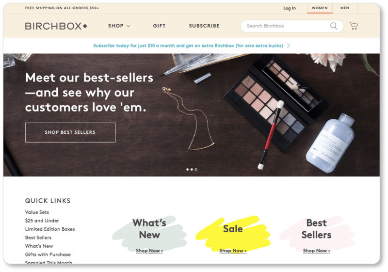
Birchbox has separate links for its new arrivals (“What’s New”) and best-sellers, as well as one for its sale items. (You can tell by the company’s color choice that the “Sale” link is the one Birchbox most wants its visitors to click on). They also currently have a separate slider image on their homepage for best-sellers:
Regardless of where on the page you decide to place your best-sellers, new arrivals, sales, and deals, do make sure they’re prominent on your homepage. Denying your prospects and customers this information would be the equivalent of posting a “Sale!” sign at the back of your store, where only the customers who entered would see it.
Shout out your value proposition
Your value proposition is your competitive advantage. When it comes to an online shop homepage, your value proposition may be about the materials your products are made of, how (and by whom) they’re made, what unique benefits they offer, or the ethical vision that prompted you to produce them.
Your value proposition is so much more than the “common values” many businesses offer in the way of fast shipping and money-back guarantees. (Though you should offer these! Especially because they’re standard fare by now.)
Here’s the value proposition from M-24, a company that recycles truck tarpaulins and car seatbelts into durable bags:
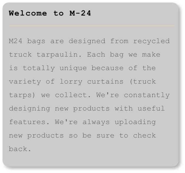
What makes M-24’s bags different from other bags is their singularity. In other words, M-24 appeals to their prospects’ desire for individuality in their value proposition.
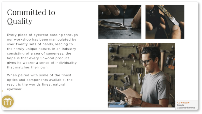
And here’s what’s below the fold of Shwood’s homepage:
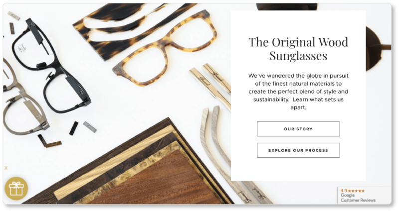
“The original wood sunglasses” is Shwood’s crisp, one-line value proposition; but they follow it up with detail here. Phrases like “wandered the globe,” “finest natural materials,” and “the perfect blend of style and sustainability” help Shwood highlight what sets them apart from other sunglass manufacturers: Not only is Shwood the original, they’re also the most conscientious when it comes to their process. We couldn’t help but click on “Our Story,” where their value proposition is extended—and further strengthened:
Your value proposition should be placed prominently on your homepage. Don’t make your prospects do the work to discover what makes you better than the competition! (Here’s a tip: They probably won’t.) Rather, let them know as soon as they click into your homepage what value you offer, and why they shouldn’t bounce and head to your competitor. That’s good UX.
Be clear about your (ideally free) shipping and returns policies
Your value proposition should be placed above the fold. And if your shipping and returns are free, that should be shouted out above the fold, too.
Either way, tell your visitors the truth about your shipping costs and return policy up front. Don’t make them wait until checkout to discover any hard truths. Many customers will want to know how quickly they can have items delivered and whether their packages can be tracked; your (honest) answer will play a considerable role in their purchase decision.
If it’s possible for you to offer free shipping, do so. (You’ll probably need to factor shipping costs into your product price or set a purchase amount threshold for your customer, but they’ll think these trade-offs are well worth it. Or take a look at these other ways to offset free shipping.)
Pro tip: Transparency is a winning strategy, so we also suggest that you display your payment methods upfront. Consider having this information on your homepage, rather than making customers wait until checkout to learn if you take MasterCard or PayPal.
According to industry research from 2016, unexpected shipping costs are the primary cause of cart abandonment. (Other studies reinforce this, though with varying numbers.) None of us likes to get hit with unexpected shipping fees at the end of a checkout: We feel like we’ve been deceived. Free shipping, on the other hand, is like having your cake and eating it too. It’s bound to decrease your cart abandonments and increase your conversions.
If you have a return policy, spell out how much time the customer has to make the return (30 days, 90 days, etc.), as well as what the return cost is. Our tip? Again, free is best. When your customers see that returns are free, it reduces their risk of purchase, and will increase your conversions.
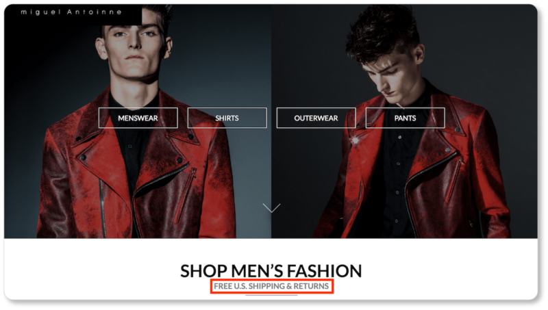
Miguel Antoinne tells its visitors right away that U.S. shipping and returns are free:
If you do offer free shipping and returns, don’t just say it loudly on your site’s homepage. Remind prospects again on each of your individual product pages. (Likewise if you offer same-day delivery.) Free shipping and same-day delivery are both unique selling points (USPs) worth shouting about.
With these best practices, you’ll be off to a brilliant start when it comes to homepage UX on your ecommerce site.
In the next section, we discuss the most important design elements of your product pages, including images and videos, CTAs, and social sharing buttons. Learn how to display each of your products in all its glory (that’s good UX, too!), and how to increase conversions through product page design.