
In one sense, the shopping cart for your online store plays the same role that the shopping cart in a brick-and-mortar store plays: It’s where customers hold the items they’re considering for purchase, so they can view them all together and deliberate their purchases before checkout.
But in another sense, your online cart has some remarkable capacities that a brick-and-mortar shopping cart doesn’t: It can calculate total cost, let users save items for later, and offer social proof of the product in question. That and more in some cases.
So why would you not let it do everything it’s capable of doing—especially when each of these things means better user experience, and thus more sales for your company?
According to the Baymard Institute, nearly 70% of online shoppers abandoned their shopping carts in 2017. Indeed, according to Baymard, average cart abandonment rates have exceeded 68% every year since 2011—a surprising consistency given the remarkable advancements made in ecommerce sophistication in that time.
Imagine if those numbers were the same in the brick-and-mortar world (Google has already imagined something like it): 7 out of every 10 people would simply leave their shopping carts in the checkout line at the grocery store and head home—or to a store nearby that included tax in its product prices, or accepted more forms of payment, or didn’t ask for personal information without displaying trust seals.
What this should suggest to you is that the work isn’t over the moment a visitor moves your product to their shopping cart. Indeed, you’ve got a whole new set of hurdles to clear now.
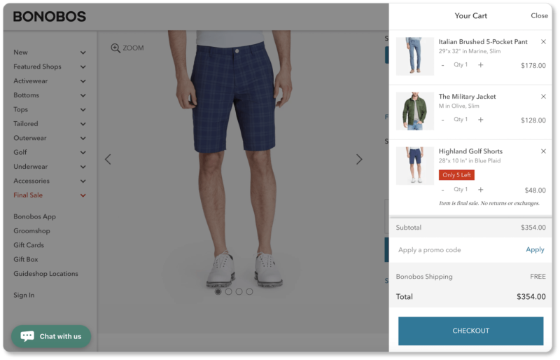
The best practices below can be implemented on your online shop regardless of whether you offer a dedicated cart page, or—like Bonobos—a simple pop-up that appears when users click to view the cart:
So let’s dive in to those crucial last elements users will see… hopefully before hitting your “Checkout” button.
Make sure your cart gives the full “picture”
Shopping cart accuracy essentially requires you to ask two questions: 1) Can users see exactly what their cart contains, and 2) Do users know exactly how much the contents of their carts cost?
Here’s how to ensure that the answers to both of those questions is “yes”:
Include product details in a basket summary
Take a look at this cart page from Schuh:
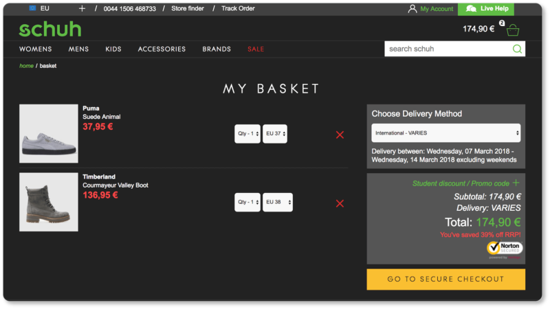
You’ll notice that the most outstanding elements on the page—second to the checkout CTA—are the images of the products in the cart. Product images are a cart page essential. Here’s why:
From a prospect perspective, it’s much more difficult to maintain enthusiasm about a product when you can no longer see what you’re about to purchase. Keeping images in users’ visual field is like dangling the carrot that will lead them through your checkout pages (which—let’s be honest—are unexciting at best). It might become difficult for them to stay motivated otherwise.
But don’t limit your cart summary to images. Display the size, color, price, and number of each item, as Schuh has done above. And include a link from each item back to its product page, in case your prospect needs to reread the full product description or double-check specs. You’ll note how the product titles are in classic “hyperlink color” in this cart in Commerce Plus, signaling to prospects that they can easily return to the product page:
Linking out reduces the number of prospects who leave your checkout page entirely to confirm the contents of their cart. This takes users out of the flow; and you run the risk that they won’t come back. It also gives prospects the opportunity to catch mistakes… which means you’re paying less for returns and exchanges.
Show total cost
The subtotal, taxes, shipping costs, and total cost should each have their own line in the cart. (Of course, we think you should consider offering free shipping; but that’s for another conversation altogether.)
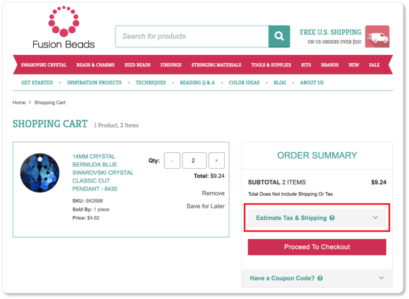
If taxes and shipping are location-dependent, you can always include tax and shipping calculators on your cart page. Fusion Beads offers an estimator in an accordion design that asks users to enter their zip code; the shipping cost then automatically gets added to the total. (It’s worth noting the placement of Fusion Beads’ estimator by the way. Calculators like these should be placed in your prospect’s eyeflow, right where the subtotal is positioned):
Even if the best you can give is an estimate in writing—without a fancy calculator feature—doing so means prospects won’t experience sticker shock on that final page. Don’t break your prospects’ trust by making them feel scammed… even if tax or shipping costs are minimal. Indeed, you risk losing up to 37% of prospects by offering shipping costs too late in the checkout process.
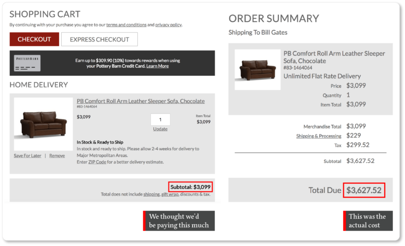
Pottery Barn shows shipping and taxes a little too late in the game for our taste; it wasn’t until the “Payment and Review” page that we learned that sleeper sofa we wanted was going to cost $600 more than the subtotal we’d been looking at:
So mitigate those abandonment numbers. Make sure your cart recalculates the total cost—including all additional fees—each time a new product is added.
Make your cart flexible
For this set of best practices, it’s worth remembering the obvious: A purchase isn’t finalized until that “Purchase” button has been clicked. Don’t make prospects feel locked into a purchase if they still have alterations they want to make to their carts. Here’s how to ensure they feel in control:
Let users edit their carts
Imagine standing in line at the grocery store, surveying your cart, and realizing you should’ve grabbed one more loaf of bread for that dinner you’re hosting tonight. Now imagine that when you tried to get out of line to grab it, you were told that if you needed to make any changes to your cart, you’d have to leave the store, come back in the entrance, grab a new cart, and start over.
Don’t give your prospects that ultimatum: They’ll leave and won’t come back. Rather, let them update quantities and change and remove items from their cart altogether—until the very last step of the checkout process.
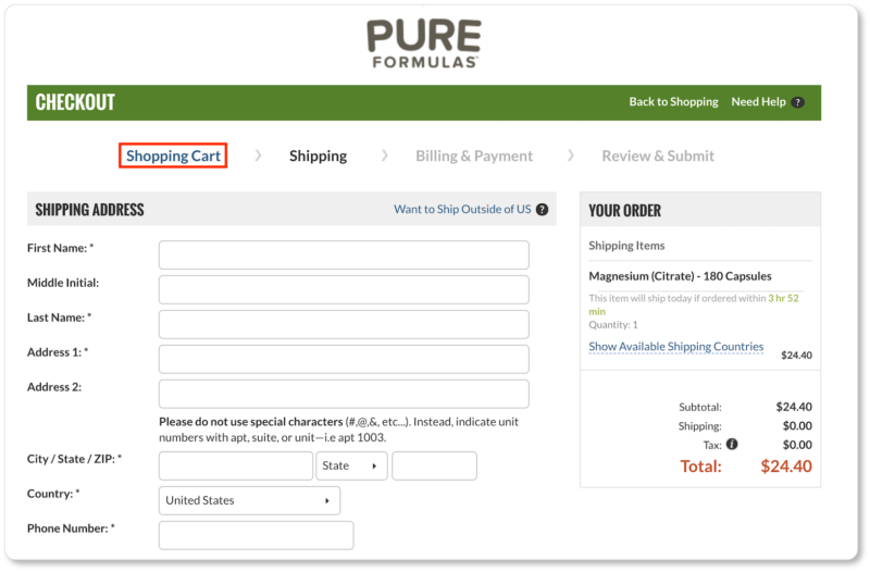
Here’s an example of how not to do it from Pure Formulas: As soon as we moved from the cart page to the shipping form, we lost the option of modifying our cart contents. We had to click on “Shopping Cart” to make our modifications—an action that felt (literally) like taking a step backward because it could only be accessed by clicking the prior page on the progress bar. After we made our changes, Pure Formulas made us sign in all over again before we could return to the shipping form:
Schuh’s cart page, on the other hand—which can be accessed from their checkout flow until the moment the purchase has been made—makes modification remarkably quick and easy:
Schuh offers drop-down menus so users can change the product quantity and size; and a single click on a red “X” deletes that product. What’s more, the “Go to Secure Checkout” CTA is still the brightest thing on the page; so prospects are pulled right back into the purchasing funnel after they’ve made their modifications.
This last point is worth observing. In the next section, we’ll be offering various strategies for keeping your checkout enclosed: in other words, ensuring there’s no friction—and there are no distractions—for your prospect, from the moment they view their cart until the moment they click the CTA to finalize their purchase. Enclosing your checkout encourages users to be as one-track-minded as possible, with the end goal of conversion. Schuh does this with their large, bright yellow CTA here… but they also give prospects the opportunity to reassess.
In other words, there’s a difference between a cart that guides users clearly and decisively through the checkout journey, and a cart that restricts users’ options by prioritizing the sale over prospects’ confidence in their selections. Don’t do the latter.
Let users save items for later
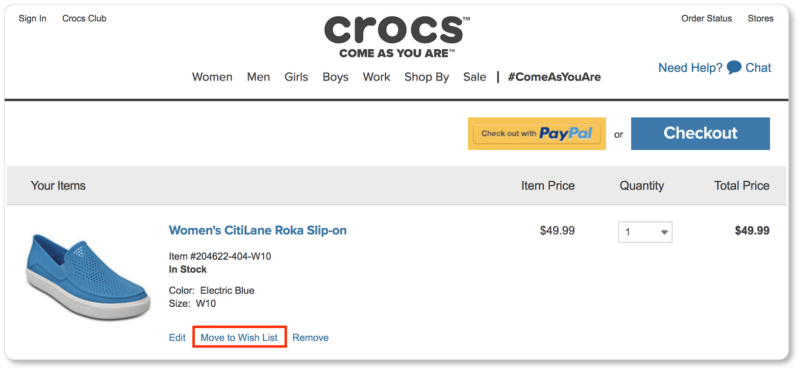
Users tend to treat online shopping carts as wishlists, collecting things that they’d like to buy later. In other words, just because they didn’t purchase your product today doesn’t mean they don’t want it. So take a tip from Crocs and give users an actual wishlist. (Your ecommerce platform should allow you to do this through widgets or plugins):
Pro tip: You might also consider a link that allows prospects to email the contents of their carts to themselves (or to others). This way, even if they don’t remember to return to your site on their own, they’ve got a reminder in their inbox that your products await them.
Give your shopping cart long-term memory
Here’s the thing: People are going to abandon their shopping carts. When your cart refreshes every time a visitor returns, you’ve essentially helped them forget that they ever wanted that product of yours. How many people do you think are willing to go through the same search process all over again when they return to your site?
If you don’t want to learn the answer to that question through first-hand experience, make sure your shopping cart is persistent: Keep track of the unpurchased items in the cart, saving that information for the prospect’s next visit to your site. (You’ll have to code your store to establish long-term cookies to do this, which may be a job for your developer. If you’re using a platform like Commerce Plus, the shopping cart contents save automatically when a user exits your store.)
Make your CTAs clear
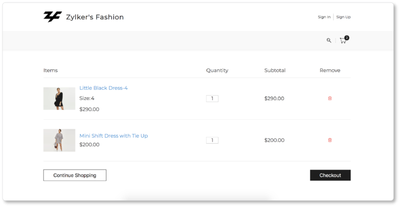
Once they arrive on your cart page, users should only have two possible actions they can take: “Continue Shopping,” or “Checkout.” Your primary call to action will typically be your “Checkout” CTA; your secondary call to action will be to “Continue Shopping.”
Users should be clear which is which, thanks to a visual hierarchy you’ll create. Your “Checkout” CTA should be the biggest, boldest element on the cart page, with a lot of white space around it to help it stand out even more. It should be of a different color than your “Continue Shopping” CTA—which will be accessible to users, but not as visually compelling.
Your “Checkout” CTA should be located at both the top and the bottom of the cart page (on the right is standard positioning). This way users have easy access to it, no matter how long the cart page is… plus it’s a persistent reminder that they can check out at any time. Here’s how Under Armour does it:
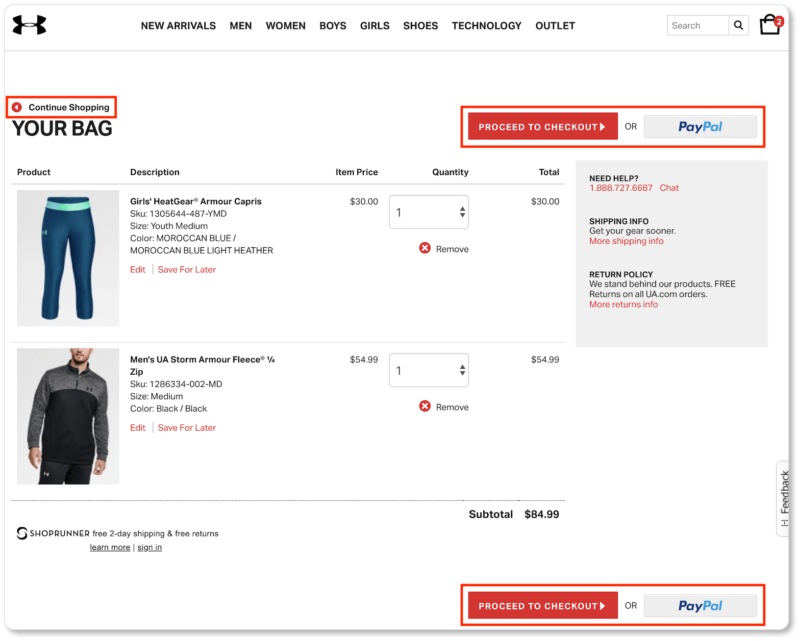
Under Armour’s CTA hierarchy is unmistakable. The “Continue Shopping” CTA isn’t even a button, though it’s quietly available in the top left corner: easy to spot by prospects who have other items they want to buy, but less obvious to prospects who are simply looking to pass quickly through the purchasing funnel now.
Pro tip: Since we’re discussing “Continue Shopping” CTAs, it’s worth reminding you to keep your “Back” button functional—don’t disable it! Some users will try to click it to continue shopping; the last thing they want to experience is an error message and the realization that their cart details and form data have vanished.
Be consistent with your product and checkout pages
Finally, there are certain elements you should consider offering across the board: from your product pages, to your shopping cart, to your checkout pages. These may include your company’s contact information, a live chat feature, trust badges, reminders about free shipping, estimated delivery dates, accepted forms of payment, product guarantees, links to return and refund policies, FAQs, and cross-selling and up-selling opportunities. (These final elements should disappear at the checkout stage so users can focus wholly on the purchase.)
Of course, the elements you’ll include consistently across these pages will be determined through testing. And by “testing,” we mean A/B testing, heatmapping, or even informal user testing sessions: having five of your closest friends sit down with your ecommerce site and talk through their checkout processes out loud, for example.
And if you think you’ve gotten your shopping cart to a point of UX flawlessness, keep in mind that users—and their expectations—change over time. So keep track of those metrics long after you think you’ve won the online cart game. Staying proactive will let you quickly implement changes if you ever see cart abandonments start to climb.
In the next section, we turn to that last step in the eCommerce purchasing funnel: your checkout pages. We’ll show you how to increase conversions through terrific UX on these pages by carefully considering account creation, enclosing your checkout, and creating the quickest and easiest checkout forms possible.