Creating a New Pivot Table
- Creating a Pivot Table
- Multiple Columns in Row, Column and Data Shelves
- Applying Functions on Columns
- Applying Filters
- Providing User Filters
A Pivot Table allows you to dynamically summarize large amounts of data for easy analysis and visualization. You can transform data in a table(s) into meaningful summaries easily by using the intuitive drag and drop interface provided by Zoho Analytics. With Pivot tables, you can easily aggregate and filter the values the way you want it.
Creating a Pivot Table
To create a Pivot View, follow the steps given below:
- Open the Workspace containing the required data with which you want to create a Pivot Table.
- Click Create > Pivot View.
- In the Select Base Table dialog box, choose the required table in your workspace on which you want to create the Pivot Table, and click OK. Alternatively, you can also create a new Pivot table by opening the corresponding table on which you want to create the pivot table and invoking the New > New Pivot View option in the toolbar.
- The Edit Design mode will open. In Edit Design mode, you will notice that all the columns of the selected table will be listed as drag and drop items on the left side Column List pane. On the right-hand side, you can see the Design Area with shelves to drop the columns and preview area below to view the Pivot created.
Note:
- If multiple tables in the workspaces are connected using a Lookup Column then all the columns of the related tables will be listed in the Column List Pane.
- Drag and drop the required columns listed in the Column list pane into the respective shelves in the Pivot tab. You can also select the checkbox adjacent to each column listed to auto place the columns into the appropriate shelves. After dropping the columns click on the option Click here to Generate Pivot to create the new Pivot Table.
Once you have created the required Pivot Table, click Save button in the toolbar to save the view. In the Save As dialog box that appears, type the Name, Description for the Pivot Table and choose the folder where the view is to be saved and click OK. You can also customize the look and feel of your Pivot Table using the customization options available. Click here to learn more.
About Shelves
Below is a brief description of each of the shelves in the Pivot tab.
- Column: Distinct data values present in the columns dropped in this shelf will appear as the column headers of your pivot table. You can also have multiple columns dropped in this shelf for summarization. When you add multiple columns, they will be displayed as categorized layers (a group within a group) of data vertically.
- Row: Distinct data values present in the columns dropped in this shelf will appear as the row headers of your pivot table. You can also have multiple columns dropped in this shelf for summarization. When you add multiple columns, they will be displayed as categorized layers (a group within a group) of data horizontally.
- Data: Values of the columns dropped in this shelf will appear in the body of the pivot table. Values will be summarized based on the summary function that you select. Also, it will be categorized to provide the appropriate summary value for each cell corresponding to the row and column value in the table. You can also have multiple columns dropped in the Data shelf for summarization. When you add multiple columns to the data shelf, you can choose to display the values either as rows or columns.

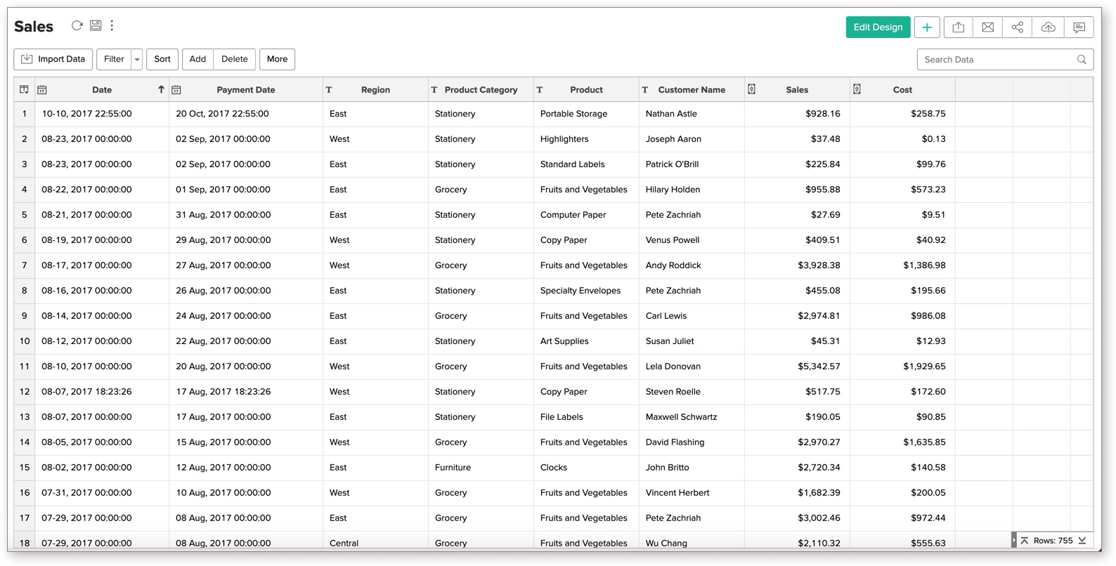
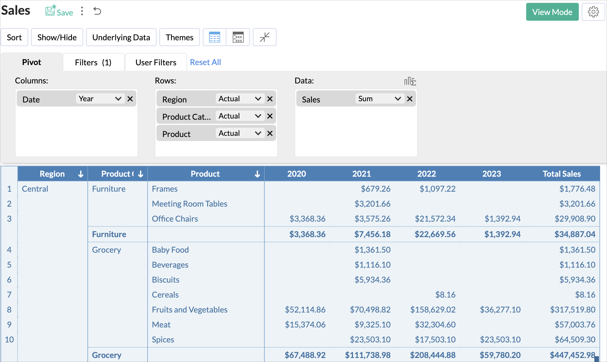
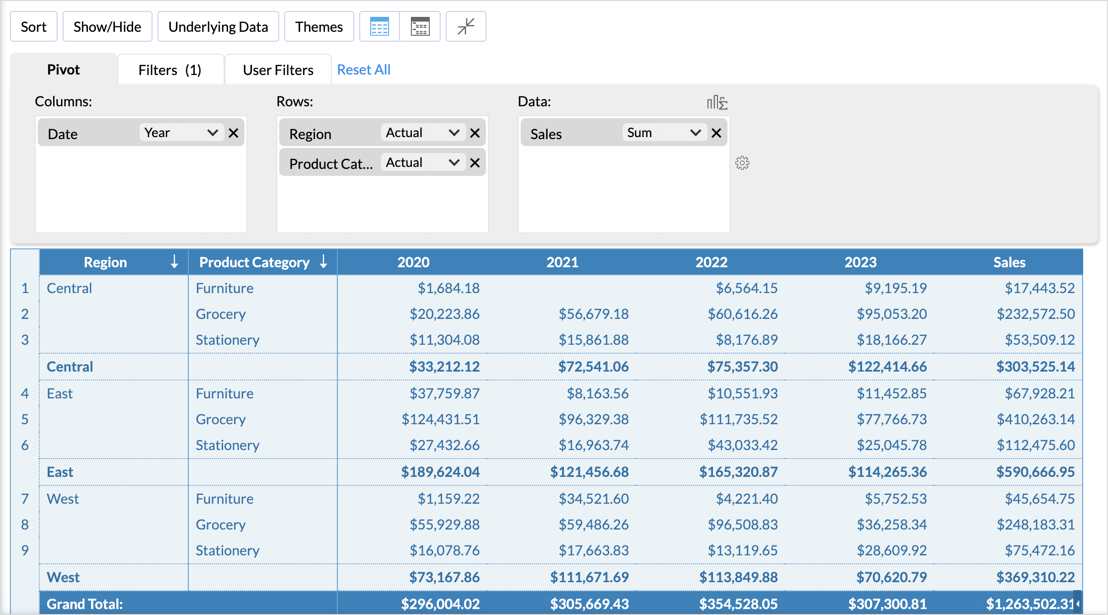
The best way to understand how to summarize data in a Pivot table is by example. The following is a table showing sales data of a store.
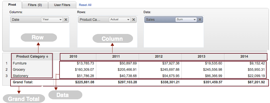
In the example shown below, pivot table summarizes the data in the above table and presents the total sales in each region grouped by each year. In this example, the pivot table has Date column in Column shelf, Region column in Row shelf, and Sales column in Data shelf. Sales in each region is displayed using a Sum aggregation. Also, Zoho Analytics automatically summarizes (in this example it is an addition) the values of each row and column based on the summary function that you select. Summary row and column will be added at the bottom and to the right of the pivot table.
Functions that are applied on each of the columns in the example here are:
- Date - Year (all distinct years in the column will be displayed)
- Region - Actual (all distinct values in the column will be displayed)
- Sales - Sum (sum of the values in the column will be displayed)
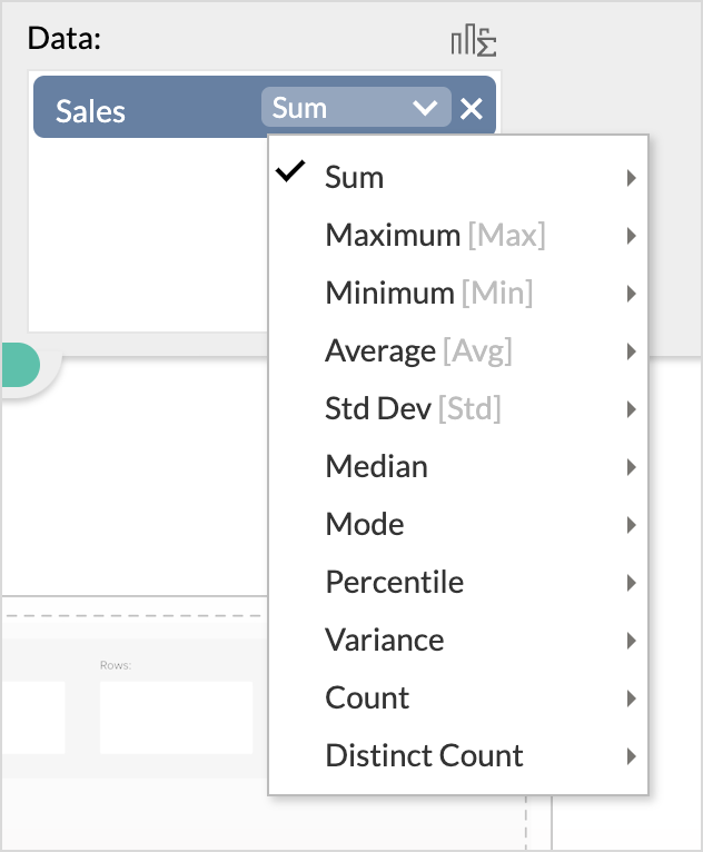
You can also change a data column to use any one of the other functions like: Sum, Count, Average, Standard Deviation etc., depending on the data type of that column, which will be discussed in the next section.
Multiple columns in Row, Column and Data Shelves
Columns/Rows Shelf
Zoho Analytics allows you to drop multiple columns in to each of the shelves. When you have more than one column in Column/Row shelf, Zoho Analytics groups data in the order they appear in the shelf, from left to right or top to bottom.
For example, if you add Product Category and then Product to Rows shelf, all the products will be grouped by their product categories making it easy to see related data and summary information. Similarly, if you add Date and then Region in the Column shelf, then for each distinct year all the regions will be grouped under it to provide the corresponding summary information.
Data Shelf
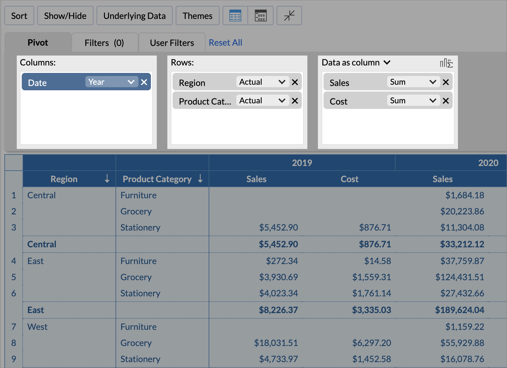
Zoho Analytics allows you add one or more columns to the Data Shelf. Zoho Analytics also provides two options: Data as column and Data as row, to display the data.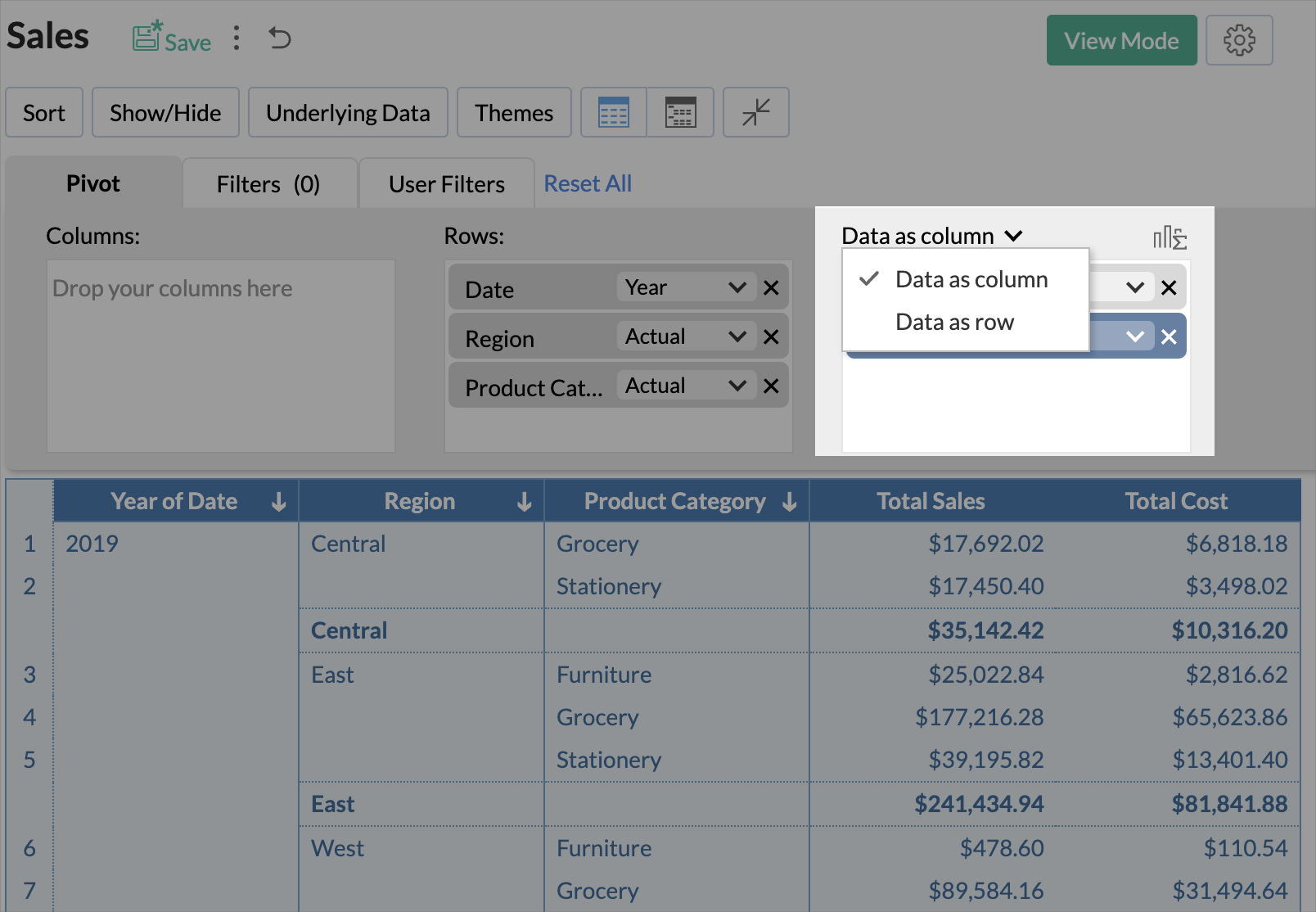
Data as column
Data as column is the default format used for the pivot view. In this format, when you drop multiple columns into the Data shelf, these columns will be arranged horizontally as separate columns in the pivot table as shown in the below image.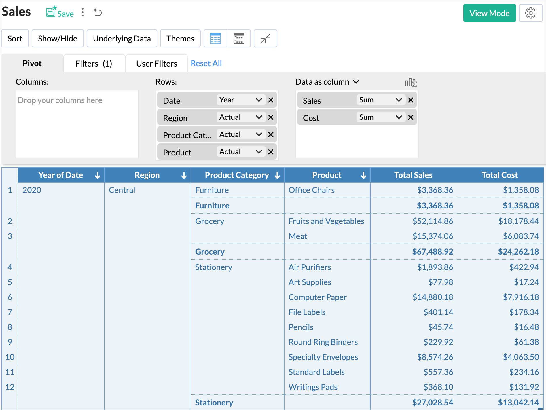
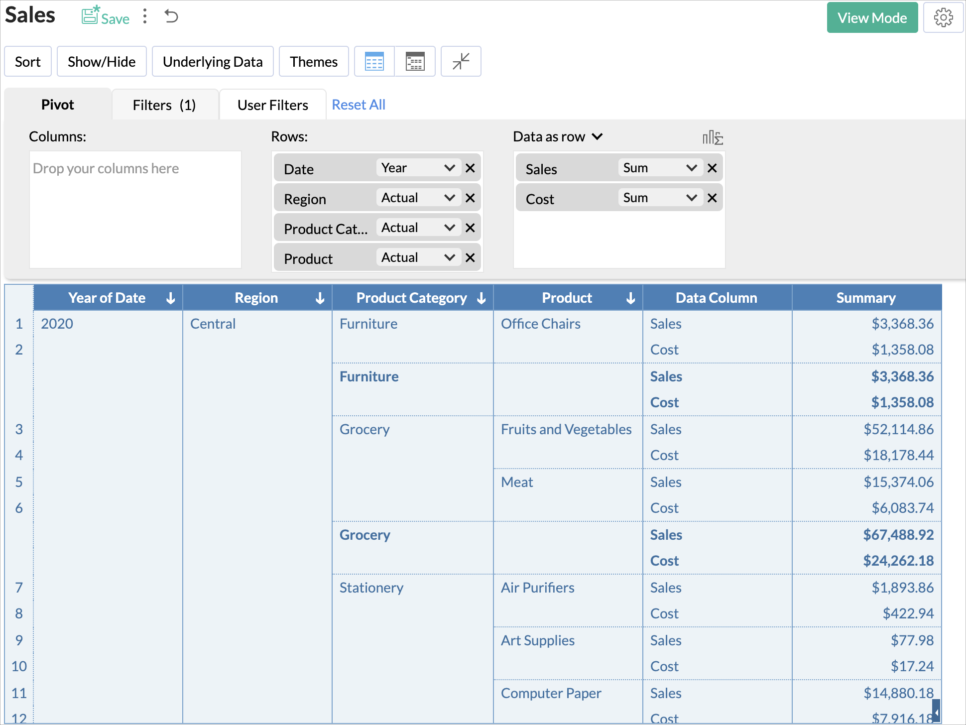
Data as row
The Data as row option will be available when multiple columns are added to the data shelf. Selecting the Data as row option will unpivot or transform all the columns as rows under a single Data Column. The column headers can be changed when needed. Double-click the column headers to rename.In the below image, Sales and Cost are expressed in Data as row format.
Summary Rows and Columns
When you create a Pivot Table, Zoho Analytics automatically adds summary rows and columns to it, based on the summary function that you select. A row displaying summary values of each group of data will also be added, if you have added more than one column to the Row shelf of your Pivot Table. For each column dropped in the Data shelf there will be a summary column added to the right of the pivot table.
Applying Functions on Columns
Zoho Analytics allows you to apply functions like Sum, Count, Average, Min, Max, Year, etc., on the columns to group and summarize data in the Pivot table you create. When you apply a function on a column, a single value will be returned, derived based on the values in the column.
In Zoho Analytics, list of Aggregate/Categorical Functions that you can apply on a column varies depending on the data type of the column. The default function for a Numeric (including Currency) data type is Sum and for a Date data type it is Year. If the data type of the column is a string (Categorical/Dimension column) and not numeric, then the default function applied is Actual Values.
To change this default function that is applied:
- Open the Pivot table in the Edit Design mode, after dropping the column select the required function (aggregate/category) from the drop-down list present on the column. The drop-down list displays all the applicable functions based on the data type of the column, as shown in the screen-shots below.
- Once you select the aggregation that you would like to use, you can click the Click here to Generate Pivot link or you can click the View Mode button in the toolbar.
For instance, if you want to find the average sales of each product by product category in each region, select an Average function from the drop-down list for Sales (Data) column and then click Click here to Generate Pivot link or View Mode button in the toolbar.
The following tables list all the functions along with the description of their functionality that are applicable for the Rows and Columns field.
Numeric and Currency Data Types:
| Function | Description |
| Dimension | Treats the values in the column as a textual (categorical/dimensional) value. Returns each distinct value present as a text value. |
| Range | Groups the entire range of numeric values present in the column into multiple ranges. E.g., 0 to 100, 101 to 250 etc., |
Date Data Type - Actual values:
| Function | Description |
| Year | Returns all distinct year values present in the column. E.g.,2007, 2010 |
| Quarter & Year | Returns all distinct quarter values present in the column. E.g., Q1 2010 |
| Month & Year | Returns all distinct month values present in the column. E.g., March 2010 |
| Week & Year | Returns all distinct week values present in the column. E.g; W1 2010 |
| Full Year | Returns all distinct dates present in the column date. E.g., 1/1/2011 |
| Date & Time | Returns all distinct date and time pairs present in the column. E.g. 01/12/2010 00:10:07 hrs. |
Date Data Type - Seasonal Value:
| Function | Description |
| Quarter | Helps identifying seasonal trends based on quarter across all years. E.g., Q1, Q2. |
| Month | Helps identifying seasonal trends based on months across all years. E.g., January, February. |
| Week | Helps identifying seasonal trends based on weeks across all years. E.g., Week 1, Week 2. |
| Week Day | Helps identifying seasonal trends based on week day across all years. E.g., Sunday, Monday. |
| Day of Month | Helps identifying seasonal trends based on day of month across all dates. E.g., 1 to 31. |
| Hour of Day | Helps identifying trend across hours in a day. E.g., 0 to 23hrs. |
String(Categorical/Dimension) Data Type:
| Function | Description |
| Actual Values | All the distinct values in the column will be listed. |
The following tables list all the functions along with the description of their functionality that are applicable for the Data field.
Numeric and Currency Data Types:
| Function | Description |
| Sum | Returns the sum of all the values in the column. The summation will be done at each category/group level. |
| Maximum [Max] | Returns maximum values in the column. |
| Minimum [Min] | Returns minimum values in the column. |
| Average [Avg] | Returns Arithmetic mean of all the values in the specified column. |
| Standard Deviation | Returns the standard deviation of the column. |
| Variance | Returns the variance of the column. |
| Count | Returns a count of number of values in the column. |
| Distinct Count | Returns the number of distinct value in the column. |
Date Data Type:
| Function | Description |
| Count | Returns the number of date values in the column. |
| Distinct Count | Returns the number of distinct date value in the column. |
String(Categorical/Dimension) Data Type:
| Function | Description |
| Count | Returns the number of values in the column. |
| Distinct Count | Returns the number of distinct value in the column. |
Advanced Summarizing Options
When creating pivots, you can choose how to summarize data i.e., by Sum, Max, Min, Average or by Count in a column, depending on its data type. Apart from these, Zoho Analytics also provides advanced summarizing options, which allows you to summarize data values in a column based on other values in the column. For example, you can display a running total of sales over each year or you can display the percentage for each region's sale of a product compared to the total sales.
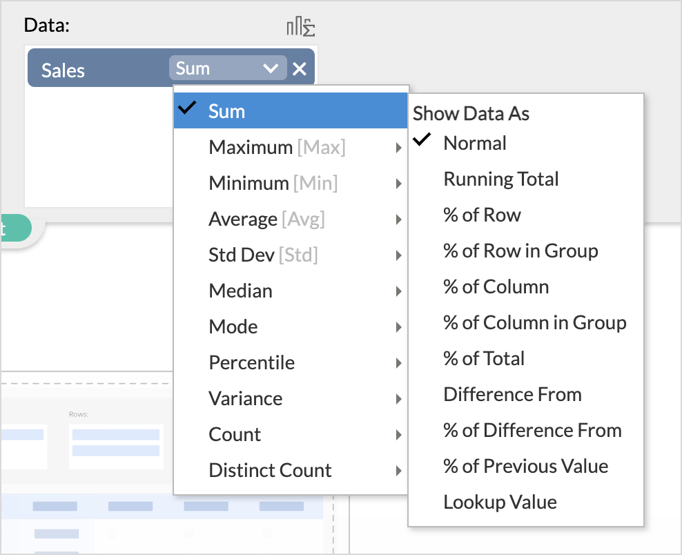
Following are the functions available for advanced summarization:
| Function | Description |
| % of Row | Displays data as a percentage of the total for each row. |
| % of Row in Group | Displays the data in each cell as a percentage of the total value, of each row within a group. |
| % of Column | Displays data as a percentage of the total for each column |
| % of Column in Group | Displays the data in each cell as a percentage of the total value, of each column within a group. |
| % of Total | Displays values as a percentage of the grand total of all the data in the report. |
| Running Total | Displays the data as a running total (successive data points). You must select the base field based on which you want to show the items in a running total. You can apply Sum, Avg, Min, and Max over this function. By default, the sum will be selected. |
| Difference From | Displays the data value as the difference between the value in the previous cell, based on the base field provided. You can apply Previous Value, Next Value, First Value, Last Value calculation over this function. Previous Value will be selected by default. |
| % of | Displays each data value as a percentage of the value in the previous cell, based on the base field provided. |
| % of Difference From | Displays each data value as a percentage of difference. You can apply Previous Value, Next Value, First Value, Last Value calculation over this function. Previous Value will be selected by default. |
| Look Up | Displays the data in each cell by fetching the value from any of Previous/Next/First/Last cell, based on the Base Field selected. |
Applying Filters
A useful feature of pivot tables is that you can filter columns, to display only required data. Zoho Analytics allows you to filter a column for specific ranges, individual values, date ranges, etc. depending on the data type of the column. Zoho Analytics offers various filtering options like filter based specific numeric ranges, date ranges, individual values, top 10, bottom 10 etc., Zoho Analytics also allows you to apply multiple filters (based on multiple columns) on a pivot. The filtering option discussed in this topic can be applied only when you are designing a Pivot Table (i.e., when you are in design mode) and not in View mode.
To apply a filter, after you have created the required Pivot view:
- Click Edit Design option in the toolbar.
- Click Filters tab next to the Pivot tab in the Design Area.
- Drag and drop the required columns into the Filters shelf.
- Once a column is dropped, a list of all the possible options available for filtering the data will be displayed in the box right to Filters shelf as shown in the screenshot below.
- Filter Options vary depending on the data type of the dropped column.
- After you have dropped the column, select one or more values to filter by. Selected filter items appear in the third box on the right.
- Click the button Click Here to Generate Pivot or View Mode button in the toolbar. Data that matches the filter values that you have applied will be displayed. However, if you want to exclude specific data from the view, select Exclude Items option in the drop-down list at the top of the filter items box.
The Filtering options are the same for all types of reports that you create in Zoho Analytics namely charts, pivot table & summary views. The filtering options provided varies based on the data type of the column dropped. Refer Filters section under Charts topic to know about various Filter Options.
Providing User Filters
Zoho Analytics also allows you to include dynamic filters in the Pivots view mode called User Filters. This enables your users who access the report, to apply filters on the report data displayed using the filter columns exposed as part of the User Filters. The filter columns included in User Filters can be displayed using a variety of display components like Drop Down boxes, Slider, Date range chooser etc., to suit your needs.
The steps to provide User Filters are same for all types of reports that you create in Zoho Analytics. Refer User Filters section under Charts topic for details on how to provide User Filters for various column types (Datatypes).
Solutions
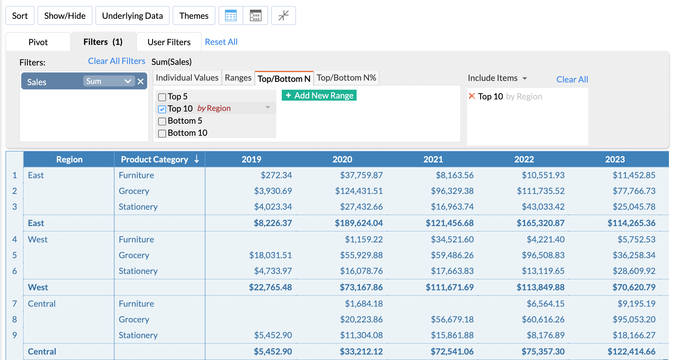
Top N Items in Each Category
Top N analysis is a common business technique that involves sorting data to view a specific category’s top or bottom values. With this, you can easily identify the top or bottom values in your business data and make data-driven decisions.
Add Trend Arrow in Tabular Reports
Adding a rise and fall arrow to your report is one of the best ways to visualize your data trending patterns. This is pretty useful in highlighting the trend or plotting against a target to show progression.
Improve Data Comprehension using Expand and Collapse option
Enabling the Expand and Collapse option in the pivot table can help focus on a specific category of the data, by breaking it into smaller parts and drilling down deeper to identify trends and relationships in the data. It also increases interactivity as it allows the user to choose which category he or she needs to view.