Understand Application Themes
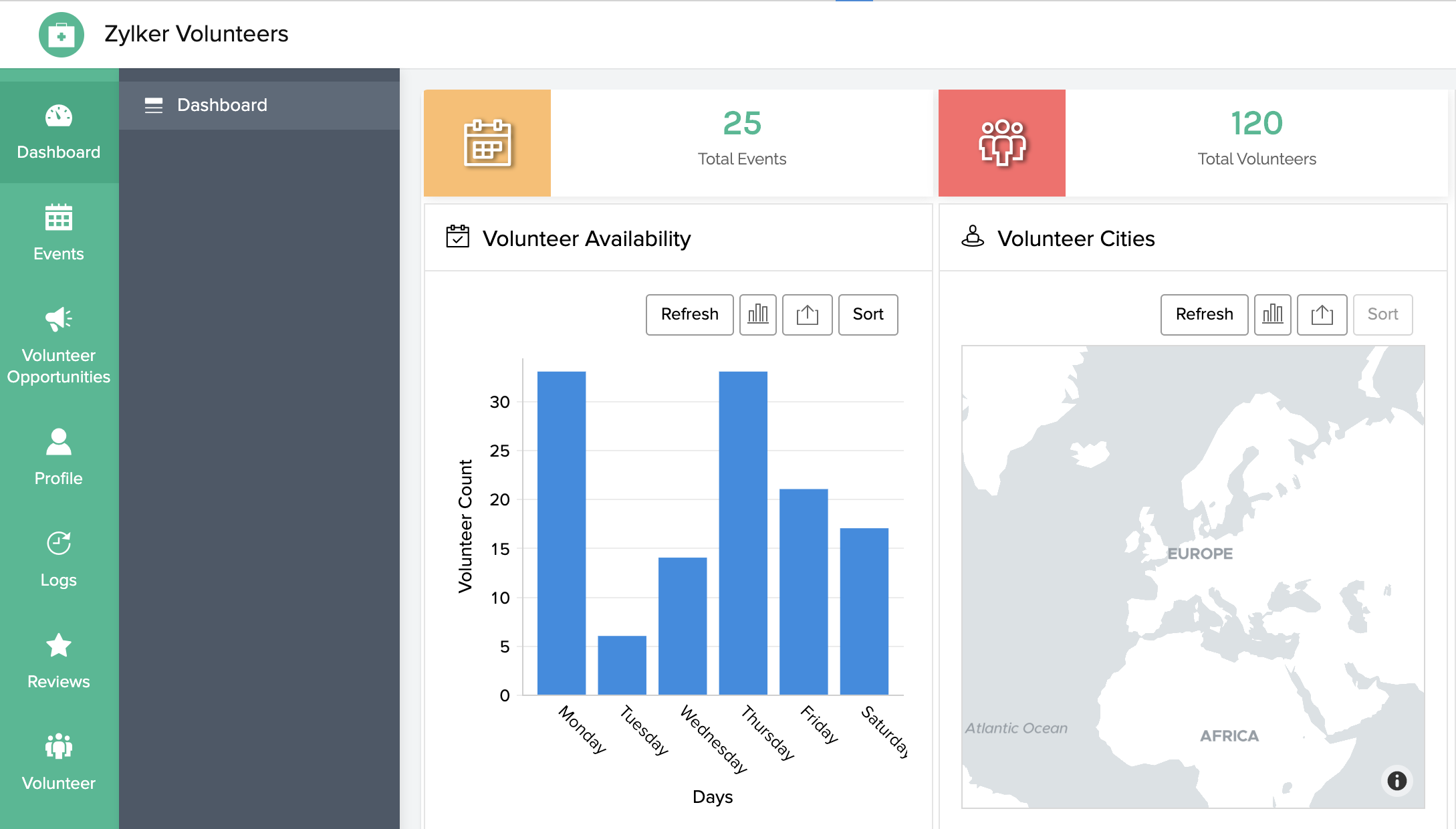
Application themes for browser
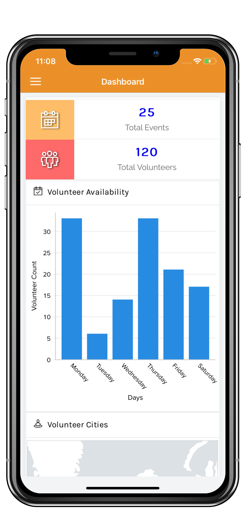
Application themes for phone
Below is an example of how the sliding pane theme looks like in an iPhone device. The sections and their components can be accessed by clicking the triple-line icon in the top-left corner of your device. Refer to this page to set a theme for your application when accessed via phone.
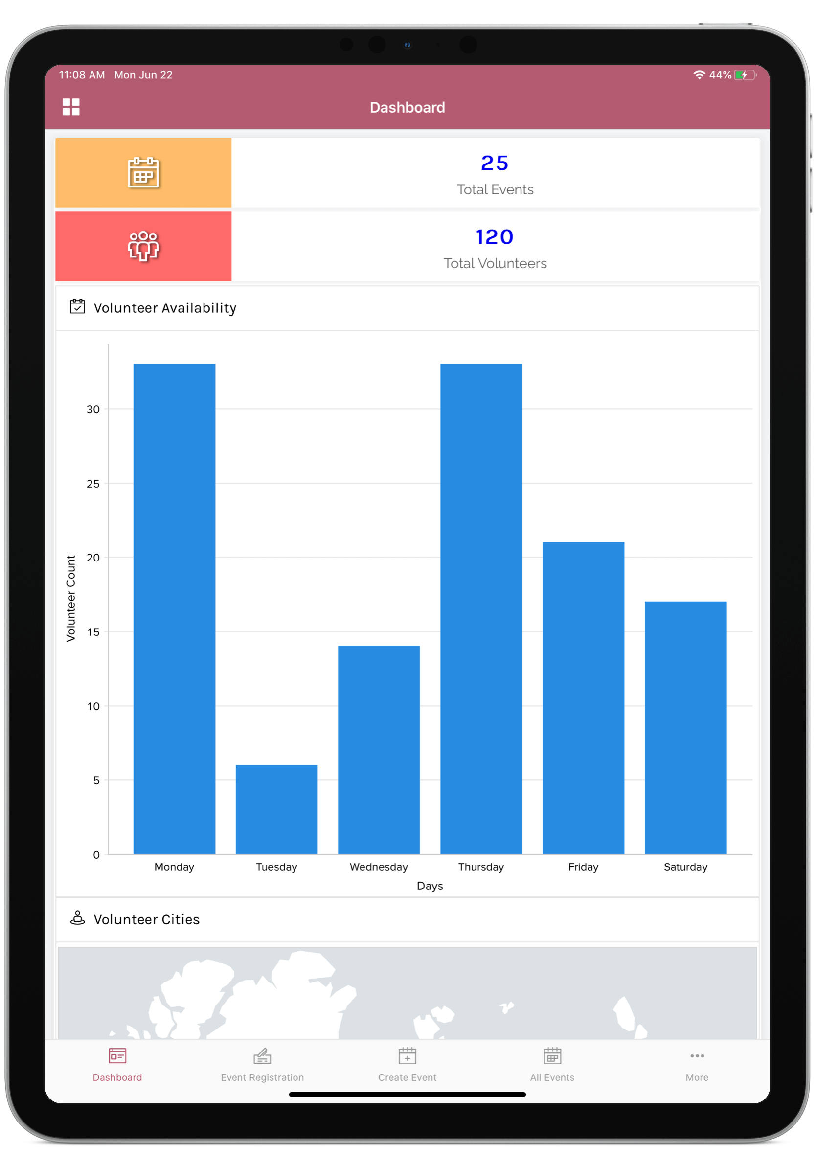
Application themes for tablet
Below is an example of how the bottom bar theme looks like in an iPad device. The sections and their components can be accessed from the bar at the bottom of your device. Refer to this page to set a theme for your application when accessed via tablet.
Related Topics
Zoho CRM Training Programs
Learn how to use the best tools for sales force automation and better customer engagement from Zoho's implementation specialists.
Zoho DataPrep Personalized Demo
If you'd like a personalized walk-through of our data preparation tool, please request a demo and we'll be happy to show you how to get the best out of Zoho DataPrep.
- Zoho Workerly Home
- Forums
- Connect With Us:


- Zoho Recruit Home
- Forums
- Connect With Us:
You are currently viewing the help pages of Qntrl’s earlier version. Click here to view our latest version—Qntrl 3.0's help articles.


Zoho Sheet Resources
Zoho Forms Resources
Zoho Sign Resources
Sign, Paperless!
Zoho TeamInbox Resources
Zoho DataPrep Resources
Design. Discuss. Deliver.
Related Articles
Understand application settings
This help page is for users in Creator 6. If you are in the older version (Creator 5), click here. Know your Creator version. The Settings section allows you to make application level configurations. You can view and change information about and ...Understand application IDE
This help page is for users in Creator 6. If you are in the older version (Creator 5), click here. Know your Creator version. Application IDE (Integrated Developer Environment) displays the skeletal framework of Forms, Reports, Pages, Schedules, and ...Understand Application Activity
What Does This Page Cover? Learn about Application Activity Dashboard and how it makes it easier to analyze and monitor the usage statistics across applications in a single platform. Learn more about the Metrics dashboard. Availability Metrics is ...Understand mobile application
Zoho Creator enables you to easily build custom Android/iOS apps with multiple features and functionalities. You can also download your Creator application as a separate mobile app for iOS and Android devices. Code sign Understand rebranded mobile ...Understand Application
An application is built by an app owner to collect data from users. The first step in creating an application is to set up an interface to collect data. This interface is called a form. A form is the component of your Zoho Creator app that enables ...